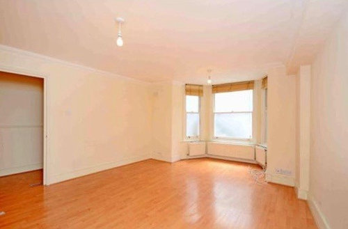
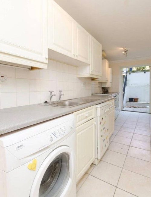
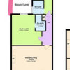
A Notting Hill Before & After
Venta Construction
4 years ago


Featured Answer
Sort by:Oldest
Comments (7)

Stephanie Hayes
4 years agoRelated Discussions
Awkward kitchen (1)
Comments (16)My 2¢ worth: first of all replace the dark blinds with translucent cordless single cell blinds in ivory or off-white--they let light through and provide privacy + some insulation from cold or heat. Clean, crisp look.That alone will brighten up this space. #2: clear the counterspace!--so much clutter! Where to put all these appliances that get little daily use? Get yourself a ss 24x20 or larger cart on wheels (see Amazon.com--Seville classic ss cart) and store little used, bulky appliances on its shelves--and roll the cart into a nearby coat closet--out of sight and way-- to be wheeled back when needed or individually carried back as needed. 3#gorgeous blue tiled walls.Don't touch them. #4:Walls: keep as is if off-white--not same as trim white white.Just a fresh coat needed.To make it "disappear," paint the radiator the same color as the wall behind it. #5Keep the white trim white--looks bright and clean.Keep kitchen door white. You might want to stop here and make no further changes #6Cabinets: I like Gast pic above on right, but too much blue for your blue-tiled kitchen...IMO. I'd go cooler and lighter...consider the light gray of the beadboard in the Gast pic above right. Beautiful hue. Don't go for the white white everyone clamors for these days.Too stark for your kitchen and too contrasty with the blue tile, too country kitchenish. #7. cabinet hardware: Look like glass knobs in pics. Go for knobs/pulls like in the Gast pic above--or similar in pewter or ss, my preference. Those "modern" ss bar handles don't work with your cabinets. #8 the round table is not a good fit against the wall. Get a small sq or rectangular ss or butcherblock-top table for that spot. Chop off the top tier of your chairs to shorten....and match their tops as they are now so's won't appear to take up so much visual space and still remain comfy--don't replace w/ uncomfortable stools.Keep white. #9. Do away with wood valance over sink window.Too country. #10 Countertops--solid color Corian type or laminate--depends on budget--don't want busy stone textures of quartz, etc. Consider a medium value cool gray. (Or maple butcherblock?). Can't see color/texture of floor.... hope some of this helps. Good luck! lisianthus' pic tho nice is too busy-cutesy for your minimalist aims IMO...See Moreneed help with my living room
Comments (37)Hello CG, you can buy some of these and try them on site. From the pictures you posted I get the feeling you have 2 colors with similar saturation both fighting for attention. It's a little too much. I would keep the green but go softer on the red (i.e rust). You can also let yourself be inspired by the grey/silver/bordeaux floral and stripe pillows to create a brand new color scheme using these colors instead. For example, a very soft gray on the walls, gray carpet, grey/bordeaux combo in the curtains and for the sofa accents, pillows similar to these 2. It's decision time. Go for what speaks to you, but do it with elegance :-)...See MoreNew kitchen, but just not working.
Comments (448)fragle0 ... congratulations on the new addition to your family. Have been following your lovely changes. You probably won't have time to work on the decor for a while. Just wanted to suggest that you try pulling the nesting tables forward to be more in line with front of the chairs & placing your floor lamp to the back of them. This will give a bit more light at night for reading in that area.Also switching the plant by the fireplace & the one on the corner by the sofa....See MoreHelp with colours
Comments (53)Thanks a mil! That's the thing about new colour. It does take some getting used to. However I had my babies room, a spare room and the inside of my front door painted at the same time last week and love all of the colours chosen but this one I just can't look at. It turned out to be more of a minty green than the colour samples on the wall. One of the fabrics below are being make up in a footstool and I think it may be overkill with too much colour. I wanted the coushions and footstool to pop as those are the things you spend the most amount of money on rather than the paint. In saying that. The cost of the paint was expensive and also paying someone to do it. Now to do it all over again is not ideal.:(. i took the cushions and fabric into one of my other rooms to see what it looked like against a more neutral background and felt it looked a little better. See pics below. Any other paint suggestions are much appreciated....See More PRO
PROVenta Construction
4 years ago
Kazza None
4 years ago PRO
PROPaintforme
4 years ago
Davina Smith
4 years agocheekyc
4 years ago

Sponsored
Reload the page to not see this specific ad anymore

Jonathan