Help with colours
michelleg2k
9 years ago
Featured Answer
Sort by:Oldest
Comments (53)

Darzy
9 years ago
anne dee
9 years agoRelated Discussions
Need help choosing colour for walls
Comments (3)Benjamin Moore has a color called Gray Cashmere. It is a perfect compliment for the red tiles. Has some blue, some green and gray undertones....See MoreHelp???!! What colour for kitchen cabinets please??
Comments (0)What colour should I paint these kitchen cabinets?...See MoreNeed help with colour for 1 wall in white kitchen
Comments (1)As you have blue within your scheme already, I'd try to pull this into the design. Possibly 'Parma Gray' - Link Below http://www.farrow-ball.com/parma-gray/paint-colours/farrow-ball/fcp-product/100027 Let me know what you think. Kerry...See MoreHelp with colour scheme!
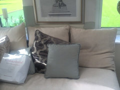
Comments (0)I really need to redecorate my living room but not sure what colour scheme to go for. was thinking of a grey with brown undertones but not sure if it would be too bland. The sofa is almost identical to this one ⬇️...See MoreDarzy
9 years agolast modified: 9 years ago PRO
PRODawson & Clinton
9 years ago
User
9 years ago
michelleg2k
9 years agomarilynellis
9 years ago
decoenthusiaste
9 years ago- PRO
User
9 years ago michelleg2k
9 years agomichelleg2k
9 years agobtydrvn
7 years agobtydrvn
7 years agobtydrvn
7 years agomichelleg2k
7 years agomichelleg2k
7 years agobtydrvn
7 years agomichelleg2k
7 years agomichelleg2k
7 years agobtydrvn
7 years agomichelleg2k
7 years agobtydrvn
7 years agomichelleg2k
7 years agobtydrvn
7 years agobtydrvn
7 years agomichelleg2k
7 years agobtydrvn
7 years agomichelleg2k
7 years agobtydrvn
7 years agomichelleg2k
7 years agomichelleg2k
7 years agobtydrvn
7 years agomichelleg2k
7 years agobtydrvn
7 years agobtydrvn
7 years agobtydrvn
7 years agomichelleg2k
7 years agomichelleg2k
7 years agobtydrvn
7 years agomichelleg2k
7 years agobtydrvn
7 years agomichelleg2k
7 years agobtydrvn
7 years agomichelleg2k
7 years agobtydrvn
7 years agomichelleg2k
7 years agobtydrvn
7 years agobtydrvn
7 years agomichelleg2k
7 years ago


Sponsored
Reload the page to not see this specific ad anymore

btydrvn