Medium Sized Midcentury Dining Room Ideas and Designs
Refine by:
Budget
Sort by:Popular Today
41 - 60 of 2,869 photos
Item 1 of 3
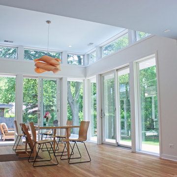
This is the addition to a early 1960's split level. The addition encloses a family room and dining room. The dining room is defined by the higher ceiling. Daylighting is brought further into the interior by the use of a light shelf, which bounces the daylighting off of it and reflects it up onto the ceiling of the taller space. The overhang that the light shelf is made from blocks out the high summer sun, while still admitting the low winter sun for passive solar gain.
The existing home's exterior was is located at the far left. http://www.kipnisarch.com
Kipnis Architecture + Planning
Download our free ebook, Creating the Ideal Kitchen. DOWNLOAD NOW
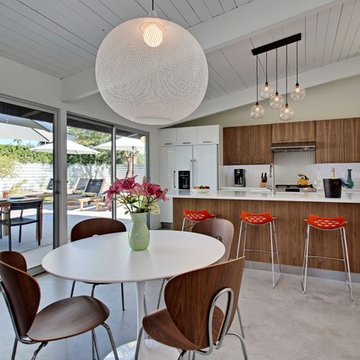
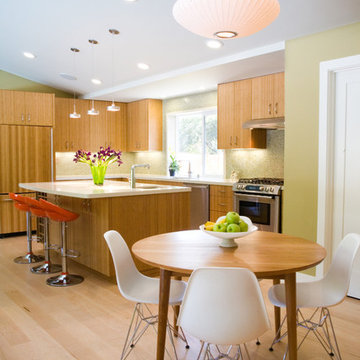
As with most projects, it all started with the kitchen layout. The home owners came to us wanting to upgrade their kitchen and overall aesthetic in their suburban home, with a combination of fresh paint, updated finishes, and improved flow for more ease when doing everyday activities.
A monochromatic, earth-toned palette left the kitchen feeling uninspired. It lacked the brightness they wanted from their space. An eat-in table underutilized the available square footage. The butler’s pantry was out of the way and hard to access, and the dining room felt detached from the kitchen.
Lead Designer, Stephanie Cole, saw an improved layout for the spaces that were no longer working for this family. By eliminating an existing wall between the kitchen and dining room, and relocating the bar area to the dining room, we opened up the kitchen, providing all the space we needed to create a dreamy and functional layout. A new perimeter configuration promoted circulation while also making space for a large and functional island loaded with seating – a must for any family. Because an island that isn’t big enough for everyone (and a few more) is a recipe for disaster. The light white cabinetry is fresh and contrasts with the deeper tones in the wood flooring, creating a modern aesthetic that is elevated, yet approachable for everyday living.
With better flow as the overarching goal, we made some structural changes too. To remove a bottleneck in the entryway, we angled one of the dining room walls to create more natural separation between rooms and facilitate ease of movement throughout the large space.
At The Kitchen Studio, we believe a well-designed kitchen uses every square inch to the fullest. By starting from scratch, it was possible to rethink the entire kitchen layout and design the space according to how it is used, because the kitchen shouldn’t make it harder to feed the family. A new location for the existing range, flanked by a new column refrigerator and freezer on each side, worked to anchor the space. The very large and very spacious island (a dream island if we do say so ourselves) now houses the primary sink and provides ample space for food prep and family gathering.
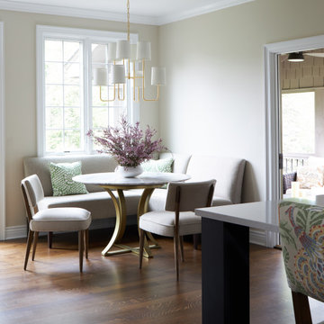
The new kitchen table and coordinating banquette seating provide a cozy nook for quick breakfasts before school or work, and evening homework sessions. Elegant gold details catch the natural light, elevating the aesthetic.
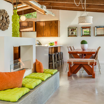
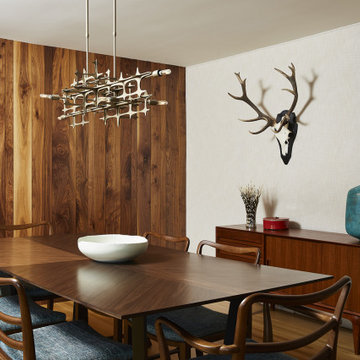
The dining room was transformed into one of this client’s favorite spaces and we couldn’t agree more. We saw an opportunity to give the dining room a more distinguished identity by closing off the entrance from the foyer. The relocated wet bar enhances the sophisticated vibe of this gathering space, complete with beautiful antique mirror tiles and open shelving encased by moody built-in cabinets.
Updated furnishings add warmth. A rich walnut table is paired with custom chairs in a muted coral fabric. The large, transitional chandelier grounds the room, pairing beautifully with the gold finishes prevalent in the faucet and cabinet hardware. Linen-inspired wallpaper and cream-toned window treatments add to the glamorous feel of this entertainment space.
There is no way around it. The laundry room was cramped. The large washer and dryer blocked access to the sink and left little room for the space to serve its other essential function – as a mudroom. Because we reworked the kitchen layout to create more space overall, we could rethink the mudroom too – an essential for any busy family. The first step was moving the washer and dryer to an existing area on the second floor, where most of the family’s laundry lives (no one wants to carry laundry up and down the stairs if they don’t have to anyway). This is a more functional solution and opened up the space for all the mudroom necessities – including the existing kitchen refrigerator, loads of built-in cubbies, and a bench.
It’s hard to not fall in love with every detail of a new space, especially when it serves your day-to-day life. But that doesn’t mean the clients didn’t have their favorite features they use on the daily. This remodel was focused largely on function with a new kitchen layout. And it’s the functional features that have the biggest impact. The large island provides much needed workspace in the kitchen and is a spot where everyone gathers together – it grounds the space and the family. And the custom counter stools are the icing on the cake. The nearby mudroom has everything their previous space was lacking – ample storage, space for everyone’s essentials, and the beloved cement floor tiles that are both durable and artistic.
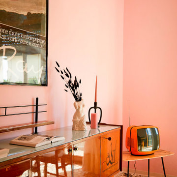
The vision for the living room of this 1960's apartment in Milan was to create a design that reflected the character and age of the property. We kept some of the original features like the beautiful terrazzo floors and some of the existing pieces like the burgundy sofa and the original curtains, and chosen vintage furniture to add an elegant retro vibe, whilst keeping the free-flowing interiors light and airy. The artwork is an homage to surrealism and the 1970's orange TV brightens up the space with a splash of vivid colour against the shell-pink walls.
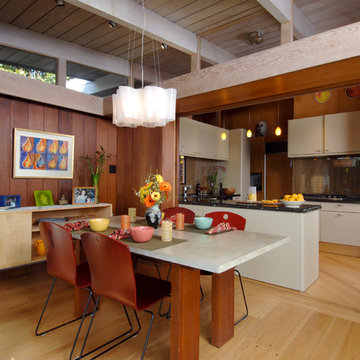
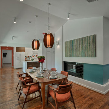
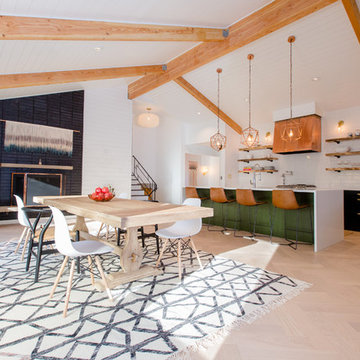
Painting the kitchen cabinets a soft neutral color — instead of the former kelly green (!) — compliments the washed tone of the ceiling beams and the cool gray of the concrete tabletop in the dining area, completing the harmonious palette.
Contractor: Reuter Walton
Interior Design: Talla Skogmo
Photography: Alyssa Lee
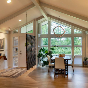
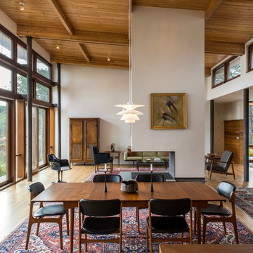
The dining room and foyer, looking out towards the front. The vaulted ceiling has beams that project out to the exterior.
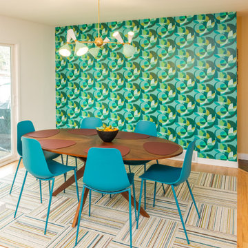
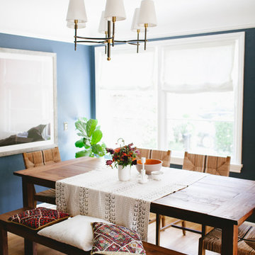
Photographer: Meghan Klein
Designer: Cassandra Kelley of Coco+Kelley
This navy midcentury modern dining room has added modern touches like a brass tipped chandelier, kilim pillows, and cool navy walls. Shop and create your custom window treatments at loomdecor.com
Medium Sized Midcentury Dining Room Ideas and Designs
3