
Living Room with Purple Walls Ideas and Designs
Refine by:
Budget
Sort by:Popular Today
161 - 180 of 332 photos
Item 1 of 2




 Cheville Parquet
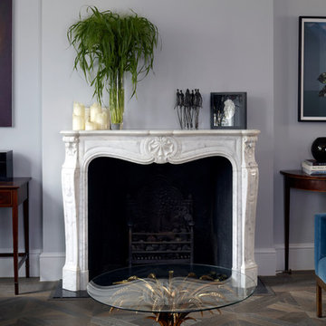
Cheville plank smoked and finished in a metallic oil. The metallic finish reflects the light, so you see different tones at different times of the day, or depending on how the light is hitting it.
The client specified Versailles tile in the reception room, planks in the basement, and clad the staircase in the same wood with a matching nosing. Everything matched perfectly, we offer any design in any colour at Cheville.
Each block is hand finished in a hard wax oil.
Compatible with under floor heating.
Blocks are engineered, tongue and grooved on all 4 sides, supplied pre-finished.
Cheville also finished the bespoke staircase in a matching colour.


 Nellie Vin
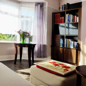
Living room. Nellie Vin ©Style, interior design and photography.
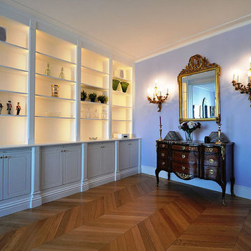
Sharp company build in bookcases


 Forté - Timber Flooring
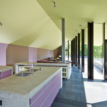
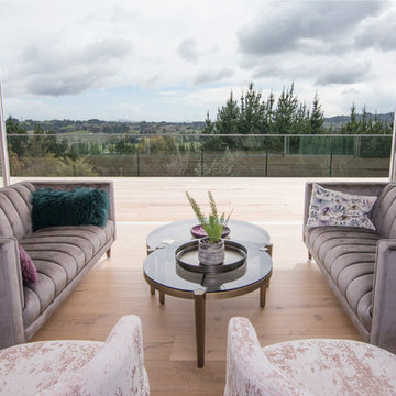
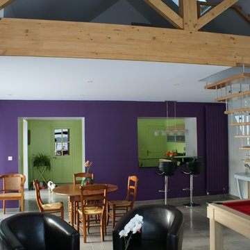
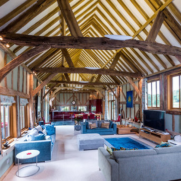
This quirky home, surrounded by stunning bush views brings nature indoors with Manor Classique timber flooring. The home features pops of colour and smooth transitions as the French Oak moves throughout the different areas of the house.
Range: Manor Classique (19mm Engineered French Oak Flooring)
Colour: La Grange
Dimensions: 220mm W x 15mm H x 2.2m L
Grade: Feature
Texture: Lightly Brushed & Handscraped
Warranty: 25 Years Residential | 5 Years Commercial
Photography: Forté






 Baileys Blinds Ltd
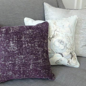
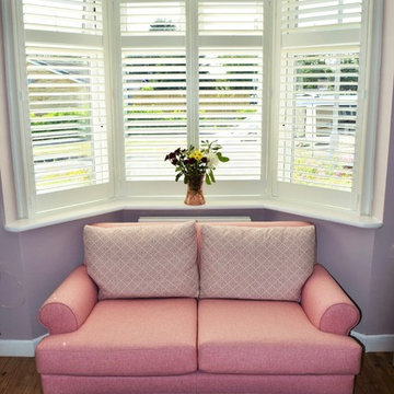
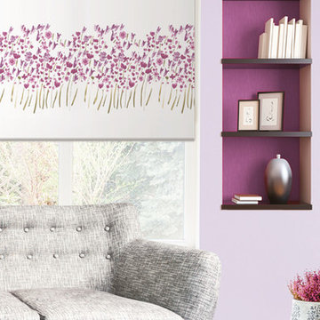
Baileys supply made to measure roller blind using Dutton & Gavin Textiles' fabric with purple floral pattern on white background.
 Alta Mente
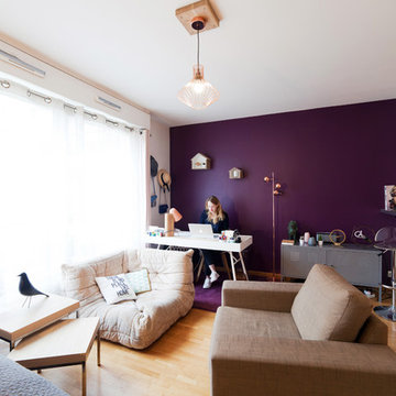
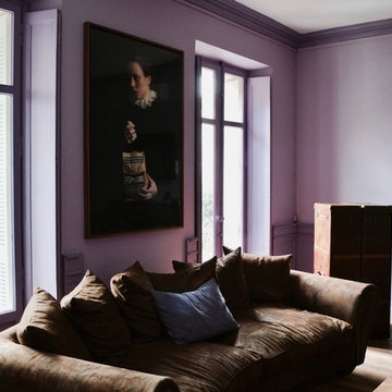
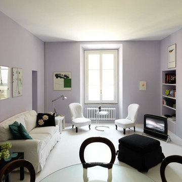
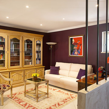
Côté petit salon, le muret séparant la pièce de la salle à manger est légèrement rehaussé et revêtu d’un stucco (crèma di calce pastel) lui conférant plus d’élégance. Afin de délimiter clairement l’espace tout en conservant la perspective vers la pièce à vivre, une ‘cloison’ de barreaux de fer, carrés et légèrement oxydés, voit le jour.
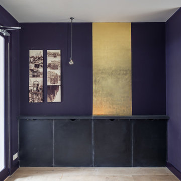
L’imposante bibliothèque en chêne blanchi est quant à elle déplacée à 90°. Objectif : alléger le mur principal devant lequel sera désormais positionné un canapé convertible (XXL Maison). Une lithographie très colorée, jusque-là peu mise en valeur, devient l’accroche principale de la pièce. La propriétaire des lieux aimant oser en termes de couleur, c’est l’aubergine (Zolpa), discrètement présente dans la lithographie, qui est retenue pour les murs. Contraste assuré, permettant de mettre en valeur le mobilier aux tonalités claires et conférant à l’endroit une personnalité forte !
Crédits photo Christelle Gilles

9