Kitchen with Multi-coloured Floors and White Worktops Ideas and Designs
Refine by:
Budget
Sort by:Popular Today
161 - 180 of 7,235 photos
Item 1 of 3
Free ebook, Creating the Ideal Kitchen. DOWNLOAD NOW
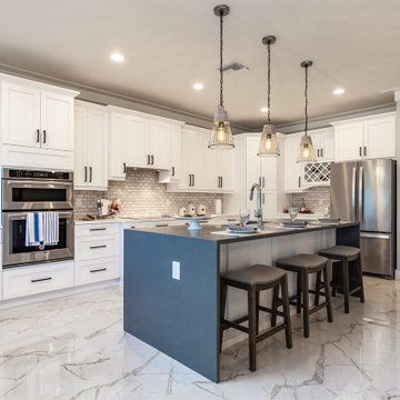
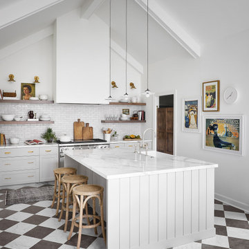
Our clients came in after thinking a long time about what to do with their kitchen – new cabinets or paint them, white kitchen or wood, custom or is semi-custom? All good questions to ask! They were committed to making this home for a while, they decided to do a full remodel. The kitchen was not living up to its potential both visually and functionally. The dark cabinets and countertop made the room feel dull. And the major drawback, a large corner pantry that was eating into the room, make it appear smaller than it was.
We started by ditching the corner pantry. It created a perfectly centered spot for the new professional range and made room for a much larger island that now houses a beverage center, microwave drawer, seating for three and tons of storage. The multi-generational family does a ton of cooking, so this kitchen gets used! We spent lots of time fine tuning the storage devices and planning where critical items would be stored. This included the new pantry area across from the refrigerator that houses small appliances and food staples.
Designed by: Susan Klimala, CKBD
Photography by: LOMA Studios
For more information on kitchen and bath design ideas go to: www.kitchenstudio-ge.com
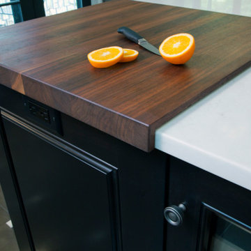
This two-toned kitchen was designed by Paula Greer, CKD of Bilotta Kitchens with Robin Zahn of Robin Prince Zahn Architecture. The u-shaped space has perimeter cabinets in Bilotta’s own line, the Bilotta Collection in a custom gray paint. The island is Wood-Mode Cabinetry in cherry with a stain. Countertops are Caesarstone’s London Grey with a built-in walnut cutting board on one corner of the island from Brooks Custom. The custom Madison Hood by Rangecraft is in a Dark Antique Steel finish and extends up accentuating the high ceiling above the cooking triangle. Two of the most interesting elements of this space are the banquette area and the coffered ceilings. By far, the most frequent installation of banquettes is tucking them into a corner of the room, regardless of how much seating is available at the island. In this kitchen, the island provides enough space for four to five stools. But because the space is separated from the rest of the house, the client wanted to ensure there was sufficient seating for their frequent entertaining. Also, the house is situated in a secluded wooded area; the new kitchen includes an abundance of unobstructed windows to fully experience the beautiful outdoor surroundings. The corner banquette (under more windows!) makes it feel like you’re dining in the trees. The bonus feature is that there’s extra storage below for table linens or seldom-used serving pieces. This really functions like a couch, complete with throw pillows and a TV, where the empty-nesters love spending time even when it isn’t mealtime. As for the ceiling, coffers don’t necessarily have to be large and intricately detailed with layers of moldings in order to be effective. This kitchen features two different ceiling heights: a small section of an addition contains a vaulted ceiling, while the larger island and eating area are tucked under a 2nd floor balcony and bedrooms. The client wanted to distinguish the lower area from the vaulted section, but in a subtle manner. The architect chose to implement shallow coffers with minimal trim for a softer result. The geometric pattern also reflects the floor tile and other lines within the room. The most interesting aspect, though, is that the vaulted area is actually concealed from view when you’re standing in the breakfast area; but as you approach the sink and window, the ceiling explodes above you for a visual surprise. And lastly, of course during this time of “work from home” the desk tucked in a nook opposite the banquette creates the perfect space for Zoom meetings, email checking and just the day-to-day activities we used to go into the office to do. The kitchen is an all-around perfect space for cooking, entertaining, relaxing or working!
Bilotta Designer: Paula Greer
Photographer: Philip Jensen-Carter
Architect: Robin Prince Zahn Architecture
Painted kitchen off dining area, high ceilings over 8'
clean contemporary style Floating wood shelves either side of window
Modern farmhouse, reusing existing Saltillo floor tiles and existing glass block. Dark grout accentuates subway tiles.
Combination creamy white wall cabinets with grey washed cabinet finish below.
In this wonderful high ceilinged kitchen, we knocked through to the dining room and were able to create a kitchen/dining/snug, keeping the living room at the front of the house seperate, for the teenage children to hang out with their mates and the parents to relax with guests out here. The black and white pattern in the floor tiles tie in the monochrome colours of the kitchen cabinetry, whilst the sherbert lemon range oven catches your attention for all the right reasons. We then have the dark oak flooring coming into the dining and snug area, softening everything down for the social spaces. Let's not forget the fabulous collection of ceiling lights from Cox & Cox and finally the extra tall black metal french doors, all in all a super stylish place to cook, relax and entertain.
!
Bungalow Extension + Renovation – West Waterford
Involved a new Rear Extension changing how the House is used and moved the new Front Entrance & approach to the rear of the House. The new Porch was built with stone salvaged on site, which came from a previously demolished stone building where earlier generations of the family lived on the farm.
The Project finished in early 2019 and involved the Extension and Deep-Renovation of the Existing Bungalow, where Utility Spaces previously received most of the midday sun, while the Living Spaces were disconnected and did not get sufficient direct daylight.
The redesign of this bungalow creates connected living spaces which benefit from a south, east and west aspect receiving all day sunlight, while connecting the interior with the countryside and garden spaces outside.
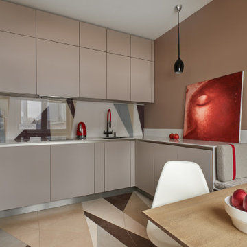
Гостиную не стали объединять с кухонной зоной из соображений практичности. П-образную кухню словно встроили в нишу и сделали максимально функциональной. Верхние шкафы довели до уровня потолка, чтобы не создавать дополнительные пространства для неправильного хранения. Столешницу выбрали кварцевую — из неприхотливого и износостойкого, но вместе с тем эстетичного материала. Столешница плавно переходит в небольшую скамейку с мягким матрасом, которая позволяет при желании увеличить количество мест за обеденным столом. Под ней разместили выдвижные ящики для хранения.
Кухня немецкой фабрики Sachsen. В интерьере представлены картины Игоря Лекомцева
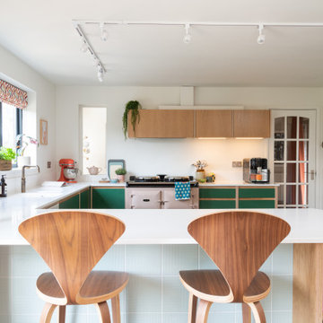
Custom made mid-century style kitchen with Oak Veneer, Birch Ply and Green Formica. Blush Aga and Corian Worksurfaces in Whitecap.
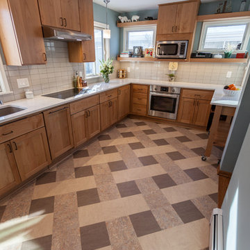
This 1901-built bungalow in the Longfellow neighborhood of South Minneapolis was ready for a new functional kitchen. The homeowners love Scandinavian design, so the new space melds the bungalow home with Scandinavian design influences.
A wall was removed between the existing kitchen and old breakfast nook for an expanded kitchen footprint.
Marmoleum modular tile floor was installed in a custom pattern, as well as new windows throughout. New Crystal Cabinetry natural alder cabinets pair nicely with the Cambria quartz countertops in the Torquay design, and the new simple stacked ceramic backsplash.
All new electrical and LED lighting throughout, along with windows on three walls create a wonderfully bright space.
Sleek, stainless steel appliances were installed, including a Bosch induction cooktop.
Storage components were included, like custom cabinet pull-outs, corner cabinet pull-out, spice racks, and floating shelves.
One of our favorite features is the movable island on wheels that can be placed in the center of the room for serving and prep, OR it can pocket next to the southwest window for a cozy eat-in space to enjoy coffee and tea.
Overall, the new space is simple, clean and cheerful. Minimal clean lines and natural materials are great in a Minnesotan home.
Designed by: Emily Blonigen.
See full details, including before photos at https://www.castlebri.com/kitchens/project-3408-1/
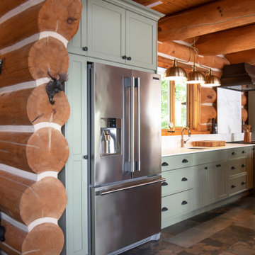
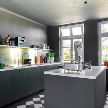
Messing ist nichts für Putzteufel. Die Inspiration hatte die Bauherrin natürlich von Instagram und die Materialeigenschaften waren bekannt und sogar erwünscht. "Das paßt zu unserem alten Haus!"
(Tatsächlich sieht es auf dem Foto nicht so gut aus wie in Wirklichkeit. Der warme Schimmer durchbricht das viele Schwarz.)
Kitchen with Multi-coloured Floors and White Worktops Ideas and Designs
9