Kitchen with Grey Floors and All Types of Ceiling Ideas and Designs
Refine by:
Budget
Sort by:Popular Today
81 - 100 of 8,301 photos
Item 1 of 3
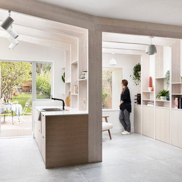
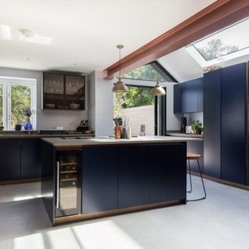
Amos Goldreich Architecture has completed an asymmetric brick extension that celebrates light and modern life for a young family in North London. The new layout gives the family distinct kitchen, dining and relaxation zones, and views to the large rear garden from numerous angles within the home.
The owners wanted to update the property in a way that would maximise the available space and reconnect different areas while leaving them clearly defined. Rather than building the common, open box extension, Amos Goldreich Architecture created distinctly separate yet connected spaces both externally and internally using an asymmetric form united by pale white bricks.
Previously the rear plan of the house was divided into a kitchen, dining room and conservatory. The kitchen and dining room were very dark; the kitchen was incredibly narrow and the late 90’s UPVC conservatory was thermally inefficient. Bringing in natural light and creating views into the garden where the clients’ children often spend time playing were both important elements of the brief. Amos Goldreich Architecture designed a large X by X metre box window in the centre of the sitting room that offers views from both the sitting area and dining table, meaning the clients can keep an eye on the children while working or relaxing.
Amos Goldreich Architecture enlivened and lightened the home by working with materials that encourage the diffusion of light throughout the spaces. Exposed timber rafters create a clever shelving screen, functioning both as open storage and a permeable room divider to maintain the connection between the sitting area and kitchen. A deep blue kitchen with plywood handle detailing creates balance and contrast against the light tones of the pale timber and white walls.
The new extension is clad in white bricks which help to bounce light around the new interiors, emphasise the freshness and newness, and create a clear, distinct separation from the existing part of the late Victorian semi-detached London home. Brick continues to make an impact in the patio area where Amos Goldreich Architecture chose to use Stone Grey brick pavers for their muted tones and durability. A sedum roof spans the entire extension giving a beautiful view from the first floor bedrooms. The sedum roof also acts to encourage biodiversity and collect rainwater.
Continues
Amos Goldreich, Director of Amos Goldreich Architecture says:
“The Framework House was a fantastic project to work on with our clients. We thought carefully about the space planning to ensure we met the brief for distinct zones, while also keeping a connection to the outdoors and others in the space.
“The materials of the project also had to marry with the new plan. We chose to keep the interiors fresh, calm, and clean so our clients could adapt their future interior design choices easily without the need to renovate the space again.”
Clients, Tom and Jennifer Allen say:
“I couldn’t have envisioned having a space like this. It has completely changed the way we live as a family for the better. We are more connected, yet also have our own spaces to work, eat, play, learn and relax.”
“The extension has had an impact on the entire house. When our son looks out of his window on the first floor, he sees a beautiful planted roof that merges with the garden.”
Nouveau Bungalow - Un - Designed + Built + Curated by Steven Allen Designs, LLC
Large kitchen designed for multi generation family gatherings. Combining rustic white oak cabinetry and flooring with a high gloss lacquer finish creates the modern rustic retreat the clients dreamed of.
A Sapele buffet with wine storage provides a physcial separation between the kitchen and the dining area while maintaining access to the beautiful view beyond the dining room.
A Kitchen That Works LLC
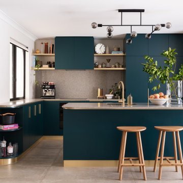
The charm of our latest kitchen project begins with the captivating choice of its finishes.
A velvety dream, the cabinets are adorned with a lavish coat of Matt Lacquer in RAL Steel Blue. This deep, lustrous hue exudes tranquillity while making a bold statement, effortlessly infusing the space with an aura of serenity and grandeur.
Enhancing the overall aesthetic are the exquisite Copper Gola Rail and Plinth, delicately curated to harmonise with the resplendent blue cabinets. The warm, burnished tones of copper lend an air of refined sophistication, captivating the eye and elevating the kitchen's allure to new heights.
Crowning this culinary masterpiece is the 30mm Silestone Gris Expo worktop, a breathtaking union of functionality and beauty. This sleek quartz surface exudes a sense of timelessness, its soft grey tones offering the perfect backdrop for culinary creations to take centre stage. The inherent durability of Silestone ensures that this worktop will remain a testament to enduring elegance for years to come.
Our vision for this project extends beyond aesthetics, incorporating thoughtful functionality into every aspect. Customised storage solutions, seamless integration of appliances, and intuitive design elements make this kitchen a haven for culinary enthusiasts, providing a seamless and pleasurable cooking experience.
As the heart of the home, this kitchen effortlessly transforms mere cooking into an exquisite art form. Its harmonious blend of luxurious materials, expert craftsmanship, and timeless design is a testament our commitment to redefining luxury kitchen living.
Discover more of our breathtaking designs on our projects page, or book a consultation to bring your dream kitchen to life.
Welcome to the kitchen of your dreams, where everything has a place and everyone can be together!
Weather House is a bespoke home for a young, nature-loving family on a quintessentially compact Northcote block.
Our clients Claire and Brent cherished the character of their century-old worker's cottage but required more considered space and flexibility in their home. Claire and Brent are camping enthusiasts, and in response their house is a love letter to the outdoors: a rich, durable environment infused with the grounded ambience of being in nature.
From the street, the dark cladding of the sensitive rear extension echoes the existing cottage!s roofline, becoming a subtle shadow of the original house in both form and tone. As you move through the home, the double-height extension invites the climate and native landscaping inside at every turn. The light-bathed lounge, dining room and kitchen are anchored around, and seamlessly connected to, a versatile outdoor living area. A double-sided fireplace embedded into the house’s rear wall brings warmth and ambience to the lounge, and inspires a campfire atmosphere in the back yard.
Championing tactility and durability, the material palette features polished concrete floors, blackbutt timber joinery and concrete brick walls. Peach and sage tones are employed as accents throughout the lower level, and amplified upstairs where sage forms the tonal base for the moody main bedroom. An adjacent private deck creates an additional tether to the outdoors, and houses planters and trellises that will decorate the home’s exterior with greenery.
From the tactile and textured finishes of the interior to the surrounding Australian native garden that you just want to touch, the house encapsulates the feeling of being part of the outdoors; like Claire and Brent are camping at home. It is a tribute to Mother Nature, Weather House’s muse.
Чистый, лаконичный интерьер, с нестандартными объемными решениями и цветовыми акцентами по проекту дизайнеров из Краснодара, отвечает самым современным трендам в дизайне
История этого проекта не совсем обычна. Хозяева квартиры в Краснодаре – молодая семья с ребёнком. Только, встречи с дизайнерами и общение проходили только при участии главы семьи, так как покупка квартиры и сам процесс создания интерьера держались им в строгом секрете. «Наш заказчик хотел преподнести домочадцам роскошный сюрприз, поэтому семья не должна была ничего знать, - вспоминает Ярослав Алдошин. – При этом он максимально детально озвучил все свои предпочтения, что очень помогло нам при проектировании. Основной задачей стало создание лаконичного, технологичного пространства, с нестандартными объемными и конструктивными решениями. Никаких элементов классических стилей, все должно отвечать современным визуальным требованиям о дизайне».
Особенностью проекта стало объединение двух квартир площадью 73 и 58 кв. метров. У обоих квартир – хорошие исходные данные: панорамное остекление во всех жилых помещениях, минимальное количество несущих перегородок, высота 2,9 метра, расположение на 21 этаже, что обусловило великолепную изоляцию – комнаты буквально залиты светом. Из минусов: маленькая ванная и очень узкая, вытянутая хозяйская спальня. Для семейного времяпрепровождения дизайнеры организовали объединенную зону гостиной-кухни с большим кухонным островом, увеличили площадь ванной комнаты за счёт нежилой площади, тем самым получив дополнительное пространство для размещения большой душевой и ванны, а также предусмотрели детскую комнату. Недостатки спальни исправили с помощью расстановки мебели (кровать установили по длине комнаты, изголовьем к окну) и переносом стены глубь соседней детской. Благодаря этому, в помещении удалось получить комфортную, хорошо освещенную рабочую зону с полноценным письменным столом, а также установить системы хранения и макияжный столик. При выходе из спален ближайшее помещение — вместительная гардеробная (в ней хранится основной объем вещей), что очень удобно в плане эргономики: хозяевам не нужно метаться по квартире в поисках нужных вещей, на это уходит минимум времени. К слову, алгоритмы передвижения по квартире спроектированы так, что все пути жильцов ведут в гостиную, где каждый сможет заняться своими любимыми делами, от просмотра ТВ до кулинарных поединков и отдыха у камина с книгой в руках».
Интерьер построен на контрасте тёплых и холодных цветов, фактур и паттернов. Это создает необходимую динамику и наполняет пространство его смыслами. «Главной нашей задачей было создание тактильного контраста материалов, в котором современный человек нуждается не меньше, чем в цветовом и тональном разнообразии, - объясняет Ярослав, - Так, в общественной зоне мы использовали природные паттерны теплого дерева и холодного камня, нанесённые на крупноформатный керамгранит. «Местом встреч» выступает яркий, красного цвета кухонный остров. Красный цвет выбран не случайно! Василий Кандинский описывал красный как цвет, который производит впечатление почти необъятной мощи. Таким образом мы хотели подчеркнуть характер владельцев квартиры - успешных и сильных духом людей. Остров – главная точка притяжения этого пространства, соседствует с большим диваном из матового приятного на ощупь велюра, изготовленного по нашим эскизам. Обязательным условием было наличие камина в гостиной. Мы выбрали камин на биотопливе, который встроен в инсталляцию, отделанную фактурным кермогранитом и перетекающею в ТВ-зону, декорированную уже гладким керамогранитом. Световые сценарии продуманы, исходя из назначения каждой зоны. Мы предусмотрели разные типы осветительных приборов: технический потолочный свет, направленные светильники, мягкие подсветки в виде бра, торшеров и настольных светильников, создающих обволакивающую атмосферу и интересные световые акценты».
Фрагмент гостиной. «Мы не привыкли сильно ориентироваться на моду, ведь она быстро меняется, а хороший интерьер должен быть актуален долгие годы, без этого весь его смысл исчезает, - замечает Елена, - Поэтому работаем на нюансах, на правильном построении колористического решения, светового сценария, очень любим использовать тактильные контрасты. Все это (даже по результатам научных исследований) помогает комфортно находиться в интерьере долгое время и получать от этого удовольствие». Вазы ручной работы. На стене – часы Menu Norm
Центральный элемент интерьера — это, конечно же, большой кухонный остров красного оттенка, с консольным вылетом столешницы – центр притяжения и самое «тусовочное» место квартиры, где можно встречаться с родными после рабочего дня, проводить кулинарные поединки, устраивать шумные вечеринки или просто завтракать каждое утро. Диван изготовлен на заказ. На полу – керамогранит Colorker
Общий вид гостиной. Кухня изготовлена по эскизам авторов проекта. Обеденный стол и стулья AM.PM, La Redoute. Барные стулья, Normann Copenhagen. Подвесной светильник, SWG. Ковёр, Kover.ru
Портал камина облицован керамогранитом Porcelanosa, на полу в ТВ-зоне – керамогранитом URBATEK, кресло Saba Italia, торшер Artemide, каминная топка — салон Арт-Рум.
Коридор дизайнеры оформили как миниатюрную картинную галерею, ведь особое место в интерьере всей квартиры занимает искусство! «Для владельцев - это совершенно новый опыт, и они с большим удовольствием позволили нам наполнить пространство картинами, - отмечает Елена Алдошина, - Кроме того, мы предусмотрели дополнительные места для новых полотен, расположив в местах стыка потолка и стен специальные крепления для подвесов картин. Это избавит в будущем от сверления поверхностей, картины можно будет передвигать без ущерба для стен. Все картины, находящиеся в интерьере — работы Сергея Яшина».
В ванной комнате установлена умная стеклянная перегородка, которая изменяется от прозрачной к полностью непрозрачной
Особого внимания в спальне заслуживает тумба-изголовье кровати в виде инсталляции из цветного глубоко-синего стекла, за которой находится хорошо освещённая рабочая зона с письменным столом. «Прозрачный лист стекла установлен в тумбу-изголовье, отделанной декоративной штукатуркой, - объясняет Ярослав, - Внутрь изголовья мы заложили электрические выводы для подключения прикроватных светильников, чтобы все провода были спрятаны и не портили общую картину. Таким образом изголовье кровати и его стеклянная инсталляция стали самыми технически сложными элементами этого пространства». Синее кресло, Sits Mokka. Рабочее кресло, Zuiver Nikki. На столе – вазы LSA International. Светильники, ЦЕНТРСВЕТ. Прикроватные светильники, Artemide
Ванная комната. В качестве особого декоративного и конструктивного приёма выступает перегородка из smart-стекла. Таким образом, при желании можно «впустить» интерьер гостиной в ванную комнату и наоборот. По словам дизайнеров, все гости приходят в восторг при ее виде. Душевая перегородка выполнена из цветного стекла синего оттенка и в сочетании с плиткой в душевой с эффектом «кривого зеркала» образует броскую световую, цветовую и рельефную композицию. Лепной декор, Orac Décor. Керамогранит, Mirage (стены), Venis (душевая).
Детская комната. Мебель изготовлена на заказ. Бра, подвесной светильник, GROK
After the second fallout of the Delta Variant amidst the COVID-19 Pandemic in mid 2021, our team working from home, and our client in quarantine, SDA Architects conceived Japandi Home.
The initial brief for the renovation of this pool house was for its interior to have an "immediate sense of serenity" that roused the feeling of being peaceful. Influenced by loneliness and angst during quarantine, SDA Architects explored themes of escapism and empathy which led to a “Japandi” style concept design – the nexus between “Scandinavian functionality” and “Japanese rustic minimalism” to invoke feelings of “art, nature and simplicity.” This merging of styles forms the perfect amalgamation of both function and form, centred on clean lines, bright spaces and light colours.
Grounded by its emotional weight, poetic lyricism, and relaxed atmosphere; Japandi Home aesthetics focus on simplicity, natural elements, and comfort; minimalism that is both aesthetically pleasing yet highly functional.
Japandi Home places special emphasis on sustainability through use of raw furnishings and a rejection of the one-time-use culture we have embraced for numerous decades. A plethora of natural materials, muted colours, clean lines and minimal, yet-well-curated furnishings have been employed to showcase beautiful craftsmanship – quality handmade pieces over quantitative throwaway items.
A neutral colour palette compliments the soft and hard furnishings within, allowing the timeless pieces to breath and speak for themselves. These calming, tranquil and peaceful colours have been chosen so when accent colours are incorporated, they are done so in a meaningful yet subtle way. Japandi home isn’t sparse – it’s intentional.
The integrated storage throughout – from the kitchen, to dining buffet, linen cupboard, window seat, entertainment unit, bed ensemble and walk-in wardrobe are key to reducing clutter and maintaining the zen-like sense of calm created by these clean lines and open spaces.
The Scandinavian concept of “hygge” refers to the idea that ones home is your cosy sanctuary. Similarly, this ideology has been fused with the Japanese notion of “wabi-sabi”; the idea that there is beauty in imperfection. Hence, the marriage of these design styles is both founded on minimalism and comfort; easy-going yet sophisticated. Conversely, whilst Japanese styles can be considered “sleek” and Scandinavian, “rustic”, the richness of the Japanese neutral colour palette aids in preventing the stark, crisp palette of Scandinavian styles from feeling cold and clinical.
Japandi Home’s introspective essence can ultimately be considered quite timely for the pandemic and was the quintessential lockdown project our team needed.
Kitchen with Grey Floors and All Types of Ceiling Ideas and Designs
5