Kitchen with a Belfast Sink and a Drop Ceiling Ideas and Designs
Refine by:
Budget
Sort by:Popular Today
1 - 20 of 1,021 photos
Item 1 of 3
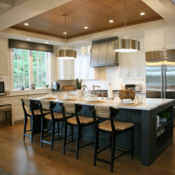
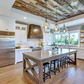
The stained wood ceiling in the recessed tray does a great job of creating a room within a room in the open concept space. This is something that warms up all the white and keeps a good balance of fresh and earthy at the same time.
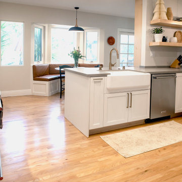
New construction of a 3,100 square foot single-story home in a modern farmhouse style designed by Arch Studio, Inc. licensed architects and interior designers. Built by Brooke Shaw Builders located in the charming Willow Glen neighborhood of San Jose, CA.
Architecture & Interior Design by Arch Studio, Inc.
Photography by Eric Rorer
Behind doors that look like cabinetry (if closed) is a generous walk-in pantry. It offers another sink, second dishwasher and additional storage.
This kitchen was once half the size it is now and had dark panels throughout. By taking the space from the adjacent Utility Room and expanding towards the back yard, we were able to increase the size allowing for more storage, flow, and enjoyment. We also added on a new Utility Room behind that pocket door you see.
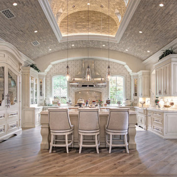
We love this custom kitchen featuring a brick ceiling, wood floors, and white kitchen cabinets we adore!
This 1910 West Highlands home was so compartmentalized that you couldn't help to notice you were constantly entering a new room every 8-10 feet. There was also a 500 SF addition put on the back of the home to accommodate a living room, 3/4 bath, laundry room and back foyer - 350 SF of that was for the living room. Needless to say, the house needed to be gutted and replanned.
Kitchen+Dining+Laundry-Like most of these early 1900's homes, the kitchen was not the heartbeat of the home like they are today. This kitchen was tucked away in the back and smaller than any other social rooms in the house. We knocked out the walls of the dining room to expand and created an open floor plan suitable for any type of gathering. As a nod to the history of the home, we used butcherblock for all the countertops and shelving which was accented by tones of brass, dusty blues and light-warm greys. This room had no storage before so creating ample storage and a variety of storage types was a critical ask for the client. One of my favorite details is the blue crown that draws from one end of the space to the other, accenting a ceiling that was otherwise forgotten.
Primary Bath-This did not exist prior to the remodel and the client wanted a more neutral space with strong visual details. We split the walls in half with a datum line that transitions from penny gap molding to the tile in the shower. To provide some more visual drama, we did a chevron tile arrangement on the floor, gridded the shower enclosure for some deep contrast an array of brass and quartz to elevate the finishes.
Powder Bath-This is always a fun place to let your vision get out of the box a bit. All the elements were familiar to the space but modernized and more playful. The floor has a wood look tile in a herringbone arrangement, a navy vanity, gold fixtures that are all servants to the star of the room - the blue and white deco wall tile behind the vanity.
Full Bath-This was a quirky little bathroom that you'd always keep the door closed when guests are over. Now we have brought the blue tones into the space and accented it with bronze fixtures and a playful southwestern floor tile.
Living Room & Office-This room was too big for its own good and now serves multiple purposes. We condensed the space to provide a living area for the whole family plus other guests and left enough room to explain the space with floor cushions. The office was a bonus to the project as it provided privacy to a room that otherwise had none before.
This is one of our favorite kitchen projects! We started by deleting two walls and a closet, followed by framing in the new eight foot window and walk-in pantry. We stretched the existing kitchen across the entire room, and built a huge nine foot island with a gas range and custom hood. New cabinets, appliances, elm flooring, custom woodwork, all finished off with a beautiful rustic white brick.
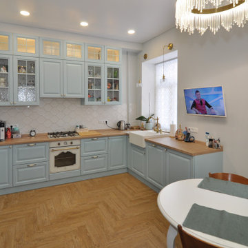
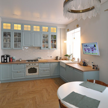
Кухня в стиле Прованс
Дизайн проект: Анна Орлик ☎+7(921) 683-55-30
Кухонный гарнитур с рамочными фасадами и перекрестиями
Очень уютный проект получился.
Материалы:
✅ Фасады - сборные мдф, покрытые матовой эмалью,
✅ Столешница с заходом в подоконник (SLOTEX),
✅ Фурнитура БЛЮМ (Австрия)
✅ Мойка керамическая BLANCO (Германия),
✅ Бытовая техника Электролюкс.
In this expansive kitchen update we kept the limestone floors and replaced all the cabinet doors and drawers, lighting and hardware.
Download our free ebook, Creating the Ideal Kitchen. DOWNLOAD NOW
As with most projects, it all started with the kitchen layout. The home owners came to us wanting to upgrade their kitchen and overall aesthetic in their suburban home, with a combination of fresh paint, updated finishes, and improved flow for more ease when doing everyday activities.
A monochromatic, earth-toned palette left the kitchen feeling uninspired. It lacked the brightness they wanted from their space. An eat-in table underutilized the available square footage. The butler’s pantry was out of the way and hard to access, and the dining room felt detached from the kitchen.
Lead Designer, Stephanie Cole, saw an improved layout for the spaces that were no longer working for this family. By eliminating an existing wall between the kitchen and dining room, and relocating the bar area to the dining room, we opened up the kitchen, providing all the space we needed to create a dreamy and functional layout. A new perimeter configuration promoted circulation while also making space for a large and functional island loaded with seating – a must for any family. Because an island that isn’t big enough for everyone (and a few more) is a recipe for disaster. The light white cabinetry is fresh and contrasts with the deeper tones in the wood flooring, creating a modern aesthetic that is elevated, yet approachable for everyday living.
With better flow as the overarching goal, we made some structural changes too. To remove a bottleneck in the entryway, we angled one of the dining room walls to create more natural separation between rooms and facilitate ease of movement throughout the large space.
At The Kitchen Studio, we believe a well-designed kitchen uses every square inch to the fullest. By starting from scratch, it was possible to rethink the entire kitchen layout and design the space according to how it is used, because the kitchen shouldn’t make it harder to feed the family. A new location for the existing range, flanked by a new column refrigerator and freezer on each side, worked to anchor the space. The very large and very spacious island (a dream island if we do say so ourselves) now houses the primary sink and provides ample space for food prep and family gathering.
The new kitchen table and coordinating banquette seating provide a cozy nook for quick breakfasts before school or work, and evening homework sessions. Elegant gold details catch the natural light, elevating the aesthetic.
The dining room was transformed into one of this client’s favorite spaces and we couldn’t agree more. We saw an opportunity to give the dining room a more distinguished identity by closing off the entrance from the foyer. The relocated wet bar enhances the sophisticated vibe of this gathering space, complete with beautiful antique mirror tiles and open shelving encased by moody built-in cabinets.
Updated furnishings add warmth. A rich walnut table is paired with custom chairs in a muted coral fabric. The large, transitional chandelier grounds the room, pairing beautifully with the gold finishes prevalent in the faucet and cabinet hardware. Linen-inspired wallpaper and cream-toned window treatments add to the glamorous feel of this entertainment space.
There is no way around it. The laundry room was cramped. The large washer and dryer blocked access to the sink and left little room for the space to serve its other essential function – as a mudroom. Because we reworked the kitchen layout to create more space overall, we could rethink the mudroom too – an essential for any busy family. The first step was moving the washer and dryer to an existing area on the second floor, where most of the family’s laundry lives (no one wants to carry laundry up and down the stairs if they don’t have to anyway). This is a more functional solution and opened up the space for all the mudroom necessities – including the existing kitchen refrigerator, loads of built-in cubbies, and a bench.
It’s hard to not fall in love with every detail of a new space, especially when it serves your day-to-day life. But that doesn’t mean the clients didn’t have their favorite features they use on the daily. This remodel was focused largely on function with a new kitchen layout. And it’s the functional features that have the biggest impact. The large island provides much needed workspace in the kitchen and is a spot where everyone gathers together – it grounds the space and the family. And the custom counter stools are the icing on the cake. The nearby mudroom has everything their previous space was lacking – ample storage, space for everyone’s essentials, and the beloved cement floor tiles that are both durable and artistic.
Like what you see? Call us today for your home renovation consultation! (909) 605-8800. We hope you are as excited to see this reveal as we all were. What an amazing transformation! This beautiful Claremont, CA home built in 1955 got a wonderful Mid-Century Modern update to the kitchen. The fireplace adjacent to the kitchen was the inspiration for this space. Pure white brick matched with a natural “Dune” stained maple mantle. Opposite the fireplace is a display will donned with matching maple shadowbox shelving. The pure white cabinets are topped with a Cabrini Grey quartz from Arizona Tile, mimicking a combination of concrete and limestone, with a square edge profile. To accent both the countertop and the cabinets we went with brushed gold and bronze fixtures. A Kohler “White Haven” apron front sink is finished with a Delta “Trinsic” faucet in champagne bronze, with matching push button garbage disposal, soap dispenser and aerator. One of the largest changes to the space was the relocating of the plumbing fixtures, and appliances. Giving the stove its own wall, a 30” KitchenAid unit with a stainless steel hood, backed with a stunning mid-century modern rhomboid patterned mosaic backsplash going up to the ceiling. The fridge stayed in the same location, but with all new cabinetry, including an over-sized 24” deep cabinet above it, and a KitchenAid microwave drawer built into the bottom cabinets. Another drastic change was the raising of the ceiling, pulling the height up from 8 foot to 9 foot, accented with crown moldings to match the cabinetry. Next to the kitchen we included a built in accent desk, a built in nook for seating with custom leather created by a local upholsterer, and a built in hutch. Adding another window brought in even more light to a bright and now cheerful space. Rather than replace the flooring, a simple refinish of the wood planks was all the space needed blending the style of the kitchen into the look and feel of the rest of the home.
Project Description:
// Type: Kitchen Remodel
// Location: Claremont, CA
// Style: Mid-Century Modern
// Year Completed: 2019
// Designer: Jay Adams
// Project Features: Relocation of the appliances and plumbing, Backsplash behind stove and refrigerator walls, in a rhomboid mosaic pattern, Microwave drawer built into the lower cabinets. And a raised ceiling opening up the space.
//View more projects here http://www.yourclassickitchens.com/
//Video Production By Classic Kitchens etc. and Twila Knight Photo
The dated, blond-colored cabinetry was replaced with Dura Supreme recessed-style custom cabinets finished in white with natural maple interiors and soft close drawers. The new cabinetry was further enhanced by an exotic, level five sandblasted granite in a matte finish.
Download our free ebook, Creating the Ideal Kitchen. DOWNLOAD NOW
This family from Wheaton was ready to remodel their kitchen, dining room and powder room. The project didn’t call for any structural or space planning changes but the makeover still had a massive impact on their home. The homeowners wanted to change their dated 1990’s brown speckled granite and light maple kitchen. They liked the welcoming feeling they got from the wood and warm tones in their current kitchen, but this style clashed with their vision of a deVOL type kitchen, a London-based furniture company. Their inspiration came from the country homes of the UK that mix the warmth of traditional detail with clean lines and modern updates.
To create their vision, we started with all new framed cabinets with a modified overlay painted in beautiful, understated colors. Our clients were adamant about “no white cabinets.” Instead we used an oyster color for the perimeter and a custom color match to a specific shade of green chosen by the homeowner. The use of a simple color pallet reduces the visual noise and allows the space to feel open and welcoming. We also painted the trim above the cabinets the same color to make the cabinets look taller. The room trim was painted a bright clean white to match the ceiling.
In true English fashion our clients are not coffee drinkers, but they LOVE tea. We created a tea station for them where they can prepare and serve tea. We added plenty of glass to showcase their tea mugs and adapted the cabinetry below to accommodate storage for their tea items. Function is also key for the English kitchen and the homeowners. They requested a deep farmhouse sink and a cabinet devoted to their heavy mixer because they bake a lot. We then got rid of the stovetop on the island and wall oven and replaced both of them with a range located against the far wall. This gives them plenty of space on the island to roll out dough and prepare any number of baked goods. We then removed the bifold pantry doors and created custom built-ins with plenty of usable storage for all their cooking and baking needs.
The client wanted a big change to the dining room but still wanted to use their own furniture and rug. We installed a toile-like wallpaper on the top half of the room and supported it with white wainscot paneling. We also changed out the light fixture, showing us once again that small changes can have a big impact.
As the final touch, we also re-did the powder room to be in line with the rest of the first floor. We had the new vanity painted in the same oyster color as the kitchen cabinets and then covered the walls in a whimsical patterned wallpaper. Although the homeowners like subtle neutral colors they were willing to go a bit bold in the powder room for something unexpected. For more design inspiration go to: www.kitchenstudio-ge.com
Kitchen with a Belfast Sink and a Drop Ceiling Ideas and Designs
1