Entrance with a Single Front Door and a Drop Ceiling Ideas and Designs
Refine by:
Budget
Sort by:Popular Today
81 - 100 of 620 photos
Item 1 of 3
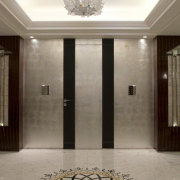
un mobile perfettamente inglobato con il muro, nasconde un guardaroba ed un ripostiglio, sulla destra del muro, grigio, un pannello apribile dello stesso colore, cela alla vista una serie di piccoli quadri elettrici.
Download our free ebook, Creating the Ideal Kitchen. DOWNLOAD NOW
The homeowners built their traditional Colonial style home 17 years’ ago. It was in great shape but needed some updating. Over the years, their taste had drifted into a more contemporary realm, and they wanted our help to bridge the gap between traditional and modern.
We decided the layout of the kitchen worked well in the space and the cabinets were in good shape, so we opted to do a refresh with the kitchen. The original kitchen had blond maple cabinets and granite countertops. This was also a great opportunity to make some updates to the functionality that they were hoping to accomplish.
After re-finishing all the first floor wood floors with a gray stain, which helped to remove some of the red tones from the red oak, we painted the cabinetry Benjamin Moore “Repose Gray” a very soft light gray. The new countertops are hardworking quartz, and the waterfall countertop to the left of the sink gives a bit of the contemporary flavor.
We reworked the refrigerator wall to create more pantry storage and eliminated the double oven in favor of a single oven and a steam oven. The existing cooktop was replaced with a new range paired with a Venetian plaster hood above. The glossy finish from the hood is echoed in the pendant lights. A touch of gold in the lighting and hardware adds some contrast to the gray and white. A theme we repeated down to the smallest detail illustrated by the Jason Wu faucet by Brizo with its similar touches of white and gold (the arrival of which we eagerly awaited for months due to ripples in the supply chain – but worth it!).
The original breakfast room was pleasant enough with its windows looking into the backyard. Now with its colorful window treatments, new blue chairs and sculptural light fixture, this space flows seamlessly into the kitchen and gives more of a punch to the space.
The original butler’s pantry was functional but was also starting to show its age. The new space was inspired by a wallpaper selection that our client had set aside as a possibility for a future project. It worked perfectly with our pallet and gave a fun eclectic vibe to this functional space. We eliminated some upper cabinets in favor of open shelving and painted the cabinetry in a high gloss finish, added a beautiful quartzite countertop and some statement lighting. The new room is anything but cookie cutter.
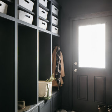
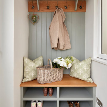
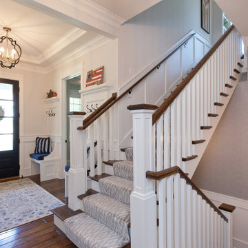
Next the mudroom. You can see a peek of the mudroom across the way from the butler’s pantry which got a facelift with new paint, tile floor, lighting and hardware. Simple updates but a dramatic change! The first floor powder room got the glam treatment with its own update of wainscoting, wallpaper, console sink, fixtures and artwork. A great little introduction to what’s to come in the rest of the home.
The whole first floor now flows together in a cohesive pallet of green and blue, reflects the homeowner’s desire for a more modern aesthetic, and feels like a thoughtful and intentional evolution. Our clients were wonderful to work with! Their style meshed perfectly with our brand aesthetic which created the opportunity for wonderful things to happen. We know they will enjoy their remodel for many years to come!
Photography by Margaret Rajic Photography
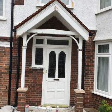
Fully woodwork sanding work to the damaged wood - repair and make it better with epoxy resin and specialist painting coating.
All woodwork was painted with primer, and decorated in 3 solid white gloss topcoats.
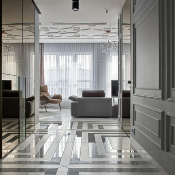
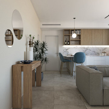
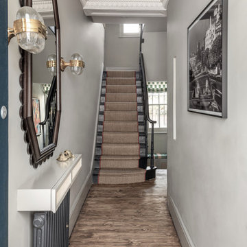
Вид из прихожей на гостиную. Интерьер сложно отнести к какому‑то стилю. Как считает автор проекта, времена больших стилей прошли, и в нашем скоротечном мире редко можно увидеть полноценную версию классики или ар-деко. Этот проект — из разряда эклектичных, где на базе французской классики создан уютный и парадный интерьер с современной, проверенной временем мебелью европейских брендов. Диван, кожаные кресла: Arketipo. Люстра: Moooi.
Light and Bright entry with natural lighting from above skylight; axis point to public spaces one way and private spaces the other.
Vista dell'ingresso dalla zona living. Il pilastro di fianco alla pedana non poteva essere rimosso, quindi abbiamo trasformato un "problema" in uno dei punti focali del progetto, rimuovendo la struttura cilindrica e sostituendola con una dalle linee più moderne, un pilastro tagliato in mezzo per ospitare un filtro verde.
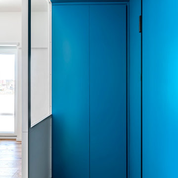
L'ingresso di casa c70 è la quinta scenica che filtra la zona giorno open space. Si caratterizza dal contrasto cromatico tra la vernice blu di pareti e soffitto e il bianco della vetrina in falegnameria realizzata su disegno. La parete in legno bianca nasconde una piccola cabina armadio e un soppalco.
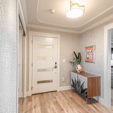
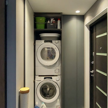
New contemporary door and metallic wallpaper accent the curved walls in entry foyer. Ample storage and laundry closet with pantry space.
Our clients were in much need of a new porch for extra storage of shoes and coats and well as a uplift for the exterior of thier home. We stripped the house back to bare brick, redesigned the layouts for a new porch, driveway so it felt inviting & homely. They wanted to inject some fun and energy into the house, which we did with a mix of contemporary and Mid-Century print tiles with tongue and grove bespoke panelling & shelving, bringing it to life with calm classic pastal greens and beige.
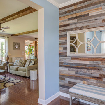
Adding Architectural details to this Builder Grade House turned it into a spectacular HOME with personality. The inspiration started when the homeowners added a great wood feature to the entry way wall. We designed wood ceiling beams, posts, mud room entry and vent hood over the range. We stained wood in the sunroom to match. Then we added new lighting and fans. The new backsplash ties everything together. The Pot Filler added the crowning touch! NO Longer Builder Boring!
Cosy and elegant entrance hall with bright colours and bespoke joinery and lights
Entrance with a Single Front Door and a Drop Ceiling Ideas and Designs
5