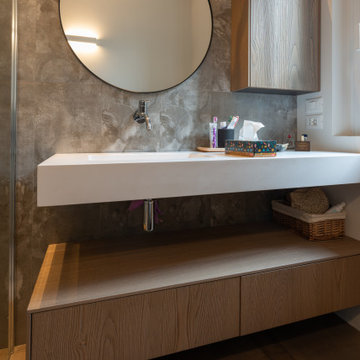
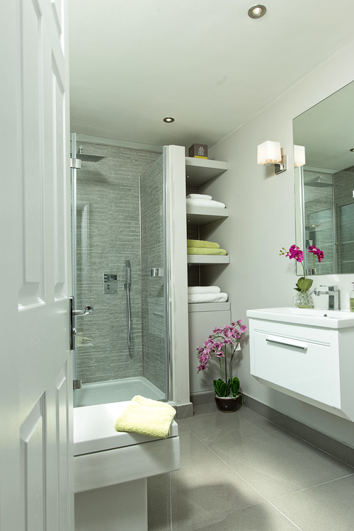
Bathroom with Multi-coloured Tiles and Solid Surface Worktops Ideas and Designs
Refine by:
Budget
Sort by:Popular Today
61 - 80 of 2,714 photos
Item 1 of 3
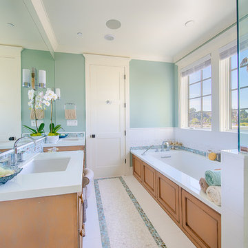
The client fell in love with this Modena tile from Emser - which has a Petrified wood look to it. With the active pattern in it - the remaining tile installed was a mixture of natural stone and glass.
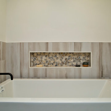
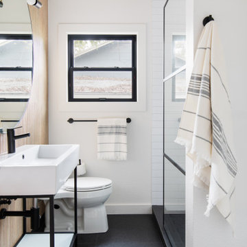
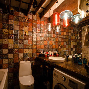
This warm and inviting space has great industrial flair. We love the contrast of the black cabinets, plumbing fixtures, and accessories against the bright warm tones in the tile. Pebble tile was used as accent through the space, both in the niches in the tub and shower areas as well as for the backsplash behind the sink. The vanity is front and center when you walk into the space from the master bedroom. The framed medicine cabinets on the wall and drawers in the vanity provide great storage. The deep soaker tub, taking up pride-of-place at one end of the bathroom, is a great place to relax after a long day. A walk-in shower at the other end of the bathroom balances the space. The shower includes a rainhead and handshower for a luxurious bathing experience. The black theme is continued into the shower and around the glass panel between the toilet and shower enclosure. The shower, an open, curbless, walk-in, works well now and will be great as the family grows up and ages in place.
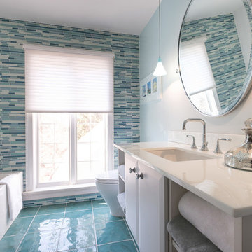
This turquoise and white bathroom features matching mosaic tile accents in the walls and floor. We partnered with Jennifer Allison Design on this project. Her design firm contacted us to paint the entire house - inside and out. Images are used with permission. You can contact her at (310) 488-0331 for more information.
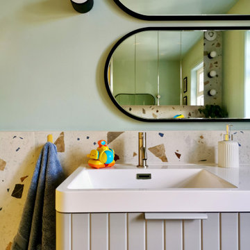
Kids bathrooms and curves.
Toddlers, wet tiles and corners don't mix, so I found ways to add as many soft curves as I could in this kiddies bathroom. The round ended bath was tiled in with fun kit-kat tiles, which echoes the rounded edges of the double vanity unit. Those large format, terrazzo effect porcelain tiles disguise a multitude of sins too.
A lot of clients ask for wall mounted taps for family bathrooms, well let’s face it, they look real nice. But I don’t think they’re particularly family friendly. The levers are higher and harder for small hands to reach and water from dripping fingers can splosh down the wall and onto the top of the vanity, making a right ole mess. Some of you might disagree, but this is what i’ve experienced and I don't rate. So for this bathroom, I went with a pretty bombproof all in one, moulded double sink with no nooks and crannies for water and grime to find their way to.
The double drawers house all of the bits and bobs needed by the sink and by keeping the floor space clear, there’s plenty of room for bath time toys baskets.
The brief: can you design a bathroom suitable for two boys (1 and 4)? So I did. It was fun!
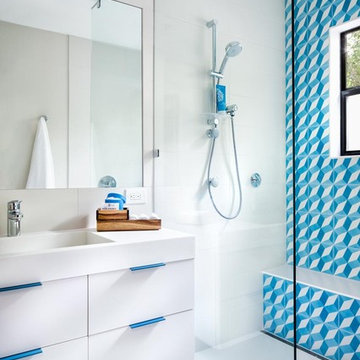
this fun and spunky design features our "modern roman holiday" pattern in a bright blue colorway! the pop of color adds so much to the sleek, contemporary white space which is outfitted with matching pops of blue. shop here: https://www.cletile.com/products/moroccan-encaustic-cement-tile-modern-roman-holiday?variant=41225653382
design by piston design/paul finkel photography
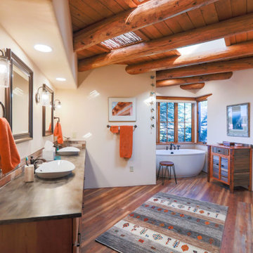
Sometimes the true inspiration for a space come from who the client's really are at heart. The owners of this center-hall colonial just didn't seem to match their house. Oh sure the space was cut up and horrendously decorated, but the true inspiration was the client's love for the horse world and their down-to-earth lifestyle.
Immediately, I blew out the walls of a space that was segregated into three little rooms; a dressing room, a vanity/tub room, and a shower/commode room. Using the supply and waste lines locations of the tub I was able to build them a custom shower area that better fit their lifestyle. Jumping on the old shower supply and waste lines, I was able to add a second vanity to this master suite.
The real magic came from the use of materials. I didn't want this to come off a "gitchy", over-the-top horse and barn motif but a space that spoke of an earthy naturalness. I chose materials that had a irregular, organic feel and juxtaposed them against a containing grid and strong vertical lines. The palette is intentionally simple so as not to overwhelm the strong saturation of the natural materials. The simplicity of line and the scale of the shapes are all designed to compliment the pungent earthiness of the well-chosen materials.
Now they have a room that "feels" like them, but allows them to interpret that as they enjoy the room for years to come!
Bathroom with Multi-coloured Tiles and Solid Surface Worktops Ideas and Designs
Whether you’re doing a bathroom renovation or just a refresh; making your bathroom design brighter, cleaner and more attractive will make you feel happier to use it every day. If your bathroom is a small space in your home where you don’t spend much time, it’s time to think about alternatives. Browse the pictures to find inspiring bathroom ideas on Houzz, including stylish vanities, fancy toilets, taps, shower tiling, as well as storage ideas for small bathrooms. 
 Shelves and shelving units, like ladder shelves, will give you extra space without taking up too much floor space. Also look for wire, wicker or fabric baskets, large and small, to store items under or next to the sink, or even on the wall.
  The sink, the mirror, shower and/or bath are the places where you might want the clearest and strongest light. You can use these if you want it to be bright and clear. Otherwise, you might want to look at some soft, ambient lighting in the form of chandeliers, short pendants or wall lamps. You could use accent lighting around your bath in the form to create a tranquil, spa feel, as well.
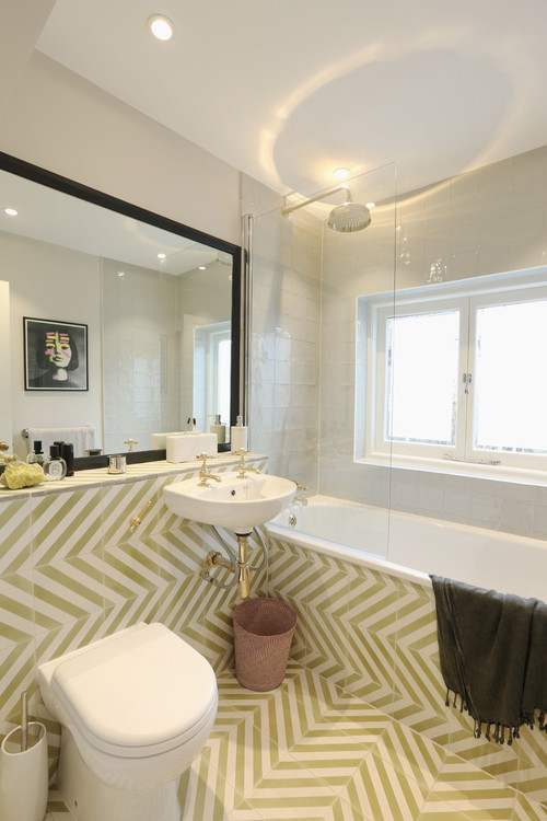
How do I find bathroom ideas for my renovation?
If you’re starting your bathroom renovation from scratch, or ripping out and starting again, then once you’ve sorted the plan and the plumbing you’ll need to think about what kind of ideas you’d like. The easiest option is to get inspiration from bathroom professionals. However, if you’ve dreamt of a roll-top bath or a walk-in shower with heating at, then you might want to take longer looking for each item individually. Choosing all white elements will obviously tie everything together, but also think about the style you’re going for – ultra modern taps will clash with traditional Victorian-style wash basins. And it’s probably good to consider your flooring or surfaces, and walls to make sure everything will complement. Take a look through the different styles of bathroom designs on Houzz to get some inspiration. How do I select the right bathroom decor & furniture?
Selecting bathroom decor such as cabinets, mirrors, shelves or other furniture for bathrooms can be tricky. You want to consider the storage they offer while also making sure they make an attractive feature as you enter your bathroom. Don’t forget you need them to be durable and withstand the damp conditions, e.g. if you’re going for a painted cabinet make sure the paint is suitable for baths. For medicine cabinets you will find most have mirrored fronts, but you can find extra features such as clocks and shaving sockets built-in.What bathroom storage ideas should I look at?
While bathroom storage ideas is not the first thing you think of when it comes to bathrooms, you’ll be surprised at how much difference it makes when your bathroom is organised – specially if you’re dealing with a small bathroom, this is essential. We all know how accessories like bottles, toiletries, lotions and potions can pile up next to the bath. And where to put the cotton buds, painkillers, plasters, other medicine, creams and sanitary products? That’s not even considering using your bathroom as a place to store your towels and bathrobes. The first thing to consider when reviewing bathroom ideas is if you can invest in built-in bathroom storage. Large vanity units will have drawers and compartments to store a great number of toiletries and bathroom necessities, and if your bathroom or cloakroom has room for a built-in cupboard you can start storing small accessories and larger items there. If you can’t do anything on this scale, you could investigate built-in storage around the bath or look at less permanent options. Shelves and shelving units, like ladder shelves, will give you extra space without taking up too much floor space. Also look for wire, wicker or fabric baskets, large and small, to store items under or next to the sink, or even on the wall. What's the best ideas for lighting?
Water and electricity don’t mix, so make sure your bathroom lights are safe, first and foremost. There are actually regulations around what type of light fittings you can use and where – IP67 rating lights for submerged areas e.g. inside baths and sinks (Zone 0); IP65 for any area above a shower or bath (Zone 1); and IP44 rating for anything 0.6m from a bath or basin (Zone 2). After you’ve made sure your light fittings are safe and to-code, you can consider the type and style you’d like as your working through your bathroom ideas. The sink, the mirror, shower and/or bath are the places where you might want the clearest and strongest light. You can use these if you want it to be bright and clear. Otherwise, you might want to look at some soft, ambient lighting in the form of chandeliers, short pendants or wall lamps. You could use accent lighting around your bath in the form to create a tranquil, spa feel, as well. Bathroom tiles – what should I go for?
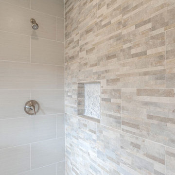
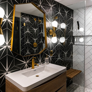
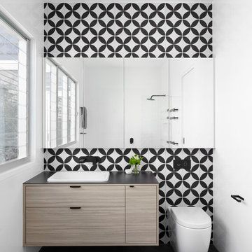
It’s rare to find bathrooms without tiles. Although it can be done with panelling, materials like tadelakt, waterproof paint, wallpaper or well-treated wood; bathroom tiles are so copious and easy to apply that it’s hard to avoid going with tiles in the bathroom. The great thing is that both floor tiles and wall tiles come in a huge variety of sizes, styles, colours and patterns, so you can remodel your room completely with whatever tile choices fit with your bathroom ideas. When it comes to flooring, tiles will be durable, easy to clean and deal well with water, but if you want something different you could go with modern concrete, traditional or country-style treated wooden floorboards, or a bit more quirky bamboo, cork or vinyl. What to do with small bathrooms?
The best small bathroom ideas will maximise the space you have. From installing a bidet to simple decorative tips there are plenty of things you can do to make it look bigger. Recessed shelves can make a huge difference both visually and practically to small bathrooms, so if you are able to have these installed when your walls are being renovated you could add some to your shower or sink area. You could choose pale colours and iridescent tiles that reflect the light, keep walls and ceilings the same colour and texture, and use complementary shades throughout the bathroom– fewer contrasts and transitions will help maintain the sense of space. Floating bathroom units also draw the eye to visible floor space underneath them, and clear glass shower screens will keep the room feeling open and airy. Finishing touches like artfully placed large mirrors will also make small bathrooms appear more expansive.4