Decorating
Stylish External Windows That Aren't Painted White
Newsflash! Window frames really don't have to be painted white all of the time

Yes, white is the standard for window frames, but another colour may be more practical, more stylish, more fun or simply fit in more with the period of your home. Darker tones also show less dirt and may weather less harshly. Before you automatically reach for the tin of brilliant white, take a look at these gorgeous sets of windows, all of which detour from the safer option. If you live in a listed building or in a conservation area, there may be special controls on the colours you can choose from, so always check with your local authority first before deciding on your new hue.
Keep it natural
Don’t automatically grab your paintbrush – consider if a more natural look will work for your property. Unpainted can be a great choice for window frames, especially if you love the rustic quality of wood. The extension at the back of this period home has frames built from timber which have been left unpainted.
The mid-brown tones are sympathetic to the colours of the garden and add a soft, nature-inspired effect. If you’re going for unpainted timber, remember it will need to be finished with a wood sealant to protect it from the elements.
Get the blues
This beautiful Cornwall home features blue window frames in keeping with the coastal location, and the colour really lifts the entire exterior.
Light blue frames are a pretty choice if you live near the sea, but don’t reject them if you live in a more urban setting. There are as many shades of blue as there are grey, so have a think about the effect you are looking for. Choose a chalky or greyish blue if you want something subtle, or go for a bold, bright blue to make a statement, if you dare.
How often you need to repaint your exterior windows will probably depend on how exposed to the elements your home is, but it’s usually every two to five years. Wooden windows may also need to be painted more often than aluminium – worth thinking about if you decide to commit to a pricier paint.
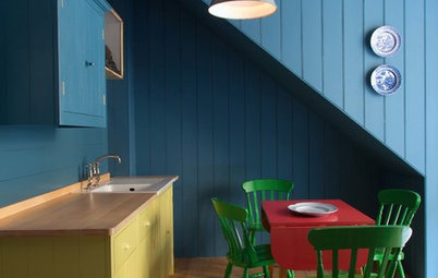
Say yes to yellow
Yellow is having a moment in interiors. Not wall-to-wall yellow, but flashes of a bright, almost neon shade that can lift rooms and instantly make things seem more modern and fun. It’s also surprisingly easy to live with. The same principle applies to window frames – while you might not want your entire house painted this colour, it works brilliantly when picked out as an exterior detail. This modern extension wears its frames well, and the bold yellow details continue inside for an integrated effect. Remember, however, that a bright shade like this may show marks more quickly and need more maintenance to retain its good looks.
Why you should add a splash of yellow to your interior
Try out taupe
A soft greyish-brown can be a great solution if you don’t want anything too shouty or look-at-me. It has a subtle heritage feel that’s softer than straight-up grey. This colour looks good with both the white stucco and the brickwork of this house. Try out several tester shades in varying light conditions, as these kinds of colours can look quite different depending on the time of day or year.
A soft greyish-brown can be a great solution if you don’t want anything too shouty or look-at-me. It has a subtle heritage feel that’s softer than straight-up grey. This colour looks good with both the white stucco and the brickwork of this house. Try out several tester shades in varying light conditions, as these kinds of colours can look quite different depending on the time of day or year.
Be bold with red
Red might not be the first colour you think of when it comes to window frames, but in this industrial-style building it works perfectly, stopping the grey walls looking too bland or disappearing into the sky.
The key is to pick a shade of red that works – this tomato-sauce hue is warm enough to complement the grey. It has also been used on the metal railings of a balcony to add extra impact. In general, when choosing a window frame that isn’t white think about how your chosen colour will tone with what’s around it, from brickwork to foliage.
Paint a grey area
Grey has been the big story in interior paints in recent times, so it’s no surprise it’s crept onto exterior window frames, too. It works well teamed with warmer brickwork and surrounded by grass, as they’ve done here.
Coloured window frames not only make more sense on a gorgeous period property like this one where brilliant white would have looked out of character, they also make sense if you have a number of larger windows or French windows as they will weather better. White gloss paint can yellow over time and also gets dirty quickly; grey is more forgiving. However, conversely, darker shades can also fade and bleach out after prolonged exposure to sunlight.
How to use grey with natural wood
Try heritage green…
If you live in a country cottage – or even if you don’t – and want to try a traditional ‘outdoors’ heritage shade, then a classic grey green can be a good choice for wooden window frames, and less harsh than white. These Accoya windows have been painted in Farrow & Ball’s Lichen, a muted green that works well with natural brickwork.
Remember, if you commit to a coloured window frame keep a record of the paint shade you’ve used so you don’t forget when it’s time to repaint your frames – and ideally make it one that isn’t too hard to source.
…or go for grass green
This spectacular architect-designed home has frames painted a vivid grass green, both inside and out. However, you could easily copy this shade for a more modest home. Green has the benefit again of blending naturally with the outside world – if you have trees and foliage outside it will add to the lush effect, and if not it can help give the illusion of green space. Use it on front window frames to give small front gardens a refreshing boost.
This spectacular architect-designed home has frames painted a vivid grass green, both inside and out. However, you could easily copy this shade for a more modest home. Green has the benefit again of blending naturally with the outside world – if you have trees and foliage outside it will add to the lush effect, and if not it can help give the illusion of green space. Use it on front window frames to give small front gardens a refreshing boost.
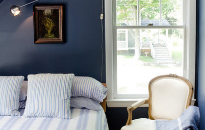
Express your darker side
If black feels too harsh, especially against a white painted exterior, go for a dark and moody heritage shade that has other tones in it, too. The windows of this cottage in Sandwich, Kent, have been painted in Farrow & Ball’s Black Blue. Remember, the frames at the front of your house don’t necessarily have to match those at the rear – think about what works with the style of windows you have.
What colour are your window frames painted? Share your photos and ideas in the Comments section.

Sponsored
Reload the page to not see this specific ad anymore
Black is an obvious alternative to white, and gaining popularity in homes. It has depth and drama, and can add a lovely vintage feel. It works particularly well as a detail on period homes, or on a modern extension.
Black paint reflects the trend for darker heritage paint hues generally, both inside and out. Metal and wooden frames can usually be painted another shade, but don’t despair if yours are white UPVC and you can’t afford to change them. You can source UPVC primer and paint over it with gloss or satin paint.