

Room Tour: An Open-plan Living Area in a Self-build Home
Sage, olive and wood mix with clean lines to create a calm, light living space for a retired couple

“The structural changes were quite small,” says interior designer Jessica Preston of the open-plan kitchen and living space she revamped for her clients. A modest claim, as it’s only when you see the Before photos that you can grasp the difference those alterations and the rest of the redesign made to the ground floor of this self-build, eco-friendly home.
The original kitchen stopped where the hallway door was, and a breakfast bar separated it from the dining area. Jessica decided to move the door along slightly to allow a longer run of base units, and took away the breakfast bar to open up the space.
She then positioned the dining area further towards the living space, which is to the right in the L-shaped layout.
She then positioned the dining area further towards the living space, which is to the right in the L-shaped layout.
“The kitchen layout was kept much the same,” says Jessica. “But as we were able to extend the units on the side, we could move the hob down, which made the worksurfaces more spacious.
“We also totally cleared the end wall of units and shelving,” she adds. “As we had more space in the base units, we could keep the rest quite simple.”
Planning a new kitchen? Find kitchen designers and fitters in your area
“We also totally cleared the end wall of units and shelving,” she adds. “As we had more space in the base units, we could keep the rest quite simple.”
Planning a new kitchen? Find kitchen designers and fitters in your area
The floorplan illustrates how the door was moved along to free up space for extra base units. The new position also encourages people to enter directly into the living and dining area, rather than having to walk through the kitchen.
Two studwork nibs, which jutted out into the dining and living area, were also removed. “It made a huge difference to how we could use the space,” says Jessica.
Two studwork nibs, which jutted out into the dining and living area, were also removed. “It made a huge difference to how we could use the space,” says Jessica.
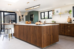
The couple chose flat-fronted kitchen cabinets with integrated handles. “The Corian worktop helps to get a seamless look,” says Jessica. “It has a slight speckled pattern for some subtle interest.”
The base units house lots of drawer storage, including cutlery trays and bespoke herb racks. Opposite are tall units for an integrated fridge-freezer and pull-out larder units.
The original flooring consisted of tiles in the kitchen and dining room, and wood in the living space. Jessica re-levelled the floor to lay wood-effect porcelain tiles throughout the whole area. “We set them in a diagonal pattern,” she says. “I think it works well to draw the eye across the L-shaped space.”
Roma kitchen in sage green, Masterclass Kitchens. Whitecap worktops, Corian. Woodtech porcelain floor tiles, BluePrint Ceramics. Colori Matt ceramic tiles, Domus.
“We replaced the ceiling downlights with flush fittings and a whiter finish, but the owners didn’t want the hassle of moving them,” says Jessica. “Usually we would position them closer to the worktop, but in fact the under-shelf LEDs make up for it and help to illuminate the worktop.”
“The owners were keen for a simple, uncluttered look,” says Jessica, “so we tried to think of ways to introduce pattern in more subtle ways.” On the splashback, for example, she chose plain white tiles, but laid them in a basketweave pattern.
Although the couple had decided to remove the peninsula from the kitchen, Jessica wanted to give them a breakfast bar. She used the space next to the back door to fit in a seating zone and storage unit, with a window above.
“I also wanted to introduce as many gloss and glass surfaces as possible to reflect the light,” she says. The glass tiles behind the stools give a shimmery effect; she also used them behind the wood-burner in the living room.
Walden gloss wall tiles, Grestec Tiles. About A Stool bar stools in pastel green, Hay.
Discover a range of stylish little indoor plant pots in the Houzz Shop
The dining area was moved towards the living room, which freed up space around it. The couple’s oak dining table is complemented by light wood chairs and leafy houseplants.
“They were uncertain about having wallpaper behind, but I thought the wall needed something, rather than a piece of artwork floating in the middle,” says Jessica. “This dappled watercolour is subtle enough not to overpower the space, and almost ties in with the glass tiles under the breakfast bar and in the fireplace.”
The couple were also reluctant to have pendants over the dining table, as they used to bang their heads on the old ones. “So I tucked these out of the way in the corner,” says Jessica. “They’re replicated in the opposite corner of the living area.”
Brush Large wallpaper, Engblad & Co. Hardy dining chairs, Another Country. Liuku ball pendant lights with smoked glass, Mater. Ash trugs (on table), Jane Crisp.
The floorplan pictured previously shows how the old living area was differentiated from the dining area with a studwork nib. When Jessica removed this, it created a wider opening.
The owners had struggled to fit in their seating, and had turned the two chairs to face the dining area.
The owners had struggled to fit in their seating, and had turned the two chairs to face the dining area.
Jessica swapped the seating for a sofa and a chaise longue. “The owners sit in here in the evening to watch TV and knit,” she says. “The chaise longue allows the person sitting in that space to turn and face the television comfortably.”
The wood-burning stove was already in place, but the top of the opening was very high up the wall. “It made the ceiling look quite low,” says Jessica. “We built a studwork frame to bring the line down and balance the space.”
Lumi mirror, Skandium. Sofa; chaise longue, both Case Furniture; both upholstered in Matara fabric in olive, Designers Guild. Plaisir side tables, Zeitraum. Herringbone rug, John Lewis.
Jessica also replaced the dark wood shelving units in the alcoves with simple floating shelves in pale oak.
“They didn’t have a central coffee table, and it wasn’t something they felt they needed,” the designer says. “We chose some small side tables, which add to the fresh, uncluttered feel.”
Tell us…
What do you like about this light, fresh, open-plan space? Share your thoughts in the Comments section.
“They didn’t have a central coffee table, and it wasn’t something they felt they needed,” the designer says. “We chose some small side tables, which add to the fresh, uncluttered feel.”
Tell us…
What do you like about this light, fresh, open-plan space? Share your thoughts in the Comments section.

Sponsored
Reload the page to not see this specific ad anymore

Sponsored
Reload the page to not see this specific ad anymore
Who lives here A retired couple
Location Chesterton, Cambridge
Property Self-build eco home with four bedrooms and three bathrooms
Room dimensions 45-50 sq m
Designer Jessica Preston of Colour + Shape
Photos by Megan Taylor
Jessica Preston’s clients had built their property about 10 years previously, but they didn’t feel as if the layout was really working in the ground-floor space. “It’s an eco house, and there was a lot of timber,” says Jessica. “However, it looked quite dark and heavy, as many of the surfaces were dark wood or granite.”
Walls painted in Pearl Colour Pale; skirting boards and architraves painted in Pearl Colour Mid, both Little Greene. Window frames painted in Gin & Tonic, Fired Earth.