Houzz Tours

Kitchen Tours
London Kitchen

Room Tour: A Low-cost Extension That’s a Triumph of Clever Design
Brilliant use of space and materials transformed a cramped, dark room into this light, family-friendly kitchen-diner

For its new owners, the original design of this Victorian worker’s cottage was missing a trick. There was a small lean-to extension at the back, but, far from linking the space to the garden, it actually blocked the light and view without adding much in the way of functionality.
The young family were keen to create a more open room that connected to the outdoors, but they had a limited budget to achieve their goal. Thankfully, James Davies of Paper House Project had plenty of ideas. Using the same small footprint plus a short infill extension, he transformed the space – and the way the family live.
The young family were keen to create a more open room that connected to the outdoors, but they had a limited budget to achieve their goal. Thankfully, James Davies of Paper House Project had plenty of ideas. Using the same small footprint plus a short infill extension, he transformed the space – and the way the family live.
Before, there was no view through to the garden, the space was starved of light, and the layout was cramped.
“There was a slightly weird existing rear addition with a pitched roof, but it had a plant room at the end, so you couldn’t walk into the kitchen and look out to the garden, you were just looking to the side alleyway,” James says. “It was very dark, and because there were no skylights, it wasn’t a very nice space to be in.”
“There was a slightly weird existing rear addition with a pitched roof, but it had a plant room at the end, so you couldn’t walk into the kitchen and look out to the garden, you were just looking to the side alleyway,” James says. “It was very dark, and because there were no skylights, it wasn’t a very nice space to be in.”
This view as work got underway shows the old kitchen window and the back door from the lean-to.
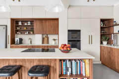
With the addition of a short infill extension on the right, James used the existing footprint to create a flexible family space incorporating a kitchen, a dining area and a play space.
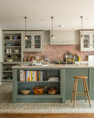
“That’s quite a lot happening in a small footprint,” he says, “so we linked the areas by having the continuous, quite bold flooring, which ties it all together. It’s a space where the family can make a mess, because the floor is suitable and nothing’s precious, so it can just be lived in.” He emphasises that it’s worth having rubber flooring installed properly. “If it’s done right, they’ll hot-weld the joints so it appears to be seamless,” he says.
James has combined the built-in cabinetry with a movable island to make the space multi-functional. Leaving room for play benefits the whole family, with this swing chair offering everyone a chance to relax in the bright space. A hook in the ceiling allows it to be attached securely whenever required. “It’s definitely a leap of faith when you first sit in it,” James laughs, “but it’s tied into one of the steels, so it’s quite safe.”
Nordic Style Round hammock, Joom. Rubber flooring, The Colour Flooring Company. Ball clock by George Nelson, available at Vitra.
This image shows the island on castors. It can easily be wheeled around to act as extra prep space in the kitchen or function as a sideboard. It also houses storage.
Feeling inspired? Find a local architect or interior designer today to help shape you own dream home.
Feeling inspired? Find a local architect or interior designer today to help shape you own dream home.
In fact, James has cleverly fitted in a huge amount storage without crowding the room, making use of every available nook. The left-hand wall in particular is packed with built-in cabinets.
“We used this bank of storage to rationalise and unify all the awkward stuff that was going on along this wall,” he explains. “You have utilities in there, a nib of wall – which had to be retained from a structural point of view – and a stepped profile, so it would have looked really bitty.
“We tried to tidy it up and make use of every inch, so all those cabinets are at different depths and have stuff going on behind them, but they’re plugged into the available space,” he says.
Both the tight budget and an eye on sustainability prompted James and the owners to reuse the kitchen carcasses, and the contractor’s joiner made the birch-faced plywood fronts on site, which saved money, too.
“Appliances were also reused,” James says, “and the splashback tiles are standard white squares, again keeping costs low.”
The door next to the drawers on the left conceals a dishwasher, but, James says, “The boiler, washing machine and tumble dryer are located in an area of the bathroom upstairs, so that freed up space down here.”
The stainless-steel worktop was chosen as an affordable material. “The initial plan was to reuse a section of steel [the owners] had before, but it got damaged when it was taken out,” he says. “They knew the material worked well for them, though – it’s not a precious surface and they’re happy for it to gain a patina. It tied in quite well with how they use the kitchen and with the material palette – I think if we’d put in a terrazzo or marble worktop, it might have been a bit too busy or out of place.”
The handles on the cabinets were made from semicircles of ply and semicircular cutouts, adding to the playful feel.
There are windows rather than doors onto the garden at the back of the dining area. “Because it’s the lowest point of the extension, it lends itself to an area where you’d sit, rather than where you’d walk out,” James says.
The couple made the table by having Formica-topped plywood cut to size then adding hairpin legs.
Laminate table top with plywood edges, The Contract Chair Company. Desk & Dining Table legs, The Hairpin Leg Company.
The couple made the table by having Formica-topped plywood cut to size then adding hairpin legs.
Laminate table top with plywood edges, The Contract Chair Company. Desk & Dining Table legs, The Hairpin Leg Company.
The bench seats around the table create a sociable area in what is a very small space, plus they hold yet more storage, perfect for stashing away toys. The lift-up lids were chosen over drawers to keep costs down. “It’s a little bit cheaper having lift-up lids,” James says. “There’s more work in a pull-out drawer mechanism.”
Tolomeo Mini wall lamp by Artemide, available at The Conran Shop.
Tolomeo Mini wall lamp by Artemide, available at The Conran Shop.
Key to the success of the design is the huge amount of glazing, which makes the space seem roomier than it is. As well as large windows on two sides and the roof of the rear addition, there’s a large glazed door and a full run of skylights in the infill extension. Overheating could have been a concern, but the side windows face north and the back ones face west.
Exposed beams run along the skylight, both to provide a surface from which to hang the pendant lights and for cost reasons. “It was a much cheaper alternative to have smaller pieces of glass,” James says. “A larger pane would have required a more heavyweight frame around it, maybe some more steels; the glass would have been more expensive, and trying to get it through the house into the back of the property would have been really difficult.” The bare beams also link nicely with the timber kitchen opposite.
Terrazzo Geometric pendant lights, Beautifulhalo.
This window from the middle reception room originally looked down the side return and James left it in place “so it feels like an open footprint that’s partially partitioned. The family wanted to be able to have the window open to shout through. It just links the space,” he says. Along with the fully glazed door into the kitchen, it also ensures there’s plenty of light in the middle reception room behind.
The tall cabinet seen here houses a fridge-freezer on the left and storage on the right.
You might also enjoy How to Avoid ‘Dead Front Room Syndrome’ When Extending.
The tall cabinet seen here houses a fridge-freezer on the left and storage on the right.
You might also enjoy How to Avoid ‘Dead Front Room Syndrome’ When Extending.
You can see the now internal window at the end of the side return on the left here. James demolished the old lean-to and the back wall, then constructed the new addition along the same lines.
“It’s in a restricted conservation area, so you can’t have a flat-roof extension unless your neighbours do,” he explains. “There are protected sightlines across the back of the properties, so we had to work within a predetermined envelope, and it was a case of trying to make that work as best we could within the space.”
“It’s in a restricted conservation area, so you can’t have a flat-roof extension unless your neighbours do,” he explains. “There are protected sightlines across the back of the properties, so we had to work within a predetermined envelope, and it was a case of trying to make that work as best we could within the space.”
The new extension, made from reclaimed London Stock brick and Welsh slate, looks quite simple, but it’s far from it. “You have bricks, glazing and tiles all within a small surface area, so there are loads of different junctions and details,” James says. “Getting things to align and the skylights flush with the tiles and brickwork was a lot of work.”
Having benches both inside and outside the window further helps to link the spaces. “They can converse through the spaces and [anyone in the garden] can be part of the house,” James says.
Having benches both inside and outside the window further helps to link the spaces. “They can converse through the spaces and [anyone in the garden] can be part of the house,” James says.
Not surprisingly, the couple were delighted with the new space. On the ‘after’ floorplan here, you can see how much bigger the room is than the original kitchen, which was just in the top left-hand segment. “The way it’s laid out is pretty successful,” James says. “It really does maximise a small footprint.”
Tell us…
What do you like about this reconfigured kitchen/dining/play space? Share your thoughts in the Comments.
Tell us…
What do you like about this reconfigured kitchen/dining/play space? Share your thoughts in the Comments.

Sponsored
Reload the page to not see this specific ad anymore
Who lives here? A young family with one small child
Location Queen’s Park Conservation Area, west London
Property A Victorian terraced worker’s cottage
Kitchen-diner dimensions Around 5.5m x 4.2m (at the longest and widest points)
Architect James Davies of Paper House Project
Photos by French+Tye
The couple’s brief to James was to improve the connection with the outside space. Even though they were on a tight budget, they wanted the design to be playful, and the materials used needed to be robust enough that they could enjoy the space as a family without feeling precious about any of the surfaces.