
Room Tour: A Clever Idea to Zone and Connect a Broken-plan Space
An asymmetrical roof and creative design add character and function to this bright, open extension

The obvious option for replacing an impractical conservatory at the rear of this Victorian home would have been to build a flat-roofed, open-plan extension, but architect Amos Goldreich wanted to give his clients something a little different. So instead he designed a space with an asymmetrical roof to bring both character and practicality to the new room.
The open framework separates the two rooms while at the same time keeping them connected.
Nuvola floor tiles, Calma range at Porcelain Tiles. Point track lights, Fluvia. Utzon pendants, &Tradition.
Find reviewed architects in your area on Houzz.
Nuvola floor tiles, Calma range at Porcelain Tiles. Point track lights, Fluvia. Utzon pendants, &Tradition.
Find reviewed architects in your area on Houzz.
The kitchen is a clever combination of Ikea carcasses and plywood doors, designed by a specialist company.
“The plywood is laminated with a really nice material called Fenix,” Amos says. “It has nanotech properties, so light scratches can easily be wiped off. You can also use it for worktops, as it’s resistant to hot plates, and it comes in nice colours with a matt or satin finish.”
Kitchen, Holte.
“The plywood is laminated with a really nice material called Fenix,” Amos says. “It has nanotech properties, so light scratches can easily be wiped off. You can also use it for worktops, as it’s resistant to hot plates, and it comes in nice colours with a matt or satin finish.”
Kitchen, Holte.
A practical Silestone worktop adds to the clean-lined look of the kitchen, and Amos kept costs down by specifying an Ikea sink and appliances.
At the end of the galley-style layout is a wide, glazed door that leads out to the garden and brings plenty of light into the space. Track lighting illuminates the room in the evening.
Appliances; sink; tap, all Ikea.
At the end of the galley-style layout is a wide, glazed door that leads out to the garden and brings plenty of light into the space. Track lighting illuminates the room in the evening.
Appliances; sink; tap, all Ikea.
Alongside the base and wall units is a run of tall cabinets where the boiler, larder and fridge-freezer are located.
Amos also managed to fit a cloakroom into the space, which can be seen on the left of this image.
Amos also managed to fit a cloakroom into the space, which can be seen on the left of this image.
Shelves add a cosy element to the living space, while cupboards below provide useful storage.
Amos also designed an oriel window in this area with a deep ledge where the owners can sit and look out to the garden. “They’ve put cushions on the window ledge now and told me that their son sits here a lot,” he says.
Amos also designed an oriel window in this area with a deep ledge where the owners can sit and look out to the garden. “They’ve put cushions on the window ledge now and told me that their son sits here a lot,” he says.
The extension is clad with bricks that have been whitewashed to match the airy feel of the interior.
“For the patio, we were looking for something that would closely match the façade bricks,” Amos says. These pavers are a similar size to normal bricks and have the same pale hue.
Bricks, The Bespoke Brick Company. Pavers, Chelmer Valley.
“For the patio, we were looking for something that would closely match the façade bricks,” Amos says. These pavers are a similar size to normal bricks and have the same pale hue.
Bricks, The Bespoke Brick Company. Pavers, Chelmer Valley.
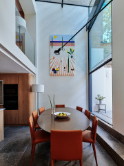
To the back of the space is a dining area where the owners can still look out through the picture window to the garden.
A sliding pocket door (just seen, left) can be closed or opened up to connect the dining area to the cosy living room at the front of the house.
The traditional bay window in the front room mirrors the more modern oriel window opposite, helping to emphasise the new and old parts of the house.
Tell us…
What do like about Amos’s creative ideas in this extension? Share your thoughts in the Comments.
The traditional bay window in the front room mirrors the more modern oriel window opposite, helping to emphasise the new and old parts of the house.
Tell us…
What do like about Amos’s creative ideas in this extension? Share your thoughts in the Comments.

Who lives here? A couple and their two children
Location North London
Property A Victorian semi-detached house
Room dimensions 3.5m x 6m
Architect Amos Goldreich of Amos Goldreich Architecture
Photos by Ollie Hammick
The homeowners were keen to have a light, bright space that connected with the garden, but also wanted clearly defined areas rather than a completely open-plan room. The asymmetrical ceiling helps with this, as it zones the kitchen and living areas.
Amos also made use of the extension’s rafters to both divide and connect the two spaces. “The structural framework holds up the roof,” he says, “but we incorporated shelves and storage to make it both decorative and functional.”