Decorating
How to Decorate With Red (Without a Whiff of the 1980s)
It’s the colour we’ve shied away from for years, but don’t be afraid – it’s back in a stylish and subtle way

A colour we’ve been seeing more of is red. It’s a hue that had fallen out of favour in recent years, giving way to cool and calming blues and greens, but it seems we’re ready to ramp things up and inject our homes with a dash of this energetic colour, often associated with passion and drama.
Don’t assume, however, that it’s all about reviving the solid blocks of scarlet or ruby so popular in the 1980s. This time around, the shade is softer – think terracotta or red wine – or, if it is used bright, it’ll be amid pattern to tone it down. Not convinced? Let these ideas inspire you.
Don’t assume, however, that it’s all about reviving the solid blocks of scarlet or ruby so popular in the 1980s. This time around, the shade is softer – think terracotta or red wine – or, if it is used bright, it’ll be amid pattern to tone it down. Not convinced? Let these ideas inspire you.
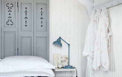
Incorporate white space
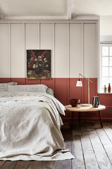
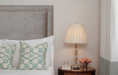
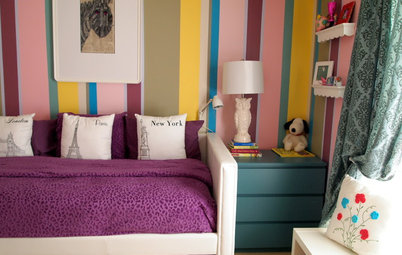
When it comes to decorating a red bedroom, proceed carefully. Red is considered to be an energetic colour, calling to mind passion, a beating heart, our very life force. Typically, we tend to aim for bedrooms that soothe rather than excite.
The red in this toile wallpaper is far from shy, yet it’s given sufficient breathing space by being part of a pattern set against a white backdrop. The crisp, all-white bedding provides yet another ‘empty space’ to break up the intensity of the colour.
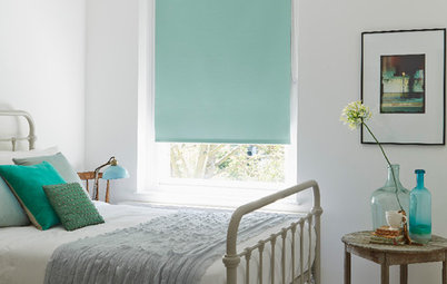
Add just a dash
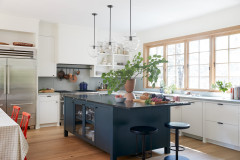
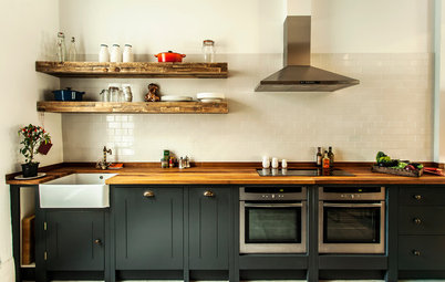
Subtlety is another way to go with strong, warm hues. Not only is this flash of Beaujolais red paired with cooling grey by way of contrast, it’s also barely there. In this kitchen, it’s a trim at the bottom of a blind and a companion appearance in a framed artwork, but think cushions, trim, small accessories, lone tiles…
When using just a tiny amount of an accent colour, follow the interior designer’s trick of ensuring it has at least one – and ideally two – ‘friends’ in the same space that anchor the shade nicely and help it to look settled.
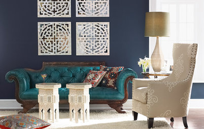
Harness red’s energy
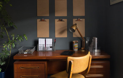
As already mentioned, red is said to be the colour of passion and energy – in other words, the perfect choice for a home office, where you want to feel fired up and creative.
Again, swerving a clown-nose version of the colour is the contemporary way to go. This russet red is classy and works well with the period-style panelling and slimline marble table.
Don’t be afraid to double up, either. With such a strong wall colour, a person could be forgiven for shying away from accessories in the same shade, but this chair shows there’s a good argument for layering your chosen hue.
Go deep
Choosing something old, or vintage-style, is a good tip if you’re trying to tone down a big colour. It will generally make a softer statement than a shiny, contemporary incarnation in the same shade.
Accordingly, the rich, dark red in this traditional Afghan kilim-style rug covers a large area, yet it doesn’t overwhelm. It’s also paired, again, with cooling blue – navy, this time – as well as contrasting monochrome bedding.
Look out for kilims or Persian-style rugs to replicate this look, and go for that ultra-dark, lived-in rouge to ramp up the aged effect, rather than a perky bright newcomer.
Browse rugs of all colours in the Houzz Shop
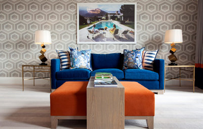
Don’t be afraid to blend with black
Shiny jet black and shameless scarlet was a match beloved in many 1980s interiors. If you were there at the time, it’s not, perhaps, one you look back on fondly.
The subtle new way to make this strong combination work is to choose a matt black (check out the legs on this chair and footstool), and one that edges more towards charcoal than coal.
Let an original feature stand out
Red, while it’s had its fashion ups and downs in recent years, was once much more of a staple colour. As such, you’ll often find it in original Victorian or Edwardian tiles or – as here – stained glass.
The all-white approach taken in this clean, fresh entrance has done two things to the feature colour. Firstly, it’s made it stand out as the strongest shade in the scheme.
Secondly, it’s given the colour a contemporary update, since it would traditionally have been paired with darker shades.
Try this with other original red details. A framed piece of antique scarlet fabric or a bright red enamel sign would stand out and freshen up in a similar way given the white treatment.
Tell us…
Where do you stand on red as a colour for home décor? Share your thoughts in the Comments section.

Sponsored
Reload the page to not see this specific ad anymore
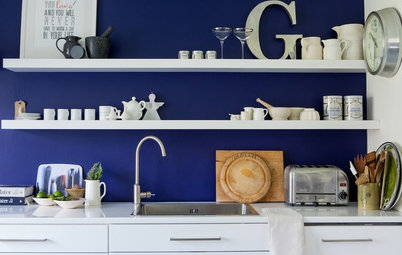
The faded, gentle red in these feature tiles is already far from in your face, but partnered with soft off-whites and cool grey-blues, the whole effect is calming and classic, rather than racy and dramatic.
While the main colours come from fairly large surface areas, don’t downplay the power of accessories in the mix. Just check out that shelf above the cooker – it’s packed with pale blues to further inject this calming shade into the scheme.