Colour Trends From Maison & Objet to Look Out For in 2024
New harmonies and unexpected pairings set the tone for next year’s interiors

“2024 will welcome a playful juxtaposition of invigorating hues and pastel shades. In particular, we can expect to see an interaction between milky and earthy colours,” says Xavier Pouget, head of communications at Peclers. Renowned for its expertise in colour, this leading trend agency was assigned the exciting task of defining the theme for the latest edition of the Maison & Objet trade fair – Enjoy.
The exhibitors certainly needed no encouragement when it came to bringing out their most spectacular colour palettes to create new and surprising pairings. So let’s take a look at the colourful selections that promise to lift our homes and spirits in 2024.
The exhibitors certainly needed no encouragement when it came to bringing out their most spectacular colour palettes to create new and surprising pairings. So let’s take a look at the colourful selections that promise to lift our homes and spirits in 2024.
Evergem Set, Designers of the Year 2023 Fien Muller and Hannes Van Severen, Maison&Objet, ©AETHION.
2. The use of sky blue to create new harmonies
New colour harmonies are emerging, with sky blue taking centre stage as an enhancing element. This is how Lidewij Edelkoort, an internationally renowned trend spotter and colourist, put it at her Everyday Paradise conference.
“We’re currently living through a difficult period. It’s therefore important to bring our focus back to beauty, serenity and aesthetics,” she said in her introduction, before deciphering the trends we can expect to see in the world of design.
Among these trends, colour is key. “The colours we can expect to see are ultra-modern and bright, such as pink, purple and orange, combined with sky blue for an unexpected contrast,” she said. “Sky blue brings out different qualities in each shade, almost transforming them into new colours.“
3. Watery effects
Lidewij Edelkoort has also worked extensively with water, adding a new dimension to the colours. This includes a watercolour effect that can be seen on PaperMint wallpapers (pictured), where the landscapes appear to have been painted directly onto the walls, as well as on accessories and household linen.
Lidewij Edelkoort has also worked extensively with water, adding a new dimension to the colours. This includes a watercolour effect that can be seen on PaperMint wallpapers (pictured), where the landscapes appear to have been painted directly onto the walls, as well as on accessories and household linen.
Water can also be integrated into the use of colour in a more abstract way, with diluted effects, as we see on this bedroom wall.
Inspire me! stand, Seductive Expressiveness, Maison&Objet September 2023, ©AETHION.
4. Three moods, three palettes
At the Enjoy, In Search Of Pleasure conference, Charlotte Cazals and Brune Ouakrat of Peclers explained the theme of this year’s show. They identified three decorating moods that represent the expectations of three emerging consumer ‘tribes’ showcased at the show in the Inspire me! exhibition. Each tribe has its own colour scheme.
Seductive Expressiveness: This is what the agency calls the tribe of decadent party people, a whole category of consumers who want to be part of a life of intense pleasure. They have a plural identity, a desire to highlight their uniqueness, to turn life into a party, and question the representation of the body, according to the two experts.
Their interiors are ultra-glamorous, flamboyant and enriched with shiny, precious materials. Their palette is made up of terracotta, gold and touches of pink.
Inspire me! stand, Liberating Creativity, Maison&Objet September 2023, ©AETHION.
Liberating Creativity: This is a tribe of collective optimists who want to rediscover the joy of carefree play. Their hallmarks are the re-enchantment of everyday life, the celebration of the collective and experimentation.
Their interiors are obviously optimistic, with patterns, creative works, new ideas and playful designs to combat the gloom of everyday life. Their colour palette is centred on hot pink, apple green and bright orange.
Inspire me! stand, Heightened Sensitivity, Maison&Objet September 2023, ©AETHION.
Heightened Sensitivity: The third and final tribe identified by Peclers is the sensitive hedonists, for whom happiness rhymes with harmony. They seek physical exploration, imaginary escape and intimate connections. Digital media plays a pivotal role for this tribe, notably augmented reality, but it must always be used in a way that is beneficial to their wellbeing. Nature is also a key part of their environment.
Their interiors therefore resemble an ultra-sensitive, sensory cocoon, with reflective materials, luminescent surfaces inspired by the digital world, and soft colours, shapes and materials. Their preferred tones are nude pink and gold, sometimes paired with burnt orange or metallic hues reminiscent of aluminium.
Stand by Tim Leclabart, Rising Talent Awards, Maison&Objet September 2023, ©AETHION.
5. Nostalgic orange
Already a major shade in Elizabeth Leriche’s homage to pattern, showcased at the beginning of this article, burnt orange was a recurring colour across numerous stands this year in an unexpected ode to the past.
This hue was given particular prominence by French designer Tim Leclabart, winner of the 2023 Rising Talent Award alongside six other promising young individuals on the French design scene. After leaving its mark on the 1960s and 1970s, burnt orange is back, reworked for the present day into resolutely contemporary, revitalised tones.
Jallu, Maison&Objet 2023. Photo by CT.
6. Ultra violet
In a nod to digitalisation and the democratisation of augmented reality, purple is playing an increasingly important role in new collections of furniture and accessories for the home. Combined with bright, sunny hues such as orange, it brings back forgotten colour combinations that we no longer dare to use in our interiors.
Evergem set, Designers of the Year 2023 Fien Muller and Hannes Van Severen, Maison&Objet. ©AETHION.
7. Khaki
Last but not least, this year, green comes in shades of khaki, which we spotted paired with purple in the spaces designed by trendsetters François Delclaux and Elizabeth Leriche.
It also contrasted with blue in Evergem, the installation by designers Fien Muller and Hannes Van Severen. According to Xavier Pouget of Peclers, the colour is part of a wider palette composed of turquoise, burnt orange and brown.
Tell us…
What do you think about the colour palettes coming up for 2024? Share your thoughts in the Comments.


Sponsored
Reload the page to not see this specific ad anymore
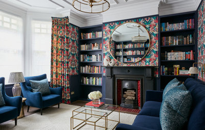
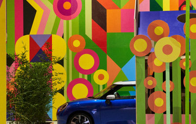
1. Colour through pattern
Patterns were a particular feature at this year’s Maison & Objet and, by definition, the many colours that create them. “We live with patterns, they’re constantly with us as they’re everywhere, from the most modest of objects and textiles to the most sophisticated of compositions,” says Elizabeth Leriche, renowned trend watcher who, for 2024, predicts an interior landscape dedicated to patterns.