complementary white F&B Hague Blue
M M
18 days ago

Sponsored
Reload the page to not see this specific ad anymore
Hello!
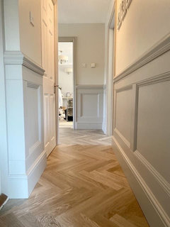
I’m planning to paint lower third panelling in my hall F&B Hague blue and I’m trying to find a complementary white for the walls.
The recommended colour - Ammonite is too dark for me. The hall is fairly dark with no windows of its own.
I like Dimity but I’m wondering if it works to pair a colour with a green undertone (the dark blue) and a colour with a red undertone (the white). Would this work ok or should I try find something that doesn’t lean slightly red/pink
Thanks
All White or good old fashioned pure brilliant white, but if the hall is that dark I wouldn’t go navy at all. I would choose something like Purbeck Stone or Pavillion Grey on the pannelling - very elegant. I made the mistake of painting my hall green, Pigeon, and it sucked the remaining light out of the hall completely! Soon repainted it a light grey, so much nicer.
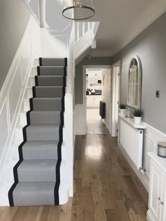
First pic is Ammonite walls and Purbeck Stone pannelling. Second pic is white pannelling with Pavillion Grey upper wall.
Another vote for All White, it’s the perfect white - soft and easy on the eye without any harshness that Pure Brilliant White can sometimes have..
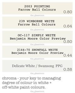
If your hallway really is dimly lit and you are sensitive to shadows, I wouldn’t look to an uber light, near neutral white such as FB All White first.
Near neutral whites are very low in chroma. (degree of colour).
Zero chroma = a true neutral.
Such whites, really require a decent amount of well-balanced light, to be at their luminous and gleaming best. They aren’t illuminants in themselves.
An off-white with more chroma (degree of colour), such as Wimborne White, would be worth viewing in situ first.
Don’t dismiss it because it may appear too yellowish in the better lit areas of your home.
That extra kick of chroma may simply translate to a welcome softness, in lower lighting.
Should Wimborne White still feel too much of a colour in that space for you,
chroma = 0.68 and All White render a little raw and shadowy, with a chroma of 0.21?
Then you are looking for a white with a degree of chroma which sits between the two.
See BM Snowfall White + PPG Swansong/Delicate White within this list.
(PPG = Johnstones Trade Colour)
#chroma
Reload the page to not see this specific ad anymore
Houzz uses cookies and similar technologies to personalise my experience, serve me relevant content, and improve Houzz products and services. By clicking ‘Accept’ I agree to this, as further described in the Houzz Cookie Policy. I can reject non-essential cookies by clicking ‘Manage Preferences’.


Isla Cherry