Splasback suggestions
I've always disliked the orange glass splashback we have in our kitchen - mainly because it's a citrus orange (rather then the reddy-orange of our kitchen chairs) and there's too much orange overall. I am now considering changing it for tiles, but need some advice please:
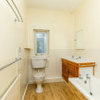
1. Size - the current splashback reaches the level of the cooker hood, but I think it needs to be higher, as there are cooking splashes on the wall as high as the bottom of the pictures. As there are no wall cupboards, I don't know how high to go with the tiles?
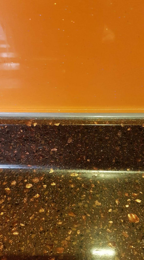
2. Design - I'm thinking of cream gloss tiles (same colour as cupboards) and maybe a feature of mosiac with some brown and copper in (the worktops are brown with copper, see attached photo). I could do a block of mosiac over the hob and the same width as the cooker hood, with cream tiles either side/above?
3. Budget - I need to keep the cost down, hence tiling rather than buying bespoke splashbacks (and potentially making another costly mistake). I have to keep all other fixtures/appliances, but will be repainting the walls.

Any thoughts would be appreciated, thanks.
Comments (16)

Ellie
3 years agoClear glass would be my choice as you already have colour in the chairs. And I'd probably only do it above hob
randjb thanked Ellie
Sonia
3 years agoThere are some lovely tiles about. Not necessarily colourful, but with interesting shapes and texture. I’ve noticed some people have tiles up past the cooker hood around the cooking area that may suit you? I’ve also included a glass splash-back in a softer shade.

 randjb thanked Sonia
Angie
3 years agoMaybe a clear Perspex splashback would do the trick to tide you over and wouldn’t cost the earth. We had Perspex in our previous house and it worked very well and cleaned easily. Just an idea.
randjb thanked Angie
rinked
3 years agoI'd opt for glass again. Get the back spraypainted the same color as the wall color you want to use, for example. Might even have it satinated, as there's quite a bit of gloss going on already. Glass might be a bit more costly than tiles, but if you're not doing it yourself the difference should be manageable, as mounting the glass goes quicker.
randjb thanked rinked
Alison Nicholson
3 years agoMy suggestion would also be glass, but not Perspex, which would scratch more easily. I’d have it under, and wider and higher, than the present splashback (to avoid sideways splashes mattering), and I’d simply repaint the whole wall behind it, so that essentially, it would look, at a quick glance, as though there wasn’t a splash back. I think it would lighten your kitchen that way, too. If you’re at all artistic, an alternative would be to paint some paper in colours etc you like, in the same size as the glass, and place it behind the glass. But that would bring extra colour you really don’t need, into the kitchen. I’ve never seen a cooker hood like yours...not having one myself (I have an old Aga), I’m unfamiliar with more modern hoods. I thought they were all parallel with the hob, which would have given you a more balanced and higher area for your splashback.
One thing I’d avoid like the plague, though, is mosaic tiles. Think of cleaning splashes from all that grout! Agh!randjb thanked Alison Nicholsond sen
3 years agoWhat ever you choose do NOT use where grout is concerned. Glass it the right choice, I have a local glass manufacturer I would thoroughly recommend, they supply any shape or form in any colour match or design at unbeatable reasonable prices.
Houzz - Would it be appropriate to furnish this information on this site?randjb thanked d senmidwalesparky
3 years agoI agree about not using Perspex. It's not as cheap as all that and won't age at all well. It'll scratch and any saving will be wiped out by having to replace again in no time at all. I think Indigo Design is right about the walls. If you can't live with the orange, I wonder if someone could sandblast it off the back of that glass so you would have a nice etched glass splashback instead. With walls repainted in something more up-to-the-minute/wow/stylish, I reckon you'd have it sorted.
randjb thanked midwalesparkyrandjb
Original Author3 years agolast modified: 3 years agoThanks to everyone for your help and suggestions, you've given me plenty of food for thought.
@Indigo Design you're right about the colours, there are too many of them and perhaps I should try a new wall colour before anything else. Orange was meant to be my accent but I've gone OTT with it (there's also another Orange splashback on the other wall over the sink). The worktops are actually dark brown, the cupboards are cream and the walls stone. I don't think the stone goes well with the orange, but I'm not sure what other colour to go for, or what's on trend currently. I'm a bit scared of colour, although I obviously love orange!! I could try painting the walls white, but am unsure of how that would look with cream and brown.
Isobel Notellingyou
3 years agoI rent an old house where, many many years ago, someone thought it'd be a good idea to decorate the bathroom with floor to ceiling orange tiles. I wasn't sure if I could live with this, nor am I in a position to change them but in 3 years I have come to love them. Instead of matching or disguising the colour, I used lime green to oppose it. Towels, accessories, shower curtain, all lime green, and a bit of white provides relief. I'm sure you could put a length of lime green painted cardboard or similar against the wall to see but, I reckon you'll be pleasantly surprised!
randjb thanked Isobel Notellingyourandjb
Original Author3 years ago@Isobel Notellingyou, I do have a couple of lime green things (chopping board and t towel) and I think they look ok. I just worry that the room would end up looking like a giant fruit bowl if I used too much 😀.
I may try painting the walls white to see whether it makes the orange look more like the shade I thought I bought (the sample looked different). None of it was cheap (bespoke splashback and Corian worktops) so I'd much rather find a way of living with it than replacing things. Being in the house all the time during lockdown really isn't helping, as I see it all day, every day!!
 PRO
PROCaldicot Kitchen & Bathroom Centre
3 years agoIf you've fallen out of love with the orange and can manage to get the splashack off intact, then consider getting a good sprayshop to strip the paint and recoat in a nicer colour - might be your cheapest option! It will depend on how liberal the installer was with the silicone, but worth a try - you will need to try and get a blade in and cut through the sealant.
If you do end up going back with glass again, a handy tip to make it removable - use industrial, 3M adhesive backed velcro (only a couple of lengths needed!) and just seal the edge with the sealant!
As others have suggested, before you ditch the bold orange, consider whether a different tone of wall paint would help "tame" it, and keep your vibrant colour scheme.
Or maybe just get a short section of black splashback for below your hood, and mount it over the orange? It may be sufficient to tone it down while keeping a "splash" of colour. Probably your cheapest option overall!randjb thanked Caldicot Kitchen & Bathroom Centrerandjb
Original Author3 years ago@Caldicot Kitchen & Bathroom Centre great idea re breaking up the big splashback with amother on top near the hob. I have a horrible feeling that it will have been glued on very securely, so may be hard to get off.
I'm coming around to the idea of changing wall colour to see what that does - just can't think of a colour as already too many in the room, so perhaps white (although not sure how that would go with the cream cupboards). That would allow me to see if the orange looks better, as I think the current stone wall colour is making the orange look too insipid and not as bright as my chairs, which is why I don't like it.
Thanks again for taking the time to reply.

Miri D
3 years agolast modified: 3 years agoif you're keeping the chairs, you could go bold and make it red, something like this:
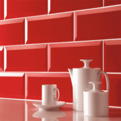
These are from here and they won't break the bank
You could also try more pastel tones of blues or teals - in combination with orange they create a very modern Scandi look. Something like this:
These are also from here
randjb thanked Miri D- PRO
Caldicot Kitchen & Bathroom Centre
3 years ago@randjb - The extra glass over is, I think, a very viable option, and actually you shouldn't worry about adhering it over the top. Glass is one of the easiest products to adhere to, and the "loading" on the extra piece is minimal, so a few small beads on the back plus sealing around the edges will give an extremely secure installation - and one you can easily remove again.
As to you now thinking about other colours for paint - that is, at least, an easy & inexpensive option, and one you can easily change if you're not happy with the result! Your orange is actually a versatile colour to work with - you can either pick a lighter tone of the same shade, or pair it with everything from a red to teals & verdant greens. Think peacock feathers!
https://colorpalettes.net/wp-content/uploads/2014/08/cvetovaya-palitra-430.jpg

Reload the page to not see this specific ad anymore


Indigo Design