

lacking elegance?
8 years ago
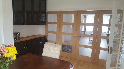
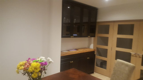
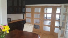
I've placed these units in the alcove of our dining room. It's as an attempt to give our dining room more practically and elegance, however it lacks something. Im tourn, if i requires a paint behind the units, a splash back or something else entirely. Any ideas would be greatly appreciated.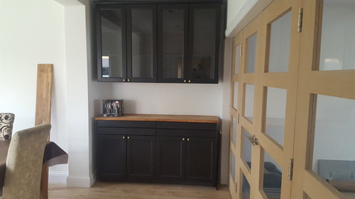
Featured Answer
Sort by:Oldest
Comments (19)
 8 years agoI am a layperson. So interesting to see what more experienced laypeople or designers think. They are nice cupboards. Are you planning to replace the white door at any time? I notice you have 3 different door wood types in a small area (if you include the cupboards). Do you intend to use any wallpaper anywhere? I may consider the same wallpaper in your splashback area and wall on far side of pillar to draw it together and create warmth.
 8 years agoI like what you were trying to achieve and I think the thing that's making it feel not quite right is balance and visual weight is off between the portion doors and your dining buffet area.
The white wall above the partition looks Mis-aligned to the dining cupboards and it's not necessarily that they are not the same height.- 8 years agoSorry not finished!
I've long been a fan of dark colours so personally i would probably go dark with the dining room walls and white door and I would hope that the wooden partition doors would look good then. But I'm no professional and sometimes it goes wrong and I have to start again!  8 years agonot sure it works because they overhang the folding doors... looks a bit odd... also it feels "top heavy"... you could perhaps keep the bottom?
 8 years agoI too think they are too deep. They shouldn't really cover the architrave or the doors. Could you have altered the carcases so they were narrower?
Also the other door doesn't blend with it as it's a different colour.- 8 years agoI also think it looks too top heavy, and I don't think it should overhang the partition doors. I think you could get away with the base unit but I think a couple of open shelves or a mirror or some artwork might look better above them.
 8 years agoI agree also, it doesn’t look right because it covers the architrave and the doors which makes the upper cabinets look top heavy. Could they be moved to the left hand side of the pillar? Would there be enough seating space at the dining table? If they can be moved I’d suggest putting something narrower by the doors such as a console table with mirror and lamp, large piece of art, or a drinks trolley etc. If they can’t be moved the only thing I can suggest is paint the partition doors, architrave and that wall the same colour as the units to help it blend in. I’d also change the white door to something similar in style to the other doors.
 8 years agoApart from the units overlapping the architrave, I think you have too many colours/shade variations within that area.
You've got the light coloured walls contrasted with very dark units; Also, the flooring, doors and worktop are similar but clash so don't work cohesively.
I like Rachel's idea of painting the doors the same colour as the units (get a unit door colourmatched at a diy store) - this limits the wood effects clashing and creates a more cohesive look
I'd the consider changing the paint colour: maybe an off white grey with a deep toned feature wall. PRO8 years agoIf the cabinetry needs to stay here I’d suggest .... Paint the white door charcoal, paint the folding door wall charcoal ( leave the door wood) - add wood back splash between wall cabinets and worktop. And paint the pillar wall charcoal too .
Or - if there’s room and you don’t mind splitting things ... split the base cabinet into two - and the wall cabinets into two and place then either side of the pillar with the wall cabinets mounted on the worktop like a dresser instead - paint the pillar charcoal to the same height as the dresser - if you want to be a bit clever add a strip of gold to emulate the wood worktop on the pillar too . Then line up the table centrally with the pillar.... add a charcoal table cloth over the table with a wooden fruit bowl to tie up the colours .nchavda88
Original Author8 years agoThanks everyone. The cupboards cost over £1000 and I've only just installed them! I think I'll have to explore the work arounds! 8 years ago
I think that they look imbalanced due to the lack of depth in the alcove. I would not paint the doors to lessen the effect, move the cupboards instead otherwise it may always bother you. Are they free standing?
 8 years ago
If you changed the table it would remove one of the mismatched woods and might help a bit. I'm afraid I agree with the others though, the fact that they are too deep and overlap the architrave is an issue. As such I'd try to disguise that by painting the walls dark so that its all a bit less obvious.
As nice as they might be in isolation I think you need to think about the room as a whole.
- 8 years agoI like the photo shop that's been done for you and I think it wouldn't matter too much that the units protrude if you did that and perhaps also mirror the 'splashback' between the top and bottom cupboards??
Love dining areas dark and moody and mirror helps the mysterious illusion feeling. - 8 years agoDone a couple more mock ups with ideas suggested. I like Oneplan’s suggestion for cupboard either side of a charcoal pillar with gold band to tie in the wood countertops. Very inventive:)


Sponsored
Reload the page to not see this specific ad anymore

rachelmidlands