Kitchen with No Island and Grey Floors Ideas and Designs
Refine by:
Budget
Sort by:Popular Today
1 - 20 of 13,889 photos
Item 1 of 3
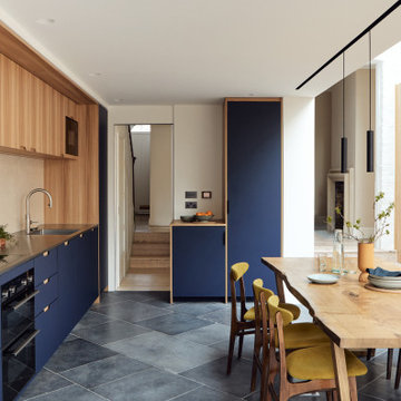
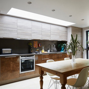
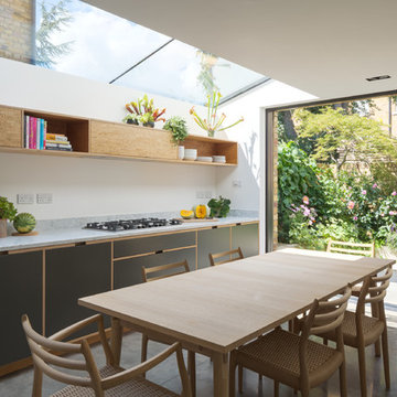
Amos Goldreich Architecture has completed an asymmetric brick extension that celebrates light and modern life for a young family in North London. The new layout gives the family distinct kitchen, dining and relaxation zones, and views to the large rear garden from numerous angles within the home.
The owners wanted to update the property in a way that would maximise the available space and reconnect different areas while leaving them clearly defined. Rather than building the common, open box extension, Amos Goldreich Architecture created distinctly separate yet connected spaces both externally and internally using an asymmetric form united by pale white bricks.
Previously the rear plan of the house was divided into a kitchen, dining room and conservatory. The kitchen and dining room were very dark; the kitchen was incredibly narrow and the late 90’s UPVC conservatory was thermally inefficient. Bringing in natural light and creating views into the garden where the clients’ children often spend time playing were both important elements of the brief. Amos Goldreich Architecture designed a large X by X metre box window in the centre of the sitting room that offers views from both the sitting area and dining table, meaning the clients can keep an eye on the children while working or relaxing.
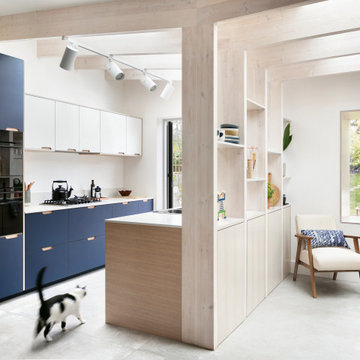
Amos Goldreich Architecture enlivened and lightened the home by working with materials that encourage the diffusion of light throughout the spaces. Exposed timber rafters create a clever shelving screen, functioning both as open storage and a permeable room divider to maintain the connection between the sitting area and kitchen. A deep blue kitchen with plywood handle detailing creates balance and contrast against the light tones of the pale timber and white walls.
The new extension is clad in white bricks which help to bounce light around the new interiors, emphasise the freshness and newness, and create a clear, distinct separation from the existing part of the late Victorian semi-detached London home. Brick continues to make an impact in the patio area where Amos Goldreich Architecture chose to use Stone Grey brick pavers for their muted tones and durability. A sedum roof spans the entire extension giving a beautiful view from the first floor bedrooms. The sedum roof also acts to encourage biodiversity and collect rainwater.
Continues
Amos Goldreich, Director of Amos Goldreich Architecture says:
“The Framework House was a fantastic project to work on with our clients. We thought carefully about the space planning to ensure we met the brief for distinct zones, while also keeping a connection to the outdoors and others in the space.
“The materials of the project also had to marry with the new plan. We chose to keep the interiors fresh, calm, and clean so our clients could adapt their future interior design choices easily without the need to renovate the space again.”
Clients, Tom and Jennifer Allen say:
“I couldn’t have envisioned having a space like this. It has completely changed the way we live as a family for the better. We are more connected, yet also have our own spaces to work, eat, play, learn and relax.”
“The extension has had an impact on the entire house. When our son looks out of his window on the first floor, he sees a beautiful planted roof that merges with the garden.”
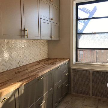
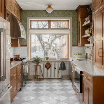
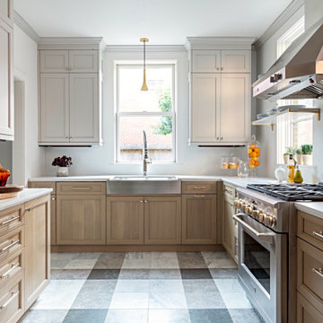
Jenny was open to using IKEA cabinetry throughout, but ultimately decided on Semihandmade’s Light Gray Shaker door style. “I wanted to maximize storage, maintain affordability, and spice up visual interest by mixing up shelving and closed cabinets,” she says. “And I wanted to display nice looking things and hide uglier things, like Tupperware pieces.” This was key as her original kitchen was dark, cramped and had inefficient storage, such as wire racks pressed up against her refrigerator and limited counter space. To remedy this, the upper cabinetry is mixed asymmetrically throughout, over the long run of countertops along the wall by the refrigerator and above the food prep area and above the stove. “Stylistically, these cabinets blended well with the butcher block countertops and the large Moroccan/Spanish tile design on the floor,” she notes.
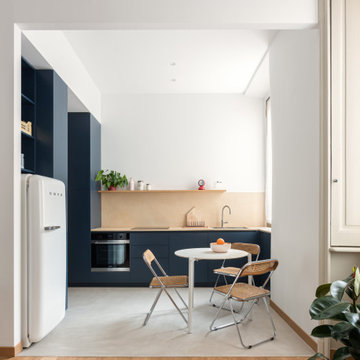
Vista sulla cucina dal soggiorno.
Abbiamo demolito la parete che c'era tra il soggiorno e la cucina rendendo in questo modo gli spazi di questo appartamento al primo piano molto più luminosi.
Il contrasto tra i diversi pavimenti sottolinea la differente funzione degli spazi, in soggiorno un parquet in rovere come nel resto della casa, in cucina il microcemento di colore grigio fa risaltare ancora di più la cucina di colore blu scuro.
Il passaggio verso l'ingresso è delimitato ai due lati dalle due colonne blu.
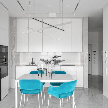
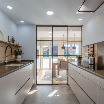
The kitchen is divided into two parts. The floor-to-ceiling column cabinets have lots of shelves and contain a built-in refrigerator and a range of appliances. The second part is a minimalist kitchen set with a sink and a cooktop. To illuminate the dining table, we made a chandelier of profile lamps mounted at different heights. We design interiors of homes and apartments worldwide. If you need well-thought and aesthetical interior, submit a request on the website.
The distinguishing trait of the I Naturali series is soil. A substance which on the one hand recalls all things primordial and on the other the possibility of being plied. As a result, the slab made from the ceramic lends unique value to the settings it clads.

Le duplex du projet Nollet a charmé nos clients car, bien que désuet, il possédait un certain cachet. Ces derniers ont travaillé eux-mêmes sur le design pour révéler le potentiel de ce bien. Nos architectes les ont assistés sur tous les détails techniques de la conception et nos ouvriers ont exécuté les plans.
Malheureusement le projet est arrivé au moment de la crise du Covid-19. Mais grâce au process et à l’expérience de notre agence, nous avons pu animer les discussions via WhatsApp pour finaliser la conception. Puis lors du chantier, nos clients recevaient tous les 2 jours des photos pour suivre son avancée.
Nos experts ont mené à bien plusieurs menuiseries sur-mesure : telle l’imposante bibliothèque dans le salon, les longues étagères qui flottent au-dessus de la cuisine et les différents rangements que l’on trouve dans les niches et alcôves.
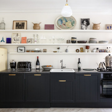
Les parquets ont été poncés, les murs repeints à coup de Farrow and Ball sur des tons verts et bleus. Le vert décliné en Ash Grey, qu’on retrouve dans la salle de bain aux allures de vestiaire de gymnase, la chambre parentale ou le Studio Green qui revêt la bibliothèque. Pour le bleu, on citera pour exemple le Black Blue de la cuisine ou encore le bleu de Nimes pour la chambre d’enfant.
Certaines cloisons ont été abattues comme celles qui enfermaient l’escalier. Ainsi cet escalier singulier semble être un élément à part entière de l’appartement, il peut recevoir toute la lumière et l’attention qu’il mérite !
Kitchen with No Island and Grey Floors Ideas and Designs
1