New This Week: 10 Delicious Dining Rooms
See how design professionals use color, pattern, furnishings and lighting to create stylish formal dining areas

We reported earlier this year that dining rooms with personality would be an emerging trend in 2020, and the following 10 stylish dining rooms are evidence that they are. But where should you begin when creating a cohesive design for your formal space? Interior designers often use one material or feature as a jumping-off point to design a room around. Here, 10 designers share what that jumping-off point was for these personality-packed dining spaces.
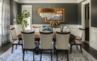
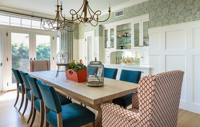
2. Terrific Table
Designers: Andrea Fripp and Paulina Cervantes of Dual Concept Design
Location: Glenview, Illinois
Size: 210 square feet (20 square meters); 14 by 15 feet
Homeowners’ request. A bright and inviting dining room that would complement the transitional finishes found in the rest of the home while incorporating some existing traditional furnishings, artwork and collectibles.
Main feature. “The jumping-off feature for this space was the antique dark wood dining table, which the homeowners wanted to incorporate into the design,” designer Paulina Cervantes says. “We paired it up with a set of sleek chairs that are a mix of upholstery and wooden accents, and anchored the furniture with a light-color rug with a navy design. A cool-tone color palette was incorporated into the space to give it that bright and airy look we were after, and a mix of reflective accents, as well as colorful artwork and accessories, was added to pull the space together.”
Other special features. Wainscoting painted white (White Dove by Benjamin Moore) with a geometric detail. Dark gray wall paint (Kendall Charcoal by Benjamin Moore). Matte brass chandelier with crystal prisms. Antique mirror and brass buffet.
Designer tip. “By incorporating a white wainscot with a geometric design, dark gray paint color on the wall above and a contemporary large brass light fixture, we were able to set a modern stage for the rest of the room,” says designer Andrea Fripp. “When you’re working with a traditional style of furniture but wanting to achieve a transitional look, it is important for the surroundings to look fresh.”
Four-door Rio dresser: John Richard
Shop for dining room tables
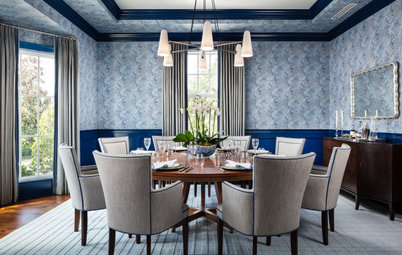
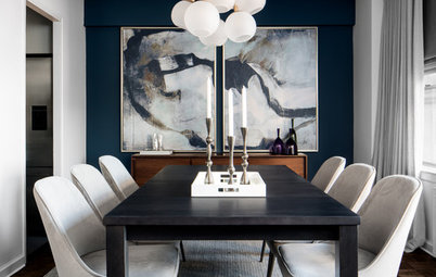
3. Bold Blue
Designers: Sara McCann and Jenna Conte Olin of McCann Design Group
Location: Palm Beach, Florida
Size: 260 square feet (24 square meters)
Homeowners’ request. “A visitor would see the dining room immediately upon walking into the blue-and-white striped foyer, so we wanted the dining room to have its own identity while keeping in theme with the rest of the house,” designer Jenna Conte Olin says.
Main feature. “Blue is a common thread throughout the home,” Conte Olin says. “Most of the home is very casual and light, but we took the dining room as an opportunity to do something a little different. The dark blue trim made this the most dramatic room in the house. Then we added a touch of formality through the patterned wallpaper.”
Other special features. Expandable round table.
Designer tip. “The two things that made this room a success are the use of color and the scale of lighting,” Conte Olin says. “Since the chandelier is light in visual weight, we went a little larger than usual, given the size of the dining table.”
“Uh-oh” moment. “We had to make sure the ceiling was the right color,” Conte Olin says. “A common issue with painting the trim a darker color is the disconnection with a white ceiling that shortly follows. We wanted to keep the ceiling light, so we painted it a soft gray in high gloss to soften the transition from trim to ceiling but also add a bit of drama.”
4. Outstanding Openness
Designers: William Philby and Aaron Taber of Retro Interiors
Location: Fort Lauderdale, Florida
Size: 280 square feet (26 square meters); 14 by 20 feet
Homeowners’ request. Create an overall interior that would complement the antebellum architecture of the home “without going too period-style,” designer William Philby says, “while also making it feel welcoming. We decided to add a few formal elements, like the chandelier, but kept the furniture items a little less formal in character. The subtle stripe and relaxed hand of the drapery fabric is a good example of adding elegance while keeping a relaxed flavor.”
Main feature. “The room was designed to be presented from its most prominent viewpoint from the main entry foyer,” Philby says. “The most significant design detail in this room is the openness to the flow of the rest of the home.” French doors on the right in this photo, between the curtains, open to a full-width covered porch. “We needed the sunlight and outdoor spaces to become part of the room to create an overall estate feel,” Philby says.
Other special features. A ceiling medallion adds architectural detail. “Blending the drapery color to the wall color helped create a softness around the bright light without intruding,” Philby says. “Matching the finish on the drapery rods to the wood floor and dining furniture draws the eye up and gives the room visual height.”
Designer tip. “We purposely chose a rug with an additional color to give it its own presence instead of coordinating it exactly to the colors of the room,” Philby says.
Chest: Theodore Alexander
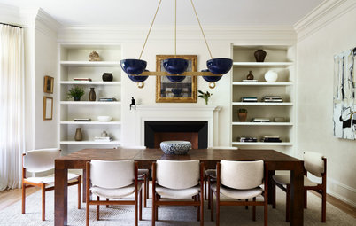
5. Beautiful Balance
Designer: Jared Sherman Epps of JSE Interior Design
Location: Huntington, New York
Size: 350 square feet (33 square meters)
Homeowners’ request. “The design vision for this dining room and the other spaces in the residence was Tudor meets modern industrial,” designer Jared Sherman Epps says. “The homeowner wanted to embrace the beautiful Tudor-style details but clean up the space visually by introducing crisp whites, industrial window glazing and modern furniture and lighting.”
Main feature. “The most significant design detail and direction was achieving the delicate balance between the traditional Tudor-style moldings and details and the modern black window glazing and fixtures,” Epps says. “By creating a clean canvas, we allowed the Tudor design elements to be appreciated without being overwhelming. Juxtaposing these elements with a layer of modern furnishings and fixtures took the residence into the 21st century.”
Other special features. “The custom live-edge and black resin table dining table is the star of the dining room,” Epps says. “It adds warmth while also combining timeless walnut wood with an accent of modern black resin. The dining chairs from Houzz were also a great feature for the client, as their last name begins with ‘H’ and the backs of the chairs have an ‘H’ on them, so they feel custom for the space.”
Designer tip. “I like to think of lighting and hardware as the jewelry of a space,” Epps says. “They shouldn’t overwhelm the space but instead add interest and sparkle. I think one mistake many people make is installing dining table chandeliers too high. I always recommend the lowest point of the chandelier to be no lower than 30 inches above the table and no higher than 36 inches.”
Astrid velvet chair in gray: Houzz
6. Wonder Wall
Designer: Nina Magon of Contour Interior Design
Location: Houston
Size: 168 square feet (16 square meters); 12 by 14 feet
Homeowners’ request. A modern-industrial lake house aesthetic with a little bit of ranch. “They wanted a place they could relax in after a long day and spend time together as a family. We came in at the architectural phase,” designer Nina Magon says. “The traditional house plan and flow of the spaces previously were not working for them, therefore we made many adjustments to the plan to create a more unique and modern design for the dining space. We changed the layout, lighting, wall surface, flooring and added a white sculpture on the wall to add drama.”
Main feature. “The stone feature wall adds that industrial-modern texture with the white feather wall sculpture from Phillips Collection — it just really adds a pop of drama that the clients were looking for,” Magon says.
Other special features. Platner-style dining chairs.
Designer tip. “Using unique lighting,” Magon says. “Lighting is always a chance to make people look up and say ‘wow.’”
“Uh-oh” moment. “A challenging moment was definitely the installation of the feathers on the stone wall,” Magon says. “It was not easy drilling into the stone, and the client was worried about damaging the stone, but the struggle and end result were well worth it, and the client could not be happier.”
Crown Plana Linea chandelier: Nemo Lighting
7. Radiant Red
Designer: Deborah French Designs
Location: New York City
Size: 288 square feet (27 square meters); 16 by 18 feet
Homeowners’ request. Having designed several houses for these clients, Deborah French, whose clients originally found her on Houzz many years ago, was given creative freedom for this dining room.
Main feature. Deep brick-red grasscloth wallcovering.
Other special features. Custom table. Midcentury dining chairs re-covered in salmon-colored velvet. Custom ceiling light fixture. Vintage Moroccan kilim. Antique Chinese buffet. Chinoiserie damask drapes. Custom antiqued mirror. Three-hundred-year-old Chinese black lacquer cabinet.
Paintings: Barbara Friedman
Paintings: Barbara Friedman
8. Right Light
Designer: Nikole Starr Interiors
Location: Cypress, Texas
Size: 224 square feet (21 square meters); 14 by 16 feet
Homeowners’ request. The owners were originally looking for just a new chandelier, but that led to an overall update of the dining room.
Main feature. The chandelier (Fantine by Currey & Co.) was the jumping-off point. “We loved the dramatic, unique sparkle it would add,” designer Nikole Starr says.
Other special features. White wainscoting with faux-metallic finish above.
“Uh-oh” moment. “I had a sculptural artificial arrangement custom-made for the corner of the room to surprise my client,” Starr says. “I thought it was fabulous. My client, not so much. Luckily my florist took the very style-specific artificial arrangement back and created the pompom tree arrangement you see in the space now. It is the polar opposite of the purple fantasy flower arrangement I tried placing in the corner of the room originally.”
“Uh-oh” moment. “I had a sculptural artificial arrangement custom-made for the corner of the room to surprise my client,” Starr says. “I thought it was fabulous. My client, not so much. Luckily my florist took the very style-specific artificial arrangement back and created the pompom tree arrangement you see in the space now. It is the polar opposite of the purple fantasy flower arrangement I tried placing in the corner of the room originally.”
9. Well-Done Wallpaper
Designer: Lisa Diaz of Nuela Designs
Location: Austin, Texas
Size: 136 square feet (13 square meters)
Homeowners’ request. For this new-build home, the owners wanted a bright, modern farmhouse look with a fun focal feature.
Main feature. Bold, high-contrast black-and-white checkered wallpaper above shiplap wainscoting. “I wanted to get the scale right between the wainscoting and the wallpaper, so I took the wainscoting higher than the typical wainscoting height,” designer Lisa Diaz says.
Other special features. Cage light fixture. Large rustic farm table.
Designer tip. “I think having a bold backdrop for the dining room allowed for the furnishings to be simple, to complement the room versus competing with it,” Diaz says.
“Uh-oh” moment. “The only question was really how bold to go with the wallpaper,” Diaz says. “It was narrowed down to three options, and we ended up going with the high-contrast one. I love the way it turned out.”
10. Smart Art
Designer: Ruthie Staalsen Interiors
Location: Grapevine, Texas
Size: 196 square feet (18 square meters)
Homeowners’ request. “The client had done a recent remodel to their home and had purchased some furniture, and also had some that was passed down from family that they really loved,” says designer Ruthie Staalsen, who used Houzz ideabooks with her client to learn their design style. “They hired us to finish out the space so it felt collected and timeless while keeping with their midcentury modern style.”
Main feature. “The existing artwork is what sets the tone for the colors in the room,” Staalsen says. “The client really wanted to keep the art, since they both loved it — and we know how hard it is for couples to agree on some of the big things in a space. We were happy to work with it, and selected items to complete the room that made it all feel cohesive, sophisticated and inviting.”
Other special features. “Art and pottery from India and around the globe — the clients are from India — set the tone in the space, blending well with the midcentury buffet and dining table that are family heirlooms,” Staalsen says. “A black-and-white area rug adds texture and a neutral background to the moss-colored velvet chairs.”
Designer tip. “Scale is so important in a space, and oftentimes that is where homeowners struggle the most,” Staalsen says. “We were able to use a heavy handmade lamp the client already had, but we raised the height by adding coffee table books underneath it, making it look more to scale on the lower buffet. We shopped their home for items that would create a personal reflection of their style. We gathered different-sized pottery pieces for the table and cut some branches from a tree in their backyard to add height. Anytime you can use a pottery collection or elements that are similar but different sizes, it can make an impact. The trick is to not overdo collections.”
More on Houzz
Key Measurements for Planning the Perfect Dining Room
Get dining room design ideas
Find home design and remodeling pros near you
Shop for kitchen and dining furniture

Sponsored
Reload the page to not see this specific ad anymore
Designer: Meghan Shadrick Interiors
Location: Lexington, Massachusetts
Size: 195 square feet (18 square meters); 13 by 15 feet
Homeowners’ request. “The dining room is right off the kitchen, and both spaces were in dire need of a cosmetic upgrade, as it had been 25-plus years since the last remodel,” says designer Meghan Shadrick, whose clients found her by searching for designers on Houzz. “The clients’ taste runs on the traditional side, but they acknowledged that it felt dowdy, dark and old. The one caveat was that I work with the existing antique dining set they acquired soon after marrying. They also embrace color and pattern, generally speaking. I wanted to add color where it would be impactful but also feel sophisticated.”
Main feature. “The jumping-off point would be the antique dining furniture, and the fact that the house was built during the Arts and Crafts era,” Shadrick says. “I wanted to pay homage to that but in a fresh and subtle way. We decided that jewel tones would work very nicely throughout the home, and the center window behind the dining table would be the first thing you see as you’re walking towards the dining area.”
Other special features. Hand-embroidered fabric curtains in raspberry, olive, saffron and teal colors. Reupholstered dining chairs with indoor-outdoor olive ticking stripe fabric backs and faux-leather seats. Saffron-colored vintage Persian rug.
Designer tip. “I would say the biggest impact in a space is to add contrast and color for visual interest,” Shadrick says. “The furniture is all dark brown, and the same color brown as well. We introduced some pops of color and cooler neutrals to counteract all that warmth in the wood. Painting the walls a very light color also contrasts against the dark furniture, which adds that visual interest.”
“Uh-oh” moment. “The homeowner was so used to bold colors on the walls — previously they were all shades of yellow — it was hard for them to adjust to nearly white walls,” Shadrick says. “It wasn’t until we added the draperies, art and accessories that they realized it was a great choice.”
Find an interior designer