Houzz Tour: Art and Light Play an Entertaining Role
A designer introduces a sense of fun into an apartment for New York art collectors who like to entertain

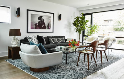
Solutions: Mikhael stole some room from the bedroom to make the wall here flush with the hallway. This creates a pleasing flow from the entry to the living room. He added three sliding panels that can hold the couple’s biggest art pieces and can open up the space to the bedroom when desired.
Lighting: “Floor space is valuable real estate, so I wanted to get the lighting off the floors as much as possible,” Mikhael says. He added a flat piece beneath the ceiling beam so he could place LED tape lights along it to uplight the ceiling. (You can see this better in the next photo.)
Flooring: Wide white oak planks also lighten up and update the look.
Flooring: Carlisle
This is the new opened-up view from the bedroom. “My clients preferred to sacrifice some square footage in their bedroom in order to have a bigger living room,” Mikhael says. “And they can open up this large sliding door to the living room when they want it to feel more open in the bedroom.”
So how do those doors function? You can see two tracks here. The doors with the paintings on them are on the track closest to the living room, while a plain door slides behind them. The three doors can be placed in different configurations to move the opening between the two rooms or create a solid wall.
To brighten the living room, Mikhael lit the bookshelves from the soffit overhead, and a giant mirror between them gives the illusion of more space.
Master bathroom after: The enlarged space is sleek and feels expansive thanks to a carefully edited color and materials palette, light recess in the ceiling, undercabinet lighting and clear glass shower walls, seen here. The long floating vanity, uplift mirrored medicine cabinets, hidden toilet tank and infinity drain enhance the minimalism.
Medicine cabinets: Robern; wall tile: Artistic Tile; floor tile: Mosa; faucets: Dornbracht; toilet: Duravit
Medicine cabinets: Robern; wall tile: Artistic Tile; floor tile: Mosa; faucets: Dornbracht; toilet: Duravit
Floor plan after: Mikhael straightened out the long hallway, which he also turned into a major design feature. He reconfigured the bathrooms, fitting a shower into the powder room by borrowing from a hall closet. He took space from the bedroom’s walk-through closet to expand the master bathroom. He made up for this loss of storage space with built-ins in the bedroom.
Hallway after: Mikhael was inspired to turn the window space into a major light source. He covered the window with wood, affixed lines of color-changing LED tape lights on it and placed plexiglass over it. Now the “window” can wash the hallway with all the colors of the rainbow and then some. “My clients really wanted their place to be fun, especially for parties,” he says. The hallway went from ho-hum to wow, bringing an element of surprise into the apartment.
The radiator cover also looks like an art piece now. “I’d been to house parties here, so I knew to turn surfaces into ledges for cocktails wherever I could,” Mikhael says. “It is composed of white horizontal strips of wood with black vertical pieces of wood behind it for structure.”
Here’s the hallway washed in green. Another LED light runs the length of a new soffit on the right. “It creates a visual line and illuminates the artwork when they don’t want the color,” Mikhael says.
Browse LED tape lighting
Color-changing LED lights: Truline, Pure Lighting
Browse LED tape lighting
Color-changing LED lights: Truline, Pure Lighting
Kitchen after: “I wanted to give it a sense of play, so I came up with this Tetris-like blocking pattern for the cabinets so that they become sculpture,” Mikhael says. All of the appliances but the range are paneled to keep the continuous look.
Black Corian counters, a black sink and a black faucet keep the color palette limited in the space, where more nifty LED lighting lets the owners switch up the color scheme as they wish. A white back-painted glass backsplash makes the most of the colorful glow.
Range: Viking; hood: Miele; refrigerator: Sub-Zero; dishwasher: Bosch; faucet: Vola
A sculptural light fixture draws the eye up. A favorite piece of art remains in the same place and serves as a quasi-window. As you can see here, the LEDs can be coordinated to match the deep blue sky in the artwork.
Before, there were no cabinets at this far end of the kitchen, and the new storage space now helps keep counter clutter to a minimum. The extended countertop serves as a bar during parties.
Light fixture: Stix, Sonneman
Before, there were no cabinets at this far end of the kitchen, and the new storage space now helps keep counter clutter to a minimum. The extended countertop serves as a bar during parties.
Light fixture: Stix, Sonneman
Here you can get a peek of that special hallway window installation, which draws visitors in that direction. But Mikhael notes that guests also tend to gather in the kitchen during a party, so he kept that in mind when designing it.
Check out more black kitchen faucets
Check out more black kitchen faucets
Powder room after: By reconfiguring the space and taking over a hall closet, Mikhael was able to fit in a shower stall.
Tile: Mosa
Tile: Mosa
Mikhael created a custom angled vanity from walnut and a Corian waterfall countertop with an integrated Corian sink. “The angle takes the energy off the hallway door and points it inward,” he says. He also moved the thin, narrow light fixture’s mounting hardware from the center to the left to continue the off-kilter play.
Vanity light: Stix, Sonneman
Takeaways
Browse more homes by style: Apartments | Barn Homes | Colorful Homes | Contemporary Homes | Eclectic Homes | Farmhouses | Floating Homes | Guesthouses | Homes Around the World | Lofts | Midcentury Homes | Modern Homes | Ranch Homes | Small Homes | Townhouses | Traditional Homes | Transitional Homes | Vacation Homes
Vanity light: Stix, Sonneman
Takeaways
- Sliding doors can replace a solid wall, making it easy to open up or close off rooms.
- A useless window can be transformed into a creative light source.
- Lights in the ceiling and under cabinets and shelves can be used creatively if you don’t have a lot of room for table and floor lamps.
- An integrated sink can provide a minimalist feel.
- LED lighting that changes color can switch up the personality and mood of a space.
Browse more homes by style: Apartments | Barn Homes | Colorful Homes | Contemporary Homes | Eclectic Homes | Farmhouses | Floating Homes | Guesthouses | Homes Around the World | Lofts | Midcentury Homes | Modern Homes | Ranch Homes | Small Homes | Townhouses | Traditional Homes | Transitional Homes | Vacation Homes


Sponsored
Reload the page to not see this specific ad anymore
Sponsored
Reload the page to not see this specific ad anymore
House at a Glance
Who lives here: An art-collecting couple who love to entertain
Location: New York City
Size: 920 square feet (85.5 square meters); one bedroom, two bathrooms
Designer: Andrew Mikhael
Backstory: The couple had lived in the building for years and admired the work that architect Andrew Mikhael had done on a neighbor’s apartment upstairs. They wanted larger bathrooms, good spots to showcase their beloved art collection and a greater sense of fun in the apartment. “Because I’d worked on an apartment three floors up on the same line as this one, I knew what could be done here,” Mikhael says.
The problems: Mikhael describes the previous finishes in the apartment as “rental bland.” The lighting didn’t highlight the art and the bathrooms were cramped. The homeowners wanted a space that had a better flow and was more suitable to entertaining their friends.