Houzz Tours

House Tours

Houzz Tour: A Sensitive Renovation Connects a Home to Nature
Materials, colours and patterns subtly reflect the foliage around this house, which was reworked to create a family home

You might not picture a semi-detached house in south-east London as a leafy haven, but this period home in Beckenham has almost a country feel, surrounded as it is by trees and greenery. So when the new owners decided to renovate, they wanted to reflect that mood in the decor.
They asked James Hood of MODEL Projects to rethink the whole property while respecting the era of the house and linking the inside to the garden. He added an architecturally sensitive rear extension and an unobtrusive loft conversion, and reconfigured the ground floor layout. The result is a home in which light and space flow beautifully and where there are reminders of the surrounding nature in every room.
They asked James Hood of MODEL Projects to rethink the whole property while respecting the era of the house and linking the inside to the garden. He added an architecturally sensitive rear extension and an unobtrusive loft conversion, and reconfigured the ground floor layout. The result is a home in which light and space flow beautifully and where there are reminders of the surrounding nature in every room.
“Previously, there was a small conservatory structure that was typically hot in summer and cold in winter,” James says. “It hadn’t fully been opened up to the rear, so it was more of a bolt-on.”
Find and hire architects and building designers in your area on Houzz.
Find and hire architects and building designers in your area on Houzz.
As the house is quite wide, the team built a staggered extension. “Because it’s such a wide semi-detached, we didn’t want it to be just some lump bolted on the back,” James says.
“Also, the previous extension had a sloping roof, but we wanted to maintain the height, so where it’s attached to the other semi, we went no further than the original conservatory, which already had a party wall agreement,” he says. “We could push it out slightly further on the other side, as there’s an alleyway between the properties, so the impact would be less.”
The extension has two-tone brickwork. “The house had the two tones anyway – the London stock brick and the grey slate roof, so we took that theme through to the choice of brickwork, then the dormers were matched to the roof colour,” James says.
As the home is in a conservation area, the team couldn’t add more volume to the loft, so instead of one big dormer across the back, it has two elegant zinc-clad ones that are proportionally similar to the windows below.
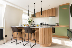
The new extension houses an airy kitchen-diner – and it’s already clear how the home’s design reflects the leafy surroundings. Deep green cabinets and oak parquet flooring echo the trees, while a verdant floral wallpaper brings in the greens, pinks and blues that run throughout the house.
New Meadow wallpaper, Lucy Tiffney. Flooring, Havwoods.
New Meadow wallpaper, Lucy Tiffney. Flooring, Havwoods.
The staggered back of the extension has helped to define the kitchen space and allowed for a corner window on the sink run (see previous photo).
The deep green Shaker-style units with brass handles, along with the butler’s sink, wood and brass shelving, and range cooker, fit in with the modern-rustic mood. “There’s nothing ultra-modern about this extension,” James says. “It’s all slightly traditional, more suitable to the age of the house, but still light and airy.”
James has neatly recessed blinds above the windows so they’re out of sight during the day.
Due to the unusual shape of the kitchen, James and the owners went for a butcher’s block rather than an island.
“The kitchen is quite long, [with plenty of storage and worktop space], and the area for the island is at the narrowest point,” he explains. “Also, the owners can move a butcher’s block to the side if they’re going to have a party.”
James didn’t need to fit laundry appliances into this space, as he carved out a small utility room at the end of the run on the right.
Kitchen; butcher’s block with copper worktop, all DeVOL.
Despite its compact size, James fitted plenty of storage into the utility room. Oak flooring and green joinery continue the nature theme.
“The room is slightly starved of light, so we’ve gone for a paler green [than in the kitchen] and fitted the doors with reeded glass to help bring in light,” he says.
Cabinets, DIY Kitchens.
“The room is slightly starved of light, so we’ve gone for a paler green [than in the kitchen] and fitted the doors with reeded glass to help bring in light,” he says.
Cabinets, DIY Kitchens.
The butcher’s block has an overhanging copper top, which creates a nice little place to perch. It’s painted in the same pale green as the utility room units, so it sits lightly in the space.
With plenty of base cabinets, there was no need for wall units, so James fitted wooden shelves with brass rails either side of the chimney breast where the owners can display crockery and glassware.
The worktop, upstand and spashback behind the hob are all marble-effect quartz for a rustic feel but in a robust material.
Brass hanging rail, DeVOL.
The worktop, upstand and spashback behind the hob are all marble-effect quartz for a rustic feel but in a robust material.
Brass hanging rail, DeVOL.
Originally, the back of the house wasn’t opened up fully to the conservatory, so the middle room was quite dark.
James has created a wide opening between the middle room and the kitchen that retains the sense of a separate room while improving light, flow and views.
“In some projects, you would have completely absorbed this middle room into the open-plan space at the back,” he says. “In this case, we semi-absorbed it – it feels part of the open room, but it’s more of a snug, family space. We didn’t want the back room to feel so big that you sort of got lost in it.”
A slight level change helps to separate the two rooms, as well as not being able to see everything at once. “You don’t see the kitchen when you come in, then you get the surprise of the rich green cabinets as you turn the corner,” James says.
This is now the route through to the kitchen from the hallway.
There was previously no sense of connection from the hallway.
Moving the doorway in the middle room to the left, so it aligns with the front door, gives a view straight through the house.
The original staircase has been refreshed. The deep green on the front door and stair runner chimes with the kitchen units and is a thread that runs right through the house.
The original staircase has been refreshed. The deep green on the front door and stair runner chimes with the kitchen units and is a thread that runs right through the house.
The layout before works. Notice the isolated middle room.
In this ‘after’ floor plan, you can see how widening the opening into the middle room has made it much more a part of the kitchen-diner, and moving the door that connects with the hallway has created a link to the garden right from the front door.
You can also see how, having pushed the extension out into the garden on the left of the kitchen, James could afford to steal a small space to create a utility room to the right. This has made the kitchen-diner less of an awkward L shape, too.
You can also see how, having pushed the extension out into the garden on the left of the kitchen, James could afford to steal a small space to create a utility room to the right. This has made the kitchen-diner less of an awkward L shape, too.
The original features in the living room were restored and the walls painted in a deep green. “The rich green walls mean the detailing on the cornicing is brought forwards,” James says.
The owners have further enhanced the link to the trees at the front of the house with a green velvet sofa, curtains with a foliage motif, and a pendant light in a laser-cut winter trees design.
The wood-burning stove was already in place, but the team re-tiled the hearth.
The owners have further enhanced the link to the trees at the front of the house with a green velvet sofa, curtains with a foliage motif, and a pendant light in a laser-cut winter trees design.
The wood-burning stove was already in place, but the team re-tiled the hearth.
The blues, pinks and greens that run through the house are at their boldest in the cloakroom, with the floral wallpaper bringing all the colours together. “The room has a Soho House vibe to it,” James says.
Basin in Confetti Pink, Burlington. Borastapeter Rabarber wallpaper, Beut.
Basin in Confetti Pink, Burlington. Borastapeter Rabarber wallpaper, Beut.
The loft was previously more of a storage space, with a couple of roof windows and stair ladder for access.
James was restricted to small dormers in the loft, but luckily the ridge line is quite high. The key to making the little dormers work is having the large roof window between them. It’s barely noticeable from the outside, but makes a huge difference in the room, giving an airy view from the bed.
James has cleverly built plenty of storage into the eaves on both sides of the room.
Walls and woodwork painted in Cromarty, Farrow & Ball.
James has cleverly built plenty of storage into the eaves on both sides of the room.
Walls and woodwork painted in Cromarty, Farrow & Ball.
Fitting roof windows to the front, too, means the front and back can be opened for cross ventilation.
The unusual shape of the bathroom was dictated by the position of the dormer, which is aligned with the window on the floor below.
“We had to decide, does that dormer sit in the bedroom, which would make the en suite very narrow, or do we put it in the bathroom, which makes the room quite wide, so then we’re restricted on where the bed would go,” James explains. “In the end, we went for a kink in the wall, so it opens up where the bath is then kinks back to allow the bed to sit in the main room.”
The curved end of the bath, which again brings in that rich, dark green, makes it easier to manoeuvre around it without banging shins.
Bath, Waters Baths of Ashbourne.
The curved end of the bath, which again brings in that rich, dark green, makes it easier to manoeuvre around it without banging shins.
Bath, Waters Baths of Ashbourne.
The shower was fitted into the snugger space at the back of the room.
Pink vanity unit, Parker Howley & Co. Basin, Lusso Stone. Medina Hexagon Porcelain Rosa floor tiles; scalloped wall tiles, all Ca’ Pietra. Ice Blue Zellige tiles, Otto Tiles & Design.
Pink vanity unit, Parker Howley & Co. Basin, Lusso Stone. Medina Hexagon Porcelain Rosa floor tiles; scalloped wall tiles, all Ca’ Pietra. Ice Blue Zellige tiles, Otto Tiles & Design.
On the floor below, there are three bedrooms and a bathroom. This is the guest room – note the foliage motifs on the bedding and wood lamp shade.
All the rotten windows in the house were replaced with double-glazed sashes.
All the rotten windows in the house were replaced with double-glazed sashes.
In the boy’s room, the orangey-red fireplace and skirting boards make a bold feature, but the walls are all quite plain to make that work; even the wallpaper – a leafy motif again – is a single simple pattern.
Fireplace and skirting boards painted in Charlotte’s Locks, Farrow & Ball. Go Your Own Way wallpaper in Oxford Blue, Lust Home.
Fireplace and skirting boards painted in Charlotte’s Locks, Farrow & Ball. Go Your Own Way wallpaper in Oxford Blue, Lust Home.
The team built plenty of fitted storage into the girl’s room to make the most of the alcoves. Notice how the colour of the wardrobe is followed through along the skirting boards. The wall opposite is filled with a pretty floral wallpaper, helping to create a link with the leafy view.
Sophie’s Garden wallpaper, Milton & King. Woodwork painted in Pall Mall, Little Greene.
Sophie’s Garden wallpaper, Milton & King. Woodwork painted in Pall Mall, Little Greene.
The family bathroom is fresh and fun, with lily-pad-motif tiles subtly bringing in the nature theme.
Yellow tiles, Ca’ Pietra.
Yellow tiles, Ca’ Pietra.
The team laid the patio using brick pavers and porcelain tiles. Pots and beds bring greenery right up to the property.
The house is now a lovely family space, where rooms flow together and feel light while retaining their character. And the owners couldn’t be happier, as they commented on Houzz, “We are delighted with our refurbished home and the role Model [Projects] played in delivering that.”
Burlington Ivory outdoor tiles, CTD Tiles. Brick pavers, Chelmer Valley.
Tell us…
What do you think of the space-planning and vision in this home? Share your thoughts in the Comments.
Who lives here? A couple with two children
Location Beckenham, south-east London
Property A late Victorian semi-detached house
Size Five bedrooms and two bathrooms
Project year 2021
Designer James Hood of MODEL Projects
Photos by Chris Snook
The brief was to turn the house into a proper family home while being sensitive to the era. “They wanted to keep the original features where possible, then add a cosy feel,” James says.
The whole house refurbished, with key elements such as the heating being upgraded.