Houzz Tours
Houzz Tour: A Double-fronted Semi Gets Divided into Two
A tired and tatty three-bedroom period house is transformed into two new homes – both still with three bedrooms

This semi-detached London house had little to recommend it when Tim O’Callaghan of Nimtim Architects first saw it. “It was a mess with dropped ceilings and leaks,” he says. “It had to be gutted and started from scratch – all that was kept were the external walls at the front and side.” But perhaps an even more dramatic a change is that this one double-fronted home has now been divided into two individual houses; one half for the owner and their family to live in, while the other half is rented out.
Unlike other homes in the street the house hadn’t been improved at the back, so it offered plenty of potential. It presented an interesting challenge, though. “It’s wonky,” says O’Callaghan. “The whole house is six degrees from square!”
Unlike other homes in the street the house hadn’t been improved at the back, so it offered plenty of potential. It presented an interesting challenge, though. “It’s wonky,” says O’Callaghan. “The whole house is six degrees from square!”
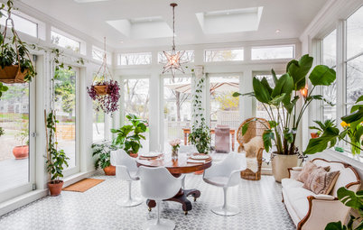
The ground floor of both properties is open plan. But the layout demanded a clever strategy to meet the requirements of the building regulations regarding fire safety. Fitting a sprinkler system allowed the staircase to be flipped and the rooms opened for a more generous ground floor layout than would have been possible without this significant change.
The white oiled oak floorboards on the ground floor are placed at an angle and resemble giant parquet. “We realised that if you laid the flooring square it would highlight the wonkiness of house,” says O’Callaghan. The floor tricks the eye into overlooking this quirk, and also inspired the chevron motif of the kitchen and bathroom tiling.
The white oiled oak floorboards on the ground floor are placed at an angle and resemble giant parquet. “We realised that if you laid the flooring square it would highlight the wonkiness of house,” says O’Callaghan. The floor tricks the eye into overlooking this quirk, and also inspired the chevron motif of the kitchen and bathroom tiling.
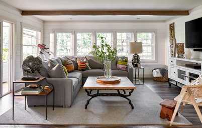
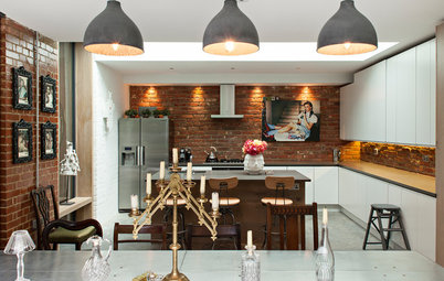
“The overall palette of materials for the house is monochromatic but with splashes of colour,” says O’Callaghan. The colours help the spaces to feel much bigger than they are. Standard unit carcasses were used in the kitchen while the doors are robust plywood with a translucent coating that leaves the grain visible. The owners designed the table and bench, which have birch ply tops and turned ash legs.
Browse lighting in the Houzz Shop
Walls painted in Strong White, Farrow & Ball. Carcasses, Howdens. KoskiDecor eco doors, Koskisken. Funk ceiling suspension lights, Nordlux
Browse lighting in the Houzz Shop
Walls painted in Strong White, Farrow & Ball. Carcasses, Howdens. KoskiDecor eco doors, Koskisken. Funk ceiling suspension lights, Nordlux
The owners designed the kilner jar storage shelves and brackets. Most of the unit doors in the kitchen have push-catch openings to stop the small space from becoming too busy.
See more ideas for kitchen wall tiles
See more ideas for kitchen wall tiles
Storage was built under the staircase to house the washing machine, dryer and cleaning equipment – keeping noisy appliances and household essentials out of the kitchen.
The owners designed and made the wall unit in the living room, which continues the house’s palette of colours. Contemporary column radiators take up less wall space and have a more pleasing appearance than standard designs.
Classic vertical column radiator, Stelrad
Classic vertical column radiator, Stelrad
Shutters were used throughout the house, including the café-style versions that keep the living room private but light filled.
Lab Ceiling pendant light, Made.com. Sofa, John Lewis. Vintage coffee table, G Plan
Lab Ceiling pendant light, Made.com. Sofa, John Lewis. Vintage coffee table, G Plan
The living room shelving is part of a single structure located between the front and the back of the house on the ground floor, and is made from plywood. The pod-like design forms the kitchen on the other side and there’s a WC within it. Using a single structure frees up the remainder of the ground floor for a spacious-feeling, open layout.
Armchair and side table, Habitat
Armchair and side table, Habitat
The chevron pattern suggested by the wood flooring is repeated in the tiling in the downstairs toilet.
WC and basin, Roca at Potter Perrin
WC and basin, Roca at Potter Perrin
The new front door to this ‘half-house’, painted dark grey, can be seen on the left. “The banister was one part of the house where we could have a splash of colour,” says O’Callaghan of the new staircase, which was moved to create more space. “It was the clients’ idea to use yellow and the colour goes all the way through the house to tie it together.” The stair gate was made by the homeowners.
Banister painted in Babouche, Farrow & Ball. Stair gate painted in Pure Orange RAL 2004
Banister painted in Babouche, Farrow & Ball. Stair gate painted in Pure Orange RAL 2004
The handrail was made bespoke in oak. “Things you touch should give a sense of quality, and that something’s been thought out,” says O’Callaghan.
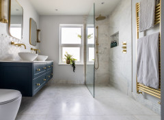
The bathroom is on the first floor at the back of the house, and repeats the chevron tile design of the downstairs WC but with a fresh accent shade. “It gives the bathroom a lift but isn’t too overwhelming,” the designer explains.
The architects included a slot window in the bathroom design. “The idea was to have a good view out of the back but provide privacy,” explains O’Callaghan. The bathroom flooring picks up the colour accent from the tiling.
Marmoleum flooring, Forbo. Suite, Potter Perrin
Marmoleum flooring, Forbo. Suite, Potter Perrin
Plywood above the concealed cistern in the bathroom creates further continuity of materials, while a mirrored cabinet boosts the light, yet keeps the overall scheme as simple as possible.
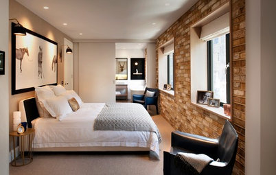
On the first floor, this child’s bedroom features pale grey walls. “They offset the white of the woodwork to keep things simple,” says O’Callaghan.
Bed, chair and rug, Ikea. Chest of drawers, Marks & Spencer
Bed, chair and rug, Ikea. Chest of drawers, Marks & Spencer
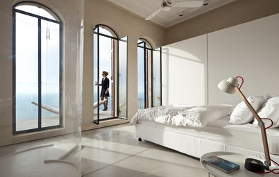
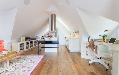
The master bedroom is in the loft extension. “We adjusted the internal floor levels when the house was gutted,” explains O’Callaghan. “The ground floor had a high ceiling, which was moved down, as was the first floor ceiling, to give more height in the master bedroom and to make the landing feel a bit more generous.” The staircase uses the dormer window area and storage was built into the eaves of the bedroom.
Check out creative ways to use loft space
Check out creative ways to use loft space
Both houses as seen from the back. The garden was divided to give both properties outside space with the owners’ home having the larger area.
Sliding doors lead from the house to the terrace. “The decking was laid at an angle to continue the pattern from inside the house,” says O’Callaghan.
What’s your favourite design detail in this family home? Share your thoughts in the Comments below.
What’s your favourite design detail in this family home? Share your thoughts in the Comments below.


Sponsored
Reload the page to not see this specific ad anymore
Who lives here A family of four in one half, the other is rented out
Property 2 homes of 3 bedrooms and 1 bathroom
Location South-east London
Architects Nimtim
Photos by Elyse Kennedy
The property wasn’t new to the current occupants; one of the clients had originally lived in it as a student, and later moved back with her husband and newborn child.
The idea of turning the house into two was prompted by both its layout and the style of the nearby properties. “The other houses along the street were terraced, and it was part of a semi-detached pair that’s double fronted,” explains O’Callaghan.
The original house had three bedrooms, but by adding a two-storey rear extension and a loft extension to it and entirely reconfiguring the internal space, two three-bedroomed terraced homes were planned instead.
However, the project wasn’t immediately smooth sailing: the local authority was against the idea of splitting the house and getting the go-ahead came in two different stages.
“We got approval for the ground floor, first floor and loft extension as permitted development of a single house, then made a sub application to split it into two,” explains O’Callaghan. “It was initially refused but agreed on appeal.” The two resulting homes are almost mirror images, but not quite – because of the skew of the building. They share a front door and lobby with separate inner doors leading to each.