Houzz Tours

House Tours

Houzz Tour: A Clever Restoration Rescues a Georgian House
Updated period features and inventive ways to circulate light have brought this neglected building back to life

Renovating a fine Georgian house so it’s fit for modern life without erasing the past is a tricky balance at the best of times, but Mark Barratt of CATO Creative architects had to combine that challenge with restoring the fabric of a damp, neglected building.
As with a large percentage of CATO’s projects, the homeowners had come to him via Houzz. Browsing photos on the company’s Houzz profile, the couple had spotted just what they were looking for. “They really liked our use of structural glazing and light,” Mark says.
Two years and a couple of lockdowns later, the resulting family home is a triumph, with oak parquet flooring, decorative iron banisters and crisp mouldings beautifully reintroduced in an understated way, daylight flowing freely through the house, and modern luxuries, such as an extensive sound system, woven subtly into the elegant design.
To see more great projects where the homeowner found their professional via Houzz, take a look at our Born on Houzz series.
The hallway before work began.
The roof windows and internal glazing throughout have massively boosted the light, particularly in the hallway. “The arrival into the house is transformed by the glazed arches; the long corridor would be dark otherwise,” Mark says. “In a terrace house, where light is limited, especially in the belly of the building, if you have ways of moving the light into it, it alters the way it feels.”
As well as boosting the light, the internal glazing aids a sense of connection. “We often use glazing to create separate spaces that still have an open-plan feel, which these owners really liked,” Mark says.
The floor tiles in the hallway are a good illustration of nodding to the past while keeping the look modern. “These tiles are used widely to create the classic checkerboard pattern,” Mark says. “We’ve designed a more contemporary look using that traditional material.”
Under the stairs, there’s lots of storage for “small child paraphernalia”, plus a cloakroom at the far end. The panelling beside the oak staircase was created by the team using simple wooden beading.
Floor tiles, Winckelmans at Old English Tiles.
The house was overgrown and unsafe when the team came to assess it.
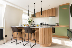
The rear of the house was extended on the lower and upper ground floor levels; the kitchen is in the upper ground addition. Rather than glazing right across the back, Mark has fitted in-keeping, Georgian-style windows and doors and boosted the daylight with a large roof window.
The little table is the perfect spot for a quick breakfast, but there’s room for the family to have a larger table here if they prefer.
The little table is the perfect spot for a quick breakfast, but there’s room for the family to have a larger table here if they prefer.
There’s a utility room on the lower ground floor, so Mark didn’t have to fit a washing machine in here, but he’s included plenty of storage behind unfussy bespoke units in a calm putty shade.
“We work with small, local cabinet-makers,” he says. “We’ve established relationships, so we get a good product and service from them.”
The worktops and splashback are marble-effect Silestone. This photo was taken before the tap and handles were fitted.
Kitchen doors, Concept Linea; painted in Slate III, Paint & Paper Library.
More: How to Choose a Cabinet-maker
With the tap and handles in place, it’s clear how nicely the touches of black in these and other fittings work with the neutral scheme, helping to add definition without being shouty. Oak chevron flooring brings in warmth.
The team fitted a pocket door between the kitchen and hallway. “We needed a door for Building Regulations,” Mark says, “but we wanted the height and didn’t think a 3.2m hinged one would look right or have space to open properly, and the view when you come in through to the back is so incredible, we wanted to keep that clear.”
Induction hob with downdraft extractor, Siemens. Engineered oak flooring, Oak Artisans.
Rather than have the staircase to the lower ground floor stacked under the one to the first floor, Mark moved it into the extension at the back of the house. “It means we could have a skylight above the stairs, which makes the family room below feel lighter and bigger,” he says.
The back of the lower ground floor before works.
The informal family room in the lower ground floor extension connects with both the garden and the kitchen above. “This is a relaxed TV room,” Mark says. There’s also a guest en suite down here.
The team fitted underfloor heating on this floor, the upper ground floor and the first floor, with radiators on the top two floors.
Sofa, Camerich.
The team fitted underfloor heating on this floor, the upper ground floor and the first floor, with radiators on the top two floors.
Sofa, Camerich.
With the wall between the living room and kitchen removed, the whole space is flooded with light.
A screen creates a broken-plan space without blocking the long view. It contains a mix of plain and reeded panes. “We wanted it mainly transparent, so you have that view, but also to have a bit of interesting detail,” Mark says.
A screen creates a broken-plan space without blocking the long view. It contains a mix of plain and reeded panes. “We wanted it mainly transparent, so you have that view, but also to have a bit of interesting detail,” Mark says.
The living room on this floor is more of a formal space. As in most of the other rooms, the walls are a soothing off-white. There’s a music system integrated in the lower and upper ground floors and the master suite.
Sofas and chairs, Camerich.
Sofas and chairs, Camerich.
The glazed arches help light to circulate between all the spaces and make the relatively narrow living room feel bigger. One is a door and the other two are fixed panes in a shape that echoes the banister beyond.
The frames are timber rather than metal. “It’s lighter and easier to work with, plus we didn’t want to end up with too much metal in the space,” Mark says.
The frames are timber rather than metal. “It’s lighter and easier to work with, plus we didn’t want to end up with too much metal in the space,” Mark says.
On the first floor there’s a master suite – a bedroom, bathroom and dressing room – accessed via a neat sliding door.
Sliding door painted in Mole’s Breath, Farrow & Ball.
Sliding door painted in Mole’s Breath, Farrow & Ball.
The oak flooring, off-white panelled walls and ornate coving seen downstairs continue in here for a calm mood.
Bed, Camerich.
Bed, Camerich.
Mark created a dressing area at the front of the house. “Outside that window is the road, so we’ve moved everyone away so it’s quieter,” he says. “For privacy, the window is half reeded glass [a material that crops up throughout the home], but because you can see out at the top, it doesn’t feel too enclosed.”
He fitted triple glazing, but within a traditional sash frame. “When updating, you can end up with something so modern, it doesn’t really translate back to the original building,” he says. “It’s a beautiful building, but if the cornicing, panelling and sash windows weren’t there, it could be quite boring.”
The wardrobes fit in seamlessly. “We don’t take wardrobes up to ceiling level, as they can feel quite overpowering, but we’ve fitted bulkheads over the top,” Mark says.
Wardrobes painted in Mr Clifton, Coat Paints.
On the other side of the bedroom there’s an en suite bathroom.
The walls in the en suite are tadelakt. “We wanted it to feel quite luxurious and spa-like, but also very calm,” Mark says.
More: 19 Bathrooms Where Tadelakt Has Been Used Beautifully
More: 19 Bathrooms Where Tadelakt Has Been Used Beautifully
Behind the screen there’s a walk-in shower. “The window isn’t overlooked – it’s very private,” Mark says.
The large-format porcelain floor tiles in the bath area change to a herringbone pattern in the shower. “It delineates the two spaces and also links back to the traditional,” he says.
Sanitaryware, Lusso.
The large-format porcelain floor tiles in the bath area change to a herringbone pattern in the shower. “It delineates the two spaces and also links back to the traditional,” he says.
Sanitaryware, Lusso.
There’s a home office at the front of the house on this floor. “Originally, the idea was to connect it to the dressing room, so you could get access all round,” Mark says, “but because we were working on the design during the Covid period, we just thought, do you really want to be able to access the study from your bedroom, or do you want that feeling of being in a different space? I think people had had enough of working in their bedrooms.”
The first floor banister is a simple metal one, changing to white wood up to the second, children’s floor. “The original plan was to keep the same banister [as in the hallway] running all the way up, but it proved to be very expensive, so we changed it,” Mark says.
The white timber design, which runs right up to the loft, echoes the screen in the kitchen. “We wanted something a bit more playful,” he says.
The children’s bathroom has a shower over the bath as well as a standalone shower, plus double basins, so two of them could use the room at the same time.
Sanitaryware, Crosswater.
Sanitaryware, Crosswater.
The turquoise tiles add a touch of playful colour, with the half and full tile layout bringing in pattern.
Turquoise tiles, Domus.
Turquoise tiles, Domus.
There are two guest rooms in the mansard loft conversion.
The loft also has a bathroom.
The owners are over the moon with the finished house. “It was an exciting project and the clients were great, as they were very much open to pushing the design,” Mark says. It’s clear their willingness to trust him has very much paid off.
Tell us…
What do you like about this updated home? Share your thoughts in the Comments – and let us know if you’ve contacted a pro after seeing their previous projects on Houzz.

Sponsored
Reload the page to not see this specific ad anymore
Sponsored
Reload the page to not see this specific ad anymore
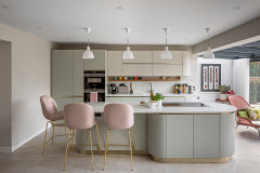
Who lives here? A family of five
Location Kensington, west London
Property A Georgian terrace with four floors plus a loft conversion
Size Seven bedrooms and five bathrooms
Designer Mark Barratt of CATO Creative
Builders Progressive Design
Project year The whole process took from June 2020 to May 2022, with breaks for lockdown
Photos by Chris Snook
Mark’s brief was to boost light and bring the building up to date while respecting its heritage. “The house was gloomy,” he recalls, “and because they were extending at the back, that can take away light from the middle of the house.”
It didn’t help that it had been sitting empty for two or three years. “There were three issues with it,” Mark says. “It hadn’t been looked after for about 30 years and was in a state of decay; damp had set in, and a developer had done a bit of work [at some stage], but it was unsafe, with steels that weren’t level. However, it was an amazing building and the proportions were unreal.”
At the entrance, the team fitted glazed steel doors to create a vestibule without blocking light. “The Georgian style tended to have lots of panes, so this is a modern twist on what you might have found originally. The metal profile is a lot slimmer than timber, so it feels light,” Mark says.
On the right of the vestibule as you walk in, there’s roomy storage for outerwear.
The team drew lots of references from traditional elements, the banisters being a case in point. “There’s a profile that was used in a lot of Georgian properties in west London that had this look to it,” Mark says. “We just took the core element to create something representative of what would have been there, but more modern.”
Watch now: Step inside this updated London home on Houzz TV