Eye-Catching Islands: 8 That Bring the Zing With Orange
Whether soft and warm or bold and hot, orange sizzles in the kitchen

Halloween may have come and gone, but for fans of orange, or of fall-inspired hues, it’s a dynamic color choice for a kitchen island. Orange is no wallflower shade. In its purest form, it’s an energetic color that tends to clamor for immediate attention. I say, harness this power by using it to clad a centerpiece island in your kitchen.
1. A bold red-orange is the perfect complement to a contemporary, clean-lined kitchen. Rooms with minimal visual clutter can handle this high-octane hue. In fact, I would argue that such streamlined spaces often work best when the color palette is pumped up.
2. White continues its reign as a popular kitchen color, but detractors struggle with how cold and sterile it can feel. A great way to balance out any chilliness is to introduce warm colors or materials. This vibrant orange island adds oomph while remaining grounded by the cooler, neutral flooring. This is a smart scheme in a space with minimal natural light because the broad expanses of white keep it light and open-feeling, and the splashes of orange add warmth and vibrancy.
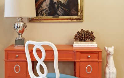
3. Looking for a subtler dash of color? With a waterfall countertop edge like this, you can offer just a peek of color on the plane of cabinetry underneath. This particular shade of orange has a bit more brown and white in it than the previous examples, which further dials down the intensity.
4. Another way to reduce the intensity of an amped-up orange island is to forgo cabinet doors or drawers altogether and go for open shelving instead. Not only does it break up the plane of color, but it also allows for easier access to your cooking tools. You can add baskets or bins that tie in with your kitchen’s decor.
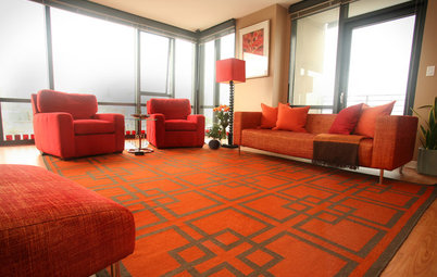
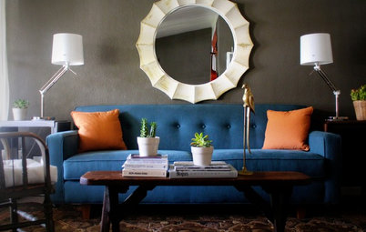
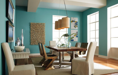
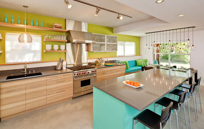
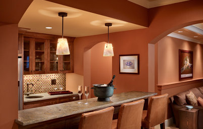
5. Create a happy, high-energy palette by combining orange with its complement, blue. These two colors offer the most contrast to each other, so if one of the hues is super bold, such as this orange, try pairing it with a softer, lighter blue, as used on the backsplash and far wall.
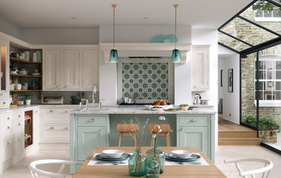
6. Bold oranges tend to feel most at home in modern and contemporary kitchens. Those who favor more traditional design styles can still get their orange fix by going for a neutralized orange, one that has brown or gray undertones. This gorgeous kitchen has many treats for the eye, but the handsome, deep orange island really takes center stage.
Island paint: Red Barn 7591, Sherwin-Williams
Island paint: Red Barn 7591, Sherwin-Williams
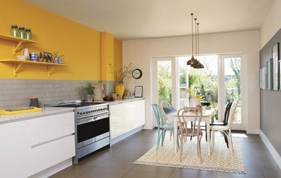
7. If you go for a bold orange island, think about tying in the color with small accents throughout the kitchen. This helps move the eye around the space. And by using the striking hue in the back wall of open shelves or niches, you create a wonderful area for display.
8. I love the mix of materials, textures, sheens and colors in this modern kitchen. It can be a real challenge to balance so many elements, but this is an example of a successful marriage of warm and cool, hard and soft, dark and light. If all the cabinets were clad in the bright orange hue, it might be a bit much, but the bamboo picks up on the orange in a subtler way.
Tell us: What do you think of orange-clad islands?
More
Eye-Catching Islands: 8 That Are Elegant in Black
Eye-Catching Islands: 10 Beauties in Blue
Kitchen Confidential: A Guide to 6 Island Styles
Tell us: What do you think of orange-clad islands?
More
Eye-Catching Islands: 8 That Are Elegant in Black
Eye-Catching Islands: 10 Beauties in Blue
Kitchen Confidential: A Guide to 6 Island Styles


Sponsored
Reload the page to not see this specific ad anymore