8 Neutral Rooms That Sneak In Color Interest
Kick up your favorite palette's visuals without diluting the tone-on-tone look, following the lead of these sophisticated spaces

One of the biggest misconceptions that people have about neutral color schemes is that they're boring, which — if you do them right — couldn't be further from the truth. But if weaving in texture, contrast, patina and pattern aren't enough to satisfy your urge for visual interest, a wee bit of color can do the trick.
However, you don't want to go overboard; that's why you chose a neutral palette in the first place. Check out these eight ideas for slipping in some more colorful hues without upsetting the balance.
However, you don't want to go overboard; that's why you chose a neutral palette in the first place. Check out these eight ideas for slipping in some more colorful hues without upsetting the balance.
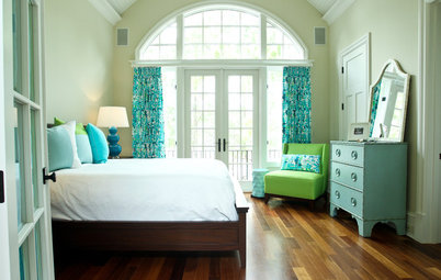
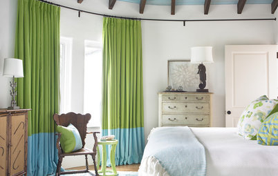
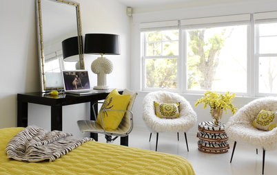
You have to look for a moment to find the color in this bedroom, and then you'll wonder how you missed it. A pretty china blue print, edged in red, on the window treatments and bed skirt pairs with restrained red details in the bedding. Keeping the fabric backgrounds predominantly white preserves the room's neutral overtones, but those small touches of color add a vibrancy that's sensed as much as seen.
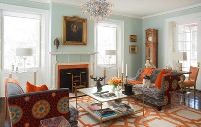
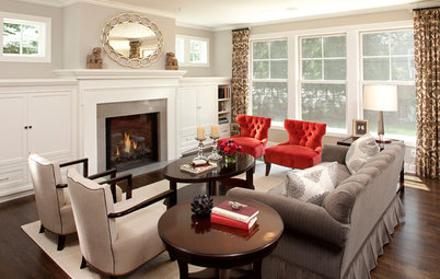
The colors are a little more obvious in this traditional space — bright books, hunting art, china and an Oriental rug — but not enough to detract from the tone-on-tone sensibility. French vanilla–hued walls, natural flooring and ecru linens preside over the peppier notes and assert their dominance.
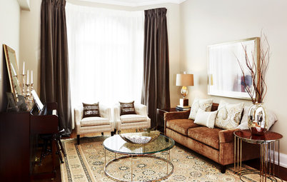
This living room has been a huge hit on Houzz, and for good reason. Everything about it feels comfortable and familiar, yet fresh and clean. And those neutrals — vibrant woods contrasted with pale creams and beiges — simply glow together. Still, I don't think the space would be as engaging without the apricot throw pillows, which bridge the neutrals and create an irresistible warmth.
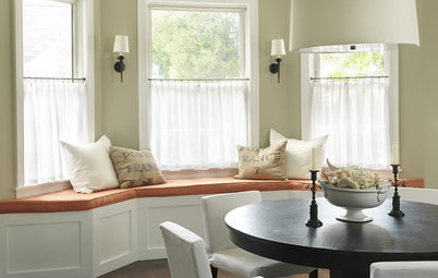
How many times have you heard it said that the best way to keep a neutral space from feeling flat is to layer textures? It's true, and this living area demonstrates the idea to lovely effect, from coarse rope and spooled detailing on the furniture to matte wire and nubby yarn accents. Soft chamois-yellow draperies warm the palette without calling attention to themselves.
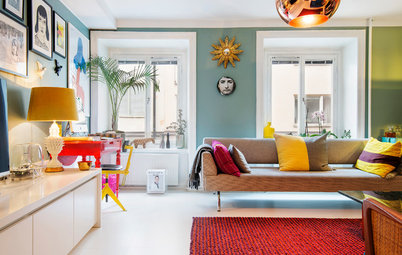
Art can be one of the easiest, most natural ways to vary the palette of a room. This gallery wall works especially well because of the limited range — just a couple of colorful pieces anchor the grouping, which otherwise reflects the black, white and brown shades of the space.
This space proves that you can slip a little color into a neutral scheme without disrupting the effect. Gentle Wedgwood blue and vivid orange on the chest bring to life an otherwise toned-down palette. It can be tricky to mix warm and cool shades in a neutral space, but it works here: Orange and blue make natural partners, and they pick up the yellow and gray undertones in the rest of the decor.
Here's another stroke of orange and barely-there blue. Tiers of rustic and refined woods and gentle geometric prints diversify the beautifully nuanced neutrals, which are peppered with darker notes to lend additional depth.
Even without the cozy fire, this dining space would radiate welcome. The secret? The rough-hewn dining table, with red undertones that warm up the brown-on-brown scheme. An abundance of natural light streaming in and bouncing off the mirror amplifies the color variations and makes them feel alive.
More: Houzz guides to using neutral colors
More: Houzz guides to using neutral colors

Sponsored
Reload the page to not see this specific ad anymore