Do's and Don'ts of "White Layering?"
mamabear03
9 years ago
last modified: 9 years ago
I'm having TONS of problems with my builder. This particular issue stems from this thread:
https://www.houzz.com/discussions/leave-these-areas-as-is-or-repaint-something-but-what-dsvw-vd~1691813
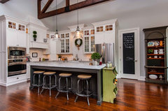
Please see all the pictures I'm linking below. It's hard to tell colors well with all the shadows in there. The crown moulding has not been installed yet. In Person, the difference between the white and cream is VERY different, especially under that triangle wall on the right. Maybe that's a good thing ? (I know nothing about white layering) but right now that's where my eye goes because there are no furnishings in the room.
We had been thinking we should paint the over-head pot shelf ledge as well as the right side upper triangle wall the light gray so that the cream cabinets would look brighter white... BUT if we do this, there is no good place to stop the gray when it goes to the left dining area and into the hall. To avoid white/gray lines starting and stopping we would probably have to paint the hall ceiling gray as well and that seems really odd.
Now we are thinking we better just leave it as, is with the bright white on top and creamy cabinetry. I don't know how "White Layering" is supposed to work exactly. Is leaving the paint AS IS going to look good? I'm at a loss and completely overwhelmed with disappointment for the whole house, not just this one thing. It's been a nightmare. PLEASE HELP!


https://www.houzz.com/discussions/leave-these-areas-as-is-or-repaint-something-but-what-dsvw-vd~1691813
Please see all the pictures I'm linking below. It's hard to tell colors well with all the shadows in there. The crown moulding has not been installed yet. In Person, the difference between the white and cream is VERY different, especially under that triangle wall on the right. Maybe that's a good thing ? (I know nothing about white layering) but right now that's where my eye goes because there are no furnishings in the room.
We had been thinking we should paint the over-head pot shelf ledge as well as the right side upper triangle wall the light gray so that the cream cabinets would look brighter white... BUT if we do this, there is no good place to stop the gray when it goes to the left dining area and into the hall. To avoid white/gray lines starting and stopping we would probably have to paint the hall ceiling gray as well and that seems really odd.
Now we are thinking we better just leave it as, is with the bright white on top and creamy cabinetry. I don't know how "White Layering" is supposed to work exactly. Is leaving the paint AS IS going to look good? I'm at a loss and completely overwhelmed with disappointment for the whole house, not just this one thing. It's been a nightmare. PLEASE HELP!
Featured Answer
Sort by:Oldest
Comments (54)

mamabear03
Original Author9 years agoALSO, the mantle should be painted the same CREAM as the cabinets, correct? Right now it is the brighter white as the ceiling and baseboards are. (The cabs were supposed to be bright white as well but that's not how it went and can not be changed.) So what color for the mantle? The CREAM or the WHITE?mamabear03
Original Author9 years agolast modified: 9 years agoI am having wood blinds installed, so should those be the creamy color or the brighter white? The door trim and baseboards are the brighter white and I didn't look but I'm sure the window sills are as well. When choosing decorative curtains what do I go with there? I'd like to add some pops of color in the curtains and shelf decor so the whole space isn't too blah with all the neutrals.
Brandi Nash Hicks
9 years agoLeave it all as is very pretty ,when everything is finished and your furniture is in then you will be happy ,I like the mix one color of white looks too sterile,if you do wood blinds on the windows do whiter ,cream will look dirty faster white will look greatmamabear03 thanked Brandi Nash Hicks PRO
PROJohanne Blansche Designs
9 years agoLeave the mantle the brighter white, it doesn't actually touch the cabinets.Go with a brighter white on the wood blinds but try to get drapes with a texture, maybe a linen with some tone on tone embroidery or detailing on them. Keep the colour for some interesting things you put on the cabinet shelves.Are you putting art or a TV over the mantle?mamabear03
Original Author9 years agoTV goes over the mantle, yes. I am really divided now on the mantle color. In my other thread and a few of my friends/family suggested the mantle should be the cream. I stink at this!
Kelly Henry
9 years agoKeep baseboards white and take that grey on every other space accept that ceiling beam...including cabinetry...with odd ceiling angles....eliminate with all one color....mamabear03 thanked Kelly Henry- mamabear03 thanked Kelly Henry
- PRO
Johanne Blansche Designs
9 years agoYou don't stink at this!!! It is not always easy to make these decisions and every family member will have an opinion.You don't have to match each piece of trim, it depends where they are in a room and what they abut. Crown moulding doesn't always match a baseboard. Try to keep your eye on the finish line and remember things can be repainted. If you paint the mantle cream and hate it when all is said and done then you repaint it white. I still think white is the way to go.Hope this helps. I did a bathroom recently and the crown moulding wasn't the same colour as the baseboard because the crown was against a very white shower tile and I had to alter the colour so the crown didn't look like a dirty white against it. I have a photo of it in my projects if that helps.mamabear03 thanked Johanne Blansche Designs  PRO
PROIPC Reno Crew.ca
9 years agoLeave it alone!!. you may change your mind once the room is furnished as the walls will look different by picking up the furnishings !!mamabear03 thanked IPC Reno Crew.caUser
9 years agoI think it looks great! I would leave it alone for now. You can always touch it up once the furniture is in. And, I'm sorry guys, but the teacher is coming out in me..."Mantle" is a loose, sleeveless coat or cloak. "Mantel" is the shelf above a fireplace.mamabear03 thanked User
zazfuzzroc
9 years agoHi, I definitely think it looks beautiful. :) First, I think the mantel should stand out, along with the stone....I say white for the mantel. :) Second, for the wood blinds, I also think white. :) Third, as far as the spear shaped part of the wall.... I believe any front facing part of the wall should be painted the same as the wall color. That does not mean that you need to continue the color below the spear and on to the hall ceiling. Just my take on it. It really does look great. Try to relax and not stress, I can imagine that it's been hard with all you have dealt with. I know all the small things add up..... but in the end.... what I see is a really pretty home. Good luck mamabear and Enjoy it! :)mamabear03 thanked zazfuzzroc
Ramona
9 years agoFirst of all, building a house is stressful and challenging if your builder does something wrong, so give yourself some slack. Looking at this empty is going to be hugely different from a house filled with your stuff.
Grey on the ceiling is not weird although you might not like the look. Colored ceilings need to be considered more seriously, more often.
Repainting those triangles will not be a big deal if necessary, but I think you will not be disappointed in the end if you leave it as is. Our eye always goes to the place we have contemplated and worried about, but the overall effect is what everyone, including you, is going to see eventually.
You've got a lot of decisions to make as the house is finished. I wouldn't stress over this minor issue. Keep your eyes on the prize and make sure your builder doesn't make other, much more important mistakes that you don't catch.
I don't understand why your builder is refusing to correct his mistake, but you have to choose your battles with builders.
Make sure the house is technically fault free and don't sweat the small stuff which can always be changed later.
I am guessing that this problem is going to disappear when you move in and start focusing on the good things and all the other decisions you will need to make.
The room looks beautiful. There are quite a few design books about all white decorating and search houzz using the terms. You are sure to come up with some interesting spaces.mamabear03 thanked Ramonamamabear03
Original Author9 years agoHi, All! So we have decided that (at least for now) we will leave the space as is. I plan to order the blinds in white instead of cream as well. Hope I dont regret that but it makes more sense in all the bedrooms that way too.
So today I took this photo and realized the bottom of my island (bead board front) was painted bright white (Dove White in my case) and it also shows how yellow/cream my cabinets are in the kitchen area. Should I paint that beadboard cream then?mamabear03
Original Author9 years agoI'm still upset about the cream cabs because I think I would have chosen different light fixtures/shades had I known this was going to happen. Someone remind me I will grow to love this house once we move in. :/zazfuzzroc
9 years agoMamabear, your kitchen is nice! :) I definitely would paint the back of the island to match the cabinets. I feel your light fixtures are perfectly fine. Everything doesn't have to be cream. The lights look good. :) Your wall color looks nice and so does your backsplash. :) You will love it. The end is near.....then on to the fun stuff! ;)mamabear03 thanked zazfuzzrocRamona
9 years agosorry to say that your builder is a lunatic and/or has lunatic sub contractors not paying attention, but he is supposed to SUPERVISE them. that is his job. when something is done wrong: he is supposed to fix it at his own cost.
so the painters had the right color paint and just chose to use it in the wrong places. on the bright side, dove white might show the dirt more and I have recently read that white cabinets yellow over time, so you might has less yellowing this way, or more. frankly, i don't know.
i do think the tile trim SHOULD be fixed. i think these guys just push as hard as they can and are used to being as unpleasant as they can in order to influence home buyers into accepting their mistakes. it is a psychological game he is playing on you. i wish you could learn to play an alternate one back.mamabear03
Original Author9 years agolast modified: 9 years agoAlthough they say they can't repaint the cream cabs, they are supplying me with a little bit of touch up paint for the cabinet "lacquer" as they call it. Then for the mantel and the front/back of this island I will need to color match the cream if I want to paint that. I'm thinking I'll do cream on the island bead board here and since I'm undecided on the mantel I'm going to leave that white for now. Maybe once I get my blinds put in the windows and our stuff put in the house (Saturday! YIKES!) and spend some time in there I'll have a better idea what else to do, if anything.
Hindsight is 20/20 and there are LOTS AND LOTS of things I'll do different next time around. Truly thankful for your advice!mamabear03
Original Author9 years agolast modified: 9 years agoHi All! Need a bit more advice... im ordering the blinds tomorrow. I brought the color sample books home... The whites/creams in my price range are either whiter/brighter than my White Dove white or slightly creamier/yellow which is similar to the built-on shelving. Do I go the brighter white? If so the blinds would be the whitest/brightest white ive got so far. (But the good thing about the whiter/brighter color is that brand is slightly better than the best creamy colored one I've heard.) Let me know! THANKS! :)mamabear03
Original Author9 years agolast modified: 9 years agoThank you! It's a big investment so I need to do it right.zazfuzzroc
9 years agolast modified: 9 years agoYou're welcome. I feel, closer to the trim color is best. Hopefully...you get more input. :)mamabear03 thanked zazfuzzrocUser
9 years agoLOVELY HOME. Once paintings are hung, furniture and tables are in it will all work. I wouldn't do anything about the white paint and tones until you do move everything in. Only then will you realize it's all ok. :)User
9 years agoProbably, I will add: in person and with no furniture in your home, you are seeing every little detail magnified. I know, we just finished our new home. For me, I would be happy that your kitchen cabinets are on the cream side, rather than stark white. I know that stark white is beautiful to look at but I think cream is softer on the eyes.- PRO
Johanne Blansche Designs
9 years agoHi mamabear, can you tell me what colour paint you used on the fireplace wall ,thanks? 
sacapuntaslapioz
9 years agomamabear. which are the paint colors on the walls, trims and cabinets. I think you are making a mountain out of a grain of salt, but the monitors can lie.Sally Pascale
9 years agoI think it is beautiful. Once you start bringing in the accessories and textures it will be amazing.mamabear03
Original Author9 years agolast modified: 9 years agoWalls are Revere Pewter, trim (and mantel currently) is Dove White or white dove whichever way it goes I keep forgetting... cabs and shelving are some random cream that accidentally happened at the cabinet shop. :/
Do I go with a bright white (whiter/brighter than the White Dove) for the window blinds or a cream? Neither one is really that close to the trim/White Dove as one is brighter and one is creamy. Trim color is between the two blinds color choices.- PRO
Johanne Blansche Designs
9 years agoI would make the blinds a warm white I think the creamier. Sometimes these companies have linen whites and they are usually a nice compromise 
Patty Serpone
9 years agoI think it looks beautiful! I love the colors. We are currently picking out stone for our fireplace. I love yours. Can you please tell me the manufacturer and color? Thank you!sacapuntaslapioz
9 years agomamabear, the thing with white layering is you want your whites in the same tone, either warm or cool. it seems your whites are warm. the more the merrier there, but keep your whites toward yellows instead of blues. have a bright white sheet of paper and compare them. always carry samples of the colors with you. revere pewter, dove white and a cream are all in the good families. do not get crazy. leave it as it is. move in, put your stuff inside. live with it.mamabear03
Original Author9 years agoThanks, I do have the warms yes. I just need to decide on the blinds whether to go lighter/brighter (though still warm/not coo) white than my trim color or more creamy which would be a little more creamy/ivory than my trim color of Dove White. My trim color is right in the middle of the blinds color choices.bliz179
9 years agoMamabear... my first thought on the right side wedge was to paint it the wall color (as it looked rather odd there), but I rethought that when I visualized the total wall area including the dining room. The two wedges actually balance each other out. If you use the plant ledge for something (?) I think the total area will look good. I like the mantel white.
Next, the kitchen island I would pick a color to paint it. Not white or cream. There are some awesome photos on houzz that show the island being totally different from the cabinets. If you are scared of color, maybe a dark gray.
The blinds are a difficult decision. I lean to the white, but understand your concern of the white being brighter than the trim. That would bother me, too. Can you look at a different brand of blinds?mamabear03 thanked bliz179sacapuntaslapioz
9 years agolast modified: 9 years agoblinds in white. classic and simple. in cream they just look dirtymamabear03 thanked sacapuntaslapiozPatty Serpone
9 years agoMamabear - I just spoke to the manufacturer that I am ordering my stone from. They do not carry it in stock so I am ordering it. Can you confirm it's the profit. Echo Ridge | Pro-Fit Alpine Ledgestone
Thanks again! I've been looking for a month for the right stone and I think this is it!
Nancy Travisinteriors
9 years agoI don't see a problem. It looks amazing. It's difficult when you have a open concept. But I think this came out very well. It will look very different after furn, accessories and art go up. Don't stress it's very nice.mamabear03 thanked Nancy TravisinteriorsNancy Travisinteriors
9 years agoMantel is fine. Why are you 2 nd guessing every design. Go for it. Chill.mamabear03 thanked Nancy Travisinteriors- mamabear03 thanked Nancy Travisinteriors
mamabear03
Original Author9 years agoYou are correct on the stone, Love Design! I think its a new stone profile. We had to order it also. Glad to help!
Thanks for the blinds advice, All! I'm going to go with the brighter white. :Dzazfuzzroc
9 years agoMamabear, are you in already? I'm glad you went for the white, I think it will look great. :) I really hope you share some pictures along the way. Would love to see what you do. :) Have fun!Kelly Henry
9 years agoHow about a nice neutral wood grain on the blinds to break up all that mix of color....keep the party going haha...Patty Serpone
7 years agoI posted last year regarding your stone fireplace. We got the same one! Can you tell me what color the walls are around it? It really makes the stone pop!


Sponsored
Reload the page to not see this specific ad anymore


Johanne Blansche Designs