Traditional Kitchen Opens Up and Lightens Up
Removing a wall was key to creating a large kitchen and dining space for family life in this London house

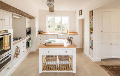
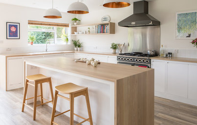
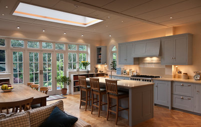
Designer Maya Wilson suggested that taking down the dividing wall between the kitchen and dining room would make a big difference in this West London family’s cooking and eating spaces, and improve the flow and feel of their Victorian home. “After lots of exploratory plans for different uses of the rooms, we felt the knock-through was the best option, giving more light throughout and creating a flexible and comfortable living space,” Wilson says. In this open-plan kitchen and dining space, Wilson added Shaker-style cabinets in white and deep blue, a spacious island and a custom cabinet in the dining area. Now the eating and cooking areas function well as individual spaces but also share features, such as brass lighting and handsome cabinetry, for a harmonious feel.
Once the wall between the two rooms was taken down, the owners wanted to make sure the spaces still felt connected while retaining a subtle division. A peninsula separates the two areas and provides more of the countertop surface the owners craved. “It’s quite wide, with seating on the dining room side,” Wilson says. “You can sit and have breakfast or use a laptop there — it’s big enough to do multiple things at once. Guests can also sit there while you finish making dinner, so it’s sociable too.”
A mix of pendant lights adds personality. Five styles hang over the table, and one of the designs is over the island too. “They are all from Jim Lawrence, which has a fantastic range in brass,” Wilson says.
A mix of pendant lights adds personality. Five styles hang over the table, and one of the designs is over the island too. “They are all from Jim Lawrence, which has a fantastic range in brass,” Wilson says.
The sink is neatly tucked into a corner, so it’s largely out of sight from the dining space. “The owners were certain they didn’t want a sink in the island,” Wilson says, “so we fitted it here. They don’t use it much, because they have a dishwasher, and wanted to prioritize surface area.”
Wilson encouraged the owners to use a rich blue shade on some of the cabinets. “They were a bit unsure at first and worried it would look too dark, as the kitchen that was here before was quite gloomy,” she says. But now, with the additional light coming from windows at both ends, the room is much brighter, so the blue works beautifully.
For balance, Wilson painted the wall of cabinets on the left white. “We used the blue shade for the brighter side of the room and chose white for the darker wall,” she says. The blue also goes well with the sections of exposed brick wall. “The bricks are a lovely sandy color, which complements the blue. That’s partly why we chose it,” the designer says.
For balance, Wilson painted the wall of cabinets on the left white. “We used the blue shade for the brighter side of the room and chose white for the darker wall,” she says. The blue also goes well with the sections of exposed brick wall. “The bricks are a lovely sandy color, which complements the blue. That’s partly why we chose it,” the designer says.
With its soft, curved edges, the island fits beautifully. “It has just the right proportions for the space,” Wilson says. “We couldn’t have made it any larger, or it would have started to feel a little bit cramped in here.” Rounding the corners also helped the island fit into the available space. “This avoids any pinch points and is great for flow,” she says. “You can scoot around it comfortably.”
Ovens: Neff; Leiston brass pendant lights: Jim Lawrence
Ovens: Neff; Leiston brass pendant lights: Jim Lawrence
Simple white subway tiles line the kitchen wall, a practical choice. “They are very classic and very functional, which fits the vibe of this space,” Wilson says. “The brick shape helps to accentuate the long lines of this wall too.” Instead of a plate rack above the sink, Wilson had a rectangular box shelf built in. “It works really well,” she says. “It’s easy to use and convenient.”
Lovell glass pendant light: Jim Lawrence
Lovell glass pendant light: Jim Lawrence
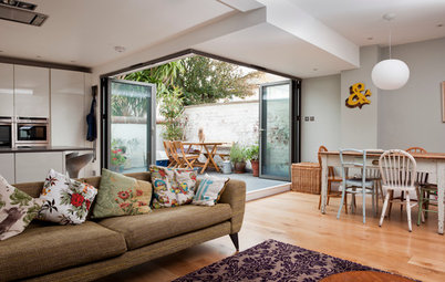
“Victorian homes often have big rooms, but they can be quite narrow,” Wilson says. And this was the case in the dining space, where a large fireplace used to dominate the room. “There wasn’t really enough space to walk behind the table and chairs, and you always felt you were stepping onto the hearth,” she says.
Wilson removed the fireplace and installed a custom cupboard instead. It “holds things specifically for the dining area, such as glasses and placemats, and also acts as an additional surface for serving,” she says. The dining space is now well-proportioned, with useful storage that doesn’t intrude.
Wilson removed the fireplace and installed a custom cupboard instead. It “holds things specifically for the dining area, such as glasses and placemats, and also acts as an additional surface for serving,” she says. The dining space is now well-proportioned, with useful storage that doesn’t intrude.
The bay window contains more storage, which serves as a window seat too. “It holds stuff that spills over from the hallway, such as shoes and other bits and bobs,” Wilson says. It’s been spray-painted in a midsheen off-white shade.
There’s a small conservatory area just off the kitchen, and a short row of lights on the kitchen wall illuminate the space. “They are discreet and fit in really nicely,” Wilson says.
Hector wall light: Original BTC
Hector wall light: Original BTC

Sponsored
Reload the page to not see this specific ad anymore
Who lives here: A couple and their two young children
Location: Hammersmith area of West London
Size: About 350 square feet (34 square meters); 32 by 11 feet (9.7 by 3.3 meters)
Designer: Maya Wilson
The owners wanted Shaker-style doors for their cabinets and, having had an island in the kitchen in their previous home, wanted to include one here too. “They were also very focused on ensuring they had a lot of surfaces,” Wilson says. “Their last kitchen, although relatively big, didn’t have much [countertop] space, and they were eager to create plenty here.”