Houzz Tours
Kitchen Tours

London Kitchen
Kitchen Tour: A Poor Extension is Brilliantly Reinvented
Creative thinking helped to beautifully slot a kitchen-diner and utility/cloakroom into a small existing space

When the owners of this small Victorian terrace wanted help to improve their home’s very dark kitchen and badly planned extension – but without demolishing it and starting again, as there wasn’t the budget – architect Gemma Fabbri of Studio Fabbri happily rose to the challenge. “I like problem solving,” she says. “I like thinking about how people live and how they flow through their homes.”
Her aim was to create a light, bright, connected space while maximising functionality and keeping costs down. Read on to see her elegant solution.
Her aim was to create a light, bright, connected space while maximising functionality and keeping costs down. Read on to see her elegant solution.
The owners of this home have two very young children and the layout of the house just wasn’t working for them. There was already an extension, but it was poor quality with no skylights. It included a cloakroom (flash of red seen through the window here), which made the room quite cramped.
It also felt tacked on. “The original design had kept the former external wall with its doorway and small window, so that meant the kitchen didn’t get any real daylight,” Gemma says.
It also felt tacked on. “The original design had kept the former external wall with its doorway and small window, so that meant the kitchen didn’t get any real daylight,” Gemma says.
The couple had a very tight budget and asked if it was possible to use the existing extension, so Gemma designed a solution with that in mind. Knocking down the old external wall seemed a clear first step, but she also found a way to retain the cloakroom and add a laundry area in what is a fairly modest space.
“I did a number of plans and came up with opening the kitchen completely to the extension [including removing the cloakroom] and moving the wall that ran alongside the staircase [seen here] slightly further into the kitchen space,” Gemma says.
“This created a corridor so we could access under the stairs, where we fitted a utility/cloakroom, which houses the washing machine,” she says. “Although this made the kitchen slightly shorter, the fact we’d opened it up made for a far more flexible space.”
Make the challenge of finding the right people for your project easier by searching the Houzz Professionals Directory.
These ‘before’ and ‘after’ floorplans show how Gemma carved out a much better space for the cloakroom and managed to fit in the washing machine, too.
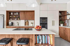
The new layout separates the small space into a galley kitchen and a dining/relaxing/play area. It works brilliantly for the family, as the peninsula separates the kids from the ‘danger’ zone. “It means the couple can still interact with the children and bake or do crafts together at the dining table, but the children don’t have to come into the kitchen zone where the hot stuff’s going on,” Gemma says.
The area between the hall door and the steel column at the start of the extension lends itself to a bank of units, which slot neatly into the recess. “It gives the family a nice run, including a fridge-freezer, a larder and a microwave,” Gemma says.
The units, which are from Ikea, are made from recycled wood and PET bottles. Due to their off-the-shelf nature, the fridge-freezer doors aren’t aligned with the other cabinets. “I said we could look at that, but the owners said they quite liked it,” Gemma explains.
She added smaller cupboards up high for occasional-use items. “The good thing with Ikea kitchens is you can get top boxes, so we could fill the space right to the ceiling,” she says.
Metod kitchen carcasses; Kungsbacka cabinet fronts in White, all Ikea. Oak-faced plywood units with brass pull handles, Plykea.
Thanks to having plenty of storage in the bank of units and the little utility room, Gemma was able to keep the cooking area open and airy, with just an extractor fan and two simple shelves on the wall.
The Ikea base cabinet carcasses have been fitted with oak-faced ply fronts and brass handles. “The wood brings in a bit of warmth,” Gemma says. “We wanted to keep it simple, but I think if we’d gone completely white, it wouldn’t have felt homely.”
The couple already had the range cooker and wanted to keep it.
Gemma fitted an oversized pocket door between the kitchen and hall to give a bit more flow into the space. “The door slides neatly into the wall, so as you come through the front door, you have a clear view through to the garden,” she says. “Also, as the space is quite small, there wasn’t really room to swing a door either in or out.”
You might also enjoy Kitchen Storage Ideas as an Alternative to Wall Units.
The splashback tiles are familiar from many schemes, but arranged in an unusual way that give them a new look. “I think I did three options and the couple said, Ooh we like this one,” Gemma says. “The colour, a sort of mustard yellow, sits really nicely with the wood tones and brass handles.”
Dandelion tiles in Ivory/Honey, Marrakech Design.
You might also enjoy How to Choose the Perfect Splashback.
Dandelion tiles in Ivory/Honey, Marrakech Design.
You might also enjoy How to Choose the Perfect Splashback.
Key to making sure the kitchen is bright is the rooflight, which runs the length of the extension and is angled to direct the rays towards the back of the room. A trio of simple pendant lights helps to keep the area illuminated after dark.
Porcelain pendant lights in Brass, Tala.
Porcelain pendant lights in Brass, Tala.
Gemma looked at putting bifold doors on the back of the extension, but there’s a step down and the depth of decking that would have been required would have eaten a lot of the short garden. “Instead, we opted for a window seat, which means the owners can use it as a bench for the table, giving them more dining space,” she says. The seat is built from oak-faced ply to match the kitchen cabinets. The table can be extended to accommodate guests.
The windows are a slide and pivot design, so the family can open one pane for ventilation or push them both to the side for a large opening. “It means they can sit inside and still feel connected to the outdoors,” Gemma says.
The back door has a very thin frame, so you get a lovely sightline when you walk in. “You don’t have a bulky frame in the way, you just see straight through to the little garden,” Gemma says. The couple already had the sofa and it fits perfectly in this spot by the door.
From this angle, you can see that, on the other side of the peninsula from the open shelving, there are good-sized drawers – including under-sink bins – and a dishwasher. The worktop is white quartz from a local supplier.
Back door, Velfac. Ultraslim Slide & Pivot doors made to fit as windows, Sunseeker.
The flooring is a pale oak herringbone, which has also helped to lighten the space while adding warmth to the scheme. The couple decided against underfloor heating to keep costs down.
The family are delighted with the results. “I think they were just amazed at the light, especially as the room doesn’t get sun all day long,” Gemma says. “It’s made a big difference to the feel and health of the house.”
Prime Engineered Oak Herringbone Sunny White Brushed UV Oiled flooring, Wood and Beyond.
Tell us…
What do you like best about this reworked extension? Share your thoughts in the Comments.

Sponsored
Reload the page to not see this specific ad anymore
Who lives here? A family with two young children
Location Walthamstow, north-east London
Property A small Victorian terraced house with three bedrooms (one in the loft conversion)
Kitchen-diner dimensions 24 sq m
Designer Gemma Fabbri of Studio Fabbri
Photos by Heather Hobhouse