Houzz Tours

Kitchen Tours
London Kitchen
Kitchen Tour: A New Layout Creates Seating, Space and Storage
By moving walls and reworking the existing plan, these homeowners found room for their dream feature: a walk-in pantry

The new owners of this period home went to Charles Elwell of design and build company Kitchens By Holloways as soon as they got the keys. They thought he could advise them on replacing the galley kitchen they’d inherited and suggest ways they might boost its functionality with an extension.
However, when they explained what they were after – lots of room for family, entertaining and, above all, a walk-in pantry – Charles told them a rear extension wasn’t the answer; the space they needed was already there.
However, when they explained what they were after – lots of room for family, entertaining and, above all, a walk-in pantry – Charles told them a rear extension wasn’t the answer; the space they needed was already there.
“They came to the showroom the day they got the keys and I popped in the next day,” Charles remembers of his first meeting with the homeowners.
Originally, their kitchen was a galley design squeezed into a side-return extension. A reception room filled the other side of the back of the house, but the two rooms weren’t connected. Looking at the existing kitchen, Charles said, “There’s no way you can get the kitchen you want in this space.”
Find design and build companies in your area on Houzz and read reviews from previous clients.
The homeowners originally wanted an extension, but Charles persuaded them there was a better way – and one that would make use of the existing space. “We discussed who cooks, how often they entertained, how big the family was, and styles they were drawn to – they wanted something classic but personalised.”
As they chatted, he did this ‘back-of-an-envelope’ sketch. A few things shifted in the final plan (see below), but this quick initial drawing shows the broad layout change.
Charles often asks clients to set up a Houzz profile in order to convey their style preferences. “The photo saving can be very pinpointed and gives you a clearer idea of what they’re looking for,” he explains.
“It all starts from the pantry,” Charles says of his design. This new, walk-in storage room – the owners’ absolute must-have – is behind the framed pictures seen here on the right. Behind the opposite wall is a utility room. “We figured we could use these dark parts of the house for the service areas of the kitchen,” he says.
To do all this, Charles designed these double doors, creating a new entry point in the middle of the floor plan to access the back part of the ground floor. “If you were to turn around in this photo, you’d see the living room with identical doors opposite on the other side of hall,” he says.
To do all this, Charles designed these double doors, creating a new entry point in the middle of the floor plan to access the back part of the ground floor. “If you were to turn around in this photo, you’d see the living room with identical doors opposite on the other side of hall,” he says.
This is how the house was laid out when the owners bought it.
The kitchen (in pink) was a galley design. “There wasn’t a way of improving it within that space,” Charles says. “I advised [the owners that] putting a new kitchen in [there] wouldn’t be better, only different.
“That’s when we started looking at reconfiguring the layout, as they’d said they were also looking at a full refurbishment,” he says. “As soon as I mentioned we could [design, build and project manage], too, the project expanded.”
More: 6 Ways to Open Up a Kitchen Without Extending
The reworked ground floor plan shows how Charles proposed transforming the space without extending.
Removing the wall between the rear reception room and the galley kitchen was transformative. It allowed Charles to put the kitchen on the right-hand side and create a generous dining area with banquette seating in the area where the old kitchen had been.
At the garden end, the original galley kitchen had stretched into a short outrigger; this has now been turned into a light-flooded seating area. At the house end of the new space, the walk-in pantry and utility room are roughly in the location of the original utility and a cloakroom, now repositioned off the hallway.
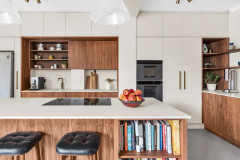
The owners wanted a large island and Charles created this 3m beauty with oak detailing for them.
“We usually try not to have a sink on an island because of the mess,” Charles says. Instead, it’s located in the run behind, in a “letterbox-like” niche painted an elegant green and sandwiched between tall cabinetry containing stacked ovens (with a warming drawer below and storage above) and a fridge-freezer.
The island, instead, contains the hob. “It’s flush, which is less visually intrusive and doesn’t draw the eye so much,” Charles says. In the ceiling above there’s a painted-in extractor that ducts out. “Everything’s hidden and it’s very powerful,” he says.
Extractor fan, Westin. Five-burner flush gas hob, Miele.
Charles designed flat-fronted doors for the kitchen with a subtle beading – a nod to traditional Shaker style but also very contemporary. “It felt more ‘them’,” he says. Brass handles are another traditional touch.
The classic style works on another level, too. With sustainability in mind, Charles explains they always design kitchens to last. “We often get a call to go back to a kitchen we put in 20 years ago from a client who wants us to repaint the cabinets,” he says.
The classic style works on another level, too. With sustainability in mind, Charles explains they always design kitchens to last. “We often get a call to go back to a kitchen we put in 20 years ago from a client who wants us to repaint the cabinets,” he says.
The oak shelf here ties in with the oak on the island. “We like to add natural materials to our kitchens,” Charles says. “It softens them.”
The striking splashback is made from patinated brass and all the sockets and switches in the room are burnished brass to tie in.
Stainless-steel undermounted sink, Franke. Tap, Quooker.
The striking splashback is made from patinated brass and all the sockets and switches in the room are burnished brass to tie in.
Stainless-steel undermounted sink, Franke. Tap, Quooker.
There’s no risk of the cupboard and drawer storage seen here becoming overcrowded thanks to the pantry, which is behind the glazed door at the end.
In the first cupboard on the left, next to the ovens, there are pull-out bins, with under-sink storage next, then a dishwasher and drawers for cutlery and crockery. Drawers on this side of the island house pots and pans, storage containers, sieves and so on.
The owners originally wanted a terrazzo worktop, but Charles nudged them towards a softer, subtle terrazzo-effect quartz. It’s 20mm deep and continues over the end of the island in a waterfall formation.
New oak herringbone flooring adds another layer of natural materials to the space.
4601 Frozen Terror worktop, Caesarstone.
All foodstuffs are kept in the hand-built oak storage in the walk-in pantry, along with a second dishwasher and a coffee machine. The open drawers are all slatted, so are perfect for vegetable storage.
Out of shot to the left there’s a wraparound worktop. “Bakery, food prep – it can all be done in there and it keeps mess out of the kitchen,” Charles says.
Out of shot to the left there’s a wraparound worktop. “Bakery, food prep – it can all be done in there and it keeps mess out of the kitchen,” Charles says.
The dining area is in the former kitchen location. The owners wanted a dining space that could seat 10 or more people, if needed. The solution was an upholstered bench and a long table, with chairs along the opposite side and at either end.
Artworks define the space. “The wall of artwork faces the kitchen and is a really nice thing to look at while you cook,” Charles says.
As for the lighting, he adds, “It was too busy above the table for pendant lighting – we’d also decided that’s what should go above the island. Here, the wall lights create a softer light for when you’re at the table.”
Wall lights, Kitchens By Holloways.
Charles was keen to include various sociable seating options for his entertaining-loving homeowners that provided alternatives to sitting at the island. He replaced the double doors that were originally in this spot with low windows and bench seating to create a bay.
The seats lift up to reveal storage and are designed in the same oak as the island detailing and the kitchen shelf.
The seats lift up to reveal storage and are designed in the same oak as the island detailing and the kitchen shelf.
The dining bench and outrigger chairs provide yet more seating alternatives. “The dining bench has a big seat – you can comfortably spend time there,” Charles says.
The seating spot at the far end of the former galley kitchen is flooded with light and offers a nice view of the garden.
The room seen from the garden.
Tell us…
What do you think of the way Charles has transformed this space? Share your thoughts in the Comments.
Tell us…
What do you think of the way Charles has transformed this space? Share your thoughts in the Comments.

Sponsored
Reload the page to not see this specific ad anymore
Who lives here? A husband and wife with two young children
Location Wandsworth, south-west London
Property A Georgian townhouse with four bedrooms and four bathrooms in a conservation area
Room dimensions Approx 5m x 6m
Designer Charles Elwell of Kitchens By Holloways
Interior designer Elizabeth Callon Macfarlane of Macfarlane Van der Heul
Year of project 2021-22
Photos by Enzo Cerri Photography
It was meant to be a site visit about replacing a kitchen, but once Charles had heard his clients’ wish list and seen the space, it became a much bigger conversation – and he began to mentally reconfigure the entire ground floor.