Houzz Tours

Kitchen Tours
London Kitchen
Kitchen Tour: A Minimal Design but Maximum Storage for Keen Cooks
An uncluttered design and calming colour palette belies the functionality of this kitchen in a Victorian house

When the owners of this period semi called on designer Mioko Fujisaki of Kitchen Bee Design, it was because the layout of their existing kitchen wasn’t working for them, especially the man, who’s a passionate cook. A not-up-to-muster ceiling extractor had to go, while the hob and sink needed to be relocated to the same run of cabinetry. A good-sized preparation area was also a must-have.
There were a few more items on the cook’s wishlist. “He’s a very organised person and wanted to organise in a very efficient way,” Mioko says. Small appliances, such as the toaster, kettle and microwave, had to be hidden, and an American-style fridge-freezer accommodated. The room even had to include a utility cupboard and coat storage. “The kitchen looks simple, but there was a lot to fit in,” she says.
There were a few more items on the cook’s wishlist. “He’s a very organised person and wanted to organise in a very efficient way,” Mioko says. Small appliances, such as the toaster, kettle and microwave, had to be hidden, and an American-style fridge-freezer accommodated. The room even had to include a utility cupboard and coat storage. “The kitchen looks simple, but there was a lot to fit in,” she says.
The kitchen’s colour palette was decided on mainly by the keen cook, and it maintains the brightness of the garden-facing space. “The wall colour is quite pinkish, but he wanted concrete-effect floor tiles,” Mioko says. “The cabinets are cashmere – the colours are soft.”
Choosing large-format tiles for the floor means less grout on show, which visually expands the space, Mioko says.
Walls painted in Passion Flower, Fired Earth. Majestic floor tiles, Saloni. Firstlight bar integrated LED small pendant lights, Castlegate Lights.
Choosing large-format tiles for the floor means less grout on show, which visually expands the space, Mioko says.
Walls painted in Passion Flower, Fired Earth. Majestic floor tiles, Saloni. Firstlight bar integrated LED small pendant lights, Castlegate Lights.
The worktop is robust Silestone and, aside from its practicality, Mioko chose it because of the finish. “It has a vein that picks up on the cashmere of the cabinets, because it has a slight brown to it,” she says.
Eternal Calacatta Gold worktop, Silestone. Sink; tap, both Caple.
Eternal Calacatta Gold worktop, Silestone. Sink; tap, both Caple.
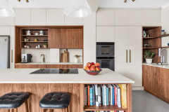
Mioko opted for an elegant curved outline where the island widens in order to create adequate preparation space for the chef. “It’s a design element because I had to allow a walkway,” she says.
The shape’s not all about functionality, though. “It looks like a piano,” she says. “Because the kitchen is a sharp, handleless design, it adds a softer touch.”
The shape’s not all about functionality, though. “It looks like a piano,” she says. “Because the kitchen is a sharp, handleless design, it adds a softer touch.”
A big range cooker was an essential for the owners, but this model has an induction hob rather than traditional burners.
While the kitchen’s not small, Mioko still had the challenge of fitting as much storage into the space as possible, and beyond the range are wall cabinets as well as base cupboards.
Range cooker, Stoves.
While the kitchen’s not small, Mioko still had the challenge of fitting as much storage into the space as possible, and beyond the range are wall cabinets as well as base cupboards.
Range cooker, Stoves.
The wall cabinets here are shallower than is usual. “I did it because there’s not much depth on this wall, but also because it’s much easier to access spices and oils,” Mioko says. “The owner has also put ramekins and pots in there. Small things are hard to reach in deep cupboards.”
The roller shutter alongside the wall cabinets conceals the coffee machine, microwave and more, keeping the kitchen surfaces free of clutter.
The roller shutter alongside the wall cabinets conceals the coffee machine, microwave and more, keeping the kitchen surfaces free of clutter.
The American-style fridge-freezer also dispenses water and crushed ice. Although it’s sizeable, it isn’t as deep as some designs, plus it’s integrated, continuing the room’s fitted look.
Storage above is for items that aren’t often needed, while the tall cabinet to the right, which has internal drawers, is for food, so both fresh and dry ingredients are in one area.
Shelves for cookbooks give the homeowner ready access to his large collection. “It also breaks up the design,” Mioko says.
Fridge-freezer, Fisher & Paykel.
The dining area adjoins the kitchen, and has garden views and access.
Find a reviewed kitchen designer or fitter in your area in the Houzz Professionals Directory.
Find a reviewed kitchen designer or fitter in your area in the Houzz Professionals Directory.
The cabinetry in the dining zone has a mature oak veneer. “We wanted to have a division between the kitchen and the dining area,” Mioko says. “The space has a different atmosphere because of the different finish.”
The wine cooler takes centre stage. Above the concealed storage, Mioko opted for open shelving. Like the bookshelves in the kitchen, it provides a break in the run of solid cabinetry. The nook on the left had to work around an existing structure, so is shallower.
The cupboards had to accommodate a lot of household items and outdoor clothing.
There’s storage space both above and below the hanging rail.
Mioko also planned in space for cleaning equipment and supplies. “The owners don’t have a utility room,” she explains.
The owners wanted a splash of colour in the room, and selected a brilliant yellow for the wall cabinets in the dining area, which were made bespoke locally. “My client has a very good sense of colour, and [the unit] goes well with the oak veneer,” Mioko says.
The cabinets are home to glasses and, with their contents on show rather than neatly concealed, they contribute to the distinct feel of this part of the room.
A sideboard below is wall-hung, keeping the floor uncluttered and creating the look of a living area.
See 24 Brilliantly Bold Yellow Kitchens.
Tell us…
What’s your favourite element of this kitchen-diner? Share your thoughts in the Comments section.

Sponsored
Reload the page to not see this specific ad anymore

Sponsored
Reload the page to not see this specific ad anymore
Who lives here? A professional couple
Location Ealing Common, west London
Property A Victorian semi
Kitchen dimensions Around 32 sq m
Designer Mioko Fujisaki of Kitchen Bee Design
Photos by Anna Stathaki
An island was a crucial element of the bespoke kitchen design, but there wasn’t a whole lot of room. “The space is narrow,” Mioko says. “The classic shape is rectangular, but because the hob and the sink are against the [end] wall and preparation space was required behind it, I had to shape the island to make it wider.” (Scroll on to get a closer look at the unusual island shape.)
The kitchen is blessed with good natural illumination. “It’s the nicest house I’ve ever done in terms of light,” Mioko says. “It’s very soft and it’s a really peaceful space, with the garden almost coming into the kitchen.” The keen cook in the couple is also an enthusiastic gardener, she notes.