Houzz Tours
House Tours

Houzz Tour: Colour and Sensitivity Transform a Victorian Villa
A thoughtful renovation has restored traditional charm and added boundless character to this old house

The ground floor of this home provided lots of space, but none of it in quite the right configuration for the family living in it. The layout was typically Victorian, with smaller rooms towards the back of the house, as well as two conservatories.
“We brought all of those together to create a kitchen/living/dining room and extended by a very small amount to make the best use of the space within permitted development,” says interior designer Jessica Gibbons of Field Day Studio, who, along with co-designer, Kat Turner, also added artwork, colour and bold ideas. The trick they pulled off particularly brilliantly was to do all of this while preserving the feel of the original house, with sensitive design throughout.
“We brought all of those together to create a kitchen/living/dining room and extended by a very small amount to make the best use of the space within permitted development,” says interior designer Jessica Gibbons of Field Day Studio, who, along with co-designer, Kat Turner, also added artwork, colour and bold ideas. The trick they pulled off particularly brilliantly was to do all of this while preserving the feel of the original house, with sensitive design throughout.
The bespoke kitchen is at the back of the newly reconfigured space. Ochre cabinetry taps into the homeowners’ desire for something unconventional. “They’re quite young and not particularly traditional,” Jessica says, “and they wanted things that wouldn’t necessarily be obvious from the outside. The choices we made feel modern and appropriate – as well as being appropriate to the house.”
She adds that they wanted a colour that you wouldn’t normally see in a kitchen rather than something that felt part of a passing trend. “It makes it timeless,” she says, and therefore more sustainable than something trend-led.
The traditional-looking dark wood worktops and utilitarian tiling, along with the functional stainless-steel island with pots and pans on its open shelves, are a contemporary take on the idea of a Victorian servants’ kitchen.
Bar stools, Nkuku. Cabinets painted in RAL 1024 Ochre Yellow.
The Shaker-style doors and freestanding stainless-steel American fridge-freezer (see previous photo), tie in with the industrial theme, as does the sink. “It’s lovely isn’t it?” Jessica says. “We’re addicted to using these fluted Belfast sinks.”
Referring to the large drawers flanking the cooker, she says, “Big and wide was proportionally right for the space.” There are also two dishwasher drawers to the left of the sink.
The window behind the sink replaced an existing opening into one of the former conservatories on the back of the house (see next photo). It now looks into a large utility room in the location of the original kitchen.
Handles, Yester Home. Tap, Studio Ore.
Find architects and interior designers in your area on Houzz.
This photo is of the original kitchen, looking out towards a side-return conservatory that’s now the location of the new kitchen.
Jessica and Kat retained the walls of this room, now the utility. They turned the door and surrounding glazing into the internal window seen above, which sits between the utility and new kitchen.
Jessica and Kat retained the walls of this room, now the utility. They turned the door and surrounding glazing into the internal window seen above, which sits between the utility and new kitchen.
An exterior shot of the two original conservatories shows more clearly what the designers have done. They extended the floor area slightly, but kept close to the original footprint and location of the extended areas.
This is the new view from the utility room through the reconfigured glazing. Reducing the height of the glazing meant a sink and run of cabinetry could sit beneath the window here.
The generously proportioned utility room is full of character, thanks in part to several vintage finds – the red piece is an old fruit-drying rack now used as shelves – and an original fireplace.
“Our general approach to sustainability is that we try to use existing pieces where we can and avoid waste,” Jessica says. “We use a lot of vintage in our projects; that’s important to us.”
The bespoke tall cupboard to the left of the fireplace contains cleaning things and other household items, while the base cabinets house a washing machine and dryer.
The ceiling in the new room is a feature in its own right. Exposed joists add height and interest, while Jessica and Kat opted to paint the support steels black. “It draws your attention to the structure of the place and connects to the industrial aesthetic,” she says.
There are various places to sit at the garden end of the room. Here, at the tail end of the food prep area, the designers sourced vintage drawers, then added shelves on top for stashing kitchen overspill. A small bench seat also adds extra storage for kids’ toys or garden things.
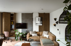
Across from the kitchen there’s a little seating area. “It’s multifunctional – a place to have pre-dinner drinks, to sit and chat to whoever’s cooking, somewhere to play with the children, a reading nook…,” she says. “There’s lots of storage for books, too, as they’re big readers.”
Of the wood-burning stove, she adds, “The chimney stack was there, but not in use, so we brought it back to life.”
Rug, Gooch Oriental. Wall light, Eporta. Brown chair, Soho Home. Black chair, Vinterior.
Of the wood-burning stove, she adds, “The chimney stack was there, but not in use, so we brought it back to life.”
Rug, Gooch Oriental. Wall light, Eporta. Brown chair, Soho Home. Black chair, Vinterior.
Next to this little nook is the dining area, with a wraparound banquette containing more storage.
The house doesn’t stretch right up to the exterior party wall, leaving room for two large windows. They flood the dining space with light and, despite not being original, add period character.
This part of the room is in the section that juts out the furthest into the garden. The plant shelves help to demarcate the zone, as well as linking to the outside.
Dining chairs, Vinterior. Pendant lights, Dyke & Dean. Table, Elisabeth James Antiques.
The previous hallway.
Although the footprint hasn’t changed at the front of the house, there is now a lot more light thanks to the rejigged floor plan at the back.
Jessica and Kat kept the original flooring but restored it.
The ceiling is painted in a heritage olive green colour and the staircase is black. “For a bit of drama,” Jessica says.
Walls painted in Stone II; ceiling painted in The Botanist, both Paint & Paper Library.
Jessica and Kat kept the original flooring but restored it.
The ceiling is painted in a heritage olive green colour and the staircase is black. “For a bit of drama,” Jessica says.
Walls painted in Stone II; ceiling painted in The Botanist, both Paint & Paper Library.
The front door and adjoining rooms as they looked before the duo got to work.
Jessica and Kat were keen to highlight the stunning original stained glass. “We wanted to make it a bit of a hero in the space, so the door is painted black and the rest is quite light,” she says.
The living room at the front of the house can just be seen through the open door here.
Pendant lights, Felix.
The living room at the front of the house can just be seen through the open door here.
Pendant lights, Felix.
The sitting room is painted black. “This is a testament to the owners; they had a lot of confidence and trust in us,” Jessica says. “The room has great light, a beautiful square bay window and a high ceiling, too, so it could take the drama. We also knew we were going to have such a light space elsewhere, the house could take somewhere that had that feel.”
Walls and ceiling painted in Off-Black, Farrow & Ball. Sofa, Rose & Grey.
Walls and ceiling painted in Off-Black, Farrow & Ball. Sofa, Rose & Grey.
The black is also a great backdrop for this gallery wall. “The owners had some great artwork, including the dipped portrait by children’s book illustrator Oliver Jeffers,” Jessica says. She also sourced lots more art for them, too.
Wall light, vintage. Sofa, Love Your Home. Table lamp, Made in Design.
Wall light, vintage. Sofa, Love Your Home. Table lamp, Made in Design.
As you go up the stairs, there’s an even bigger gallery filling two full walls. “The owners have a playful sense of humour,” Jessica says.
In the couple’s bedroom, they replaced the tiles in the fireplace, but did little to the rest of the room beyond refreshing and restoring it.
The room has a lovely square bay window, which echoes the one in the living room below. The dressing table and stool are vintage, as is the bedside cabinet.
This room, used as an office, was another bright one, so Jessica and Kat went with more bold colour on the walls – and onto the ceiling.
“It helps it to feel enveloping and cosy,” she says. “And if you’re going to pick a colour like that, just go big with it. It would have felt quite different with a white ceiling and we wanted to make the most of that choice.”
Walls and ceiling painted in Verdigris Green, Farrow & Ball.
“It helps it to feel enveloping and cosy,” she says. “And if you’re going to pick a colour like that, just go big with it. It would have felt quite different with a white ceiling and we wanted to make the most of that choice.”
Walls and ceiling painted in Verdigris Green, Farrow & Ball.
The family bathroom was originally two separate rooms, which were knocked into one.
The tiling looks deliberately old and covers all the walls. “We wanted the full tiled effect to reference the Victorian villa, to make it feel authentic to the property, but also to create as much texture as possible, so we varied the tiles and included the black detail around the top,” she says.
The shower screen and wetroom idea, in contrast, are decidedly modern. “It’s a good balance,” she adds.
Jessica and Kat had the marble-topped vanity unit made and chose a wide basin with an integrated upstand at the back.
They redecorated the first of the two children’s rooms. This wardrobe was existing…
Walls painted in Caddie, Paint & Paper Library. Tiles in fireplace, Balineum. Blanket, Scandiborn.
Walls painted in Caddie, Paint & Paper Library. Tiles in fireplace, Balineum. Blanket, Scandiborn.
…but the pair designed this one on the other side of the room, as well as the birch ply desk and pegboard wall.
The floorboards are original, but have been painted.
Chair, Etsy. Pegboard, eBay.
The floorboards are original, but have been painted.
Chair, Etsy. Pegboard, eBay.
The other child’s bedroom also has a wraparound colour, but a much paler one.
The curtains hang from a specialist track, templated to the shape of the window.
Bronze corded curtain track, Silent Gliss. Curtains, The London Curtain Girls. Duvet cover, LinenMe. Chairs, Scandiborn. Walls and ceiling painted in Smithfield, Mylands.
The curtains hang from a specialist track, templated to the shape of the window.
Bronze corded curtain track, Silent Gliss. Curtains, The London Curtain Girls. Duvet cover, LinenMe. Chairs, Scandiborn. Walls and ceiling painted in Smithfield, Mylands.
And how did the clients feel about the end result? They left a review on Houzz, saying, “Kat and Jess took us through every step of the process, designing the entire project completely in line with our tastes and needs and putting together a brilliant and friendly team of builders, decorators and installers to complete the project. They were a joy to work with and the end results were beyond our highest expectations.”
Tell us…
Which is your favourite part of this Victorian villa? Let us know in the Comments.
Tell us…
Which is your favourite part of this Victorian villa? Let us know in the Comments.
Who lives here? A family with two young boys
Location Preston Park, Brighton, East Sussex
Property A semi-detached Victorian villa
Size Three bedrooms and one bathroom
Designer Jessica Gibbons and Kat Turner of Field Day Studio
Contractor and joiner Maddison & Sons
Project year 2022
Photos by Dean Hearne
What was once a warren of different rooms is now a light-filled, open-plan space, thoughtfully zoned so as not to feel like a large, featureless and homogenous one.
In a nod to the aesthetic of a working Victorian kitchen, the family area has a gently industrial mood. Pale floorboards add to the traditional feel and keep the space feeling bright.
Jessica and Kat were careful in this family room, and throughout the period property, to preserve and enhance a sense of the home’s history, adding character with gentle references to the era in which it was built.