

Houzz Tour: A Contemporary Family Home in Canada
Creativity and originality abound in this large family home designed for eight adults

Three years ago a Vancouver couple approached architect Marianne Amodio about designing their dream house. They had lived in the same bungalow for 30 years, had raised three children there and were ready to build a new house in which they could spend the rest of their lives. But they didn’t want to downsize into a home just big enough for the two of them. Instead, they wanted to create a house where they could age in place alongside their three grown children and significant others, who had been living separately from the couple but planned to join them in the house. Marianne set to work on designing what the homeowners called their MAD house, or multi-adult dwelling - a nearly 3,000-square-foot house for eight adults.
This project challenged the idea of a modern family home, and its construction and design were innovative. ‘This is a series of little experiments,’ Marianne says. ‘With this house we had homeowners who were willing to take risks, we had a designer who was willing to take risks, and as contractors we weren’t afraid to take risks,’ says Laurel James of Novell Design Build. The family moved in this past March.
Houzz at a Glance
Who lives here A couple, their 3 grown children and significant others
Location Vancouver, Canada
Size 4 bedrooms, 4 bathrooms
Photos by Janis Nicolay
Colourful Heath tiles surround the front door and climb up the entry wall and across the soffit. ‘We really saw those as being leaves’ that frame the entry like a weeping tree, Marianne says. Most tiles are yellow, but some change from green to red as they move up the wall, representing the transition from spring to summer and then autumn.
Laurel James’ team painstakingly laid the tiles to line up on all planes, meeting the stucco edge perfectly. With the tile front porch, ‘there is definitely a wow factor,’ Laurel says. And while people may not necessarily be thinking about this detail’s construction when they see it, its seamlessness reveals a harmonious collaboration between homeowner, designer and builder. ‘We almost had to think of it getting built in reverse,’ with every detail considered all the way through from start to finish, Laurel says.
The ramp shows the residents’ intent to stay here for the long term. It also runs next to one of Marianne’s more creative details. The cantilevered room above the entry needed a support, and the flat roof required additional drainage, so she combined the two into one detail. The yellow column doubles as a drainage pipe that runs along the perimeter wall, drops down to a gravel rill and runs out to the property’s perimeter drain. This could have been something mundane, but instead it’s a playful feature that really works.
The bright yellow front door invites visitors inside. ‘We wanted that front door to be welcoming,’ says Marianne. Though much of the house is pure white, important moments such as this door are emphasised with colour.
Instinct guided a lot of the colour choices, and while Marianne says she didn’t follow a strict method when choosing colours, she did make sure everything she chose felt good. ‘They’re a happy family, and we wanted the house to reflect that,’ she says. ‘This project, to me, could be a real prototype. The finishes and the cosmetics are what made it personal to the family.’
Door paint, Sunshine by Benjamin Moore.
Get ideas for working yellow into your scheme
To the left of the front door, a dark turquoise tunnel marks the passage from the front door into the open living, kitchen and dining room. The compression of the tunnel and the expansiveness of the bright room beyond are an example of the contrasts Marianne created throughout the house, primarily between large gathering spaces and private rooms and throughways.
She came up with a system of organising the house by use. Different ceiling heights distinguish public and private spaces and increase the juxtaposition between them. In public areas the ceilings are as tall as possible, so the rooms feel larger. Private or transitional rooms, with lower ceilings, feel smaller. The tunnel is 6½ feet tall at its peak and opens into a bright white room with 12-foot ceilings.
Tunnel paint, Absolute Green by Benjamin Moore.
The archway frames a hand-laid tile fireplace that divides the living and dining areas. When Marianne returned from Spain, she brought with her a fascination with tile, particularly with the colourful and seemingly random compositions she saw there. She incorporated that fearlessness for mixing patterns and colours into this house. She composed the design after the homeowners selected the tiles they wanted to use. ‘We did about 20 different versions before we hit on the right one,’ she says.
Grey floors ground the rest of the space and showcase more of the team’s experimentation. The floors look like terrazzo but are actually concrete floors inlaid with glass chips. The team at Novell poured a specifically engineered concrete topping mix onto each floor to encase the in-floor radiant heat. They let the floors cure a little before sprinkling in the glass chips, allowing the glass to sink in a little. The floors were then ground and polished. Originally they had wanted to put a few glass chips in here and there, but they decided to push the idea further and use more colours and sizes. Each floor has a slightly different colour theme.
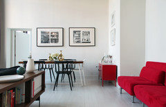
The kitchen, one of two in the house, opens up on the room’s other end. The dining table expands to seat 12.
The family likes to cook, and Marianne knew the kitchen would play an important role in daily life. Breaking down the overall square footage, Marianne calculated that each adult has about 360 square feet in the entire home. To make the most of that space, she kept everything as open and functional as possible.
The family likes to cook, and Marianne knew the kitchen would play an important role in daily life. Breaking down the overall square footage, Marianne calculated that each adult has about 360 square feet in the entire home. To make the most of that space, she kept everything as open and functional as possible.
The kitchen is bright, and the selection of light wood sliding cabinets over stainless steel shelves contributes to that overall brightness. When deciding whether a house will be light or dark, ‘there’s always a choice in the house,’ Marianne says. ‘I wanted everything to have this appearance of lightness.’ Locally harvested Canadian maple is used throughout the house.
The house has three stories, and the staircase was prepared so a stair lift can be built into it later. Alternatively, the first floor can become the primary floor, with the kitchen, a full bathroom and a bedroom all located on it.
Vantage points were also emphasised by colour. This view from the main floor down to the basement level ends with a bright yellow cabinet door. The staircase above leads to the upper floor.
Four bedrooms of equal size are spaced out around the house to enhance privacy and accessibility. The upper level, shown here, is a split level, with two bedrooms separated by a half flight of stairs. The basement level is an independent suite, and the main floor has a bedroom and a wheelchair-accessible bathroom that can be closed off from the common living areas.
All bedrooms, though connected, sit off the main path through the house in their own spaces. ‘The whole house works as this circuitous route,’ Marianne says. Private spaces are easily accessible, as seen here, but they can also be avoided. There is a freedom to interact if you choose to. It’s this usability that Amodio is most proud of. The half flight of stairs leads up to the the bedroom the parents use.
All bedrooms, though connected, sit off the main path through the house in their own spaces. ‘The whole house works as this circuitous route,’ Marianne says. Private spaces are easily accessible, as seen here, but they can also be avoided. There is a freedom to interact if you choose to. It’s this usability that Amodio is most proud of. The half flight of stairs leads up to the the bedroom the parents use.
Each bedroom has its own bathroom. Amodio designed the bedrooms and bathrooms in an almost modular way. Like the bedrooms, every bathroom, with the exception of the wheelchair-accessible first-floor bathroom, is nearly identical. Only unique tile patterns distinguish them. ‘There was a real functional approach to a suite,’ Marianne says. Everything was designed to be egalitarian.
Even in the master bedroom, distinguished only by name on the plan, the walls and ceiling of the private spaces are noticeably tighter than those of the common rooms.
Also apparent is the lack of wardrobe space and built-in storage. Though each bedroom suite has room for basic storage, and the basement level and garage offer more storage, the homeowners intentionally used this as an opportunity to minimise their possessions. This house looks at the question of how much space - and stuff - a person needs to live comfortably.
Playful peekaboo windows pop up in different corners of the house. The ones seen here are visible from the front of the house. They were placed to match the sight lines of the man and woman who use this room. A colour filter was added to the window next to the floor to play with natural light.
Discover 9 ways to deal with clutter in your home
Nooks, alcoves and balconies, such as this one, make use of every remaining square foot. In what would normally be wardrobes or leftover-space solutions, Marianne created usable rooms indoors and out. And in a house with eight people, it’s nice to find a moment of solitude - even if there’s only enough space for a stool.
‘To me the cake is really about that floor plan and how it’s able to work for that many people,’ Marianne says. Everything else is icing.
‘To me the cake is really about that floor plan and how it’s able to work for that many people,’ Marianne says. Everything else is icing.
The second floor is split level, with two suites a half a staircase apart. The roof has a deck and gardening space, as well as another private lookout space.
Millwork: Towne Millwork
Landscape design and installation: Beckie Stephens
TELL US…
What do you think about this design for ageing in place and multigenerational living? We’d love to hear your thoughts in the Comments below.
Millwork: Towne Millwork
Landscape design and installation: Beckie Stephens
TELL US…
What do you think about this design for ageing in place and multigenerational living? We’d love to hear your thoughts in the Comments below.

Sponsored
Reload the page to not see this specific ad anymore
Sponsored
Reload the page to not see this specific ad anymore
‘They were up for anything,’ says Marianne, referring to the homeowners’ willingness to explore and innovate with the designers and builders. They tore down the existing bungalow, built the new house as large as a standard Vancouver plot allowed and went from there. The house presents a modern front, and it would be difficult to guess from the street that it was designed for four couples.