Houzz Tour: A Budget-friendly Refresh of a Small Home
See how smart use of colour and materials, and considered storage solutions transformed a drab house for £27,000

With a budget of $50,000 AUD (around £27,000) and a broad brief to rejuvenate the main rooms in this weatherboard home, Candice Stroud, interior designer at Mos Interiors, focused her attention on colour, texture and introducing a few hero pieces of furniture. The result is a revived home for a family of four and a masterclass in budget-savvy design.
Living area before works.
The brief
The homeowners wanted a bright, modern interior with a Scandinavian feel for their recently purchased family home. With two small children, they required easy-maintenance furniture and finishes, but they also wanted the spaces to feel grown-up and worthy of dinner parties.
Looking to refresh your interior? Find an interior designer near you on Houzz.
Living area before works.
The owners’ must-haves
The owners’ must-haves
- A comfortable, easy-care sofa.
- Built-in units for the TV and study.
- New feature tiles for the kitchen splashback and island.
- A couple of investment pieces of art.
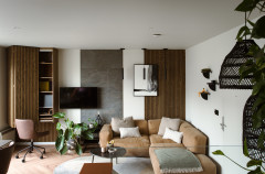
Brief for the living area
The owners wanted the adjoining living and dining areas to be complementary, with a comfortable yet elegant sofa at the heart of the living space.
They were keen for the living area to feel clean, uncluttered and suitable for children, but that once the children were in bed, they could quickly and easily hide the mess of family life.
Changes made
Everything is new – furniture, built-in cabinets and the colour palette. We only kept the white blinds, which I softened with the addition of beautiful, white s-fold sheers.
The sheers also help to control the strong afternoon sun that comes into the living area.
Colour and materials palette
I chose calming tones of soft green and milky white, paired with natural timber. The owners are busy with work and young children, so I wanted this space to feel relaxing.
We all fell in love with the custom paint colour for the TV unit and the green-blue of the large penny tiles in the kitchen.
Tying all of this back with warm whites and hints of bolder colours, such as moss green, peach and pink, just worked.
Built-in storage
The wall-mounted TV unit creates useful extra storage space in the living area. While the room is a good size, it can feel a little full, as it’s shared with the dining area. The wall-mounted unit also adds a bespoke feel to the room.
The wall-mounted TV unit creates useful extra storage space in the living area. While the room is a good size, it can feel a little full, as it’s shared with the dining area. The wall-mounted unit also adds a bespoke feel to the room.
Texture touches
Edithvale is a beachside suburb, and it was important to reflect the home’s location with a few gentle coastal touches.
Texture in the lighting, coffee table and bar stools adds a casual feel to what are otherwise elegant pieces.
Edithvale is a beachside suburb, and it was important to reflect the home’s location with a few gentle coastal touches.
Texture in the lighting, coffee table and bar stools adds a casual feel to what are otherwise elegant pieces.
A sense of connection
I created cohesion in the home by ensuring all the rooms contained an element, big or small, of our main feature colour – blue-green.
I also included other linking elements throughout, such as brass handles and oak touches.
I created cohesion in the home by ensuring all the rooms contained an element, big or small, of our main feature colour – blue-green.
I also included other linking elements throughout, such as brass handles and oak touches.
Brief for the dining area
A dining table large enough to fit eight people, with chairs that would tuck fully beneath it, plus gorgeous feature art.
Changes made
All new furniture and art.
Colour and materials palette
Oak, rattan and touches of soft colour through the original Kirsten Jackson painting.
A dining table large enough to fit eight people, with chairs that would tuck fully beneath it, plus gorgeous feature art.
Changes made
All new furniture and art.
Colour and materials palette
Oak, rattan and touches of soft colour through the original Kirsten Jackson painting.
Brief for the kitchen
First and foremost, the client wanted me to get rid of the kitchen’s original bright green glass splashback. They love green, but the colour was too loud, so we used this as a launch pad for a new, softer palette.
First and foremost, the client wanted me to get rid of the kitchen’s original bright green glass splashback. They love green, but the colour was too loud, so we used this as a launch pad for a new, softer palette.
Changes made
I kept the original white and dark grey cabinetry and added blue-green penny tiles to the splashback and front of the island, plus a pair of rattan pendants overhead.
I kept the original white and dark grey cabinetry and added blue-green penny tiles to the splashback and front of the island, plus a pair of rattan pendants overhead.
Brief for the hallway
The original front door was fluorescent yellow and the owners wanted a selection that was more in tune with the home’s coastal location, but not an exact match with the blue-green used elsewhere in the home.
Changes made
I changed the door colour to warm blue, added an oak console table for some interest and warmth (and somewhere to drop keys), plus a beautiful wall print of Wilsons Promontory, which is a couple of hours south in Victoria.
Colour and materials palette
Oak, warm blue and milky white.
Study before works.
Brief for the study
This narrow study is used by one of the owners and it needed to be clean and uncluttered, and feature generous storage and bespoke fitted joinery that tied in with the TV unit.
Brief for the study
This narrow study is used by one of the owners and it needed to be clean and uncluttered, and feature generous storage and bespoke fitted joinery that tied in with the TV unit.
Changes made
The main change is the addition of a wall-mounted desk, which I purchased from Ensemble and had customised with my choice of colour and finish.
It works well in this narrow space, as it doesn’t take up a lot of room and creates height to trick the eye into thinking the space is bigger than it actually is.
Colour and materials palette
As cohesion and consistency was key for both the client and me in this project, we used the same palette as in the main living area – soft green, milky whites and oak.
As cohesion and consistency was key for both the client and me in this project, we used the same palette as in the main living area – soft green, milky whites and oak.
Main bedroom before works.
Brief for the main bedroom
To be a comfortable retreat for the parents, with a grown-up feel.
Changes made
Everything in here is new.
Brief for the main bedroom
To be a comfortable retreat for the parents, with a grown-up feel.
Changes made
Everything in here is new.
Main bedroom before works.
Colour and materials palette
I specified a lighter and more pared-back colour scheme for the main bedroom to give it a really serene and relaxing feel.
I specified a lighter and more pared-back colour scheme for the main bedroom to give it a really serene and relaxing feel.
Tell us…
Are you impressed with this budget-savvy makeover? Tell us in the Comments.
Are you impressed with this budget-savvy makeover? Tell us in the Comments.

Sponsored
Reload the page to not see this specific ad anymore
Who lives here? A couple with two toddlers
Location Edithvale, Victoria, Australia
Property A weatherboard house
Size Three bedrooms and two bathrooms
Rooms redesigned Open-plan kitchen/living/dining area, main bedroom, study, playroom and outdoor areas
Interior designer Candice Stroud of Mos Interiors
Budget $50,000 AUD (approx £27,000), with most being spent on the open-plan kitchen/living/dining area
Answers by Candice Stroud
Photos by Daniela Fulford Photography