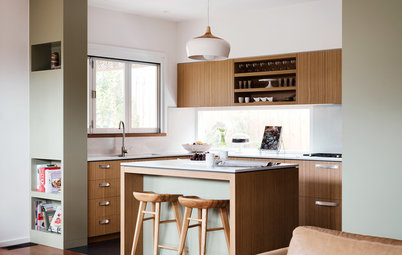
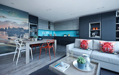
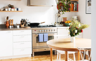
A Kitchen That Looks Less Kitchen-y
A sleek redesign transforms an open-plan room from a cramped corridor to a cooking-living hub

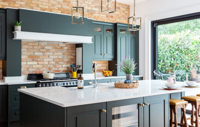
When kitchen designer Nicholas McColgan of Snug Kitchens first looked at this Victorian property, it already had an open-plan downstairs space, but the layout wasn’t working for the owners. “The kitchen is now the hub of the house, and links the dining area and the main living room, whereas the original kitchen was disjointed,” he says. “It was like a corridor you had to walk through to get to the family living room.”
The goal of the project was to create a large and functional room that didn’t dominate the space, says McColgan, whose background is in cabinetmaking. “The living area had to remain the focal point, as it’s the main family room. The way we approached it was to use soft, organic finishes.”
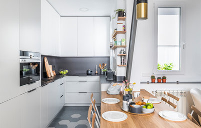
This design was about making the kitchen less kitchen-y. “The way we did that was by playing with depth and height,” McColgan says. “You’ll see there are mid-height cabinets on the opposite wall to the entrance, and we used the whole wall height on the other side, but fitted sunken-in cabinets. It feels as if you’re in a living area, rather than a kitchen, and the idea was that the kitchen became a bridge between the dining and living spaces.”
Y-Line kitchen with super matte crystal white base cabinets: IPS Pronorm
The space needed three weeks of prep work by the builders before McColgan and his team could move in. Underfloor heating was added as well as new Amtico flooring, and much of the plumbing and electrical work was rejigged to prepare for the new layout.
The couple also enlisted the help of interior designer Emma Hooton, who worked with McColgan on getting the shell of the space right as it moved into the dining and living areas.
Masters chair: Kartell
The couple also enlisted the help of interior designer Emma Hooton, who worked with McColgan on getting the shell of the space right as it moved into the dining and living areas.
Masters chair: Kartell
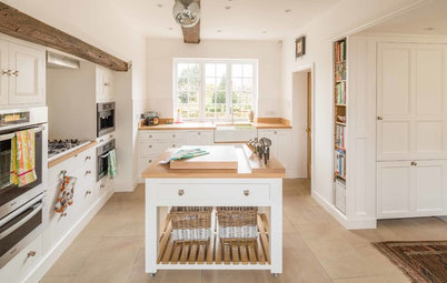
The homeowners went for built-in cabinets along an entire wall, which provide lots of storage. McColgan worked with the builders to get these planned in from the start.
“You can get this look by boxing the tall units in all around with material painted in the wall’s finish,” he says. “These are Rift Oak Dark Decor units by Pronorm. I didn’t do any carpentry on this occasion.”
Appliances: Siemens
“You can get this look by boxing the tall units in all around with material painted in the wall’s finish,” he says. “These are Rift Oak Dark Decor units by Pronorm. I didn’t do any carpentry on this occasion.”
Appliances: Siemens
“The cabinets are indicative of our design style,” McColgan says. “You don’t feel oppressed by them when they’re fitted into the wall like this. The tall units are three times the height of a normal wall cabinet and nearly twice the depth, so one tall unit gives nearly the same storage as six wall cabinets. Efficient, clean and so much less kitchen-y.”
The matte white cabinets create a crisp, clean look.
The countertops are Caesarstone in Shitake. “It gives a warm organic look with high technical performance,” McColgan says. “It’s easy to see why modern composites are so popular, as they’re available in hundreds of finishes, and are highly scratch-resistant and nonporous.
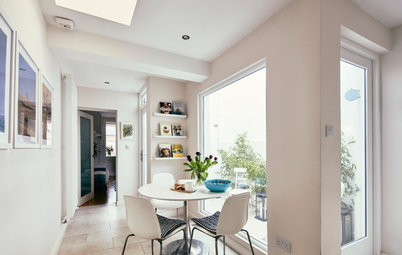
It was important for the couple to show an ever-changing collection of art in their kitchen, as they have two galleries (one in London and one in Winchester), so McColgan suggested this long floating shelf in a wood finish to match the tall cabinets. It’s deep enough to hold sculptures as well as frames.
Sink: Kohler; boiling-water system: Quooker; faucets: Franke
Sink: Kohler; boiling-water system: Quooker; faucets: Franke
The solid oiled-walnut breakfast bar seats four and was a neat solution, as the owners wanted the space to work for the whole family. Their son can do his homework here while his parents cook.
The mid-height cabinets behind hold tall glasses, bottles and schoolbooks if they need to be tidied away.
The mid-height cabinets behind hold tall glasses, bottles and schoolbooks if they need to be tidied away.
There was an existing addition to the house, which meant they had to think about how to install the ceiling fan for the cooktop, McColgan says. They created a bulkhead because the addition had a lot of steel joists in the kitchen ceiling.
“It also meant we couldn’t duct out the [exhaust fan], so we used a filter box, which means the dirty cooking air is passed through a carbon filter and then pumped back into the room as clean air,” McColgan says. “Modern filtering technology makes this type of recirculation very effective. The other benefit is that you aren’t pumping tons of lovely warm air from your kitchen into the garden.”
“It also meant we couldn’t duct out the [exhaust fan], so we used a filter box, which means the dirty cooking air is passed through a carbon filter and then pumped back into the room as clean air,” McColgan says. “Modern filtering technology makes this type of recirculation very effective. The other benefit is that you aren’t pumping tons of lovely warm air from your kitchen into the garden.”
Electrical outlets were installed on the end panel of the island under the breakfast bar. McColgan and his team simply drilled a hole through for the cables, then added a neat cap with a cutout, so phones can be charged on the tabletop.
Because the owners love entertaining, a generous dining table was a must. They were so happy with their renovation that they even had a launch party for it. “They’re good friends of ours now,” McColgan says.
Woods wallpaper: Cole & Son
Woods wallpaper: Cole & Son
McColgan is pleased with the outcome. “In 27 years of designing, this has been one of my favorite projects,” he says. “It’s a simple solution that’s created a more fluid space for family life, and it feels so relaxed.” Even the cat seems to agree.
Browse more Kitchens of the Week
Browse more Kitchens of the Week

Sponsored
Reload the page to not see this specific ad anymore
Who lives here: A professional couple and their 11-year-old son, plus their two cats
Location: Winchester, England
Size: The kitchen, dining and living area is about 36 by 16 feet (11 by 5 meters); the kitchen itself is about 16 by 16 feet (5 by 5 meters)
Designer: Nicholas McColgan of Snug Kitchens
It was a chance meeting that put McColgan in touch with the homeowners. McColgan had traveled to Winchester to buy a piece of art as a wedding present for his wife and, while there, he asked the gallery owner if he’d like to display some work in his kitchen showroom. “It turned out he and his wife were looking to refit their kitchen, and they didn’t feel entirely comfortable with the plans that had been quoted,” McColgan says. “So I went over to take a look.”
It ended up being a meeting of minds. “This project was a joy to work on, as the homeowners were happy to let us take the lead,” McColgan says. “It gave us a chance to demonstrate our ethos that kitchens should be warm and organic.”