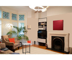
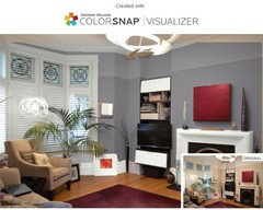
Walls colour vs conjugal harmony
Few weeks ago, the carpenter finally finished the shelving units in the living room. I knew from the beginning that the beige on the walls won't go well with the crisp black&white of the bookcases, but the plan was to repaint the walls gray or an off-white, anyway.
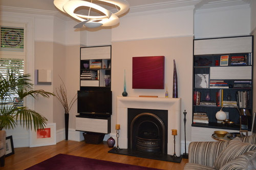
However, now hubby says he's happy with how it looks and doesn't want to have the walls repainted. He is normally rather casual (actually - uncaring) about my decor choices; this time though he's quite adamant that we should leave the room as it is. But I don't like it!! The beige clashes with the white and it makes everything look oldish and blah...

Comments (20)
 7 years agoI agree with you. And I think you should paint the walls crisp white to go with the shelving units. Can't really see the size of the rug, but it looks a good size from this angle. I'd say the rule of thumb is that everyone can put their feet on the rug when they are seated.Luciana thanked Carolina
 7 years ago
I love the title of your post, it could have been about my house! I think the beige is nice but I think crisp white would be gorgeous!
Luciana thanked uk1982
Luciana
Original Author7 years agoThank you both! So you think crisp white would be better? No grey? How about if I do the walls white and the ceiling grey? Hubby would probably start howling :))
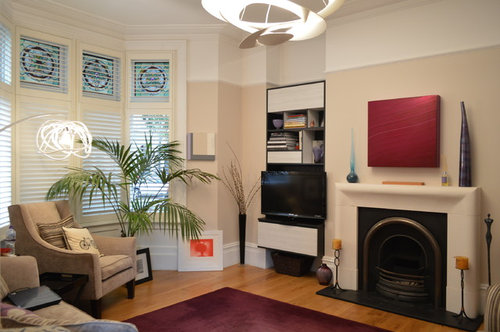
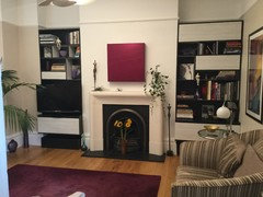
Carolina, long time no see!! Hope you're ok! Here's an older photo where you can see the rug better... I did move the furniture slightly away from the walls now, so you can put your feet on the rug, but I've always thought it's too small...
 0
0- 7 years agoI think you need another colour- if you paint this room white the fireplace will disappear.
I agree that the beige is not doing this room justice but perhaps hubby likes it's warmth and imagines white and grey will be cold. Perhaps you can sell him on a warm grey with either a green or beige undertone or since so little of the wall is showing (because of doors and windows and fireplace etc) you could consider a dark colour- with the red accessories I think F&B Tanners Brown could look great.Luciana thanked Jonathan Luciana
Original Author7 years agoJonathan, I love the way you're thinking! That is bold and a lot to my liking!! How am I ever going to convince hubby, though? He keeps saying the room is too dark anyway (it's North facing)... He's out sailing at the moment; I'll let you know his reaction to your suggestion when he gets back :))
0 7 years agoHi,
I think.many are reluctant to use grey on walls as it's seen as a cold dreary colour.
I think it would look fantastic in your space, co-ordinate well with your current deep red accents and frame the shelving and fireplace.
As it's north facing I'd avoid greys with blue undertone to prevent it looking cold. I'd select a grey with warm undertone or a taupe-ish grey which would work well with your sofa's.
All the bestLuciana thanked A S- Luciana thanked A S
 7 years ago
I wouldn't do it white. If the room is North facing it could feel cold and unwelcoming. Whatever you do it needs to work in daylight and lamplight. I'm not entirely sure that the red painting is working with the purple rug, I think I would try it elsewhere if possible. There are a multitude of greys, you need to pick one that has a tinge of warmth to it, and not blue. Once you have decided on a good neutral you could add some depth with a deeper colour in places - perhaps the chimney breast.
Luciana thanked Juliet Docherty PRO7 years ago
Wow! You have so great height! I'd paint the same colour all the way to the ceiling molding to get all benefits from so high walls. And gray will go perfect with white.

 Luciana thanked Celery. Visualization, Rendering images
- PROLuciana thanked Celery. Visualization, Rendering images
- 7 years ago
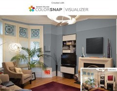
Hi Luciana :-)
I did a mock up too of your room. Now I know it's North facing, I'd go with a warmer white. I tried to get the same colour as the top part of the walls, but it turned out a bit darker. Gave you a neutral creme rug, removed some accessories that I feel don't go with your modern art and modern built in cabinets, gave you a black framed table that ties in with the cabinets, and a burnt orange cushion. So I toned some things down a bit, but think that you can add some red, purple and orange in accessories.
It looks like you still have artwork waiting for a spot on the walls, therefore I thought a calmer, more neutral base would work well.
 Luciana thanked Carolina
 - 7 years agoIf the lighting is not great- and given that it is a living room, are the lights normally on when you use the room? If so you need a colour that will work with electric light, white can look cold in this situation, creams can look yellow, magnolia looks peach, some greys look blue. I think you need a colour with green or brown tones but whatever you choose you can't make a room lighter by painting it a light colour- so I say go boldLuciana thanked Jonathan
 7 years agoYes to a larger rug! The one you have is not terrible, but one big enough for the feet of your seating to rest on would make a great difference!
The paint colour, warm medium gray would look good.
Maybe ask your husband if he has ideas of changing it to anything else, I.e. Other than white or gray. speaking of which, stay away from white. a colour will give some more interest and feel coherent.
You could try out some paint visualisers online together
as a side note, I think you have a bit too many accent / decorative pieces, also in too many colours (multiple vases, candles, scent sticks I think, object below the art) these are all pleasant looking items, and perhaps you could incorporate them into the room further apart, or some together as a collection, but as they are, to me, it gives no focal point, no balance and rest.Luciana thanked NajeebahLuciana
Original Author7 years agolast modified: 7 years agoThank you all for your suggestions! Lots to consider... Special thanks to Celerygirl and Carolina for the mock-ups. I have to say, that creme rug changes the whole feel of the room...
AS, Colourhappy and Celerygirl, I have some 3 different greys left from other jobs; I think I'm going to paint some lining paper and put it against the fireplace, units, windows, etc and see what it looks like. I'm also thinking of the smokey purple we have in the bedroom, that could be an alternative. Also, I'll have to buy some of that hue Jonathan suggested (it's quite intriguing).
Jen P and Carolina, maybe I could keep the beige and change the accessories... I ordered a new frame with a proper mount for Chris Ofili's painting and might put it back above the fireplace.
Najeebah, I know I need to cull the accessories, we have too many all over the house and I don't know where to place them any more. But I love most of them and find it hard to think about letting some go...
Hubby almost sank in the middle of the Bristol channel today and had to abandon the race, so I thought bringing up wall colours tonight would not help my cause. See, I can be sensible... and he says I'm not sympathetic to his sailing problems... :))
Thank you so much for your help again, I'll let you know the next step as soon as we decide what to do.
Good night all!
 PRO7 years agolast modified: 7 years ago
agree the beige does clash. its two styles that are contrasting - two things to look at are the lighting and also the paint. tread lightly with your hubby of course but i think a gentle paint job - farrow and ball has a lot of warm greys that wont make the place cold but would drastically change the look and feel of the place :)
Luciana thanked Aflux Designs PRO7 years ago
Dulux had a really nice paint range a few years back which they subsequently withdrew- Dulux 'Simply'. There were a number of really beautiful & sophisticated colour greys grouped in themes, in varying degrees of intensity. 'Dove' or 'Clay' immediately come to mind as possibilities. You could ask your paint stockist to do some samples- all of the codes are still on the stockists' tinting software.
Luciana thanked Hand Built DesignsLuciana
Original Author7 years agolast modified: 7 years agoThank you all again!
After some deliberation, hubby and I reached a compromise: we'd paint the chimney breast white and see how we like it, then make a decision about the rest of the room. I'm afraid he categorically vetoed any strong dark colours and the greys too... This is the result:
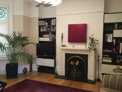 I asked the carpenter to build two boxes to go under the units, the space under them seem out of proportion before; also took off the door on top of the TV unit.
Had the Chris Ofili print framed, but it didn't look right on the chimney breast (too tall), so the Jason Martin stayed on, but hubby agreed we should look for a larger painting.
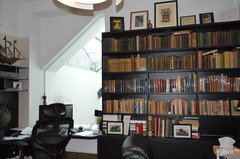
Also brought a few of my statues in the room - everybody likes the plaster readers. Still a bit of a mishmash with all the accessories and books, but by the end of the day that's why we built the shelving, to house books and vases. The bookshelves in his office (which were put up by the carpenter only one month ago) are already full...
Once more, my gratitude for all your help!!
- 7 years ago
It looks lovely! What a difference only painting the chimney white has made. I do like the red painting, don't think you need a larger one, since this one has quite an impact. Lovely room :-)
Luciana thanked Carolina - 6 years agoI know what you mean Luciana. You've gone to all that expensive but it isn't doing it for you.
For me it's something about those stunning windows. It feels like the walls are crying out to be linked with a colour that flows with them.Luciana thanked dee paraskos

Reload the page to not see this specific ad anymore

A B