


Recent Activity
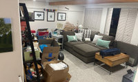

I would start with a MAJOR decluterring. How much of that stuff do you need to keep? Either get rid of it or find a home for it.
First empty it then a to scale floor plan I will say family movie night and sleep overs usually do not work together for sure not with teens .Ask the teens what they want IMO since this will be their space and honestly no office either . Gaming is a big thing for some teens that requires some different seating , and do not forget sleep spaces .

I’d start by clearing out the boxes, loose items and extra small furniture, including the white console beside the sofa. At the moment, the things behind and around the sectional are taking up a lot of usable space and pushing the seating into the middle of the room.
For everyday use, I’d keep the sectional in its most compact configuration, with any pull-out or reclining sections closed, and bring the coffee table closer to the seating while leaving comfortable legroom. I’d keep the main furniture to a simple combination: the sofa, coffee table, and a low media cabinet with the TV mounted above it on the opposite wall.
For the office, I’d explore placing a slim desk against the wall with the three pictures, behind the sofa, with a chair that tucks underneath. I can’t tell from the photos how much depth you have there or what those doors lead to, so this would depend on keeping the doors usable and leaving enough space to sit and walk through. If it fits, the sofa back would help screen the work area from the rest of the room.
Once the extra furniture is gone, I’d soften the room with full-length curtains at the windows, a compact decorative ceiling light suited to the ceiling height, and a table lamp for softer evening lighting. For the dark sofa, I’d choose larger cushions in warm ivory and deep teal, mixing a subtle pattern with textured plain fabrics, plus one soft throw. That would make the room feel more cohesive and welcoming for the whole family.
I’m an interior designer, and I made a video showing four different styles for the same living room while keeping the furniture layout the same. Once you’ve cleared the space and settled the practical arrangement, the examples could help you see how lighting, curtains, colours and décor work together to change the room’s character and choose a style that suits your family:

I would do nothing. With every home I’ve purchased I’ve redone the things I didn’t like. For example, in my current home I had all the landscape & hardscape done to better complement my modern MCM home. Guess it depends upon your market though. It looks like a nice house though, maybe just a little cleaning up the landscape.

Will suggest that you put it on the market as is. As someone else said you never know exactly what appeals to potential buyers. You could make changes and then a new buyer could change those completely.
If I was buying the first thing I would change would be the tacky balcony above the garage and that door becomes a nice big window. So clean it up make sure the interior is spotless and decluttered and move on
I have both. My second home has really tall ( idk how tall ) cabinets that go to the ceiling, my primary home does not. Even though I’m tall I never use the the uppers in my second home & I’m not about to climb on a ladder to access them. I realize that it’s ”de riguer” to have them installed to the ceiling, see that mentioned on this site always, but I don’t understand the appeal. Guess it’s for aesthetics. Resale? Do you intend to sell soon?
It depends on your local real estate market. If there are many new homes in your area with 10 ft ceilings with cabinets to the ceiling, then it would make sense to upgrade your home with similar specs.
If most homes are of the same vintage as yours and they all have soffits, then it might not matter if you keep shorter cabinets.
As a buyer, I would be annoyed that you had a newer kitchen and kept the soffits with short cabinets. Depending on the market, I might make an offer that would take into account having to remove the soffit and get new upper cabinets.
You aren't going to please everyone!
Maybe show us a photo of the kitchen so we can see how the soffits "feel" in the actual space.
Also how big is the kitchen? Getting rid of the soffits will have a bigger visual impact in a smaller kitchen.
" I am remodeling my kitchen and replacing almost everything but not changing the layout, no walls will move. "
We have remodeled 2 kitchens without moving any walls, but we absolutely made layout changes. In the first one - a U-shaped kitchen with the sink in the middle - we moved both the range and the fridge away from the corner, greatly improving both storage and work space in the kitchen.
Chances are there are places you can improve with minor tweaks to the layout, without significantly changing walls or appliance placement.
As for your question: in both our kitchens, the top of the uppers are 8' from the floor, in spite of vaulted ceilings in both cases. I would always recommend cabinets to an 8' ceiling; possibly 9', depending on the situation. But 10' is WAY up there. Cabinets are too expensive to install if they are not realistically ever going to be used.
Pictures would help a lot!

Very little. Finally caved & hired someone to install Christmas lights on the exterior. Very little inside other than 3 ’ & 4’ prelit trees from Balsam Hill. Reason is that I hate taking everything down .
i know someone who starts decorating in October, 4 or 5 Christmas trees plus tons of decor, looks like the Costco holiday decor aisle exploded in her house!

To see lovely pumpkin displays, I visit my local arboretum.

I got inspro from Blayke Silva video for my table.

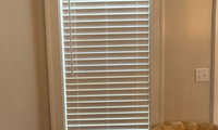
Since it’s a 9’ ceiling I would look for a ”semi flush” light fixture online ( Lumens,Lamp’s + , etc. ) I’m a Roman shade fan.
The fixture is not ugly, it is just too large for the room and too large for most homes - it is more of a foyer light or even dining room, but in smaller scale.
If you want curtains I was able to do it in my bedroom and hall with a similar setup and a rad! it is not perfect but it looks ok in my opinion.
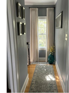
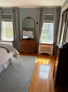
“We will probably live here until one of us gets carried out”. How old are you ? Not that I think that matters. Remodel to suit your tastes & needs & disregard any consideration of ”future buyer expectations”. Who cares what they are? You would have to be psychic.
@palimpsest. Yes, that is what I am not wanting to do. I am thinking Cambria shower walls in a beige/tan maybe veined, wood toned vanities again. I have a CKD, Aging in Place person coming out tomorrow. She actually worked for the local home improvement store and did the original layouts and then helped with the kitchen refresh 15 years ago,

great project & sounds like you’re on the right path - I love a fresh, updated and low key bath that looks like it belongs in the house. We redid my sons’ bath a few years ago - we live in an old home and just did classic black & white. I had to force myself not to fall in love with gorgeous/dramatic tile and stay simple as it fits the home - and it does tend to age well


If you don’t like Tuscan get rid of all the metal accents above the hood and doors, the wrought iron sconces, and get a cleaner fixture over the island. The floor is not the biggest issue.

I think it looks nice. I would remove the eagle and beef up the porch columns.
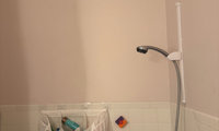
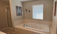
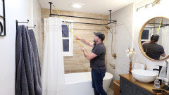
Install a ceiling mounted curtain rod meant for claw foot tubs.
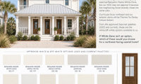

Our HOA prefers adjacent homes not be the same color, but we are hoping they will still allow us to move forward.
You quantifiably do not have a problem. BenM Swiss Coffee might as well be White Dove when applied exterior. The quantifiable difference between the two is extremely small. You can compare factual color attributes outlined in pink.
BenM Swiss Coffee is comparable, you're not making any concessions with it.

However, I think they did you a favor; I would choose Oyster White out of the options available (outlined in orange). It has the most chroma (orange star). And that is what you want in that region. I specify color in Phoenix, similar intense sun situation. OW is the only white on that list worth testing IMO. We have done exteriors in BenM Swiss Coffee and it always shows up more white that homeowner expected because the chip and even the Samplize shows up warmer and creamier than the reality of painted exterior walls.
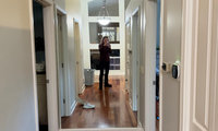
@Amber …. its not so much that it’s a “dated” look, I think the issue is that it’s a “tripping hazard“. A safety issue, it was a deal breaker for us while house hunting several years ago. We passed on a beautiful house because they had several, one stepping down into the master bath , yikes! I know people that have had their’s removed but that is a big $ project.

I would keep the mirror at the end of the hall and have a sticker made of a sleeping dog and adhere it near the bottom of the mirror so it looks like there is a dog sleeping in the reflection of the mirror but not in the hallway.

Why two active threads about this?
https://www.houzz.com/discussions/6611238/if-selling-house-should-i-remove-these-mirrors-walls#n=7
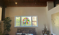

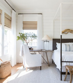
I agree with the woven shades and drapery panel solution.
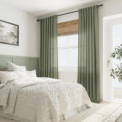
The stained glass and dark wood ceiling already give this room a lot of character. If you’d like to soften the space, I’d consider simple floor-length curtain panels at the sides, with enough room to stack clear of the glass. Since privacy isn’t needed, they could stay open and frame the window.
I’d mount the curtain rod closer to the ceiling rather than just above the window frame. That would draw the eye upward and make the most of the room’s height.
I’d decide whether the bench is staying before choosing the length and placement, so the fabric doesn’t bunch up behind it. A plain textured fabric could work well without competing with the stained glass.
I made a video comparing roughly $10 and $50 curtains and showing how fabric, fullness and hanging height change the overall look. It may help you decide what would suit this room: https://youtu.be/zxl28NBfMEo

Rather than OUR thoughts what would you like to use the garage for? Would you use the gym? Lounge area? it’s personal, what I would prefer is irrelevant.

You have wonderful space. Using the vacant garage for shelter or 3-season space is a great option.
Our former property wasn’t as large or provide opportunities like yours but we did install serpentine
gardens, firepit and steppingstone path. A video showing the final result follows.

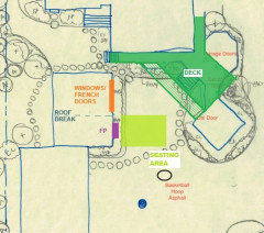
Because of the multiple deck entrances, multiple accessory structures, and change in elevation, a professional architect and landscape archtect should be involved for a successful outcome.
Not all info is apparent from the photos and drawing, so this is just conceptual. Two things I notice immediately that could be considered in a design:
- The pavilion seems too visually disconnected, just a "bridge" to access it, and the very haphazard deck footprint exacerbates that. So in order to integrate it more seamlessly with the main house, extending the deck out while simplifying the footprint would help.
- The garage roof varies, so that should be respected with the layout of any changes to the garage. The secondary roof section of the garage seems to offer an opportunity for a fireplace and patio seating area in front of it.
No style of seating is going to change the length of a person's thighs.
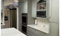
I really like the color you have, perhaps you would like something with a little less gray undertone? Something like SW Clary Sage?

Thought this article might be helpful with its commentary and Green Smoke kitchen examples.
https://www.sarahkaron.com/farrow-ball-green-smoke-matches-dupes/
Thank you,VAal. I really love thst color! Maureen/-thanks for sharing

Square, definitely.
I popped out the grids on my garage door at my last house, easy to do. Btw, I love having windows on my garage door, brings light inside.

The square look best. The solid looks good too, but if there are no other windows in the garage the door windows serve a purpose!
Square, no hinges, or no windows, no hinges. The less busy the better, as your house already has enough visual elements.

Our contractor saw our custom kitchen cabinets 15 years after he fabricated them. He was amazed that they still looked almost like new, said he sees some of his work six months later with lots of wear & tear on them. YMMV however.
Many manufactuers have specific cleaning instructions
As someone who builds furniture for a living, this photo shows exactly why I think the edge and underside of a piece tell you more than the top does. When a surface lifts or seams open up like this after a few years, it usually points to how the piece is constructed rather than how it was treated. Veneered surfaces over composite cores can fail at the joints when the core moves with humidity, and unlike solid wood, you can't simply sand and refinish them back to life. Before buying, I'd suggest checking a few things: ask whether the top is solid wood all the way through, look at how the edges and corners are joined, and see how the underside is finished — well-made pieces tend to be finished underneath too, because the maker expects them to last. Solid hardwood isn't indestructible, but it is repairable, and that's the real difference. I hope you get a resolution that feels fair.

As always, you need to seek the help of someone ( a nursery, landscape designer or ? ) local. Even though you’ve mentioned your zone, there are wide variations, microclimates, exposures, etc. that can’t be addressed on here.
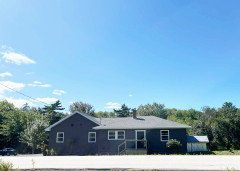
I need to start small and work towards more later. Today it seems bare, we have big property behind us.
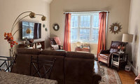
I usually try to position furniture so you can take advantage of the view out a window, but in your space I like the sofa under the window because it really opens up the room.
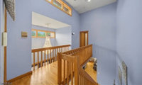
I would replicate what you already have in a safer version. I would seek the services of a talented woodworker or stair company. That’s what I did in my previous 1979 ”contemporary” home., which from the looks of it, without seeing your exterior, reminds me of yours. I think Patricia is correct regarding horizontal railings , a condo complex in my area is replacing all of theirs due to “safety” issues ( assuming children climbing ).
Agree with Dani…. Cleaning the grout makes a huge difference. I was surprised . Did the same at my previous home, wish I had done it sooner!
KAT! ❤️🙏YES!

You're welcome. I hope you can find someone to do the work for you.

Hire someone local ? That’s what landscape designers / architects do.
AI is notoriously lacking for landscape design. It can sometimes be useful to “jumpstart “ a thought process but that’s about it.
Thank you. Some additional information.
House Orientation: North-Facing (Full shade / indirect light)
USDA Climate Zone: Zone 8
Garden Bed Dimensions & Specifications
Bed 1: Garage Wall (Left Elevation)
Dimensions: 20 ft. Length × 4 ft. Depth
Area: 80 sq. ft.
Bed Type: Linear shallow foundation strip
Bed 2: Dining Room Wall (Center Courtyard)
Dimensions: 13 ft. Length (along wall) × 20 ft. Depth (extending outward till walkway)
Area: 260 sq. ft.
Bed Type: Deep courtyard nook / showcase garden
Bed 3: Living Room Wall (Right Elevation)
Dimensions: 14 ft. Length × 5 ft. Depth
Area: 70 sq. ft.
Bed Type: Linear shallow foundation strip
Design Constraint: Must keep plant heights below window sills.
Bed 3 extension: Conservatory (Rightmost Elevation)
Dimensions: 12 ft. Length × 6 ft. Depth
Area: 72 sq. ft.
Bed Type: Linear shallow foundation strip
Design Constraint: Must keep plant heights below window sills.
Based on above suggestions, I will probably wait for landscape design consultation and recalibrate accordingly. I may need to swap some of these choices. Any plant suggestions are welcome though.
I think it is too much for this forum.
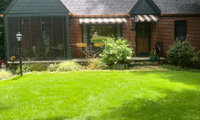

You’re prepared? Good deal. Unfortunately others haven’t been and get their feelings hurt.
Mea Culpa.
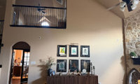
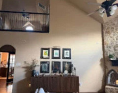
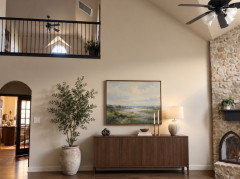
I think there is actually too much going on. The wall feels busy because of the two openings, the grouping of prints, and the numerous items on the console.
Suggest moving console over a bit to create more balance and add weight and volume to ground the wall/offset the openings and enhance the fireplace. Different proportions will really make a difference…less will be more.

I would not do the green with those floors so I vote all one color and I guess the white but honestly I would think hard about painting at all. It looks like the cabinets are 2 colors of wood is that right ? If so I would just have them stained all one color unless you are changing the floor.
Urbane Bronze would be my choice.

Shingles are already bought.
Unused buildings materials are easily returned.
Try to decide on all your exterior colors/finishes/materials now, not one at a time.
What brand/model of windows are you getting?
I would do black the bronze my next choice but charcoal and black just seems to be a better choice and in the pics you post it has a nice clean look

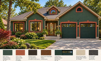
NO to the two toned garage doors. I would just do garage doors the siding color, no need to emphasize them.
Patricia, the second photo is the house in progress. The siding is Certainteed Forest and the garage doors are original from the previous sage green. We squared them off and intend to "beef up" the posts. Trying to decide on entry door and garage door color/style
It was instructive also to approximate how certain colours conflicted with the eavestroughs.
Agree with Sigrid’s comment … ”garish” , but it would look sort of ”Christmas” .