

Recent Activity

KSWL…thank you for the gift article.

I’ve seen that video and agree with it 1000%. And that is exactly how I used to explain privilege and social capital to our kids way back in the early 2000s, lest they think they were one molecule better than anyone else.

As for the typos, so many people no longer know how to spell and no longer know good grammar, and so many people skim and scan rather than read-- it's appalling what can make it into print. Even in juried publications.
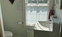
Ilike the second one because i find it stands out better. i find the first one too pale.

I like both papers, but, think they may be too cutesy for a powder room.
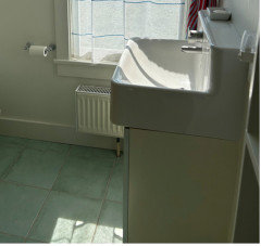
I notice there are a few tones of green in the bathroom. Find a paper to include them>
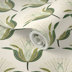

Aren't you in Maine? I'm somewhat of a traditionalist and I wouldn't use a tropical or color-saturated paper just because a powder room allows you to be bold. It's a Maine powder room.
I like the idea of a colored background rather than a cream background, like the blue-gray paper Emily posted. I like how the creamy white flowers pick up the color of the vanity and window trim while the background matches the floor tile. I wouldn't use that particular paper however.
We stayed at Hotel Grifo in Rome a few years ago. It's not fancy but it's nice and was clean and offered breakfast. It's a great location in the Monti area. https://www.hotelgrifo.com/en/
It's near cafes and shops and walking distance to the coliseum and many other sites.