


Recent Activity


@housegal200 …… lol, exactly what I was thinking, ”don’t even THINK about a bean bag anything” …. omg!
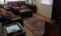
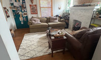
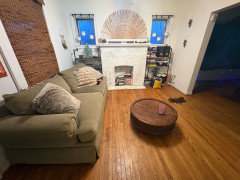
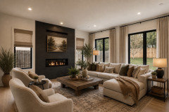
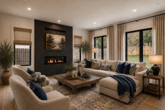
This is the wall with the fireplace
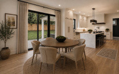
These are some pictures of what it looks like from the dining room. I plan on getting curtains from the dining room instead of the tapestry.
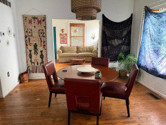
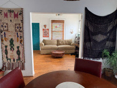
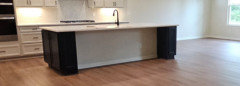
You have a very nice, modern-design home with clean, simple lines. I would recommend to keep simmilar flair with the furniture. Also, I think this island white area should be painted the same color as the rest of the island.
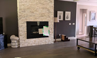

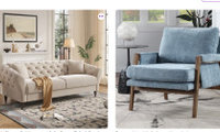
I agree to stay far away from gray near the fireplace. The fireplace has warmish colors of cream and tan and that last sample picture of gray (or green, I can’t tell) is an obvious clash.
I don't know if it's all the stress right now or coming to my senses and doing what @Jan Moyer often said, "Edit". But I decided to switch from the glass inserts to slab doors on my wall cabinets on the south sink wall in the kitchen. I just imagined them between the window and sliding glass doors and thought, "That's too much glass." Also, those are prep area cupboards, not contents I want seen. The glass was going to have to be so dark, it wouldn't have had the light effect I was after. And they will be wood, the cherry with "truffle" stain. I went back and forth between stained and painted for those cabinets.
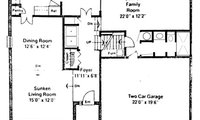
I also decided that immediately after the renovation, I'll use one of my leather loveseats in the living room and one in the family room. My chair and ottoman go in the family room too. That will give me the chance to carefully add in the non-seating pieces, the bookshelves and tables. Then I can add in new lights, consoles, and make sure of the living room arrangement before adding in a daybed in the family room and sleeper sofa upstairs in our workout room. I don't want things to get too crowded.
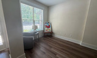

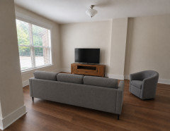
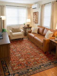
This is a setup that you can try out. The proportions are a bit off in this photo but it can give you a general idea. The space seems small so you can only fit so much into it, therefore I suggest only using one of the accent chairs here if you want to keep it a TV viewing/living room area. This is not the exact console i'd use, it's to give a general idea of where to put the tv. You can put the table with the lamp on it on the right side of the sofa for task lighting. If you have another space in the house that would be a better fit for a tv area I'd consider exploring that too.
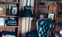
If you are ever short of natural light, buy more artificial light. I love trees and they make my home dark. I have north windows, and my south windows are under deep patio roofs. No amount of white paint can make up for insufficient light. To add insult to injury, white paint just looks grey and dusty. The only fix to not enough light is more light fixtures. And I'm sick of dusty dingy wall colors. I want rich, sumptuous interior colors, not dust. I want dark backgrounds to show off all the light fixtures, art, views to the yard, and the beautiful grain of the wood furniture in my home. When I turn down the lights in the evening or when I first wake up, I don't want my walls to look blah. I want them to glow in a deep velvety color where the light touches them.
Please show results or progress in all your posts. You have such a lovely and interesting home.
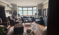
Hellogardener, I decided on color, BM Mysterious for the library (dark blacky blue). The problem is, is that we have too many things on the go at once so I have many paritally completed spaces! My husband won’t budge on the neutral, kind of boring living room paint for right now.
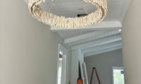
I find it difficult to embrace many styles of lighting, so don't mind me. Mine is a complicated relationship. But I'd never get past my first thought of how much it resembles the edging on a ladyfinger cake. I'd probably chuckle to myself every time I saw it IRL. That isn't necessarily a bad thing, but probably not the desired reaction.

Way too big! For hallways, measure length and width of space and divide by 2.
The chandelier would look better over a dining table and you weren't looking up into a hole. The 25" one would look better and probably the correct size. Currey and Company shows how it is white washed. Your does look yellow....maybe the light bulbs are wrong color?
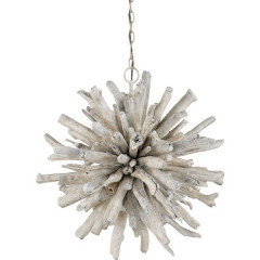
Your designer should know how to choose a chandelier size, BTW.
I think it's too big for that space. Find something smaller than that and it will be good.
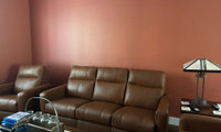

mustard or sage is not the first colors that come to mind with a brown leather sofa.
a dark olive green, a dark gray or even blue would compliment the Brown leather.
It's a realatively small space, you could use the mustard in accents. Will you get an area rug?
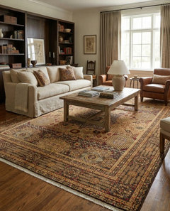
I will definitely be adding a rug! I hadn’t thought of blue but just saw a post about it.

When you have a brown leather sofa, think about colors in nature - especially for accent colors.
I agree with Lyn above - I forgot to pull a dark gray photo!
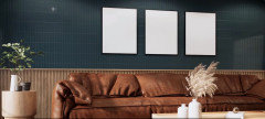
Personally, this blue is not something I would use - however, it is a popular color:
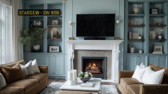
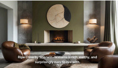
Olive Green - I think darker would even look better:
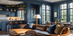
BM Hale Navy was the color of the year several years ago - I still see rooms where people are using it now.
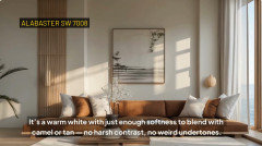
If you want to throw in mustard yellow (+ some other pop of color) - SW Alabaster might looks nice:
SW Evergreen Fog was also the "color of the year" a few years ago:
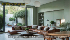
If you want to try something bold!
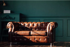
There are many greens that will work with the brown leather that you have:
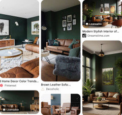
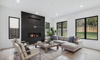
You asked about a color scheme, and that should be personal preference, not what is trendy. In developing a whole-house color scheme I would love forever, I was helped significantly by this article and the ones embedded in it from the same author: https://www.fromhousetohome.com/whole-house-color-scheme/
Work through it a couple times. "Warm" color schemes primarily are leaning towards yellows and oranges at the moment, but the other option is reds, and my heart sings with the reds... in the form of cool espresso chocolate browns. These are getting less attention, but I thought I should mention them in case you like them better than the mainstream caramels. I especially like the chocolates balanced with cool steely blue greys to create a neutral base to the whole color scheme.
I also love organic contemporary styles and look forward to your project.
If you’re not planning on painting then stick to neutral color that will work with a lot of different color schemes. I prefer to stick with draperies that are pretty close to the color of the wall or a tad darker.
If you’re feeling pressure to cover windows but not quite sure what you want, there are paper cellular blinds that make do until you know what you want. These are good on smaller windows and great for areas like the bedrooms and bathroom.
If you’re not sure about a color scheme then look at rooms that you love. You might find that you gravitate towards particular colors. Going neutral in your big pieces like the upholstery gives you more freedom to change things up if you’re a person who likes to do that more often.
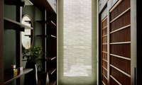
I had to laugh as my husband marveled at how innovative it was to entertain the grandkids by having puzzles on the cork floors upstairs being renovated... no furniture. He previously was concerned, thinking the floor would be too hard. But my 7-year-old grandson first sat down on it and spread his hands on it and said, "Oooooo" at how comfortable it was. After a couple days, my 10-year-old local granddaughter declared that bedroom should always be for puzzling on the floor. Cork flooring up here was a great choice.
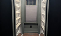
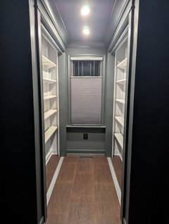
At the end of the hallway, by the window, the shelving for the two shallow closets with mirrored doors went up yesterday. After they are painted and the doors go back up, we won't be able to see them as clearly, so I got this picture. I left more space at the top (17") and more at the bottom (24" or 18") and had smaller spaces in between. I look forward to moving items upstairs as soon as these closets are finished. Our downstairs bathroom and utility closet are packed full of cleaning supplies and back-up personal care items during this renovation.

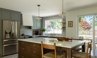
I always wonder why kitchen designers suggest dividers/pegs in drawers to store different size plates, etc. I store plates/bowls, etc. in drawers and no pegs or dividers are necessary. The weight of the items perfectly hold them in place and you could even add the rubbery drawer liners if storing small items more likely to shift. But the pegs and dividers take up room and make it a less versatile storage location.

I like this approach to living room design, focusing on the mistakes I might make. I made the first one, not having storage. I have no storage for the jigsaw puzzles I want to feature in this room, for the binoculars I want for bird watching, nor for decorative items not currently on display. One of my solutions may be to move the bookshelves from the adjacent hallway into the living room to display my items instead of storing them and rotating them. Another may be to move a chest of drawers in here for the puzzles and binoculars.
And don't put a Home Goods/Wayfair/ giant decor clock in your living room, a space meant for relaxation, not tracking the time. Exceptions: family heirloom grandfather clock or Swiss cuckoo clock.

Some love the eclectic look, but we have found that having a consistent theme and period (ours is midcentury) make the space feel consistent and much more pleasant to be in.
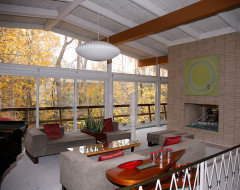


For everyone saying a TV above the FP is too high, there is a product called Mantel Mount that allows the TV to be pulled down to your preferred height when in use and pushed back up when not in use. You can add on a bracket for a sound bar and they make a paintable cover that goes over the wall mounting bracket, so you don’t see the mounting hardware. Wouldn’t it be great if we all had an extra room or the perfect place to prop a TV that followed design principles - sarcasm because no one watches TV in their living room. 🙄
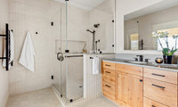
We put in a bathroom with a towel bar that is also a grab bar, glass enclosed curbless shower with stationary shower head on one side, a hand held shower head on an adjustable bar, a grab bar and fold down seat. Little did I know that 5 years later I’d be dealing with a hip replacement. It came in very handy!
Grab bars! And not just beside the shower seats. They are also very useful getting in and out of shower enclosure. Especially if you have a curb.

I like the no-door/partition options because it means less glass to keep clean; aging in place is just a bonus. Defiitely going to keep some of these for inspo in planning my bathroom remodel.
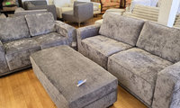
To answer the true color questions, this photo shows what happens when light hits the velvet.
The nap catches my eye and contributes to a feeling of being in a story sea. The showroom owner suggested buying a Bissell Little green machine, which I will do because there’s going to be eating and feet up that constantly disturb the nap,
I’m instead shifting my view to take this as an opportunity to not be responsible for a pristine appearance —especially hard for those of us who lean toward perfectionism. 🙂
@Diana Bier - It hasn't been delivered yet, but no, it can't be returned. The picture is a bit deceiving. It's not mottled --it's velvet so the nap is just going in different directions. Not the configuration I would have chosen, but it is comfortable (I'm 5'4" and he 6'2" so that is a feat in itself). My husband will be in charge of maintaining it (or not). My practice will adjusting with good humor and just letting it be.
I'll design around it, playing around with some ideas on this thread. Once it's delivered I'll be able to bring a cushion into a showroom to make a carpet decision. I have been enjoying the crowdsourced suggestions. At the end of the day, the relationship matters much more than any furniture.