
Despite all the mobile messaging and chat apps available today, when you want to get in touch with your audience, build client relationships, and drive sales, nothing is more powerful than email marketing. From the moment your email appears in the reader’s inbox, they should be compelled to click and scroll through it, even with just a quick glance. To get the most out of your email marketing, check out the tips and tricks below so you can create successful emails that engage your audience.
Email Design Best Practices
Personalisation
Email is the perfect place to express your brand identity. With a little added personal touch, you can help your audience feel more connected with you and your services:
Add your logo: Your logo is your brand’s icon. Including it in your email will help your readers to recognise your company instantly. Your logo should always fall into the visual hierarchy of your emails. Whether you place it in the top left corner, or at the bottom in the signature, give your logo as much exposure as possible.
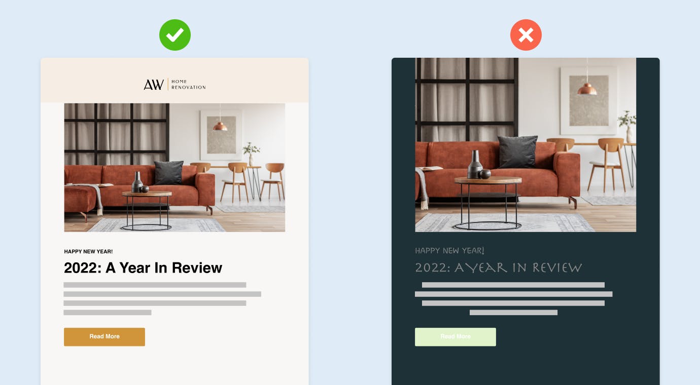
Choose the right colours: The right colour combination plays an active role in guiding your reader to important messages and the call to action. However, selecting too many colours may be overwhelming and will likely cause your message to be lost. When selecting your colour scheme, keep in mind the colour palette should best represent your brand, and don't let the colour scheme be overwhelming. Try choosing 1 to 2 primary colours and using secondary colours that complement or contrast each other. Your colour scheme should keep content readable while still drawing your reader’s eyes to the more vibrant colours.
Align your typography with your brand: Just like logos and colours, your typography helps your readers make a connection between your email content and your brand as a whole. This begins with selecting the right font. The right font will complement your message, while the wrong font may confuse people and take your emails in an entirely different direction. That’s why a good rule of thumb is to keep things neutral and legible. Avoid using more than two different fonts and make sure that they complement each other to drive your reader to action. Pay attention to size as well. Make your headline large, and make the body of your email no smaller than 14pt. In fact, 16pt. is often recommended for mobile devices.
Images
The right images have the power to create an emotional impact, grab the reader’s attention, and support your message. Here are some tips on how to best use images in your email:
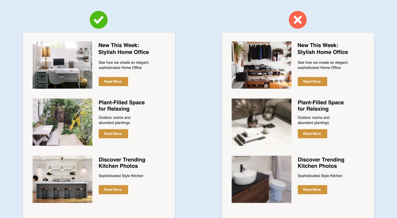
Stay relevant: Keep your images closely connected to the body of the email. This way, your readers will have visual reference to better understand your message.
Keep it relatable: Grab the attention of your audience with real images. This can be anything from photos of your work, your clients, or your team in action. People prefer to catch a glimpse of what it’s like behind the scenes, rather than stare at another stock photo.
Maintain quality: The quality of an image can make or break the feeling you want your email to create. Before sending your email out to clients, send it to yourself as a test run. Then you can make sure the size of your image file isn't too big or too small and that the photo appears perfect across all devices, not just your desktop. To learn more about the power of a good photo, check out this article on why you should invest in great project photography.
Layout
Getting people to open your email is hard enough, but trying to get people to read through a cluttered and disorganised email? Forget it. Here's how to keep it organised:
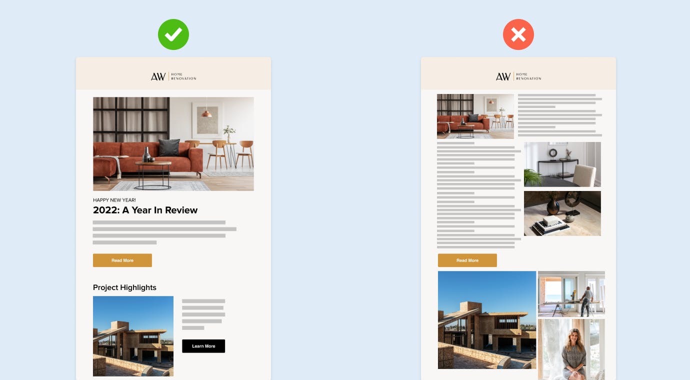
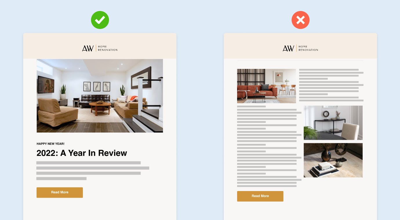
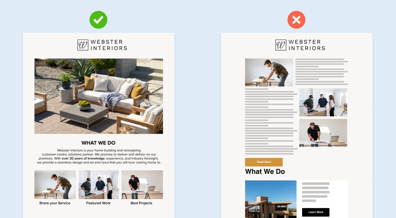
Lead with the big stuff: Your reader doesn’t want to spend all day looking through emails. Guide your reader by putting the important stuff on top such as your attention-grabbing imagery and headlines. This lets your reader know what to look at first and where to go after that.
Break up space: As your reader scrolls through your email, you don’t want them to feel overwhelmed by unending content. Instead, create white space in your emails to break up sections and allow both your design features and your readers a chance to breathe.
Account for mobile viewers: While your layout may look great on a desktop, many people open emails on mobile devices. So make sure that your layout translates without appearing sloppy or crammed together on mobile devices.
Email Content Best Practices
Length
Keep it short and sweet: Nobody has the patience or the time to read through a long story that takes up two paragraphs. Keep your email clear and concise by avoiding extensive stories, using fewer words, and including a call-to-action.
Voice
Think of your voice as the personality of your email – how do you want to come across to your readers and how is the tone of your messaging helping you do this?
Keep it consistent: Maybe you want to come across as formal and to the point or maybe you like to keep your emails light with a few jokes sprinkled into your messaging. Whatever your voice may be, make sure to stick with it. Being consistent with your voice and tone will enhance your brand's recognition.
Create a unique subject line: While it may seem like a small part of the message, your email’s subject line is the first thing any of your recipients will see. Make your subject line stand out from the rest of your reader’s crowded inbox by learning how to pique their interest. Maybe create some urgency with promotions or special deals, or incorporate trending topics to keep your emails timely.
Tailor your content: No one wants to feel like just another name on an email list. People love receiving special attention. To make sure that all of your contacts are receiving relevant emails, try creating separate email lists based on common interests or categories. For example, if you’re creating a newsletter that advertises any upcoming promotions or deals on services, create a list of leads and repeat customers that are more likely to be interested in this type of content. This way, you can create highly tailored content that is more likely to engage people from all different categories.
Appearance
Make it scannable: As already mentioned, the copy should be short and sweet — so much so that each paragraph should appear scannable when the reader first scrolls through. The copy shouldn’t appear dense or overwhelming. Rather, your audience should feel like they understand your message even if they don’t read over every word.
Embolden keywords: A good way to drive a specific point home is by using bold text for keywords to emphasise your message and grab your reader’s attention.
Make good use of email preview text: The preview text is what shows up next to the subject line. Oftentimes, it is the first line of the content of your email header that is displayed. With this in mind, use powerful and clear words in both of these places so that your preview text is just as enticing as your subject line.
Ready to put these tips and tricks to use? Houzz Pro is here to help with a new Email Marketing tool that will help you launch campaigns and send out exciting newsletters, and other communications, using professionally designed email templates.