Midcentury Kitchen with White Floors Ideas and Designs
Refine by:
Budget
Sort by:Popular Today
1 - 20 of 563 photos
Item 1 of 3
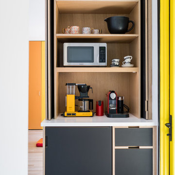
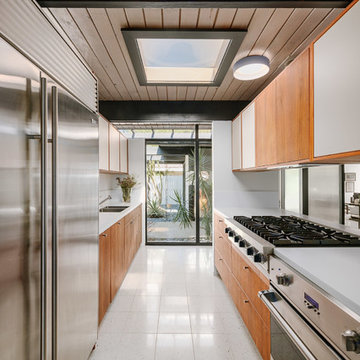
Nearly two decades ago now, Susan and her husband put a letter in the mailbox of this eastside home: "If you have any interest in selling, please reach out." But really, who would give up a Flansburgh House?
Fast forward to 2020, when the house went on the market! By then it was clear that three children and a busy home design studio couldn't be crammed into this efficient footprint. But what's second best to moving into your dream home? Being asked to redesign the functional core for the family that was.
In this classic Flansburgh layout, all the rooms align tidily in a square around a central hall and open air atrium. As such, all the spaces are both connected to one another and also private; and all allow for visual access to the outdoors in two directions—toward the atrium and toward the exterior. All except, in this case, the utilitarian galley kitchen. That space, oft-relegated to second class in midcentury architecture, got the shaft, with narrow doorways on two ends and no good visual access to the atrium or the outside. Who spends time in the kitchen anyway?
As is often the case with even the very best midcentury architecture, the kitchen at the Flansburgh House needed to be modernized; appliances and cabinetry have come a long way since 1970, but our culture has evolved too, becoming more casual and open in ways we at SYH believe are here to stay. People (gasp!) do spend time—lots of time!—in their kitchens! Nonetheless, our goal was to make this kitchen look as if it had been designed this way by Earl Flansburgh himself.
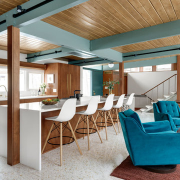
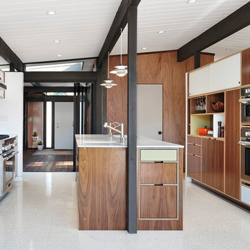
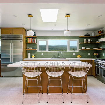
The house came to us full of bold, bright color. We edited out some of it (along with the walls it was on) but kept and built upon the stunning red, orange and yellow closet doors in the family room adjacent to the kitchen. That pop was balanced by a few colorful midcentury pieces that our clients already owned, and the stunning light and verdant green coming in from both the atrium and the perimeter of the house, not to mention the many skylights. Thus, the rest of the space just needed to quiet down and be a beautiful, if neutral, foil. White terrazzo tile grounds custom plywood and black cabinetry, offset by a half wall that offers both camouflage for the cooking mess and also storage below, hidden behind seamless oak tambour.
Contractor: Rusty Peterson
Cabinetry: Stoll's Woodworking
Photographer: Sarah Shields
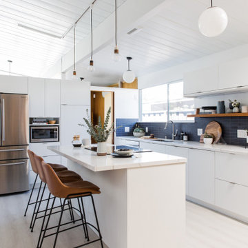
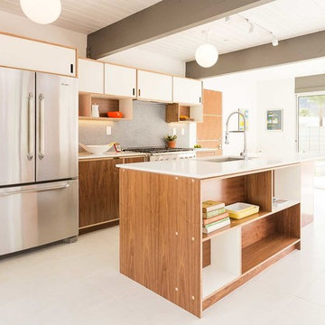
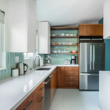
We had a tight timeline to turn a dark, outdated kitchen into a modern, family-friendly space that could function as the hub of the home. We enlarged the footprint of the kitchen by changing the orientation and adding an island for better circulation. We swapped out old tile flooring for durable luxury vinyl tiles, dark wood panels for fresh drywall, outdated cabinets with modern Semihandmade ones, and added brand new appliances. We made it modern and warm by adding matte tiles from Heath, new light fixtures, and an open shelf of beautiful ceramics in cool neutrals.
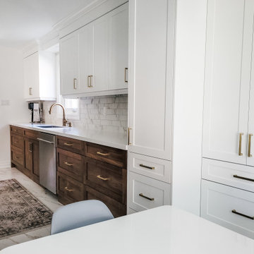
This once crowded, dark space is now bright and organized! Maximum storage achieved!
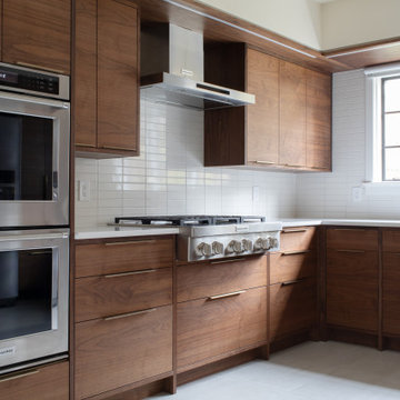
A two-tone, walnut and white shaker kitchen with modern gold accents and a distinct mid-century modern ethic that boasts a statement chandelier and Calacatta inspired tiles. Layers of texture and movement create a space that requires very little in means of décor to be elevated.
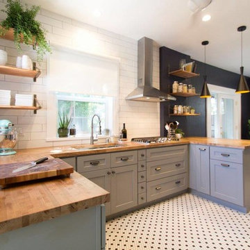
Our wonderful Baker clients were ready to remodel the kitchen in their c.1900 home shortly after moving in. They were looking to undo the 90s remodel that existed, and make the kitchen feel like it belonged in their historic home. We were able to design a balance that incorporated the vintage charm of their home and the modern pops that really give the kitchen its personality. We started by removing the mirrored wall that had separated their kitchen from the breakfast area. This allowed us the opportunity to open up their space dramatically and create a cohesive design that brings the two rooms together. To further our goal of making their kitchen appear more open we removed the wall cabinets along their exterior wall and replaced them with open shelves. We then incorporated a pantry cabinet into their refrigerator wall to balance out their storage needs. This new layout also provided us with the space to include a peninsula with counter seating so that guests can keep the cook company. We struck a fun balance of materials starting with the black & white hexagon tile on the floor to give us a pop of pattern. We then layered on simple grey shaker cabinets and used a butcher block counter top to add warmth to their kitchen. We kept the backsplash clean by utilizing an elongated white subway tile, and painted the walls a rich blue to add a touch of sophistication to the space.
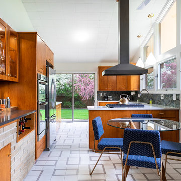
Mid-Century Modern Kitchen that transcends decades of modernism from 1950's to 21st Century. Combine an "L" shaped kitchen with a bar pass through to the dining room
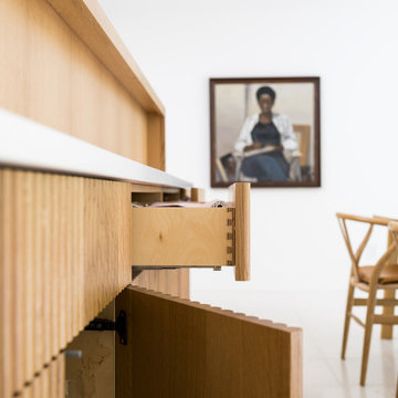
Nearly two decades ago now, Susan and her husband put a letter in the mailbox of this eastside home: "If you have any interest in selling, please reach out." But really, who would give up a Flansburgh House?
Fast forward to 2020, when the house went on the market! By then it was clear that three children and a busy home design studio couldn't be crammed into this efficient footprint. But what's second best to moving into your dream home? Being asked to redesign the functional core for the family that was.
In this classic Flansburgh layout, all the rooms align tidily in a square around a central hall and open air atrium. As such, all the spaces are both connected to one another and also private; and all allow for visual access to the outdoors in two directions—toward the atrium and toward the exterior. All except, in this case, the utilitarian galley kitchen. That space, oft-relegated to second class in midcentury architecture, got the shaft, with narrow doorways on two ends and no good visual access to the atrium or the outside. Who spends time in the kitchen anyway?
As is often the case with even the very best midcentury architecture, the kitchen at the Flansburgh House needed to be modernized; appliances and cabinetry have come a long way since 1970, but our culture has evolved too, becoming more casual and open in ways we at SYH believe are here to stay. People (gasp!) do spend time—lots of time!—in their kitchens! Nonetheless, our goal was to make this kitchen look as if it had been designed this way by Earl Flansburgh himself.
The house came to us full of bold, bright color. We edited out some of it (along with the walls it was on) but kept and built upon the stunning red, orange and yellow closet doors in the family room adjacent to the kitchen. That pop was balanced by a few colorful midcentury pieces that our clients already owned, and the stunning light and verdant green coming in from both the atrium and the perimeter of the house, not to mention the many skylights. Thus, the rest of the space just needed to quiet down and be a beautiful, if neutral, foil. White terrazzo tile grounds custom plywood and black cabinetry, offset by a half wall that offers both camouflage for the cooking mess and also storage below, hidden behind seamless oak tambour.
Contractor: Rusty Peterson
Cabinetry: Stoll's Woodworking
Photographer: Sarah Shields
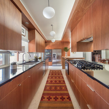
This Denver ranch house was a traditional, 8’ ceiling ranch home when I first met my clients. With the help of an architect and a builder with an eye for detail, we completely transformed it into a Mid-Century Modern fantasy.
Photos by sara yoder
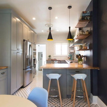
Our wonderful Baker clients were ready to remodel the kitchen in their c.1900 home shortly after moving in. They were looking to undo the 90s remodel that existed, and make the kitchen feel like it belonged in their historic home. We were able to design a balance that incorporated the vintage charm of their home and the modern pops that really give the kitchen its personality. We started by removing the mirrored wall that had separated their kitchen from the breakfast area. This allowed us the opportunity to open up their space dramatically and create a cohesive design that brings the two rooms together. To further our goal of making their kitchen appear more open we removed the wall cabinets along their exterior wall and replaced them with open shelves. We then incorporated a pantry cabinet into their refrigerator wall to balance out their storage needs. This new layout also provided us with the space to include a peninsula with counter seating so that guests can keep the cook company. We struck a fun balance of materials starting with the black & white hexagon tile on the floor to give us a pop of pattern. We then layered on simple grey shaker cabinets and used a butcher block counter top to add warmth to their kitchen. We kept the backsplash clean by utilizing an elongated white subway tile, and painted the walls a rich blue to add a touch of sophistication to the space.
Midcentury Kitchen with White Floors Ideas and Designs
1
