Kitchen with Black Appliances and No Island Ideas and Designs
Refine by:
Budget
Sort by:Popular Today
1 - 20 of 14,160 photos
Item 1 of 3
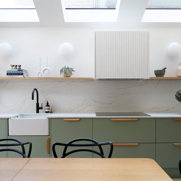
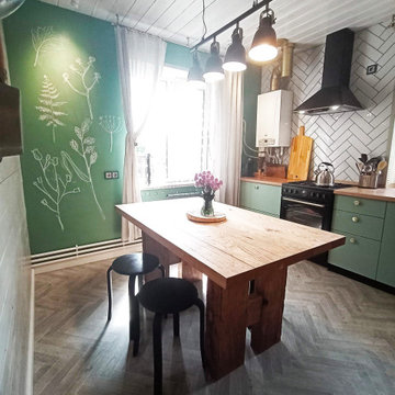
Sage green kitchen and open plan living space in a newly converted Victorian terrace flat.
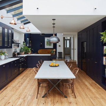
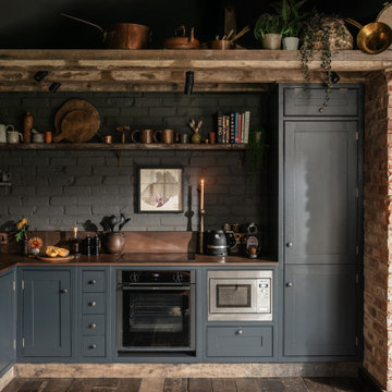
Large airy open plan kitchen, flooded with natural light opening onto the garden. Hand made timber units, with feature copper lights, antique timber floor and window seat.
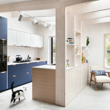
Amos Goldreich Architecture has completed an asymmetric brick extension that celebrates light and modern life for a young family in North London. The new layout gives the family distinct kitchen, dining and relaxation zones, and views to the large rear garden from numerous angles within the home.
The owners wanted to update the property in a way that would maximise the available space and reconnect different areas while leaving them clearly defined. Rather than building the common, open box extension, Amos Goldreich Architecture created distinctly separate yet connected spaces both externally and internally using an asymmetric form united by pale white bricks.
Previously the rear plan of the house was divided into a kitchen, dining room and conservatory. The kitchen and dining room were very dark; the kitchen was incredibly narrow and the late 90’s UPVC conservatory was thermally inefficient. Bringing in natural light and creating views into the garden where the clients’ children often spend time playing were both important elements of the brief. Amos Goldreich Architecture designed a large X by X metre box window in the centre of the sitting room that offers views from both the sitting area and dining table, meaning the clients can keep an eye on the children while working or relaxing.
Amos Goldreich Architecture enlivened and lightened the home by working with materials that encourage the diffusion of light throughout the spaces. Exposed timber rafters create a clever shelving screen, functioning both as open storage and a permeable room divider to maintain the connection between the sitting area and kitchen. A deep blue kitchen with plywood handle detailing creates balance and contrast against the light tones of the pale timber and white walls.
The new extension is clad in white bricks which help to bounce light around the new interiors, emphasise the freshness and newness, and create a clear, distinct separation from the existing part of the late Victorian semi-detached London home. Brick continues to make an impact in the patio area where Amos Goldreich Architecture chose to use Stone Grey brick pavers for their muted tones and durability. A sedum roof spans the entire extension giving a beautiful view from the first floor bedrooms. The sedum roof also acts to encourage biodiversity and collect rainwater.
Continues
Amos Goldreich, Director of Amos Goldreich Architecture says:
“The Framework House was a fantastic project to work on with our clients. We thought carefully about the space planning to ensure we met the brief for distinct zones, while also keeping a connection to the outdoors and others in the space.
“The materials of the project also had to marry with the new plan. We chose to keep the interiors fresh, calm, and clean so our clients could adapt their future interior design choices easily without the need to renovate the space again.”
Clients, Tom and Jennifer Allen say:
“I couldn’t have envisioned having a space like this. It has completely changed the way we live as a family for the better. We are more connected, yet also have our own spaces to work, eat, play, learn and relax.”
“The extension has had an impact on the entire house. When our son looks out of his window on the first floor, he sees a beautiful planted roof that merges with the garden.”
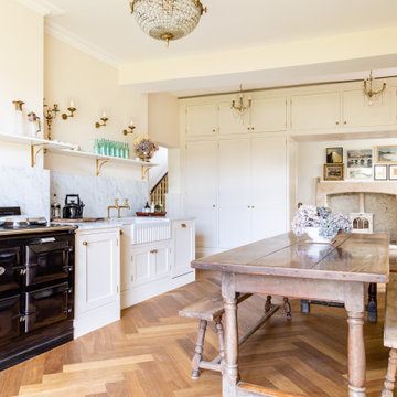
A very traditional kitchen in a beautiful Georgian home. The kitchen was designed around the Aga and an antique table as the focal points. The client wanted a calm and elegant space which felt as if it belonged to the house. The very simple cabinetry with no modern appliances on show creates a harmonious space, perfect for entertaining and family life. The traditional brass ironmongery and taps will age beautifully, as will the stunning marble tops and splashback. The shelf adds space for displaying treasured possessions and hides some practical lighting for the worktops. The modern fridge freezer is hidden in an old walk in pantry which provides space for food storage as well. The wall units which surround an existing archway to the snug form the perfect space for storing glassware and crockery.
The Brief
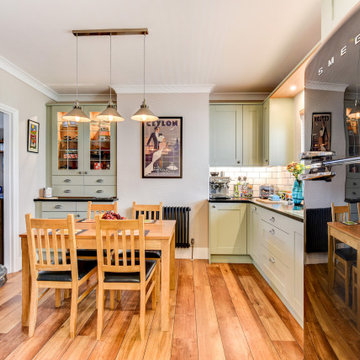
Designer Aron was tasked with creating the most of a wrap-around space in this Brighton property. For the project an on-trend theme was required, with traditional elements to suit the required style of the kitchen area.
Every inch of space was to be used to fit all kitchen amenities, with plenty of storage and new flooring to be incorporated as part of the works.
Design Elements
To match the trendy style of this property, and the Classic theme required by this client, designer Aron has condured a traditional theme of sage green and oak. The sage green finish brings subtle colour to this project, with oak accents used in the window framing, wall unit cabinetry and built-in dresser storage.
The layout is cleverly designed to fit the space, whilst including all required elements.
Selected appliances were included in the specification of this project, with a reliable Neff Slide & Hide oven, built-in microwave and dishwasher. This client’s own Smeg refrigerator is a nice design element, with an integrated washing machine also fitted behind furniture.
Another stylistic element is the vanilla noir quartz work surfaces that have been used in this space. These are manufactured by supplier Caesarstone and add a further allure to this kitchen space.
Special Inclusions
To add to the theme of the kitchen a number of feature units have been included in the design.
Above the oven area an exposed wall unit provides space for cook books, with another special inclusion the furniture that frames the window. To enhance this feature Aron has incorporated downlights into the furniture for ambient light.
Throughout these inclusions, highlights of oak add a nice warmth to the kitchen space.
Beneath the stairs in this property an enhancement to storage was also incorporated in the form of wine bottle storage and cabinetry. Classic oak flooring has been used throughout the kitchen, outdoor conservatory and hallway.
Project Highlight
The highlight of this project is the well-designed dresser cabinet that has been custom made to fit this space.
Designer Aron has included glass fronted cabinetry, drawer and cupboard storage in this area which adds important storage to this kitchen space. For ambience downlights are fitted into the cabinetry.
The End Result
The outcome of this project is a great on-trend kitchen that makes the most of every inch of space, yet remaining spacious at the same time. In this project Aron has included fantastic flooring and lighting improvements, whilst also undertaking a bathroom renovation at the property.
If you have a similar home project, consult our expert designers to see how we can design your dream space.
Arrange an appointment by visiting a showroom or booking an appointment online.
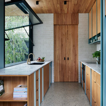
Weather House is a bespoke home for a young, nature-loving family on a quintessentially compact Northcote block.
Our clients Claire and Brent cherished the character of their century-old worker's cottage but required more considered space and flexibility in their home. Claire and Brent are camping enthusiasts, and in response their house is a love letter to the outdoors: a rich, durable environment infused with the grounded ambience of being in nature.
From the street, the dark cladding of the sensitive rear extension echoes the existing cottage!s roofline, becoming a subtle shadow of the original house in both form and tone. As you move through the home, the double-height extension invites the climate and native landscaping inside at every turn. The light-bathed lounge, dining room and kitchen are anchored around, and seamlessly connected to, a versatile outdoor living area. A double-sided fireplace embedded into the house’s rear wall brings warmth and ambience to the lounge, and inspires a campfire atmosphere in the back yard.
Championing tactility and durability, the material palette features polished concrete floors, blackbutt timber joinery and concrete brick walls. Peach and sage tones are employed as accents throughout the lower level, and amplified upstairs where sage forms the tonal base for the moody main bedroom. An adjacent private deck creates an additional tether to the outdoors, and houses planters and trellises that will decorate the home’s exterior with greenery.
From the tactile and textured finishes of the interior to the surrounding Australian native garden that you just want to touch, the house encapsulates the feeling of being part of the outdoors; like Claire and Brent are camping at home. It is a tribute to Mother Nature, Weather House’s muse.
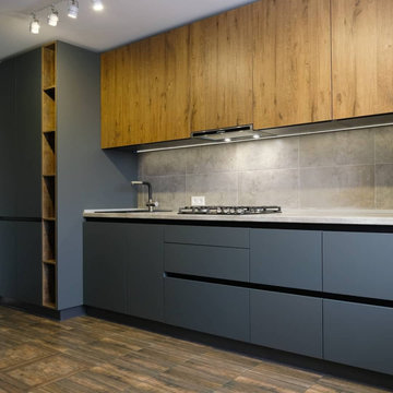
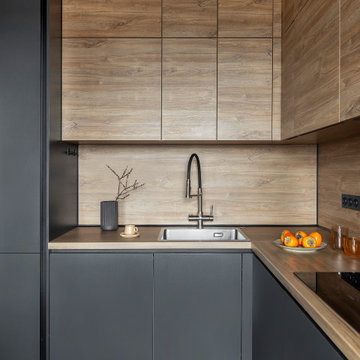
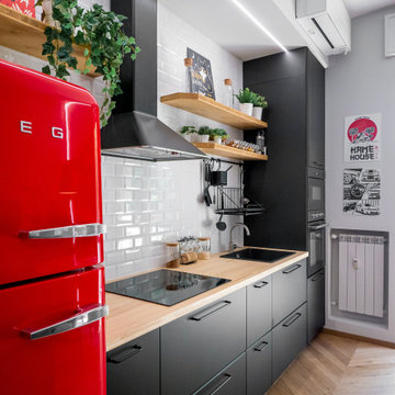
Представляем потрясающую встроенную прямую кухню с лаконичным минималистичным дизайном. Эта кухня с матовыми графитовыми и деревянными фасадами теплого коричневого цвета излучает элегантность и функциональность. Отсутствие ручек подчеркивает обтекаемый вид кухни, что делает ее идеальной для любого современного дома. Темная гамма и стиль минимализм придают кухне современный вид, а текстура дерева придает пространству естественность.
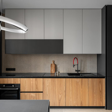
The kitchen is decorated by a variety of contrasting facades — both textured and glossy, flat and ribbed ones — echoing other interior details and areas.
We design interiors of homes and apartments worldwide. If you need well-thought and aesthetical interior, submit a request on the website.
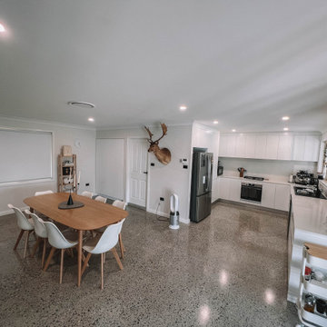
After the second fallout of the Delta Variant amidst the COVID-19 Pandemic in mid 2021, our team working from home, and our client in quarantine, SDA Architects conceived Japandi Home.
The initial brief for the renovation of this pool house was for its interior to have an "immediate sense of serenity" that roused the feeling of being peaceful. Influenced by loneliness and angst during quarantine, SDA Architects explored themes of escapism and empathy which led to a “Japandi” style concept design – the nexus between “Scandinavian functionality” and “Japanese rustic minimalism” to invoke feelings of “art, nature and simplicity.” This merging of styles forms the perfect amalgamation of both function and form, centred on clean lines, bright spaces and light colours.
Grounded by its emotional weight, poetic lyricism, and relaxed atmosphere; Japandi Home aesthetics focus on simplicity, natural elements, and comfort; minimalism that is both aesthetically pleasing yet highly functional.
Japandi Home places special emphasis on sustainability through use of raw furnishings and a rejection of the one-time-use culture we have embraced for numerous decades. A plethora of natural materials, muted colours, clean lines and minimal, yet-well-curated furnishings have been employed to showcase beautiful craftsmanship – quality handmade pieces over quantitative throwaway items.
A neutral colour palette compliments the soft and hard furnishings within, allowing the timeless pieces to breath and speak for themselves. These calming, tranquil and peaceful colours have been chosen so when accent colours are incorporated, they are done so in a meaningful yet subtle way. Japandi home isn’t sparse – it’s intentional.
The integrated storage throughout – from the kitchen, to dining buffet, linen cupboard, window seat, entertainment unit, bed ensemble and walk-in wardrobe are key to reducing clutter and maintaining the zen-like sense of calm created by these clean lines and open spaces.
The Scandinavian concept of “hygge” refers to the idea that ones home is your cosy sanctuary. Similarly, this ideology has been fused with the Japanese notion of “wabi-sabi”; the idea that there is beauty in imperfection. Hence, the marriage of these design styles is both founded on minimalism and comfort; easy-going yet sophisticated. Conversely, whilst Japanese styles can be considered “sleek” and Scandinavian, “rustic”, the richness of the Japanese neutral colour palette aids in preventing the stark, crisp palette of Scandinavian styles from feeling cold and clinical.
Japandi Home’s introspective essence can ultimately be considered quite timely for the pandemic and was the quintessential lockdown project our team needed.
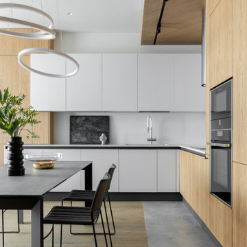
Кухня строгая, просторная, монолитная. Множество систем для хранения: глубокие и узкие полочки, открытые и закрытые. Здесь предусмотрено все. Отделка натуральным шпоном дуба (шпон совпадает со шпоном на потолке и на стенах – хотя это разные производители. Есть и открытая часть с варочной панелью – пустая стена с отделкой плиткой под Терраццо и островная вытяжка. Мы стремились добиться максимальной легкости, сохранив функциональность и не минимизируя места для хранения.
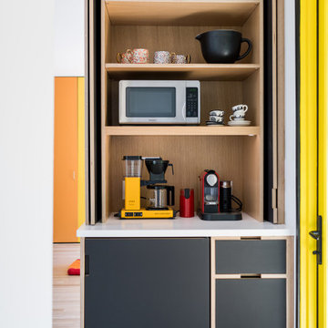
Nearly two decades ago now, Susan and her husband put a letter in the mailbox of this eastside home: "If you have any interest in selling, please reach out." But really, who would give up a Flansburgh House?
Fast forward to 2020, when the house went on the market! By then it was clear that three children and a busy home design studio couldn't be crammed into this efficient footprint. But what's second best to moving into your dream home? Being asked to redesign the functional core for the family that was.
In this classic Flansburgh layout, all the rooms align tidily in a square around a central hall and open air atrium. As such, all the spaces are both connected to one another and also private; and all allow for visual access to the outdoors in two directions—toward the atrium and toward the exterior. All except, in this case, the utilitarian galley kitchen. That space, oft-relegated to second class in midcentury architecture, got the shaft, with narrow doorways on two ends and no good visual access to the atrium or the outside. Who spends time in the kitchen anyway?
As is often the case with even the very best midcentury architecture, the kitchen at the Flansburgh House needed to be modernized; appliances and cabinetry have come a long way since 1970, but our culture has evolved too, becoming more casual and open in ways we at SYH believe are here to stay. People (gasp!) do spend time—lots of time!—in their kitchens! Nonetheless, our goal was to make this kitchen look as if it had been designed this way by Earl Flansburgh himself.
The house came to us full of bold, bright color. We edited out some of it (along with the walls it was on) but kept and built upon the stunning red, orange and yellow closet doors in the family room adjacent to the kitchen. That pop was balanced by a few colorful midcentury pieces that our clients already owned, and the stunning light and verdant green coming in from both the atrium and the perimeter of the house, not to mention the many skylights. Thus, the rest of the space just needed to quiet down and be a beautiful, if neutral, foil. White terrazzo tile grounds custom plywood and black cabinetry, offset by a half wall that offers both camouflage for the cooking mess and also storage below, hidden behind seamless oak tambour.
Contractor: Rusty Peterson
Cabinetry: Stoll's Woodworking
Photographer: Sarah Shields
Kitchen with Black Appliances and No Island Ideas and Designs
1
