Entrance with Grey Walls Ideas and Designs
A dated 1980’s home became the perfect place for entertaining in style.
Stylish and inventive, this home is ideal for playing games in the living room while cooking and entertaining in the kitchen. An unusual mix of materials reflects the warmth and character of the organic modern design, including red birch cabinets, rare reclaimed wood details, rich Brazilian cherry floors and a soaring custom-built shiplap cedar entryway. High shelves accessed by a sliding library ladder provide art and book display areas overlooking the great room fireplace. A custom 12-foot folding door seamlessly integrates the eat-in kitchen with the three-season porch and deck for dining options galore. What could be better for year-round entertaining of family and friends? Call today to schedule an informational visit, tour, or portfolio review.
BUILDER: Streeter & Associates
ARCHITECT: Peterssen/Keller
INTERIOR: Eminent Interior Design
PHOTOGRAPHY: Paul Crosby Architectural Photography
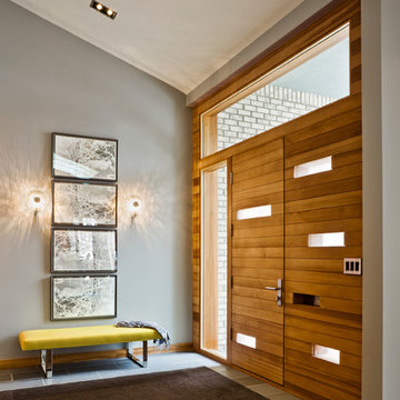
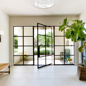
This Lafayette, California, modern farmhouse is all about laid-back luxury. Designed for warmth and comfort, the home invites a sense of ease, transforming it into a welcoming haven for family gatherings and events.
The entrance showcases a sophisticated neutral palette, elegant decor, and carefully curated lighting, setting the tone for a refined and inviting atmosphere.
Project by Douglah Designs. Their Lafayette-based design-build studio serves San Francisco's East Bay areas, including Orinda, Moraga, Walnut Creek, Danville, Alamo Oaks, Diablo, Dublin, Pleasanton, Berkeley, Oakland, and Piedmont.
For more about Douglah Designs, click here: http://douglahdesigns.com/
To learn more about this project, see here:
https://douglahdesigns.com/featured-portfolio/lafayette-modern-farmhouse-rebuild/
Download our free ebook, Creating the Ideal Kitchen. DOWNLOAD NOW
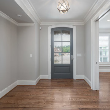
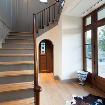
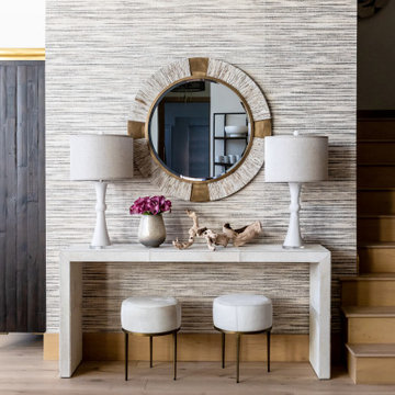
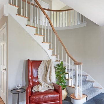
Lakefront property in the northwest suburbs of Chicago is hard to come by, so when we were hired by this young family with exactly that, we were immediately inspired by not just the unusually large footprint of this 1950’s colonial revival but also the lovely views of the manmade lake it was sited on. The large 5-bedroom home was solidly stuck in the 1980’s, but we saw tons of potential. We started out by updating the existing staircase with a fresh coat of paint and adding new herringbone slate to the entry hall.
The powder room off the entryway also got a refresh - new flooring, new cabinets and fixtures. We ran the new slate right through into this space for some consistency. A fun wallpaper and shiplap trim add a welcoming feel and set the tone for the home.
Next, we tackled the kitchen. Located away from the rest of the first floor, the kitchen felt a little isolated, so we immediately began planning for how to better connect it to the rest of the first floor. We landed on removing the wall between the kitchen and dining room and designed a modified galley style space with separate cooking and clean up zones. The cooking zone consists of the refrigerator, prep sink and cooktop, along with a nice long run of prep space at the island. The cleanup side of the kitchen consists of the main sink and dishwasher. Both areas are situated so that the user can view the lake during prep work and cleanup!
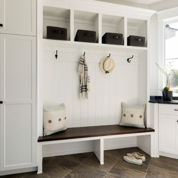
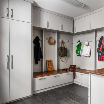
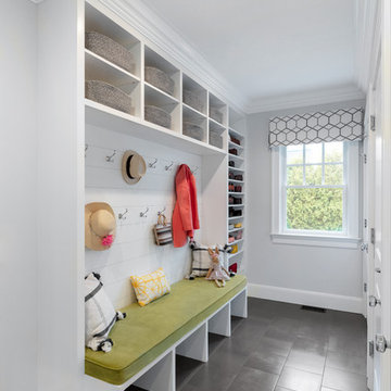
One of the home’s main puzzles was how to incorporate the mudroom and area in front of the patio doors at the back of the house. We already had a breakfast table area, so the space by the patio doors was a bit of a no man’s land. We decided to separate the kitchen proper from what became the new mudroom with a large set of barn doors. That way you can quickly hide any mudroom messes but have easy access to the light coming in through the patio doors as well as the outdoor grilling station. We also love the impact the barn doors add to the overall space.
The homeowners’ first words to us were “it’s time to ditch the brown,” so we did! We chose a lovely blue pallet that reflects the home’s location on the lake which is also vibrant yet easy on the eye. Countertops are white quartz, and the natural oak floor works well with the other honey accents. The breakfast table was given a refresh with new chairs, chandelier and window treatments that frame the gorgeous views of the lake out the back.
We coordinated the slate mudroom flooring with that used in the home’s main entrance for a consistent feel. The storage area consists of open and closed storage to allow for some clutter control as needed.
Next on our “to do” list was revamping the dated brown bar area in the neighboring dining room. We eliminated the clutter by adding some closed cabinets and did some easy updates to help the space feel more current. One snag we ran into here was the discovery of a beam above the existing open shelving that had to be modified with a smaller structural beam to allow for our new design to work. This was an unexpected surprise, but in the end we think it was well worth it!
We kept the colors here a bit more muted to blend with the homeowner’s existing furnishings. Open shelving and polished nickel hardware add some simple detail to the new entertainment zone which also looks out onto the lake!
Next we tackled the upstairs starting with the homeowner’s son’s bath. The bath originally had both a tub shower and a separate shower, so we decided to swap out the shower for a new laundry area. This freed up some space downstairs in what used to be the mudroom/laundry room and is much more convenient for daily laundry needs.
We continued the blue palette here with navy cabinetry and the navy tile in the shower. Porcelain floor tile and chrome fixtures keep maintenance to a minimum while matte black mirrors and lighting add some depth the design. A low maintenance runner adds some warmth underfoot and ties the whole space together.
We added a pocket door to the bathroom to minimize interference with the door swings. The left door of the laundry closet is on a 180 degree hinge to allow for easy full access to the machines. Next we tackled the master bath which is an en suite arrangement. The original was typical of the 1980’s with the vanity outside of the bathroom, situated near the master closet. And the brown theme continued here with multiple shades of brown.
Our first move was to segment off the bath and the closet from the master bedroom. We created a short hall from the bedroom to the bathroom with his and hers walk-in closets on the left and right as well as a separate toilet closet outside of the main bathroom for privacy and flexibility.
The original bathroom had a giant soaking tub with steps (dangerous!) as well as a small shower that did not work well for our homeowner who is 6’3”. With other bathtubs in the home, they decided to eliminate the tub and create an oversized shower which takes up the space where the old tub was located. The double vanity is on the opposite wall and a bench is located under the window for morning conversations and a place to set a couple of towels.
The pallet in here is light and airy with a mix of blond wood, creamy porcelain and marble tile, and brass accents. A simple roman shade adds some texture and it’s top-down mechanism allows for light and privacy.
This large whole house remodel gave our homeowners not only the ability to maximize the potential of their home but also created a lovely new frame from which to view their fabulous lake views.
Designed by: Susan Klimala, CKD, CBD
Photography by: Michael Kaskel
For more information on kitchen and bath design ideas go to: www.kitchenstudio-ge.com
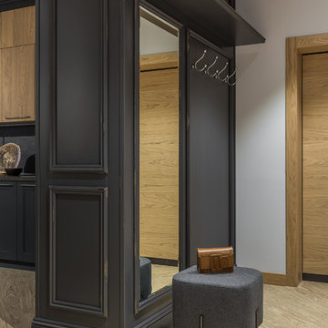
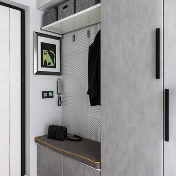
Стеновые панели и классический карниз, дополняющие кухонный гарнитур, участвуют в композиции прихожей. Этим приемом архитектор создает ощущение целостности пространства квартиры.
-
Архитектор: Егоров Кирилл
Текстиль: Егорова Екатерина
Фотограф: Спиридонов Роман
Стилист: Шимкевич Евгения
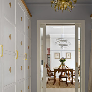
Двухкомнатная квартира площадью 84 кв м располагается на первом этаже ЖК Сколково Парк.
Проект квартиры разрабатывался с прицелом на продажу, основой концепции стало желание разработать яркий, но при этом ненавязчивый образ, при минимальном бюджете. За основу взяли скандинавский стиль, в сочетании с неожиданными декоративными элементами. С другой стороны, хотелось использовать большую часть мебели и предметов интерьера отечественных дизайнеров, а что не получалось подобрать - сделать по собственным эскизам. Единственный брендовый предмет мебели - обеденный стол от фабрики Busatto, до этого пылившийся в гараже у хозяев. Он задал тему дерева, которую мы поддержали фанерным шкафом (все секции открываются) и стенкой в гостиной с замаскированной дверью в спальню - произведено по нашим эскизам мастером из Петербурга.
Авторы - Илья и Света Хомяковы, студия Quatrobase
Строительство - Роман Виталюев
Фанера - Никита Максимов
Фото - Сергей Ананьев
Entrance with Grey Walls Ideas and Designs
8