Decorating
Will Any of These Design Trends Make it into Your Home This Year?
The Milan Furniture Fair, which offers a peek at the newest design trends, revealed the colours and décor coming our way

This year’s Salone del Mobile fair in Milan (9 to 14 April) presented countless reinterpretations of the current design zeitgeist and offered clues to the big shifts in thinking happening within the industry.
The Houzz team were on the scene, and have picked out the most popular trends from the huge variety of exhibits (there were more than 2,400 exhibitors from 43 countries) at this year’s show. From colour and décor choices to minimalism’s step to the sidelines, here we present the most important trends rocking the design world this year.
The list highlights two emerging forces that are on their way to revolutionising the furniture design industry: environmentally friendly materials and production systems are becoming increasingly visible in the industry, and technology and furniture are being placed in ever-closer dialogue in the name of comfortable living.
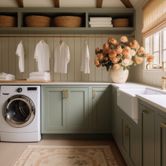
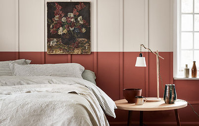
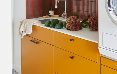
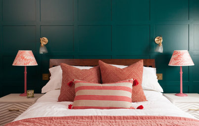
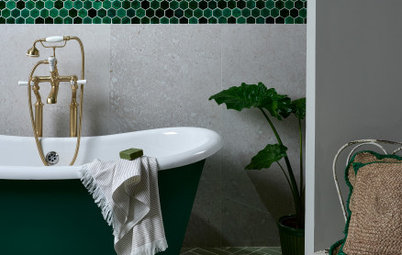
2. Colours: Blue, green and earth tones
There are three main colour protagonists this year: blue, green and earth tones. These appeared in upholstered pieces, varnished furniture and interior finishes.
Blue
Within each colour category, individual shades have been turning into the heroes. This was true, for example, of Fritz Hansen’s product launches this year.
Kalina Kalarus, European marketing coordinator at Fritz Hansen, says: “Midnight blue and mustard yellow are our colours for this year, and we’ve used them for both new products and relaunches of models from the past.”
Photo: Egg, Swan and Pot armchairs, Fritz Hansen.
Photo: Lovy bed, Sergio Bicego for Bonaldo.
Earth tones
Warm, earthy colours – ranging from ocher and mustard yellow to orange-red – were featured on all kinds of furniture, from accessories to upholstered pieces and bookcases. This is part of a larger trend towards warmer, cosier and more welcoming interiors in place of the colder living areas we saw a few years ago, which were dominated by muted and neutral shades.
Photo: Parentesi clothes racks, Fabrice Berrux for Bonaldo.
Green
Designers are continuing to use green, last year’s iconic colour, often in shades of sage and tones that are easy to match with other hues.
Forest green is also prominent this year. “Forest green and pumpkin orange brushstrokes – these are the colours that serve as the foundation of our 2019 collection,” reads Italian furniture company Flou’s official press release.
Photo: Binario sofa, Pinuccio Borgonovo for Flou.
In part, the pull of nature is another reason for the centrality of green tones this year. As discussed below, the influence of the natural world was felt throughout the fair in everything from colour and pattern to sustainable materials and processes.
Photo: Venus armchairs, Emmanuel Gallina for Porada.
Tempted to renovate your home? Find the best professionals to help you realise your vision on Houzz.
Photo: Venus armchairs, Emmanuel Gallina for Porada.
Tempted to renovate your home? Find the best professionals to help you realise your vision on Houzz.
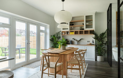
3. Floral décor
Nature was also the muse for this year’s prints. Patterns at the fair were predominantly flowers on neutral or multi-coloured backgrounds, in an intensification of a trend we’ve followed for several years now.
Photo: S Chair Brocade, Tom Dixon for Cappellini.
Nature was also the muse for this year’s prints. Patterns at the fair were predominantly flowers on neutral or multi-coloured backgrounds, in an intensification of a trend we’ve followed for several years now.
Photo: S Chair Brocade, Tom Dixon for Cappellini.
Edward Van Vliet, the designer behind the Josh sofa from Moroso (pictured), explains why, of all of the available upholstery options for this piece, he chose a floral pattern for the Salone display.
“When I design a piece of furniture, especially if it’s upholstered, I immediately think about the fabric I’d like to use. The strength of a floral pattern is that it includes every colour. This is why it’s easy to combine a floral fabric with any piece of monotone furniture, making it possible to create millions of different combinations.”
Photo: Josh sofa, Edward Van Vliet for Moroso.
Photography: Alessandro Paderni.
4. Multi-functionality
Multi-functionality is another aspect of the Bauhaus spirit that’s showing up this year. We saw partitions and moveable walls that not only divided spaces, but were also fitted with sound-absorbing panels so they could double as sound insulation.
Another example was furniture retrofitted with electric wiring to double as a light source, reducing the overall number of items that have to be placed in a room.
Photo: Paravan Mood partition, Lievore Altherr for Arper.
5. More modularity
This preference for multi-functionality may also be behind the continued popularity of modular furniture. This includes bookcases that can be placed next to one another; removable elements such as shelves, drawers or fronts, and seats that can be downsized or expanded by adding or removing one element at a time.
Photo: Sailor bookcase, David Lopez Quincoces for Living Divani.
6. A conscious approach
As we also saw at the Stockholm Furniture & Light Fair earlier this year, sustainability is no longer just an advertising claim – it’s turning into a complete process, a 360-degree vision to limit the environmental impact of design and transition to a new style of living. Here are three specific examples of this trend:
The Playful Living was a project presented at the FuoriSalone, the city-wide design fair that picks up on the themes of Salone in venues throughout Milan.
Developed in partnership with CILAB (the research laboratory of the Milan Polytechnic University of Milan), The Playful Living is a model of a 150 sq m apartment designed for changing lifestyles. Inside are interlocking furniture, eco-friendly materials, such as fabrics made of recycled plastic and FSC-certified wood, and engaging colour palettes.
Marta Meda, who directed the project, says, “It’s a home for everyone in a family that needs flexible spaces, where one can both work and live with small children. Natural materials are favoured, and we’ve also included air purifiers to guarantee high-quality air and living for overall wellbeing.”
Photo: The Playful Living by Marta Meda.
Another example of sustainability taken seriously was the Join exhibition by Norwegian Presence, which presented 21 sustainable projects by Norwegian designers and artists.
Jannike Kråvik and Alessandro D’Orazio, curators of the exhibition, say, “Why should we design a new thing? In addition to aesthetics, which is important of course, the object must have value in terms of materiality or durability. The items we’ve chosen must give something in return through longevity, decomposability or in the way in which they’re produced.”
Photo: Scandia Nett lounge chair, Fjordfiesta; part of the Join project by Norwegian Presence.
Photography: Trine Hisdal.
7. Bioplastic is catching on
One of the sustainable materials that stepped onto the scene in a big way at this year’s show is bioplastic, or plastics made out of renewable resources. This appeared in the exhibits of several major brands.
Kartell used a bioplastic from Bio-On in the second, 100% natural version of its Componibile chest of drawers.
Photo: Bioplastic Componibile chests of drawers, Anna Castelli Ferrieri for Kartell.
8. New finishes
Bioplastic wasn’t the only new material debuted at the fair. Special attention was given to brand-new finishes, from the enamelled steel we saw on Knoll’s Smalto table (pictured) to Lago’s XGlass finish (see next photo), in which wood, marble or fabric-effect patterns are printed onto glass.
We also saw finishes that are usually employed in flooring adopted in furniture: concrete textures on tables, stoneware porcelains and resins on bookshelves.
Photo: Smalto table, Edward Barber and Jay Osgerby for Knoll.
Cabinets with doors featuring XGlass with a fabric finish, Home Couture by Lago.
9. Human Centric Lighting (HCL)
Every two years, Salone del Mobile coincides with the Euroluce lighting fair. Like much of the furniture at Salone, lighting was presented as no longer a solely technical instrument, but also a source of comfort.
Hence we saw lighting incorporated into sound-absorption panels; smart lights where the “temperature” of the light – ranging from warm, which is calming, to cool, which boosts one’s ability to focus – can be selected in an app; and the creation of Human Centric Lighting systems that take into account the individual needs and preferences of each user, circadian rhythms and geography.
There was a lot to take in at the 2019 Salone del Mobile, and visitors will probably interpret things differently. But in the end, it can perhaps be summed up with the words of Danish designer Johannes Torpe:
“Trends in the design industry, like those in the fashion industry, change from season to season, but I think, when it comes to furniture, we should choose what is simple. My personal opinion is that form should respond to the demand for quality and durability.”
Photo: Trypta pendant light with sound-absorbing panels, Stephen Burks for Luceplan.
Tell us…
Have any of these trends caught your eye? Let us know in the Comments section.


Sponsored
Reload the page to not see this specific ad anymore
It seems that subdued ambiences, monotone palettes and pieces made of a single, continuous material are now stepping aside in favour of the clean geometries and extreme functionality of Bauhaus interiors.
Also reappearing is Bauhaus’s tendency to mix and match contrasting primary colours to create bold spaces with lots of character.
Photo: The Cassina Perspective installation.
Photography: Stefano De Monte.