


Which of These Trending Colours Might Make It Into Your Home?
The key colours at the influential Maison & Objet design fair were warm and cocooning, from soft pastels to autumn hues
Claire Tardy
4 October 2021
Rédactrice en chef et éditrice pour Houzz France. Journaliste spécialisée dans la rénovation.
Rédactrice en chef et éditrice pour Houzz France. Journaliste spécialisée dans la... More
The design and lifestyle fair, Maison & Objet, returned to Paris last month, 9 to 13 September, with the first in-person edition since the start of the pandemic. The eagerly awaited event gave us a chance to discover the latest products and trends, starting with the new season’s hottest colours. Which of these shades catches your eye?
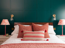
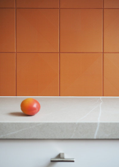
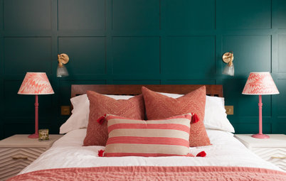
Blood red
As if to perfectly illustrate the theme of this edition, ‘Desirable Development’ (reflecting our appetite for ethical products and practices), the most prominent colours on the stands composed a natural autumn bouquet.
This palette appeared on furniture, accessories and finishes, with hues running from blood red (as seen here) to yellow by way of burnt orange and terracotta. These individual shades bring a lot of warmth into our interiors.
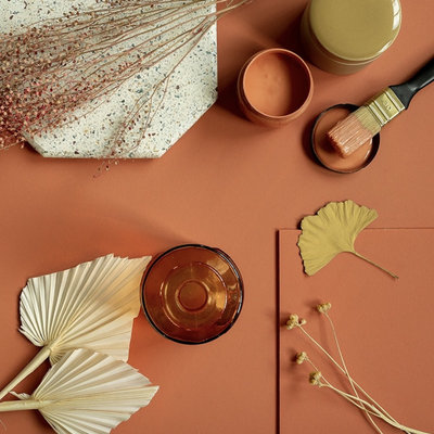
Terracotta
The autumnal composition began with a colour we’ve been talking about for a few years now: terracotta. The shade was still very much present in the collections and at the stands at this edition of the fair, appreciated for its connection to the earth, bringing us back to nature.
The autumnal composition began with a colour we’ve been talking about for a few years now: terracotta. The shade was still very much present in the collections and at the stands at this edition of the fair, appreciated for its connection to the earth, bringing us back to nature.
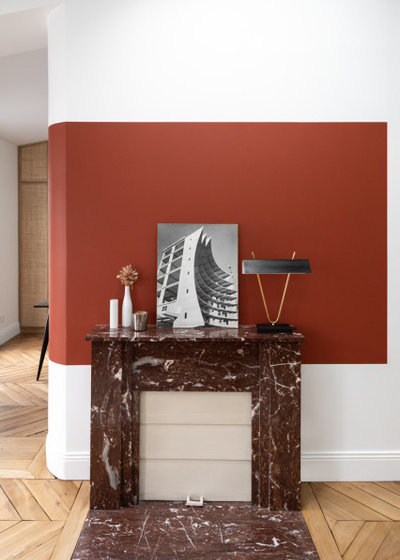
Burnt orange
New this year, burnt orange was added to the spectrum of warm colours, bringing with it a dose of nostalgia and a return to the décor of the 1970s.
Elizabeth Leriche, director of the eponymous style agency, had already mentioned this emerging trend in the Maison & Objet Digital Talks at the start of the year. “The lifestyle of this era is well loved, doubtlessly because the younger generation are nostalgic for these happy years when everything was permitted. There’s a desire for a less formal, more relaxed and convivial lifestyle,” she says.

Brown
Brown fits naturally into this ode to autumn, as it’s a pleasant, neutral and relaxing shade. It was expressed in the choice of materials, with natural fibres, leather, and darker woods than we’ve been used to in the past few years.
Brown fits naturally into this ode to autumn, as it’s a pleasant, neutral and relaxing shade. It was expressed in the choice of materials, with natural fibres, leather, and darker woods than we’ve been used to in the past few years.
Warming yellows
This colour is very much still on the design radar – Pantone chose it as the Colour of the Year 2021. Hopeful, optimistic and joyful, it was by no means an afterthought on the exhibitors’ stands, either. It made its appearance in the autumnal palette with softer, warmer and more muted shades than Pantone’s Illuminating, with tones such as mustard and pastel yellow.
This colour is very much still on the design radar – Pantone chose it as the Colour of the Year 2021. Hopeful, optimistic and joyful, it was by no means an afterthought on the exhibitors’ stands, either. It made its appearance in the autumnal palette with softer, warmer and more muted shades than Pantone’s Illuminating, with tones such as mustard and pastel yellow.
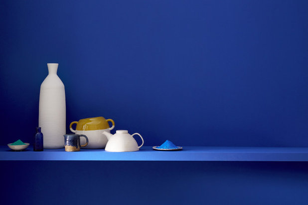
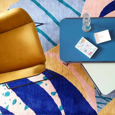
Klein blue
Yellow is combined, in moderation, with another colour that had a big comeback this year: Klein blue. Elizabeth Leriche made note of this trend earlier this year, though in a rather more electric version and as another hint of the return of the 1970s.
Take a look at the Houzz Professionals Directory to find a range of renovation pros in your area, see their projects and read client reviews.
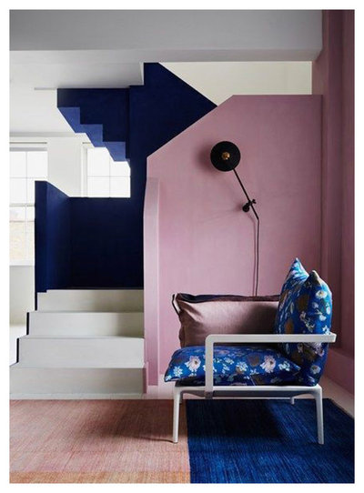
Mauve
Another nice surprise in this year’s collections was the return of mauve and violet. They were unexpected but seductive in daring combinations with the other bold shades trending this year, such as Klein blue or yellow.
Another nice surprise in this year’s collections was the return of mauve and violet. They were unexpected but seductive in daring combinations with the other bold shades trending this year, such as Klein blue or yellow.
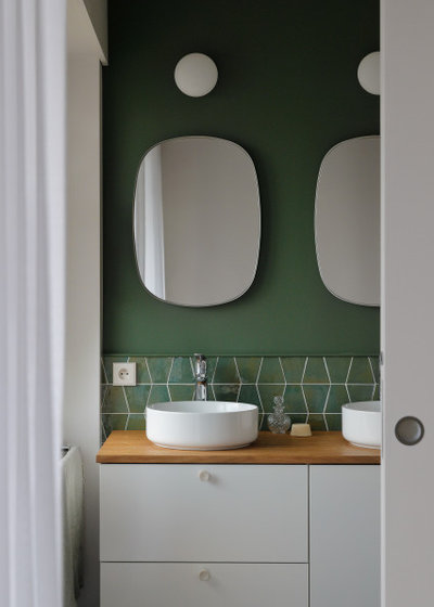
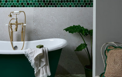
Moss green
What would an edition planned around the reconnection to nature be without the presence of green, the best representative of the plant world?
In the coming season, we’re moving slightly away from pine green and sage and turning more towards moss and lichen shades. In other words, tones reminiscent of the interiors of the 1970s, which could be combined with burnt orange to really commit to the period!
You might also enjoy 22 Ideas for Green Bedrooms.
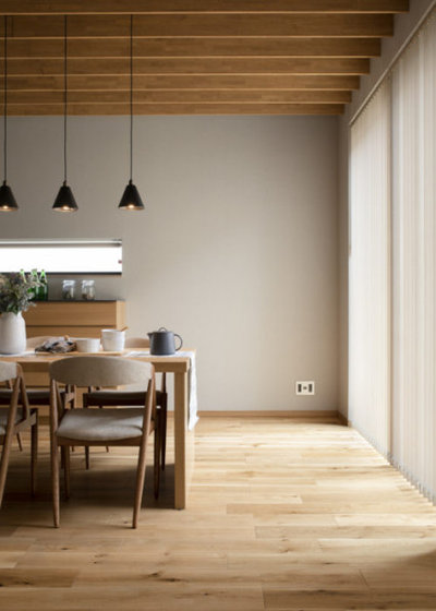
Beige to taupe
Balancing all of these striking colours is a natural and netural palette composed of ecru, beige, stone grey, taupe and brown. In other words, organic shades, related at once to the earth and the mineral world, which can be layered to create a soft and relaxing atmosphere.
Balancing all of these striking colours is a natural and netural palette composed of ecru, beige, stone grey, taupe and brown. In other words, organic shades, related at once to the earth and the mineral world, which can be layered to create a soft and relaxing atmosphere.
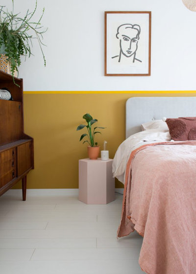
Pastels
Likewise, responding to this need for softness in interiors, pastel tones, particularly pale pinks, were in evidence in the collections presented at the fair. They are part of a more general tendency towards less saturated colours than the ones we’ve seen over the past few years.
Likewise, responding to this need for softness in interiors, pastel tones, particularly pale pinks, were in evidence in the collections presented at the fair. They are part of a more general tendency towards less saturated colours than the ones we’ve seen over the past few years.
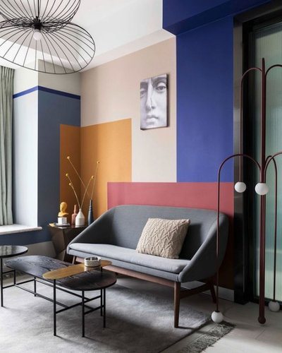
Colour blocking
More than the colours themselves, the real novelty was the way they were combined, in a big revival of colour blocking, which is so reminiscent of décor from the 1980s and 1990s. Colours no longer matched, but clashed, as contrasting solid colours were slotted together imaginatively within a scheme.
Tell us…
Which of these colour trends is your favourite? Share your thoughts in the Comments

Related Stories

More Rooms
The 5 Most Popular Laundry Rooms on Houzz Right Now
Get decorating ideas for your laundry or utility room from these most-saved photos on Houzz
Full Story
Dining Rooms
The 5 Most Popular Dining Rooms on Houzz Right Now
By Kate Burt
Vintage furniture, great lighting and top tables – feast your eyes on dining room ideas collated from your own clicks
Full Story
Colour
8 Clever Ways to Use Strategic Colour Blocking in Your Home
By Kate Burt
Paint can do so much more than refresh your walls. Explore ways to highlight features, zone areas and trick the eye
Full Story
Utility Rooms
15 Richly Coloured Utility Rooms
The trend for strong, earthy tones has reached the utility room, with hues from plum to ochre to deep green adding depth
Full Story

Kitchens
Which Kitchen Worktop Colour Should You Choose?
By tidgboutique
Consider these popular colours and styles to get the look you want, no matter which material you use
Full Story
Colour
8 Ways to Work a Rust Red and Blue Palette in the Bedroom
By Kate Burt
We’re seeing variations of this combination all over Houzz right now. Check out these tips for trying it yourself
Full Story
Colour
Creative Ways to Make a Feature of Structural Beams
Turn your RSJ into something more than just functional with these clever ideas from our Houzz Tours
Full Story
Gardens
9 Ways to Enjoy Colour in Your Garden All Year Round
By Kate Burt
However your garden grows, you can add colour with hardscaping, furniture and accessories
Full Story
Gardens
What Will We Want in Our Gardens in 2024?
Discover the gardening trends homeowners will be bringing into their outdoor spaces this spring and summer
Full Story
Kitchens
What to Expect at the Biggest Kitchen, Bedroom and Bathroom Show
Plan ahead with our rundown of what’s in store at the kbb Birmingham event this March
Full Story
Who is the manufacturer of the Moss Green?
Oh no, Ive done most of these colours over the years and im not going back to any of them. The only colour in with a chance is the moss green.
I've never been a fan of green, but it looks beautiful incorporated into a room!