


Room Tour: Large Sliding Doors Boost Flow in This Family Home
By treating the garden as an extra room, this extension’s architect has created a family-friendly indoor-outdoor space
Louise O'Bryan
13 September 2022
Houzz Contributor with over 15 years as an interiors writer, stylist and content producer for digital and print media. Specialising in house tours, room renovations and decorating solutions, my previous clients include Inside Out (Aus), Ideal Home, The Times weekend supplement and Sainsbury's magazine. I never tire from the thrill of discovering a jaw-dropping, inspirational home to feature and having an insight into other people's spaces. Call me curious or just nosey!
Houzz Contributor with over 15 years as an interiors writer, stylist and content... More
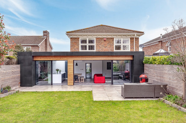
Keen to create a better connection with their large garden, the owners of this 1980s home wanted a wraparound extension that would add modern drama and improve the flow from inside to out. Searching Houzz, they came across RHJB Architects. “They found us on Houzz and really liked our style, use of materials and creative use of space,” architect and company director Richard Hobden says. “They gave us a call and it went from there.”
Top of the couple’s wish list for the new space were large-format sliding doors to maximise light and create step-free access to the garden, so the kids could run in and out unencumbered. By using the same aesthetic rules for the external areas as the internal ones, the two zones work as one huge family living area, with complementary floor surfaces ensuring a smooth transition.
Top of the couple’s wish list for the new space were large-format sliding doors to maximise light and create step-free access to the garden, so the kids could run in and out unencumbered. By using the same aesthetic rules for the external areas as the internal ones, the two zones work as one huge family living area, with complementary floor surfaces ensuring a smooth transition.
Room at a Glance
Who lives here? Adele and Keith Jarvis and their two young children
Location Bromley, south-east London
Property A detached 1980s home with four bedrooms
Room dimensions 53.75 sq m
Architect Richard Hobden of RHJB Architects
Built in the 1980s, the house had been poorly planned, with a cramped kitchen-diner that didn’t lend itself to entertaining, and a separate reception room with no sense of purpose.
“Neither of these spaces had a great relationship with the garden, where the family love to spend time with the kids and entertain in the summer,” Richard says.
“Simple, contemporary styling were the buzzwords for the aesthetic of the new wraparound extension, so we opted for streamlined sliders to allow a high level of light transfer throughout the house,” he says. “We teamed these with black moulded concrete tiles and thin profile larch cladding to create drama and a clear distinction between the original house and the new extension.”
Richard also used horizontal larch battens for the fences in the garden to link the spaces. “We always consider the garden and how the spaces interact both physically and visually,” he says.
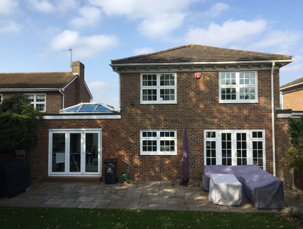
The original side extension of the house was demolished to make way for Richard’s flowing wraparound design. To the front of the house, a new entrance, hallway, coat store and cloakroom were created, together with a utility room and large walk-in pantry, both accessed from the new kitchen.
Find reviewed architects in your area on Houzz.
Find reviewed architects in your area on Houzz.
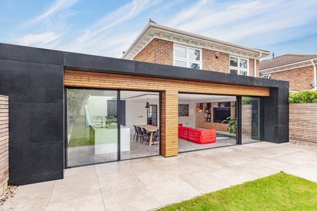
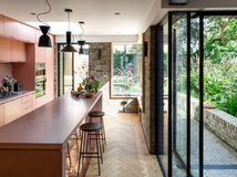
The team created a seamless threshold between the extension and the garden by raising the external floor level. “This creates the impression of increased space and makes the entire scheme far more user-friendly, particularly when the doors can be opened for maximum inside-outside use,” Richard says.
The link has been strengthened by using complementary materials across both areas. “Treating the garden like an interior space is a technique we employ on all projects of this type,” Richard says. “Using the same rules both inside and out, the choice of flooring externally has to reflect the choices made internally.
“In this case, the Amtico herringbone floor tiles indoors were complemented by large-format outdoor porcelain tiles in a comparable colourway,” he continues. “The frame of the sliding doors is the only interruption and creates a nice transitional point between materials.”
Large-format sliding doors, IQ Glass.
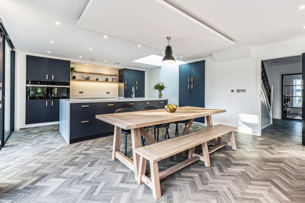
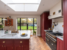
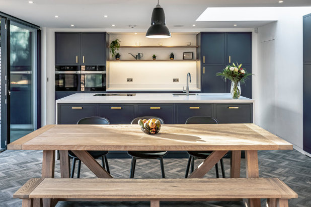
Inside, the open-plan living space has been designed to flow beautifully, but with each zone subtly defined. For example, the large island, with its wealth of prep space and storage, helps to identify the boundary of the kitchen area, while the soffit above the dining table defines the eating spot.
“The dining area is emphasised by a dropped ceiling that hovers over the dining table, matching its proportions,” Richard says. “It breaks the ‘ceiling-scape’ and is a subtle way to define an area within a larger, open-plan arrangement.”
Kitchen units, handmade by joiners from birch ply. Flooring, Amtico. Worktops, Corian.
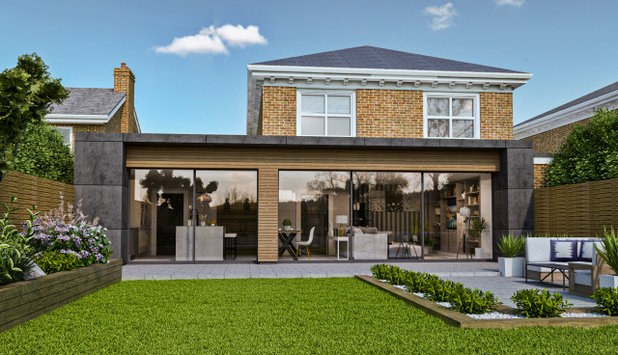
Richard used a mix of 2D plans and 3D CGI images (seen here) to show the owners the rationale and logic behind his proposals, giving them a high degree of comfort and certainty before any kitchen cupboard was even ordered or made.
You might also enjoy How to Choose a Kitchen Designer.
You might also enjoy How to Choose a Kitchen Designer.
When it came to planning the highly functional kitchen layout, Richard gathered information about the way the family lived, worked, cooked and entertained in order to understand their precise requirements.
“Ultimately, we wanted the kitchen to make their daily life a little easier, such as the proximity of the breakfast cupboard to the fridge, so milk could be accessed without too many cupboard doors ruining the flow,” he says.
“Being able to conceal clutter was also hugely important to the family, so we created hidden spaces, such as the utility room behind the frameless door [seen here on the right], and a walk-in pantry designed to match the general kitchen units.”
Kitchen appliances, Siemens.
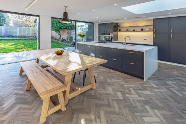
The luxury vinyl flooring was chosen to work with the underfloor heating and provide a durable surface with a warm feel. “When creating large, open-plan spaces with one type of flooring, as in this room, it’s important to avoid an airport terminal feel, so we use kitchen islands, rugs, and an assortment of other furniture to break up the floor plan,” Richard says.
It’s also important to make sure the flooring works seamlessly with any adjoining rooms, such as the hallway.
Kitchen tap, Quooker. Hob, Bora.
It’s also important to make sure the flooring works seamlessly with any adjoining rooms, such as the hallway.
Kitchen tap, Quooker. Hob, Bora.
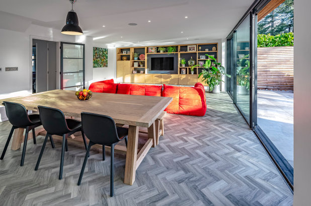
At the other end of the room, a bright, statement sofa demarcates the living space. A handcrafted birch ply media unit, which spans the entire end of the extension, creates a focal point, with an eye-catching display of photos, objets and plants. The backboards have been painted navy blue to match the kitchen.
“The materials are incredibly important to the success of this project,” Richard says. “The kitchen is fashioned from birch ply, with sprayed doors, while the exposed birch ply floating shelves provide both easy-access storage and a feature within the kitchen architecture. Birch ply has been included within the media unit, too, to provide a unifying material palette throughout the scheme.”
Overall, this open-plan space works superbly for the family, allowing them to have more quality time together, all year round.
Tell us…
What’s your favourite design detail in this modern extension? Let us know in the Comments.

Related Stories

House Tours
Houzz Tour: A Midcentury Home With a Strong Indoor-outdoor Link
By Becky Harris
A nature-inspired renovation has given this ranch house a relaxed mood and a connection to the outdoors from most rooms
Full Story

House Tours
Houzz Tour: Warm Tones and Luxurious Surfaces in a City Townhouse
An earthy colour palette, hidden storage and well-placed texture add character and practicality to this London home
Full Story

Room Tours
Kitchen Tour: A Gorgeous Extension With a Leafy Glasshouse Feel
By Kate Burt
When the owners of this terraced house extended, they were keen to retain its period feel and highlight the garden
Full Story

Gardens
Garden Tour: A Bare Roof Terrace Becomes a Pretty, Sociable Space
By Kate Burt
A retired couple got help transforming their large rooftop into a gorgeous, welcoming, multi-functional retreat
Full Story

House Tours
Houzz Tour: A Smart Layout and Genius Storage in a Victorian Home
Flipping the standard layout and carving out excellent storage have turned this tired house into a brilliant family home
Full Story

House Tours
Houzz Tour: A Victorian House Brought Impressively Up to Date
By Jo Simmons
A cohesive layout and warm colours combined with energy-efficiency measures thoroughly modernise this terraced home
Full Story

Kitchen Tours
Kitchen Tour: An Open, Airy Space Made for Entertaining
Combining two separate rooms has improved flow and created a sociable open-plan kitchen, dining and seating space
Full Story

House Tours
Houzz Tour: A Family Home Inspired by its Seaside Location
Coastal colours and practical design combine to create a house that will adapt as the family grows
Full Story

Kitchens
5 Inspiring Before and After Kitchen Transformations
Whether you want to boost storage, incorporate original features or maximise your space, take ideas from these designs
Full Story

House Tours
Houzz Tour: An Airy, Scandi Finish for a Tall Victorian House
By Kate Burt
From a tricky inherited bath to a sticky-out staircase, on-site problem-solving led to a seamless update for an old home
Full Story
Hi, this is a great space and well designed, what’s the dimensions?
Please could we see photos of the walk-in pantry and utility and also the new floor plans. Thanks
Hi Jaz The room dimensions are 53.75 sq m