
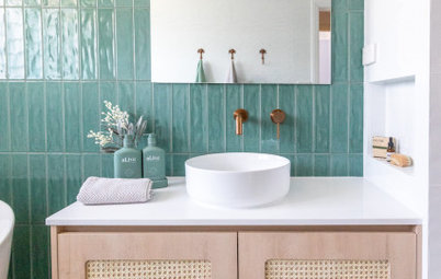
Room Tour: Clever Use of Space and Colour Reboots a Dull Bathroom
A beautiful, airy bathroom was key for this homeowner, so she found a designer on Houzz who could realise her dream

“My client is a busy dermatologist, and she told me she lives in the bathroom when she’s home,” Richard Ryder of Clearcut Construction says. So in a house with lots of future renovations planned, the master bathroom she shares with her husband was the top priority.
The Raleigh, North Carolina, homeowner found Richard by searching for professionals on Houzz. She came to him with just a few wishes for the master bathroom: a set of must-have shower heads, herringbone-patterned tiling and more USB ports than you’d find in the waiting area of an airport gate. Other than that, she gave him free rein with the design, and they shared Houzz ideabooks during the remodelling process.
The result is a modern farmhouse-style bathroom — classic elements such as beams and woodwork mix with modern touches, such as globe pendant lights and a minimalist freestanding bath.
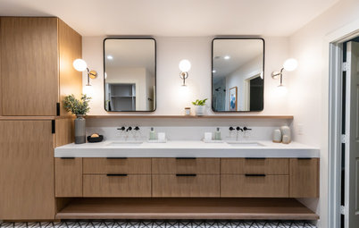
After This is the view of the bathroom from the entrance. The door to the right leads to a separate toilet room. New stained cypress box beams, a rod that provides electricity to the pendant lights and tall linen cabinets stand up to the ceiling. “I included the beams to add warmth to the high ceiling and architectural bones that look as if they date back to 1900,” Richard says. “I like to give a modern farmhouse-style room classic bones.”
The lighting system enabled Richard to incorporate the pendant lights his clients wanted and the lights’ wiring in an organised way. The voltage runs through the bar to the pendants. Hanging them individually would have created a cluttered look with wires extending high into the vault.
The lighting system enabled Richard to incorporate the pendant lights his clients wanted and the lights’ wiring in an organised way. The voltage runs through the bar to the pendants. Hanging them individually would have created a cluttered look with wires extending high into the vault.
Richard envisioned a striking set of linen cabinets that would catch the eye as a focal point upon entering the room. The dark colour comes from a black dye stain with conversion varnish, a type of lacquer.
The set on the right with the large pulls are four large cabinets; on the left are two smaller cabinets – one designed for hair products and the other for everyday toiletries. There are also two open shelves for display-worthy accessories and products.
“I knew I wanted this piece to be a focal point,” Richard says. “It’s the first thing you see when you walk into the room. So I knew we needed the pulls to stand out as special.” Oversize round pulls of crystal and brass fit the bill.
Before The existing bath, shower and vanity unit bumped up against one another in a way that made the room feel cramped.
Richard donated the cabinetry, basins and countertops to Habitat for Humanity. Under normal circumstances, he would have donated the bath, too, but this one had to be cut in half to fit though the door.
Richard donated the cabinetry, basins and countertops to Habitat for Humanity. Under normal circumstances, he would have donated the bath, too, but this one had to be cut in half to fit though the door.
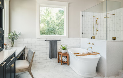
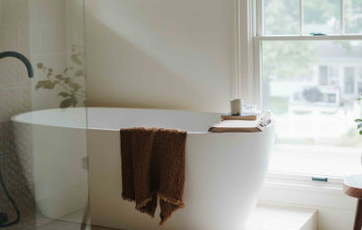
After Replacing the large bath and surround with a sculptural freestanding model freed up floor space, transforming the area into a calming corner.
The homeowners preferred hooks to towel bars; a neat row of them serve the bath. Also seen in this photo is the applied moulding on the walls. Extending the woodwork and tiles up to the base of the ceiling vault mitigated the soaring ceiling height.
Boxy minimalist wall sconces illuminate above and below, throwing light onto the ceiling and beams. “The way they shine on the texture of the wall tiles at night is really special,” Richard says.
Walls painted in Snowbound, Sherwin-Williams.
Richard knew his client loved herringbone, but he also likes to give things a twist, so he used a double herringbone pattern on the walls. He added a waterfall shelf and a small shelf in stained cypress to play off the beams and add warmth to this corner.
Also adding a wood look to the room is the flooring, which is actually digitally printed porcelain tiles. “While my client liked herringbone, we didn’t want to overpower the space with pattern. So I used large tile planks to mix up the scale,” he says.
Also adding a wood look to the room is the flooring, which is actually digitally printed porcelain tiles. “While my client liked herringbone, we didn’t want to overpower the space with pattern. So I used large tile planks to mix up the scale,” he says.
Before The existing shower was ho-hum.
After The roomy new shower stall is 6ft 2in x 3ft 6in. The homeowner had experienced this set of shower heads at a hotel, and they were one of her few must-haves. The polished nickel set includes a regular shower head, a rain shower head and a handheld wand.
Richard also incorporated a new bench topped with marble that matches the marble on the vanity unit. Benches like this are great for leg shaving and make the shower more accessible.
Richard also incorporated a new bench topped with marble that matches the marble on the vanity unit. Benches like this are great for leg shaving and make the shower more accessible.
He repeated the marble on the shower niche shelves and added something new: the marble mosaic tiles provide a surprise moment when facing the shower, and their blue-grey colours have a watery look.
Another one of the homeowner’s must-haves was a curbless shower entry. The linear shower drain is camouflaged and runs along the entrance to the shower.
Between this tiling challenge and the meticulous laying of the double-herringbone pattern on the walls, Richard was grateful to have Hero Tile on the job with him.
Between this tiling challenge and the meticulous laying of the double-herringbone pattern on the walls, Richard was grateful to have Hero Tile on the job with him.
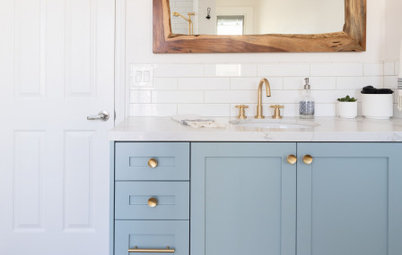
The long double vanity unit is custom-made and has a marble countertop. It provides lots of storage, including many drawers.
The vanity unit also has several USB ports, the last of the homeowner’s must-haves. “My client wanted lots of places where she could charge devices without her kids getting to them. We went totally overboard with the USBs – they are in just about every outlet – but that’s the way she wanted it,” Richard says.
The wires for the drawer outlets are secured by mechanical arms designed to work with the opening and closing of the drawers. This is a safety feature that prevents fraying.
The wires for the drawer outlets are secured by mechanical arms designed to work with the opening and closing of the drawers. This is a safety feature that prevents fraying.
Mixed metals helped establish a classic, timeless look in the room. The taps are polished nickel, the hardware and hooks are champagne-coloured and the lighting fixtures are a mix of brushed and aged brass. The globe pendant lights and cylindrical sconce add more modern touches.
“I prefer polished nickel when mixing with brass tones. It has a warmth to it that chrome and stainless steel don’t lack,” Richard says.
The pair of mirrors were custom-made. Their stained wood frames match the linen cabinet.
“I prefer polished nickel when mixing with brass tones. It has a warmth to it that chrome and stainless steel don’t lack,” Richard says.
The pair of mirrors were custom-made. Their stained wood frames match the linen cabinet.
The illuminated make-up mirror was tricky to place. This location is close to the makeup storage area and out of the way of the cabinet door’s swing.
Here’s a closer look at how everything came together. The separate toilet room is in the lower left corner.
“I believe in being as cost-efficient as possible,” Richard says. “It doesn’t have to be expensive to look expensive. In this room, all of the tile choices and the hardware were reasonably priced.” And by using box beams, he was able to get the look of solid beams for a lot less.
Tell us…
What do you love about this bathroom makeover? Share your thoughts in the Comments section.

Sponsored
Reload the page to not see this specific ad anymore
Who lives here? A busy couple with three children and a dermatology practice
Location Raleigh, North Carolina, US
Size 130 sq ft (12 sq m)
Designer-builder Richard Ryder of Clearcut Construction
‘After’ photos by Bob Fortner Photography
Before The bathroom’s design was bland, and the high ceiling was awkward. Comparing this snapshot with the next photo provides a lesson in scale and proportion. For example, the distance from the floor to the top of the mirrors is about the same as the distance from the top of the mirrors to the peak of the 14ft-high ceiling. This makes the lower portion of the room seem clunky and the empty high walls above them look awkwardly vast.
This photo also shows a large linen cupboard on the left that the homeowner didn’t want. Deep shelves were not efficient for reaching items towards the back. Removing the cupboard opened up more space and made the bathroom feel larger. This was the only change to the room’s footprint.
Find a local bathroom designer on Houzz.