


Room Tour: An Open-plan Extension That Retains Cosy Spaces
Clever architecture gave this Victorian terrace extra light and bags more space without it losing a sense of intimacy
Kate Burt
23 December 2019
Houzz UK. I'm a journalist and editor, previously for the Independent, Guardian and various magazines. I'm now excited to part of the editorial team at Houzz UK & Ireland, bringing the best of British and Irish design, interiors and architecture to Houzz.com.
Houzz UK. I'm a journalist and editor, previously for the Independent, Guardian and... More
The brief from the owners of this Victorian terrace began with the removal of their home’s existing ground floor extension, a wraparound conservatory-type structure. “They wanted to get more daylight into the house and for the new structure – a side return extension – to provide a good connection with the garden,” says Daniel Rees of REES Architects, who undertook the design.
Daniel also reworked the ground floor to make better use of the space and improve the flow, designed the kitchen, and added a cloakroom, a utility room, more storage and a window seat.
Daniel also reworked the ground floor to make better use of the space and improve the flow, designed the kitchen, and added a cloakroom, a utility room, more storage and a window seat.
Room at a Glance
Who lives here? A professional couple
Location Walthamstow, north-east London
Property A three-bedroom Victorian terrace
Size Extension area: 9 sq m; total kitchen size, including the new extension: 25 sq m (4.3 x 5.8m).
Budget The final construction cost was around £150,000, which included the full refurbishment of the house, electrics, plumbing, windows and decoration
Designer Daniel Rees of REES Architects
Photos by Chris Snook
“We reconfigured the ground floor layout so that when you enter the house, you have a direct view of the garden from the entrance hall, welcoming and drawing you in,” Daniel says.
The new extension is the full length of the outrigger, plus 50cm for the window seat, and completely fills the side return right up to the boundary line. Daniel not only took care of the Planning and Building Regulations applications, but also the management of the Party Wall Agreement.
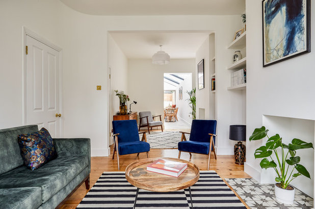
Like the hall, the living room has a long sightline. “You can see all the way into the garden, which is framed by the picture window seat,” Daniel says.
“The interconnection between the front and rear without being completely open-plan makes for a happy medium,” he adds. “There are small, intimate spaces, but you’re never cut off from any other activity going on across the ground floor.”
“The interconnection between the front and rear without being completely open-plan makes for a happy medium,” he adds. “There are small, intimate spaces, but you’re never cut off from any other activity going on across the ground floor.”
The living room opens onto the hallway.
Browse architects in your area and check out client reviews in the Houzz Professionals Directory.
Browse architects in your area and check out client reviews in the Houzz Professionals Directory.
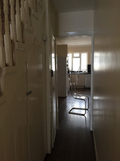
This before photo, taken from the hallway, shows how gloomy the ground floor was before the renovation.
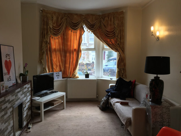
The original living room felt darker and more closed in.
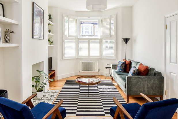
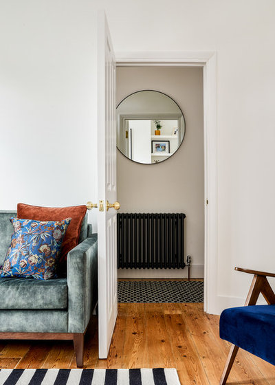
The new space is much lighter and brighter. As part of the work, Daniel had the existing floorboards sanded and oiled and added new column radiators. He also made the chimney breasts and fireplace openings in this and the middle room into focal points.
“The original fireplaces weren’t in situ,” he explains, “so we designed simple, modern openings around the existing structure to reduce costs and retain some of the original house.”
All furniture, clients’ own.
“The original fireplaces weren’t in situ,” he explains, “so we designed simple, modern openings around the existing structure to reduce costs and retain some of the original house.”
All furniture, clients’ own.
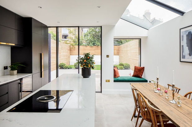
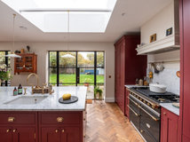
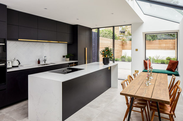
“The owners wanted a good-sized kitchen-diner for cooking and entertaining,” Daniel says, “but they didn’t want to extend any further into the small garden. The window seat gives them a nice space for a relaxing coffee, but the design really works with the existing main living space rather than making that a redundant room [by having lots of seating in here].”
In terms of the overall look, Daniel says, “The owners gave us some reference images of the type of aesthetic they liked and then we took it from there, designing everything. The concept was a simple, modern aesthetic with tactile natural materials.”
Read more about how to avoid ‘dead front room syndrome’ when extending.
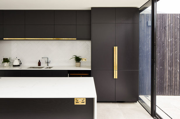
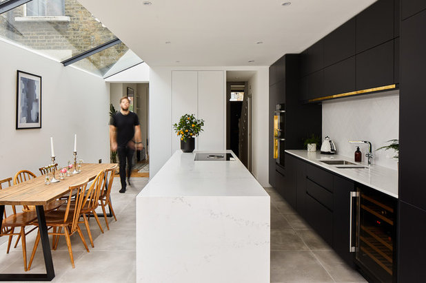
The brass handles and trim are designed to contrast with the black doors and provide a simple, modern detail,” Daniel says. Concrete-style porcelain tiles give a soft, smooth look to the floor. The worktops, another pale neutral layer, are quartz.
A herringbone layout for the tiles that make up the splashback adds texture without overwhelming the design.
A herringbone layout for the tiles that make up the splashback adds texture without overwhelming the design.
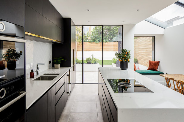
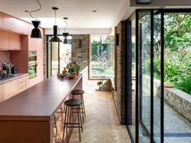
“The patio doors are perfectly sized to stack up behind the wall of kitchen cupboards, leaving the maximum opening out into the garden,” Daniel explains.
To counteract a potential dark spot at the back of the kitchen-diner, Daniel designed in a large roof window along the length of the side return extension to flood the space with natural light.
To counteract a potential dark spot at the back of the kitchen-diner, Daniel designed in a large roof window along the length of the side return extension to flood the space with natural light.
The kitchen is made up of carcasses, with the doors, handles and side panels made by Naked Kitchens, who also took on the final design and manufacture.
In among plenty of storage, the cabinets contain a bin, oven, microwave, wine fridge, dishwasher, fridge and freezer.
There’s more storage in the form of pan drawers and cupboards in the island, which also conceals the mechanism and filtering system for the downdraft extractor integrated into the hob.
Induction hob with downdraft extractor, Bora. Serie 8 oven and microwave, Bosch.
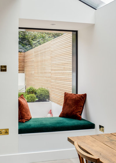
The cosy window seat provides a comfy spot overlooking the garden, and also conceals storage.
18 ideas for styling your festive dining table.
18 ideas for styling your festive dining table.
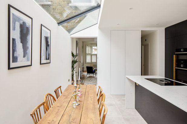
Where darkness was unavoidable – under the stairs – Daniel tucked in a cloakroom (the entrance is just visible here through the doorway back right).
He then carried this new space across the back of the kitchen, which provided a utility room and a boiler cupboard, both hidden behind the two doors at the end of the island. These are acoustic doors, which reduce any noise from the washing machine and tumble dryer.
He then carried this new space across the back of the kitchen, which provided a utility room and a boiler cupboard, both hidden behind the two doors at the end of the island. These are acoustic doors, which reduce any noise from the washing machine and tumble dryer.
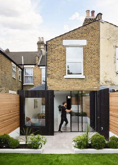
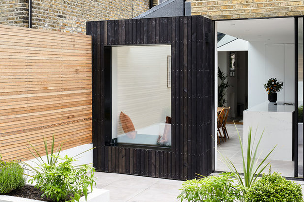
The view from the outside shows what a clean, minimal design the extension is. “The key was keeping all structural elements hidden,” Daniel says, “so we gave special attention to hiding window frames as well as rainwater pipes and guttering within the structure.
“The steelwork and top of the door frame are hidden behind the brickwork above,” he says. The team removed three rows of bricks, installed the steel and frame, then reinstated reclaimed bricks.
“We painted the extension’s timber cladding with a black stain and UV protection,” Daniels says. “This allowed some of the natural tones and grain of the timber to come through but provided a hardwearing matt finish.
“The black timber cladding then extended across the side wall of the neighbour’s rear extension,” he adds. “This wall was in very bad condition, so we were able to hide it.”
It also acts to balance out the proportions of the box extension and draws the eye into the outdoor space.
The kitchen and patio feature the same flooring, with the external slabs coated in a non-slip finish. Inside and out are now on the same level. “Originally, there was a step down onto the patio,” Daniel says. “This then sloped up to the rear of the garden.”
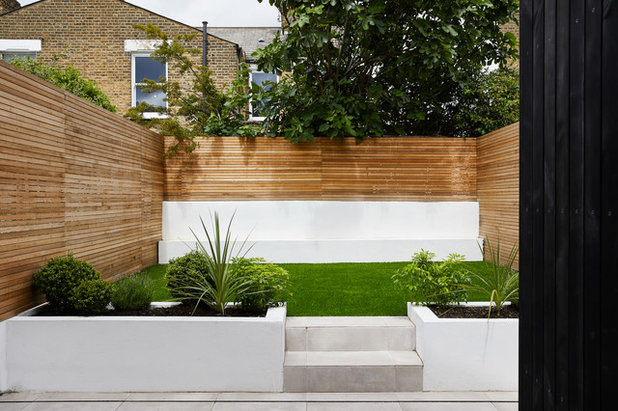
“We used the excess earth from levelling the outdoors and indoors to provide a raised lawn area at the rear,” Daniel continues. “Because the garden is north-west facing, this action of stepping up into the light rather than stepping down into a dark space is a literal uplift.”
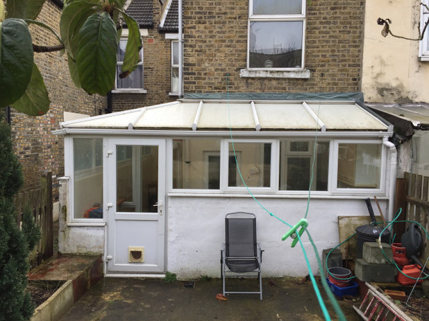
This ‘before’ photo shows the original, conservatory-like extension.
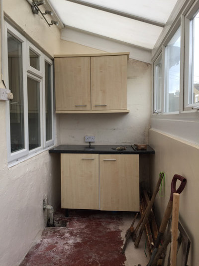
The original extension from the inside.
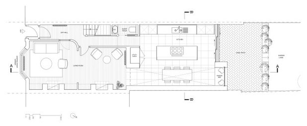
The floorplan for the new space.
Tell us…
Which ideas would you take from this side-return extension for your own project? Let us know in the Comments section.
Tell us…
Which ideas would you take from this side-return extension for your own project? Let us know in the Comments section.


Related Stories

House Tours
Houzz Tour: A Midcentury Home With a Strong Indoor-outdoor Link
By Becky Harris
A nature-inspired renovation has given this ranch house a relaxed mood and a connection to the outdoors from most rooms
Full Story

House Tours
Houzz Tour: Warm Tones and Luxurious Surfaces in a City Townhouse
An earthy colour palette, hidden storage and well-placed texture add character and practicality to this London home
Full Story

Room Tours
Kitchen Tour: A Gorgeous Extension With a Leafy Glasshouse Feel
By Kate Burt
When the owners of this terraced house extended, they were keen to retain its period feel and highlight the garden
Full Story

Gardens
Garden Tour: A Bare Roof Terrace Becomes a Pretty, Sociable Space
By Kate Burt
A retired couple got help transforming their large rooftop into a gorgeous, welcoming, multi-functional retreat
Full Story

House Tours
Houzz Tour: A Smart Layout and Genius Storage in a Victorian Home
Flipping the standard layout and carving out excellent storage have turned this tired house into a brilliant family home
Full Story

House Tours
Houzz Tour: A Victorian House Brought Impressively Up to Date
By Jo Simmons
A cohesive layout and warm colours combined with energy-efficiency measures thoroughly modernise this terraced home
Full Story

Kitchen Tours
Kitchen Tour: An Open, Airy Space Made for Entertaining
Combining two separate rooms has improved flow and created a sociable open-plan kitchen, dining and seating space
Full Story

House Tours
Houzz Tour: A Family Home Inspired by its Seaside Location
Coastal colours and practical design combine to create a house that will adapt as the family grows
Full Story

Kitchens
5 Inspiring Before and After Kitchen Transformations
Whether you want to boost storage, incorporate original features or maximise your space, take ideas from these designs
Full Story

House Tours
Houzz Tour: An Airy, Scandi Finish for a Tall Victorian House
By Kate Burt
From a tricky inherited bath to a sticky-out staircase, on-site problem-solving led to a seamless update for an old home
Full Story
Absolutely gorgeous, what a difference the new extension has made, the interior design suits the period of the property and makes it look bigger, lighter and practical.
I like it very nice
I love it but can it e done with a lower budget?