


Room Tour: A Small Extension Creates a Spacious Kitchen-diner
A low-budget addition of just a few square metres vastly improved family life in this period terraced house
Sarah Warwick
12 February 2019
Houzz Contributor. I'm a freelance journalist and editor writing for nationals, magazines and websites. A serial house revamper, I love great design, beautiful interiors and practical solutions.
Houzz Contributor. I'm a freelance journalist and editor writing for nationals, magazines... More
A ground floor with a separate galley kitchen that connected to a tired conservatory just wasn’t the right layout for the home of a couple with two young children. But with a tight budget that didn’t allow services to be moved, architects Nimtim had to be creative in designing a new extension and connecting it to the existing Edwardian house.
Room at a Glance
Who lives here? Nicola Coham, Alex Lord and their two young children
Location Beckenham, London
Property An Edwardian mid-terrace with three bedrooms and one bathroom
Room dimensions 22 sq m (28 sq m with the external patio)
Architect Nimi Attanayake and Neil Cockburn of Nimtim Architects
Photos by Megan Taylor
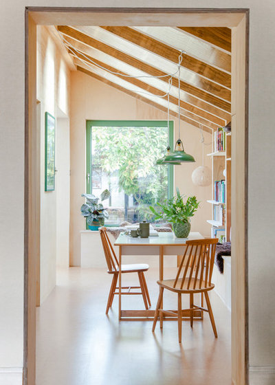
“As the couple have two small children, they wanted a connection between the kitchen and dining area so they could see and hear the kids,” Nimi Attanayake says.
A better link to the garden and improved light on the north-facing elevation were also issues the architects had to address – and all on a modest budget.
The solution? An extension with half the footprint of the old conservatory, plus, in the section that wasn’t being built into, an outdoor dining area. The materials the architects selected and how they were used were also key to keeping costs down.
Who lives here? Nicola Coham, Alex Lord and their two young children
Location Beckenham, London
Property An Edwardian mid-terrace with three bedrooms and one bathroom
Room dimensions 22 sq m (28 sq m with the external patio)
Architect Nimi Attanayake and Neil Cockburn of Nimtim Architects
Photos by Megan Taylor
“As the couple have two small children, they wanted a connection between the kitchen and dining area so they could see and hear the kids,” Nimi Attanayake says.
A better link to the garden and improved light on the north-facing elevation were also issues the architects had to address – and all on a modest budget.
The solution? An extension with half the footprint of the old conservatory, plus, in the section that wasn’t being built into, an outdoor dining area. The materials the architects selected and how they were used were also key to keeping costs down.
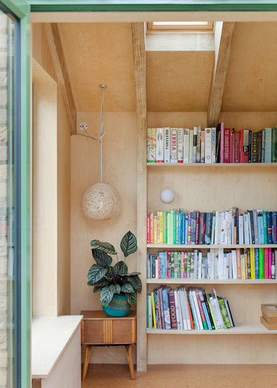
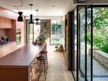
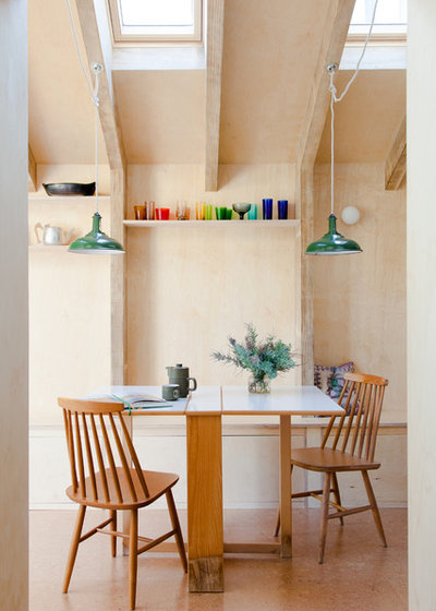
The roof timbers in the new addition are made from larch. “The couple liked the idea of the natural material and its grain,” Nimi says. Leaving the beams exposed saved money, and the architects had the idea of extending them down to form buttresses to create the open storage the couple wanted.
They also decided to extend the windowsill in the new addition to form a built-in bench seat with garden views.
Pendant lampshade, eBay. Cord, Creative-Cables.
They also decided to extend the windowsill in the new addition to form a built-in bench seat with garden views.
Pendant lampshade, eBay. Cord, Creative-Cables.
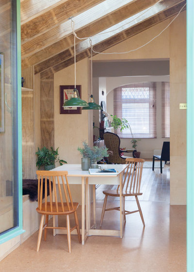
The interior of the extension is lined in ply, and the floor in here and the kitchen is covered in cork. “It’s warm to the touch,” Nimi says. “They don’t have underfloor heating, but everything is designed to give a feeling of warmth.”
The dining area looks out to the garden through a tilt and turn window at one end, and connects to the front of the house at the other.
The new space is also brightened with roof windows, and borrows light from the kitchen on one side, as well as the front room of the house.
Cork flooring, The Cork Flooring Co.
Banquette seating was fitted in the dining area. “It reduces the number of chairs needed and creates storage underneath,” Nimi says.
The homeowners – who are both creative – worked collaboratively with the architects and sourced fittings themselves. “They really like green and had these lampshades already,” Nimi says.
The colour of the vintage pendants, which forge a link between the interior and the garden, was repeated on the window frames and, in a paler version, on the kitchen cabinets.
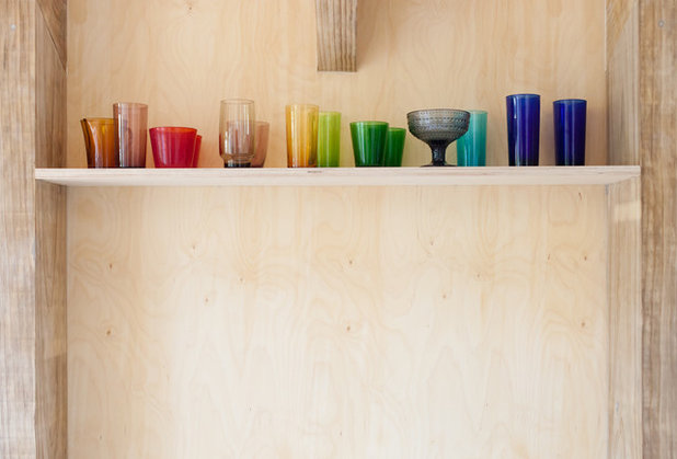
Keeping the palette neutral allowed the items on display to shine without colour clashes. “They have beautiful collections,” Nimi says, “and there are lots of things they like having on show.”
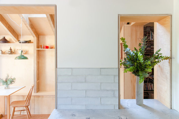
With the extension across just half of the rear elevation of the house, it was important to stop the new space feeling narrow. So the architects created a connection between the kitchen and dining area. Both the linking doorway and nook were lined with ply, tying one space to another through their materials.
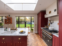
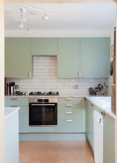
Homeowner Nicola selected a pale stone for the kitchen worktop and very pale grey tiles for the splashback. Keeping these understated meant opting for coloured cabinetry wasn’t an issue.
Moonrock stone worksurface, MGLW; cut and fitted by Keith Brocking of KMB Stone Services. Wall tiles, The Little Tile Co.
The former kitchen was dark and access to it awkward.
It was important the new kitchen didn’t lack storage and work space in comparison to the old version. The homeowners, architects and builder worked closely together to ensure there was sufficient cabinetry and more work surface than before.
In the new room, there’s a worktop between the dining area and kitchen that acts like an island. “It meant we could house the washing machine and dryer in there, which freed up the space under the stairs, where a cloakroom has now been fitted,” says Nimi says.
The architects recommended the unit carcasses, and Nicola sourced the Formica-faced doors in a soft green colour. “What’s nice with Formica is that you get the ply edge exposed, so there’s continuity in the whole design,” Nimi says.
Kitchen cabinetry carcasses, Howdens; Formica doors made by Shape Design & Build.
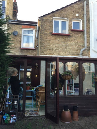
The old conservatory was cold in winter and overheated in summer.
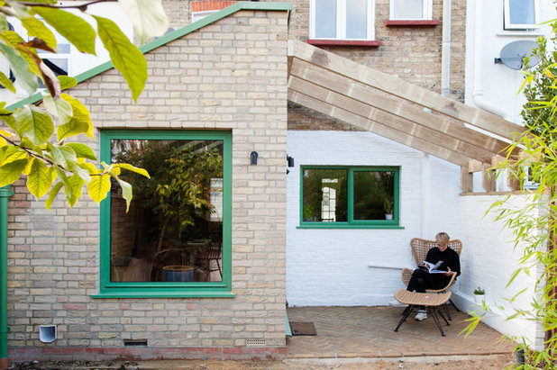
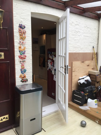
In place of a compromised addition across the rear, the house now has a dining area with a garden view connected to the kitchen, plus a terrace immediately outside the kitchen. The outdoor space is accessible through patio doors on the side of the extension.
The timbers across the new terrace line up with the roof of the extension and form a pergola around which plants will be grown for natural shading.
Underfoot is brick laid in a herringbone pattern. “It goes with both the existing and new brick and bridges between them in terms of its colour,” Nimi says.
The existing side wall was already painted white, and the wall of the kitchen was finished in the same shade, giving the reworked space a fresh appearance.
Constructing on just part of the footprint of the conservatory meant the project could be achieved on a budget of £65,000, covering not only the build itself, but fixtures and fittings, including windows, doors and the kitchen, as well as fees and approvals.
Chair; footstool, both John Lewis.
Tell us…
What do you like about this space-expanding extension? Share your thoughts in the Comments section.

Related Stories

House Tours
Houzz Tour: A Midcentury Home With a Strong Indoor-outdoor Link
By Becky Harris
A nature-inspired renovation has given this ranch house a relaxed mood and a connection to the outdoors from most rooms
Full Story

House Tours
Houzz Tour: Warm Tones and Luxurious Surfaces in a City Townhouse
An earthy colour palette, hidden storage and well-placed texture add character and practicality to this London home
Full Story

Room Tours
Kitchen Tour: A Gorgeous Extension With a Leafy Glasshouse Feel
By Kate Burt
When the owners of this terraced house extended, they were keen to retain its period feel and highlight the garden
Full Story

Gardens
Garden Tour: A Bare Roof Terrace Becomes a Pretty, Sociable Space
By Kate Burt
A retired couple got help transforming their large rooftop into a gorgeous, welcoming, multi-functional retreat
Full Story

House Tours
Houzz Tour: A Smart Layout and Genius Storage in a Victorian Home
Flipping the standard layout and carving out excellent storage have turned this tired house into a brilliant family home
Full Story

House Tours
Houzz Tour: A Victorian House Brought Impressively Up to Date
By Jo Simmons
A cohesive layout and warm colours combined with energy-efficiency measures thoroughly modernise this terraced home
Full Story

Kitchen Tours
Kitchen Tour: An Open, Airy Space Made for Entertaining
Combining two separate rooms has improved flow and created a sociable open-plan kitchen, dining and seating space
Full Story

House Tours
Houzz Tour: A Family Home Inspired by its Seaside Location
Coastal colours and practical design combine to create a house that will adapt as the family grows
Full Story

Kitchens
5 Inspiring Before and After Kitchen Transformations
Whether you want to boost storage, incorporate original features or maximise your space, take ideas from these designs
Full Story

House Tours
Houzz Tour: An Airy, Scandi Finish for a Tall Victorian House
By Kate Burt
From a tricky inherited bath to a sticky-out staircase, on-site problem-solving led to a seamless update for an old home
Full Story
Love the outside terrace too
Love this idea. I could have a conservatory BUT I’m so bothered it will take light from my kitchen. My house is north facing so not good.
Were the same with a north facing garden ! I've a lovely big garden and no money also my kitchen/dining room can be so dark.