Houzz Tours

Room Tours
Scotland Room Tour
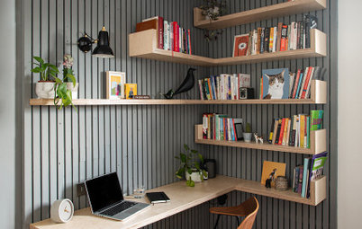
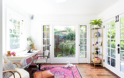
Room Tour: A Bright Workspace That’s Office and Craft Room in One
Clever use of space, interesting storage and thoughtful colour choices ensure this office is both practical and creative

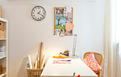
The owner of this lively space wanted more than just a home office – the room also needed to work as a creative studio for her design business. This could have been a challenge in the space available. However, with some practical planning, designer Victoria Hopkins managed to subtly create two zones and fashion a space with energy, functionality and plenty of room to make soft furnishings and upcycled pieces for her clients.
The wall opposite the desk area is filled up with a double cupboard and an adjacent radiator, so Hopkins really only had one side of the room to work with.
She maximised the space by installing two white desks, one of which curves around the corner.
Hopkins aimed to make the space work both aesthetically and practically. “I wanted to have lots of bright colours in the room,” she says, “but I also wanted to maximise the light.” The white tabletop and walls provide a clear backdrop for bright accents of colour. There’s an array of hues in the room, but, to create a harmonious feel, the designer considered the scheme carefully.
“I used the same jungle-print fabric throughout to tie in the scheme,” she says. But rather than cover a whole wall with bold pattern, Hopkins opted to introduce it in smaller elements. The same fabric features on the curtain, upholstery, cushions and lampshade. “I love the bold excitement of the fabric,” she says, “but it’s a workspace, so I didn’t want it to overpower the room.”
Leaf-print fabric, fabric4all. Desks, Ikea.
Bright pink is the other dominant shade in the room, adding a vivid shot of colour to the green pattern. Hopkins used it on the back of the cushions, the curtain lining and tieback, and the lampshade.
To give the leaf print a more edgy feel, Hopkins introduced black and white chevron prints on the wall and rug.
For storage above the worksurface, the designer positioned cube shelves in a staggered layout. “We’ve stacked them at the top, next to the ceiling, which leaves lots of space above the desk,” she says. They’re practical because they ensure all the fabrics are on show and easily accessible.
Box shelves, Ikea.
Rather than introducing extra storage in the form of a standard cupboard, Hopkins hunted around for something more interesting. She found this shelving unit, which has drawers for labels and stationery, as well as shelves to display books and plants.
“The pale grey ties in with the woodwork and ceiling,” says the designer. Hopkins chose to reverse the usual option of painting the ceiling white, and went for a pale grey instead. “It gives a soft light to the room,” she says.
A bright yellow chair is comfortable and practical, and adds an extra layer of colour to the room. “I was originally going to go for pink,” the designer says, “but the bright yellow breaks up the scheme and gives an interesting look.”
Woodwork and ceiling painted in Chic Shadow, Dulux. Yellow chair; shelving unit, both Maisons du Monde.
Hopkins made the curtain from the botanical print fabric and teamed this with a blush pink lining and hot pink tieback.
She found the chair in an antiques shop in Wales, but it was in quite a bad condition. “The seat pad was rotten, so I had to re-web, re-pad and re-cover it,” she explains.
She then painted the chair in a matt furniture paint. “I did the bottom layer light grey and added white on top. Then I sanded it slightly to reveal the grey below and give it a distressed finish. I then varnished it with a matt lacquer.”
The vintage apothecary unit is really useful for storing all the tools that Hopkins needs for her sewing and upcycling projects.
Apothecary chest, Big Living on eBay. Chair painted in matt furniture paint and lacquer, Rust-Oleum.
What do you think of this bright and practical office space? Share your thoughts in the Comments section.

Sponsored
Reload the page to not see this specific ad anymore
Who lives here Interior designer Victoria Hopkins with her husband and two cats
Where Edinburgh
Type of property A new-build flat with 3 bedrooms
Room dimensions 2.5 x 3m
Designer Victoria Hopkins of Victoria Hopkins Interiors
Photos by ZAC and ZAC Photography
When it came to designing her home office, Victoria Hopkins needed a place to tackle paperwork and a craft studio to accommodate her growing interiors business. “I make soft furnishings and upcycle furniture, and I do a lot of the making in here,” she explains.
The workspace, then, is divided into two zones – one for running the business and the other for creating products for her clients. “On the right is the office, but on the left is a surface where I can cut fabric and use the sewing machine,” Hopkins says.
“Most of the time, there’s more than enough room. It’s definitely the best use of the space I could have achieved,” she adds.
Rug, Homebase.